
A CSS-only sleight of hand
The sticky header on this blog looks like it changes background color as you scroll. In reality, the header is transparent the entire time. What you're seeing is a pair of sticky "blocker" elements that are color-matched to their sections, sitting behind the header and in front of the content.
There is no JavaScript involved. The entire effect comes down to how CSS sticky positioning behaves relative to its container.
How the blockers work
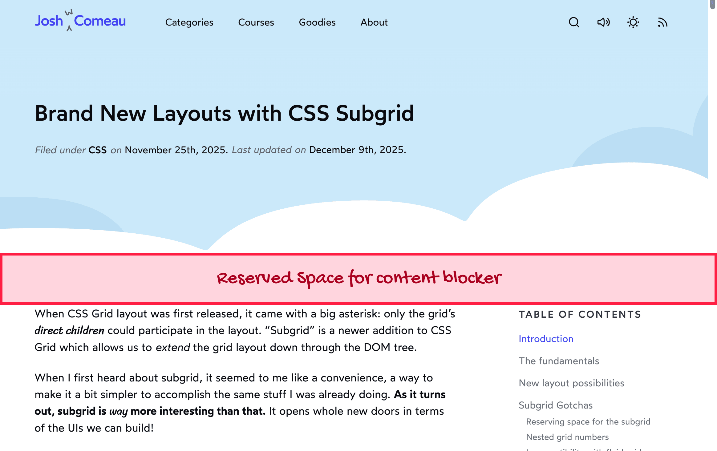
Two elements do the heavy lifting. One sits in the hero section with a blue background. Another sits in the main article area with a white background. Both use position: sticky.
As you scroll, the blue blocker stays pinned below the transparent header, covering the hero's text. When you reach the end of the hero container, the element becomes unstuck and scrolls away. The white blocker in the article area takes over at exactly that point, so the header appears to transition from blue to white seamlessly.
This behavior — a sticky element refusing to leave its parent container — is the crux of the trick. The blockers never need to move or change state; they just sit in their containers and let normal scroll mechanics do the work.
<style>
  .sticky {
    position: sticky;
    top: 2px;
    background: tomato;
  }
</style>

<div class="container">
  <div class="sticky"></div>
</div>
<div class="container">
  <div class="sticky"></div>
</div>
Here is the minimal reproduction code that powers the demonstration:
<style>
  html {
    --blue: hsl(210deg 80% 85%);
    --header-height: 4rem;
  }
  header {
    position: fixed;
    z-index: 1;
    top: 0;
    height: var(--header-height);
  }
  .blocker {
    position: sticky;
    top: 0;
    height: var(--header-height);
  }
  .hero .blocker {
    background: var(--blue);
  }
  .main-content .blocker {
    background: white;
  }
</style>

<header>Sticky Header</header>
<div class="hero">
  <div class="blocker"></div>
  <h1>Article Title</h1>
</div>
<main class="main-content">
  <div class="blocker"></div>
  <p>
    Lorem ipsum dolor sit amet, consectetur adipiscing elit. Sed vel lorem felis. Aliquam finibus libero arcu, ut sodales lorem rutrum vitae. Sed et ornare lorem. Aliquam sagittis neque ac consequat tempus. Phasellus sagittis ipsum ut velit lobortis, a dapibus libero lacinia. Integer accumsan augue sit amet ipsum luctus interdum. Nulla interdum id risus in accumsan. Curabitur quis eleifend orci.
  </p>
  <p>
    Sed sit amet tempus lacus. Aenean faucibus, libero nec posuere maximus, nisi risus laoreet est, ac scelerisque justo quam quis quam. Aliquam imperdiet magna in metus porttitor, vel sollicitudin elit placerat. Integer non elit et ante laoreet blandit vitae non diam. Morbi venenatis nisl nec magna consectetur scelerisque.
  </p>
</main>
Layering in the hero
The blog's cloud motif adds a bit of complexity, but only in terms of z-index stacking. The hero's layers, from back to front, are:
The text content (the post title and metadata)
The sticky blocker
The dark background clouds
The white foreground cloud
The blocker therefore hides the text but slides beneath the absolutely-positioned cloud SVGs, while the actual site header stays in front of everything via position: fixed.

The space requirement
The biggest trade-off is that blockers need somewhere to hide when they are not covering content. The header is 5rem tall, so each container must include at least 5rem of empty space above the content it protects. On the blog post pages, the cloud swoops are naturally positioned to provide this clearance — but that constrained the design, since the swoops could not be as deep or steep as originally intended.
When the trick doesn't fit
The homepage has no such hiding spots. Its more aggressive clouds leave nowhere to place a blocker, so the implementation there falls back to a traditional approach: the header itself has a background color, and JavaScript flips it from blue to white based on scroll position.
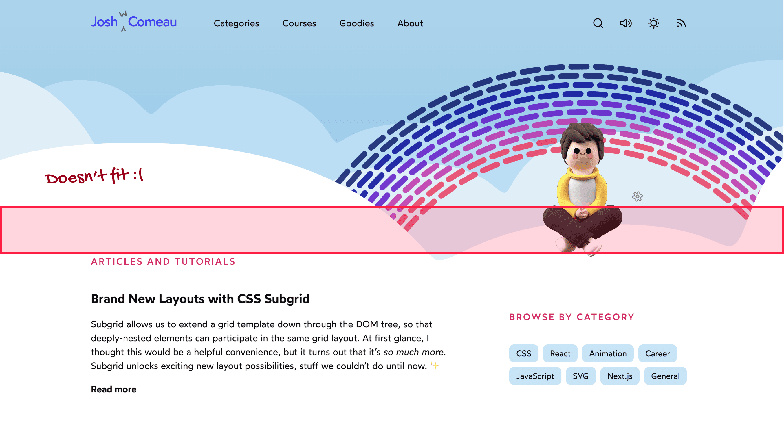
Toggling a blocker's visibility with JavaScript at the hero boundary was considered, but a sudden appearance feels jarring, and a transition is not fast enough for quick scrolls. The JavaScript-driven header background is less satisfying, but it is the right tool given the layout constraints.


