

Colour as a System: Theming SVG Animations with CSS Relative Colour
Hand-building colour palettes for every theme change is tedious work. If you've ever had to create a full set of tints and shades from a new foundation colour, you know the pain. The typical approach — picking a handful of hues and manually adjusting lightness or chroma in a design tool — works fine for a single scene. But when those same graphics must shift moods at different times of day or during user interaction, the manual workflow breaks down.
One solution is CSS relative colour values. With the widespread browser support for OKLCH, these let you establish one foundation colour and derive the entire palette — fills, strokes, gradient stops — from it algorithmically. That single source of truth becomes a system, not just a colour picker decision.
Understanding the Colour Spaces
Most front-end developers are comfortable with Hex and RGB. HSL (Hue, Saturation, Lightness) is also familiar, frequently used in design tools like Sketch. But OKLCH — a modern implementation of the LCH model — brings meaningful advantages for theming work.
OKLCH contains three channels: L (lightness), C (chroma), and H (hue). Chroma tracks intensity differently than HSL saturation — producing a wider range and more predictable blending behaviour. That means you can adjust lightness or chroma of a foundation colour with more reliable results.
Even though design tools may not support OKLCH pickers, browsers handle the conversion automatically. You can store a foundation colour in any space — including Hex — inside a CSS custom property, and let the browser convert it for calculations:
/* Foundation colour */
--foundation: #5accd6;
Any derived colours are then generated in OKLCH automatically:
--foundation-light: oklch(from var(--foundation) [...]; }
--foundation-mid: oklch(from var(--foundation) [...]; }
--foundation-dark: oklch(from var(--foundation) [...]; }
The Move, Scale, Rotate Rules
When operating relative colour values, two adjustment types behave very differently: absolute and proportional. In code they look similar, but swapping the foundation colour exposes a huge difference.
With absolute changes, you add or subtract fixed values to channels. Looking at a lightness delta between a base value (0.7837) and a darker version (0.5837), you calculate the difference (0.2) and apply it with calc():
--foundation-dark:
  oklch(from var(--foundation)
  calc(l - 0.20) c h);
That approach breaks down for chroma values. When you subtract a fixed amount from a low-chroma foundation, you'll quickly hit zero and drift toward grey. A palette that worked for one base colour collapses with another.
The more robust strategy is dividing adjustments into three operations:
- Move lightness by adding or subtracting values,
- Scale chroma with multiplication,
- Rotate hue by adding or subtracting degrees.
Lightness moves are absolute because they're perceptual. Hue relationships are rotational — multiplying them has no purpose. Chroma, however, needs proportional scaling. Multiplying chroma tells the browser to reduce colour intensity by a fraction, so the relationship between the foundation and derived colours stays intact even when the base changes:
calc(c * 0.10)
Palette Generation from a Single Colour
Relative colour values naturally form a design system. You declare a foundation colour once, and the browser derives every other colour you need — for fill, stroke, drop shadows, and gradient stops — from it. Updating the foundation updates the complete theme.
For an animated title sequence emulating classic 1959 cartoons, the foundation is a cyan-tinted blue. The background is a radial gradient between the foundation and a dark derived version:

Using custom properties means the original gradient markup stays untouched. Replace hard-coded stop-color values with inline styles referencing the custom property:
<defs>
  <radialGradient id="bg-grad" […]>
    <stop offset="0%" style="stop-color: var(--grad-end);" />
    <stop offset="100%" style="stop-color: var(--grad-start);" />
  </radialGradient>
</defs>
When choosing theme variations, the hue angle deserves attention. Moving 180° creates a complementary colour that contrasts sharply but can feel visually strained with vibration. A 90° shift produces a vibrant secondary colour with stronger balance:
.text-light {
  fill: oklch(from var(--foundation)
    l c calc(h - 90));
}
Animating the System
Nothing about this approach demands that the final result remain still. Animating the foundation colour itself opens the door for creative transitions between moods.
The task requires splitting the foundation colour into explicit OKLCH channel custom properties. Crucially, those properties must be typed: by default, browsers treat custom properties as unknown tokens, which prevents smooth interpolation. Registering a property for each channel declares the value as numeric so the engine can animate it frame-by-frame:
@property --f-l {
  syntax: "<number>";
  inherits: true;
  initial-value: 0.40;
}

@property --f-c {
  syntax: "<number>";
  inherits: true;
  initial-value: 0.11;
}

@property --f-h {
  syntax: "<number>";
  inherits: true;
  initial-value: 305;
}
After registration, reconstruct the display colour from those registered values inside a custom property definition:
--foundation: oklch(var(--f-l) var(--f-c) var(--f-h));
With channels exposed as numbers, they're now eligible for CSS transitions and keyframe animations. Consider a “breathing” effect gently shifting lightness through --foundation-lightness over time:
@keyframes breathe {
  0%, 100% { --f-l: 0.36; }
  50% { --f-l: 0.46; }
}

.toon-title {
  animation: breathe 10s ease-in-out infinite;
}
Because in the same stroke all descendant colour properties derive from that foundation, a single moving foundation propagates through the whole SVG. Fills, gradient stops, and stroked paths synchronise automatically, mirroring the efficiency of classic animation cells where one base scene composited into many moments. The foundation colour is no longer just a colour choice; it is an animation input.
From One Colour to a Whole Scene
While building a new animated background for a website’s contact page, the goal was to make the environment feel reactive to its light sources. The scene featured oil lamps that glow and swing, and the idea was to have their warm light tint the surrounding mine interior, just as real light would.
Instead of animating every colour independently, the design uses a tiny lighting system powered by a single animated colour value. An overlay layer sits between the background and the lamps, using mix-blend-mode: color to tint everything beneath it while preserving the original luminance. The overlay is opt-in, so it only appears when animations are enabled.
The lamps themselves are simple SVG elements containing a circle that gets a soft blur from a CSS filter. Rather than animating the overlay and the lamps separately, a single “flame” colour token acts as the source of truth. Three typed custom properties are registered for the OKLCH channels:
@property --fl-l {
  syntax: "<number>";
  inherits: true;
  initial-value: 0.86;
}
@property --fl-c {
  syntax: "<number>";
  inherits: true;
  initial-value: 0.12;
}
@property --fl-h {
  syntax: "<number>";
  inherits: true;
  initial-value: 95;
}
Those channels are animated with keyframes that deliberately push a few frames toward orange, making the flicker read clearly as firelight:
@keyframes flame {
  0%, 100% { --fl-l: 0.86; --fl-c: 0.12; --fl-h: 95; }
  6% { --fl-l: 0.91; --fl-c: 0.10; --fl-h: 92; }
  12% { --fl-l: 0.83; --fl-c: 0.14; --fl-h: 100; }
  18% { --fl-l: 0.88; --fl-c: 0.11; --fl-h: 94; }
  24% { --fl-l: 0.82; --fl-c: 0.16; --fl-h: 82; }
  30% { --fl-l: 0.90; --fl-c: 0.12; --fl-h: 90; }
  36% { --fl-l: 0.79; --fl-c: 0.17; --fl-h: 76; }
  44% { --fl-l: 0.87; --fl-c: 0.12; --fl-h: 96; }
  52% { --fl-l: 0.81; --fl-c: 0.15; --fl-h: 102; }
  60% { --fl-l: 0.89; --fl-c: 0.11; --fl-h: 93; }
  68% { --fl-l: 0.83; --fl-c: 0.16; --fl-h: 85; }
  76% { --fl-l: 0.91; --fl-c: 0.10; --fl-h: 91; }
  84% { --fl-l: 0.85; --fl-c: 0.14; --fl-h: 98; }
  92% { --fl-l: 0.80; --fl-c: 0.17; --fl-h: 74; }
}
The animation is scoped to the SVG element, so the resulting variables are shared between the lamps and the overlay:
@media (prefers-reduced-motion: no-preference) {
  .svg-mine[data-animations=on] {
    animation: flame 3.6s infinite linear;
    isolation: isolate;

    /* Build a flame colour from animated channels */
    --flame: oklch(var(--fl-l) var(--fl-c) var(--fl-h));

    /* Lamp colour derived from flame */
    --lamp-core: oklch(from var(--flame) calc(l + 0.05) calc(c * 0.70) h);

    /* Overlay tint derived from the same flame */
    --overlay-tint: oklch(from var(--flame)
      calc(l + 0.06) calc(c * 0.65) calc(h - 10));
  }
}
The derived colours are then applied to the lamps and the overlay they influence:
@media (prefers-reduced-motion: no-preference) {
  .svg-mine[data-animations=on] #mine-lamp-1 > circle,
  .svg-mine[data-animations=on] #mine-lamp-2 > circle {
    fill: var(--lamp-core);
  }

  .svg-mine[data-animations=on] #overlay {
    display: block;
    fill: var(--overlay-tint);
    opacity: 0.5;
  }
}
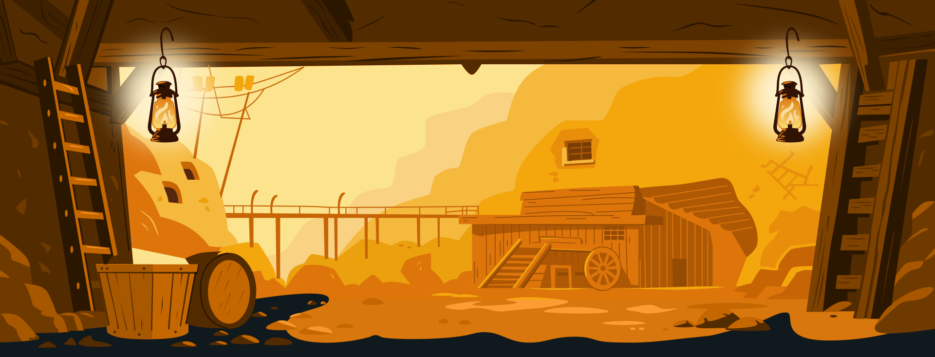
When the flame shifts toward orange, the lamps warm up, and the scene warms with them. When the flame cools, the whole scene settles together. Nothing is written manually; change the foundation colour or adjust the flame animation ranges, and the entire lighting system updates in sync.
Reusing Colour for Consistency
Reusing elements out of necessity was a technique of the early animation studios, but reusing colours is a deliberate choice for consistency and maintainability. CSS relative colour values make it straightforward to:
- Define a single foundation colour.
- Describe how every other colour relates to it.
- Reuse those relationships anywhere in the stylesheet.
- Animate the entire system by animating that one foundation value.
Relative colour syntax goes beyond easing the theming process. It encourages a mental model where colour is intentional, just like motion — where a single value change can transform an entire scene without rewriting the work underneath it.