
Lessons From the Hanna-Barbera Era
Early television animation was a masterclass in working within constraints. Hanna-Barbera productions, lacking the budgets of theatrical cartoons, relied on a handful of clever tricks: fewer frames per second, reused cells, and a focus on animating only select body parts while keeping the rest static. These limitations didn't diminish the work — they gave it a distinct charm that modern, high-budget animation often lacks.
CSS animation has followed a similar trajectory. From simple :hover states to transitions, then to multi-step @keyframes, and now to scroll-driven animation, the toolset has grown richer. Yet the fundamental techniques that made classic cartoons work map cleanly onto modern web development habits. Layering elements, toggling opacity and visibility, and recycling a few reusable assets are all achievable without resorting to JavaScript.
The payoff is more than aesthetic. Thoughtful movement improves usability by drawing attention to key interactions, reinforcing brand identity, and making an interface feel alive. When a user clicks, hovers, or scrolls, a well-placed animation can guide them naturally and add a layer of delight to what would otherwise be a flat experience.

Building a Retro-Style Site for Mike Worth
Emmy-winning game composer Mike Worth shares a fondness for the animation of the ’80s and ’90s, particularly Disney's Duck Tales. His own design preferences lean further back, finding inspiration in the Hanna-Barbera shows of the 1960s. This shared reference point formed the basis for his new website, which Andy Clarke designed to showcase Worth's work with heavy retro styling and CSS-driven animation.
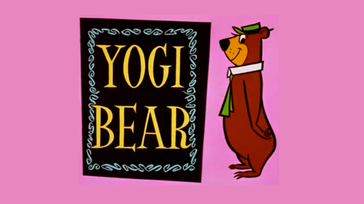
Looking at a 1961 episode of The Yogi Bear Show titled "Home Sweet Jellystone" makes the era's techniques clear. In it, Ranger Smith inherits a mansion and prepares to depart Jellystone Park. The animators stretch a single painted backdrop creatively to sell the action.
Scrolling Backgrounds and Bumpy Rides
One of the most common tricks was looping a background. When Ranger Smith receives a telegram, the camera pans across a single painted landscape from background artist Robert Gentle to suggest the postman's arrival. When the scene runs longer than one pan, the backdrop simply repeats, with the same bushes and trees cycling past.


This same effect can be recreated with a single HTML element and a CSS animation that shifts the background image's position. A similar approach was used in a discarded scene for Mike Worth's site, where an orangutan adventurer mascot drives across the landscape.

The environment scrolls infinitely via the background-scroll keyframes. To suggest a rough terrain, the mascot's body gets its own animation — bumpy-ride — which fluctuates the element's translate value at key points in the cycle:
@keyframes bumpy-ride {
  0% { translate: 0 0; }
  10% { translate: 0 -5px; }
  20% { translate: 0 3px; }
  30% { translate: 0 -3px; }
  40% { translate: 0 5px; }
  50% { translate: 0 -10px; }
  60% { translate: 0 4px; }
  70% { translate: 0 -2px; }
  80% { translate: 0 7px; }
  90% { translate: 0 -4px; }
  100% { translate: 0 0; }
}

figure {
  /* ... */
  animation: background-scroll 5s linear infinite;
}

img {
  /* ... */
  animation: bumpy-ride 1.5s infinite ease-in-out;
}
See the Pen [Mike Worth background image scroll [forked]](https://codepen.io/smashingmag/pen/ByyVZrB) by Andy Clarke.
The backgrounds themselves were often deceptively simple. The interior of Ranger Smith's mansion has very few details because it rushes past the camera during a dash across the room. To add a hint of realism, the animators bounced the postman's motorcycle and changed only his head and expression. Likewise, Ranger Smith's walk cycle animates only his legs and facial features; the torso remains pinned down.

When working with any motion on the web, viewer comfort is a primary concern. Not all people perceive motion the same way, and what feels smooth to one user could be distracting or physically distressing to another. The prefers-reduced-motion media query offers a straightforward way to respond to a user's system-wide accessibility settings:
@media (prefers-reduced-motion: reduce) {
  * { animation: none !important; }
}
Reusing and Layering Assets
Cost and schedule pressures pushed Hanna and Barbera toward a highly streamlined process. Episodes were built on an astonishingly small library of source material, sometimes involving just a few thousand individual drawings and a handful of background paintings reused across multiple episodes and scenes. Those same trees and bushes appear all over "Home Sweet Jellystone" — in the background, in the foreground, and scaled up for close-ups.

Rather than painting new backgrounds for every shot, the animators layered foreground elements — such as rocks — directly onto existing backgrounds to create distinct scenes and add depth. This technique has a direct CSS equivalent. Layering bitmap images is trivial with modern layout tools. If the scenery scrolls at a different speed than the foreground, it also hints at a parallax effect, adding a greater sense of realism without additional assets.

<figure>
  <img id="bumpy-ride" src="..." alt="" />
  <img id="apes-rock" src="..." alt="" />
</figure>
figure {
  position: relative;

  #bumpy-ride { ... }

  #apes-rock {
    position: absolute;
    width: 960px;
    left: calc(50% - 480px);
    bottom: 0;
  }
}
Animation Efficiency
Hanna-Barbera characters were drawn with a collar and necktie for a very pragmatic reason: the line between the static body and the animated head is nicely hidden. Characters walk with only their legs and feet in motion, and facial expressions are limited to moving eyes and mouths. The whole drawing doesn't redraw — only specific parts.
This same economy shows in Ranger Smith's scene reading the telegram, where only his eyes and mouth ever move. The body and head remain static layers while the dynamic elements are swapped in and out.
<svg>
  <!-- static elements -->
  <g>...</g>

  <!-- animation frames -->
  <g class="frame-1">...</g>
  <g class="frame-2">...</g>
  <g class="frame-3">...</g>
  <g class="frame-4">...</g>
  <g class="frame-5">...</g>
  <g class="frame-6">...</g>
</svg>
This principle translates directly to SVG animation. Since CSS custom properties can define variables like animation speed and frame counts, animating by swapping frames becomes tidy and manageable:
:root {
  --animation-duration: 1s;
  --frame-count: 6;
}
Adding the keyframes to toggle visibility, and then staggering which frame appears at which time with a delay, recreates the illusion of a character speaking:
.frame-1 {
  animation-delay: calc(var(--animation-duration) * 0 / var(--frame-count));
}

/* ... */

.frame-6 {
  animation-delay: calc(var(--animation-duration) * 5 / var(--frame-count));
}
See the Pen [Ranger Smith talking [forked]](https://codepen.io/smashingmag/pen/QwwxgJE) by Andy Clarke.
Ambient Animation
Ambient animation provides atmosphere and supports storytelling without being distracting. On Worth's about page, shafts of light hitting a stone tablet add depth to an otherwise flat illustration. Inside the SVG, a path for the light has its opacity reduced to .25. An SVG filter then blurs the edges of the shafts:
<defs>
  <filter id="light-shaft" width="100%" height="100%" x="0" y="0" filterUnits="objectBoundingBox">
  <feGaussianBlur in="SourceGraphic" stdDeviation="20"/>
  </filter>
</defs>

<svg>
  <!-- ... -->
  <path class="light-shaft" filter="url(#light-shaft)" … />
</svg>
A subtle keyframe animation rotates the light shafts and gives the fixture a more natural, livelier feel.
See the Pen [Mike Worth’s about page animation [forked]](https://codepen.io/smashingmag/pen/bNNKROE) by Andy Clarke.
This kind of ambient motion guides the eye toward the illustration without commanding full attention.
Interaction Animations
Interactivity can deepen a user's connection to a design. On Worth's review page, a large red button toggles the desk lamp on and off, much to the irritation of the orangutan mascot studying a map. This interaction is a playful Easter egg — one that couples a data- attribute on the whole SVG with a lights-on/lights-off state change.
Specific items that respond to the light have a class applied, and the data- attribute value controls a CSS rule to turn their glow on or off:
[data-lights="lights-on"] .lamp-glow {
  opacity: 1;
  transition: opacity .25s linear;
}

[data-lights="lights-off"] .lamp-glow {
  opacity: .25;
  transition: opacity .25s linear;
}
Flicker effects are driven by a keyframe animation that adjusts the light's opacity at seemingly irregular intervals, hiding the illuminated elements fully when the light is off.
[data-lights="lights-off"] .lamp-flicker {
  visibility: hidden;
}
A vibrating crystal skull on the desk also tempts the curious to click by hinting that there's more to find.
See the Pen [Mike Worth’s review page animation [forked]](https://codepen.io/smashingmag/pen/YPPvQBg) by Andy Clarke.
Animation as Storytelling
Beyond mere feedback, animation can directly express a brand's identity. Mike Worth's style is high-energy and playful, and the design team aimed to match that. The site's 404 page tells a tiny narrative: the hero mascot slips into quicksand, and animated bubbles rise while he sinks deeper. This approach turns what is typically a dead-end error screen into a memorable moment in keeping with the character's story.
@keyframes four-oh-dear-bubbles {
  0% {
    animation-timing-function: ease-in;
    opacity: 1;
    transform: translateY(45px);
  }
  24% {
    opacity: 1;
  }
  40% {
    animation-timing-function: ease-in;
    translate: 0 24px;
  }
  65% {
    animation-timing-function: ease-in;
    translate: 0 12px;
  }
  82% {
    animation-timing-function: ease-in;
    translate: 0 6px;
  }
  93% {
    animation-timing-function: ease-in;
    translate: 0 4px;
  }
  25%, 55%, 75%, 87% {
    animation-timing-function: ease-out;
    translate: 0 0;
  }
  100% {
    animation-timing-function: ease-out;
    opacity: 1;
    translate: 0 0;
  }
}

.four-oh-dear-bubble {
  animation: four-oh-dear-bubbles 2s ease 0s infinite alternate forwards; }
This kind of detail demonstrates how far a lightweight CSS approach can go. Rather than pulling in heavy video files, a well-crafted SVG, a few keyframes, and some thoughtful timing rules are often enough to give a website personality and motion that cartographers of the 1960s would recognize.
Animation as Storytelling
Just as Hanna-Barbera animators turned limited frames into a distinct visual language, CSS animations let web professionals build experiences that feel deliberate and alive. Layering elements, looping frames, and keeping motion subtle can give a design personality without sacrificing usability.

For Mike Worth's website, the animation does more than decorate — it narrates who he is and what he makes. Each movement reinforces his brand and turns the site into an extension of his creative output.
Think beyond movement the next time you reach for a CSS animation. Consider emotions, identity, and mood, too. After all, a well-considered animation can do more than catch someone's eye. It can capture their imagination.

Mike Worth's site launches in June 2025. In the meantime, you can browse the CodePen collection that accompanies this article.



