
Modern CSS Releases Old Layout Pain Points
CSS today handles challenges that once required JavaScript hacks or convoluted markup. From richer shadows to conditional border radii and even grainy textures, the solutions below show how far the language has come — and where innovative workarounds still fill the gaps.
Shadows With Actual Depth
Most box-shadows on the web read as "fuzzy grey boxes" rather than realistic shadows. Rob O'Leary's deep dive into shadows covers the physics of light sources, layering effects, inset shading, accessibility concerns, and performance implications — along with animation techniques. Josh W. Comeau's complementary guide transforms typical box-shadows into tactile, life-like effects. The key insight: a light source needs to be defined first, and shadows should be stacked and tuned to evoke real depth.

Paper Cut-Out Headings Without Extra Markup
Building a paper cut-out heading used to require two overlapping divs and careful relative-unit spacing. Stephanie Eckles' solution eliminates that with CSS custom properties, Grid, transforms, and the attr() function. A data-attribute on the h1 feeds the content property of an :after pseudo-element, while custom properties control highlights, shadows, and colors. Ahmad Shadeed's piece on the same effect explores when SVG makes more sense and walks through real-world implementation.
For more modern CSS inspiration from Eckles and others, StyleStage showcases what the language can achieve.
A Contextual Page Minimap
Rauno Freiberg's experimental minimap goes beyond the simple horizontal scroll-progress bar. It renders a live preview of the entire page, distinguishes images, quotes, and sections, and lets readers pin positions to jump back to later. The effect relies on the experimental element() CSS property, which displays a live image of an arbitrary HTML element — currently supported only in Firefox.
Border Radius That Adapts to Space
Cards often need a large border-radius when there's room — and no rounding at all when edge-to-edge on small screens. Ahmad Shadeed's conditional approach, originally suggested by Heydon Pickering and Naman Goel, uses a large enough number to trigger either state. When the difference between 100vw and 100% is zero, the radius becomes zero; if space exists, the larger value applies.
Adding Noise Without Image Exports
To give gradients a grainy, textured feel, Jimmy Chion's technique layers an SVG filter beneath a gradient. The noise is generated as a background, then the brightness and contrast are refined so the gradient dithers away naturally. It avoids exporting PNG, WebP, or AVIF files and keeps the texture toggleable. A playground is available for experimentation.
Gradient Text That Doesn't Reset Per Line
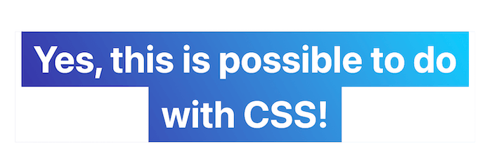
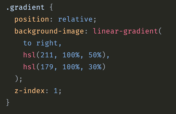
Applying a gradient to multi-line text that continues across line breaks — rather than restarting for each line — seemed impossible until Matthias Ott demonstrated a hacky but effective solution: a pseudo-element layered over the text achieves the continuous gradient effect.
Form Validation With a Dancing Indicator
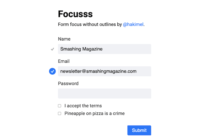
Hakim El Hattab's focus effect removes outlines entirely. Instead, a dot marks the active field; when focus moves, the dot animates a path to the new field. Validation integrates into the same animation, expanding into a checkmark. It's a subtle, surprising interaction that treats even a simple name/email/password form as a design opportunity.
Transitioning Gradients Smoothly
CSS can't natively transition between two gradients — changes happen instantly. Keith J. Grant's workaround uses a pseudo-element: the base element holds one gradient, the pseudo-element holds the second, filling the same space. Transitioning the pseudo-element's opacity produces a smooth crossfade between the two gradients.
The CSS-Background Equivalent of srcset
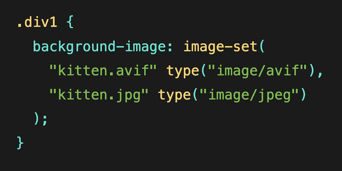
image-set() brings responsive image behavior to CSS backgrounds. Chromium browsers and Safari have long supported it; Firefox support arrived recently. As Ollie Williams explains, one use case is offering multiple resolutions and letting the browser pick — high-res on capable displays, lower-res on slow connections or low pixel densities.
A more ambitious use case — serving new formats like AVIF or WebP with a fallback — still lacks full support. Where that's needed and background-image isn't required, the <picture> element is a viable alternative.
image-set() can be used to serve different background images to different users. (Large preview)3D Effects Without Heavy Animations
With clip-path: path() supported in all major browsers, Mikael Ainalem demonstrates a pop-out effect for portraits: a photo rises from inside a circular background on hover, producing a buttery 3D impression — ideal for "About Us" pages. The underlying CSS work is minimal.
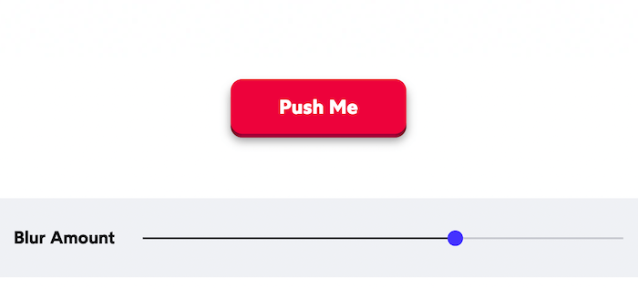
clip-path: path(). (Large preview)Josh W. Comeau's whimsical 3D button layers foreground and background elements, shifting the front layer down on hover with a softened shadow. Focus treatment uses outline-offset or :focus:not(:focus-visible) to keep the outline visible only for keyboard users. The button stays accessible, works on mobile, and feels satisfying to click.
A CSS Framework For Data Visualization
Building charts entirely in CSS is possible thanks to Charts.css, a dependency-free framework that applies utility classes to HTML elements to render a range of chart types. Created by Lana Gordiievski and Rami Yushuvaev, it supports column, bar, stacked, and multi-dataset presentations, among others. The project is MIT-licensed and available on GitHub, with component and chart-type docs on its site. For less conventional visuals, Preethi’s guide on CSS-Tricks covers charting with emoji, glyphs, and custom shapes.
Trimming The Global Reset
Browser style resets have been shrinking while staying effective. Andy Bell’s Modern CSS Reset keeps box-sizing rules, removes default margins, sets root and body defaults, and adds sensible values for scroll-behavior and text-decoration-skip-ink. It also disables animations, transitions, and smooth scrolling for users who opt out via prefers-reduced-motion.
The New CSS Reset by Elad Shechter is more aggressive: it strips default styles from specific elements but leaves the display property intact. Either approach is worth evaluating for your next project.
Preventing Scrollbar-Induced Layout Shifts
Layout shifts sometimes occur for an unexpected reason: the type of scrollbar in use. On iOS and macOS, overlay scrollbars float over content, whereas classic scrollbars consume space in a dedicated “scrollbar gutter” between the inner border edge and outer padding edge. When a box overflows, the classic scrollbar appears and takes up room, which causes shifting.
The scrollbar-gutter property aims to fix that. Setting it to stable instructs the browser to reserve gutter space even when content does not overflow. Adding the both-edges keyword keeps margins symmetric: scrollbar-gutter: stable both-edges. Chromium has the feature slated for roll-out, as detailed in Bramus Van Damme’s write-up, with other engines expected to follow.
Unexpectedly Animatable Properties
CSS animation is usually associated with transforms and opacity, but Will Boyd’s exploration highlights properties rarely considered animatable. Among them, z-index can drive layered animation sequences, and opacity enables pure-CSS modal fading. The post is a reminder of the breadth of the CSS animation specification and the possibilities beyond common practice.
Practice With Purpose: CSS Games And References
Whether you are learning the basics or sharpening advanced skills, there are browser-based games tailored to specific areas.
Flexbox Learning Games
Flexbox Froggy has you position frogs onto lilypads across 24 levels that progress from fundamental alignment to harder scenarios. If zombies are more compelling, Flexbox Zombies intersperses plot with new flexbox concepts and “zombie survival challenges.” For a tower-defense angle, Flexbox Defense lets you stop incoming enemies by moving your towers via CSS.
Grid, Selectors, And Competitive Coding
Grid Garden puts you in charge of a carrot patch and tasks you with 28 levels of layout care using CSS Grid. For selector practice, CSS Diner offers 32 challenges where you must choose items—plates, apples, pickles—with a suitable selector. And if you prefer a scoreboard, CSSBattle is a golf-style competition: replicate a target visual in the fewest characters possible. Challenges focus on specific properties like visibility, display, transition, or z-index.
For a quick lookup when deadlines loom, the CSS-Tricks Almanac covers selectors and properties in a searchable index.