

Multi-Column Layouts Get a 2D Upgrade in Chrome
Multi-column layouts have always had a fundamental limitation: once content exceeded the container's height, the browser created more columns and forced a horizontal scroll. In a web that predominantly scrolls vertically, that behavior felt broken. Chrome 145 changes this with two new properties, column-height and column-wrap, which let extra content flow into a new row below instead.
Without these properties, a classic multi-column setup looks something like this:
body {
  max-width: 700px;
}

.article {
  column-gap: 10px;
  column-count: 3;
  height: 350px;
}
Content that doesn't fit simply spills sideways. With Chrome 145+, you can flip that overflow behavior:
body {
  max-width: 700px;
}

.article {
  column-gap: 10px;
  column-count: 3;
  column-wrap: wrap;
  height: 350px;
}
The result keeps your desired column-count while maintaining a natural vertical scroll:

Browser support: As of April 2026, both properties work only in Chrome 145+. Firefox, Safari, and Edge do not yet support column-wrap or column-height.
Where Wrapping Makes Sense
Fixed-height content blocks
The strongest use case is content with predictable or capped heights—think card grids where each card has a max-height. Toggling column-wrap: wrap versus nowrap in a demo shows the difference clearly. The nowrap version produces the classic horizontal overflow:

Adding wrap transforms the same layout into a continuous vertical flow:

That said, wrapping doesn't fix unbalanced content. If individual cards have wildly different heights, the wrapped rows can still look uneven:

Newspaper and magazine layouts
When you're willing to set explicit container and column heights, these properties shine for editorial-style sections. The combination of column-height and column-wrap makes the layout responsive across screen sizes while keeping a logical reading flow.
Block-direction carousels
A particularly creative use: set column-height to match the viewport (like 100dvh) and treat the multi-column flow as pagination. Content fills the screen height, then wraps to the next "page" below. Combined with scroll-snap-type: y mandatory, you get a smooth vertical page-flipping experience without JavaScript calculations or manual clipping. One caveat: if a single slide's content is too long, the vertical flow can feel interrupted by the imbalance.
Limitations to Keep in Mind
Unpredictable content
For user-generated or CMS-driven content where heights are unknown in advance, these properties offer little help. Without a fixed column-height, the layout remains unpredictable. Overestimating the height leaves awkward gaps; underestimating it produces unbalanced columns. The fallback is JavaScript-based height calculation, which defeats the purpose of a CSS-native solution.
Responsive design still needs media queries
Wrapping only adjusts overflow behavior. To truly support varying viewport sizes, you still need media queries to tune column-count and column-height. There's no escaping that dependency yet.
No precise placement control
If you need fine-grained control over where items sit relative to each other, CSS Grid remains the right tool. Multi-column with wrapping provides flow, but not positioning control.
How It Compares to Grid, Flexbox, and Masonry
The key difference: Grid and Flexbox manage distinct containers, while multi-column is the only system that fragments a single continuous content stream across multiple columns and rows. That makes it the natural fit for long-form content, as in the newspaper example above.
CSS Grid offers precise placement control through its grid structure—ideal for dashboards, asymmetric designs, or responsive image galleries using auto-fit.
Flexbox with wrapping works well for standard UI components like navigation bars and tag clouds that reflow on smaller screens.
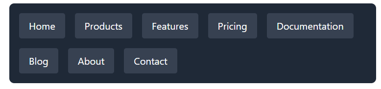
Note: Chrome is also experimenting with a flex-wrap: balance keyword that could offer additional wrapping control.
Grid and Flexbox both handle dynamic content heights better and give you superior alignment control compared to multi-column. But they each treat items as independent units. Multi-column with the new properties has a unique edge for fragmentation-aware layouts.
CSS Masonry, meanwhile, targets interlocking items with varying heights—Pinterest-style boards and e-commerce product grids where descriptions cause card heights to differ.
A Niche, Not a Replacement
The column-wrap and column-height properties in Chrome 145 meaningfully expand what multi-column layouts can do. By enabling 2D flow, they let you fragment content without sacrificing the vertical scrolling experience.
These won't replace the structural precision of CSS Grid or the item-level flexibility of Flexbox. They address a specific gap: flowing a single continuous stream of content in two dimensions while staying intuitive to the user. Practical adoption requires understanding both the advantages and the limits—they won't solve dynamic height problems or remove media query needs, but they offer a CSS-native approach to fragmenting content that didn't exist before.


