Rethinking the Breakpoint Habit
Breakpoint-driven design has become the default mental model for responsive work, yet it inherits a print-era assumption: that a handful of fixed canvas sizes can stand in for the real diversity of screens. In practice, that means mockups at 320px, 400px, 768px, 1024px and 1440px, with developers left to interpolate the logic between them. The result is often a sprawl of near-duplicate values and bespoke CSS rules that bloat the codebase and complicate maintenance.
Utopia, a free CSS tool, proposes a different starting point. Rather than adding more breakpoints to handle more devices, it leans into the web's native fluidity, letting type and spacing interpolate continuously between a defined minimum and maximum viewport. The approach couples fluid type and space scales with CSS custom properties, creating a small set of named constraints that both designers and developers can share.
A Shared Vocabulary for Design and Development
Utopia emerged from agency work where the gap between static mockups and fluid reality kept causing friction. After an early spreadsheet-based calculator proved difficult to communicate, a sprint at Clearleft in early 2020 produced utopia.fyi and its accompanying fluid type scale calculator. The tool gives a name to a set of ideas that were previously hard to articulate, and turns them into a practical workflow.
The core premise is to think in steps rather than values. Instead of specifying that a heading moves from 1.687rem to 2.3125rem at some query, you can say "Step 2 to Step 3." This self-imposed abstraction guards against a proliferation of magic-number font sizes entering a project. Crucially, the system is meant to be compact enough to hold in short-term memory, avoiding the need for constant reference to documentation.
Designing With Fluid Type Scales
The workflow typically begins with selecting a body copy font and size at both a minimum and maximum viewport width. Sizes depend on the project's fonts, visual style, content and audience, so the first step is experimentation in Figma with realistic copy. At this stage, attention focuses on legibility, line length and weight contrast.
Once the rough sizes feel right, the next stop is the Utopia type scale calculator, which maps those values onto mathematical scales. The results are pulled back into Figma to verify they suit the content. The key idea: define a scale for a small screen and another for a large screen, and let the browser interpolate smoothly between them based on the viewport, rather than hand-setting sizes at multiple breakpoints.
Implementing Fluid Type in CSS
Developers visit the same calculator URL to export CSS directly into a project. The generated code relies on CSS custom properties and CSS locks, meaning the implementation is opt-in and values remain tweakable in the browser. This malleability is deliberate: designs change as projects evolve and content shifts, so keeping values exposed as variables rather than hard-coded literals makes the system resilient.
Two implementation patterns emerge from the CSS custom properties. The first uses the custom property directly in a declaration:
h2 {
  font-size: var(--step-2);
}
The second creates single-responsibility utility classes for a more componentized approach:
.u-step-2 {
  font-size: var(--step-2);
}
<h3 class="u-step-2">Heading</h3>
Fluid Space That Interpolates
Spacing is often handled ad-hoc, which is where inconsistency creeps in. Utopia's fluid space calculator standardizes the base unit of space, starting from "Step 0" of the fluid type scale and multiplying it to generate a range of sizes. Those sizes are referred to by T-shirt names — S, M, L and so forth — rather than pixel values, giving the project a lightweight, predictable vocabulary.
Where many systems swap margin or padding values at arbitrary breakpoints, Utopia's space units can interpolate to different units between the chosen min and max viewports. The default "single-step pairs" step one size up the ladder, such as 2XS → XS or XS → S. Custom pairs are also available: a steep slope like XS → 3XL suits hero-section spacing, while a reverse slope like 2XL → XS shrinks the gap as the viewport widens.
The space palette promotes intentional rhythm across interfaces. In practice, the handful of named sizes become second nature after short use. In Figma, min- and max-sized space components are stored as variants, and a plugin to automate the process is planned. The team built a demo showing how the space system behaves in real layouts.
On the development side, the export from the space calculator drops directly into a project as custom properties or utility classes:
.grid-of-two {
  display: grid;
  grid-template-columns: repeat(2, 1fr);
  grid-gap: var(--space-s-l); // (S) 18px → (L) 44px
  margin-bottom: var(--space-xs); // 14px → 17px
}
With a shared fluid space palette, designers can stop producing mockups at every viewport width. The developer carries part of the responsive design responsibility, applying the appropriate space unit per context. A targeted mockup is still valuable for components that truly break down on smaller screens — a header, for instance — but the designer's effort shifts to genuinely thorny problems, while ordinary layout adjustment becomes automatic.
Real-World Adoption At The Natural History Museum
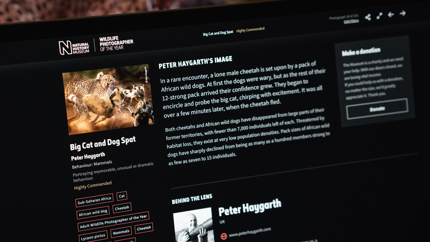
Utopia's first major trial came during Clearleft’s work with the Natural History Museum on the Wildlife Photographer of the Year website. This competition is the largest of its kind globally, and the digital team wanted the online experience to match the physical exhibition's thoughtful arrangement of photographs and carefully typeset information.
With such a powerful collection of assets, the design goal was intentionally simple: let the photograph take center stage. That directive shaped every foundational decision and made the project a natural fit for Utopian principles. To present the imagery and its supporting content effectively across devices, there were two paths: either distribute fixed breakpoints throughout the code, or embrace the fluid nature of the web and let the layout adapt to the display automatically.

The final product is an immersive digital gallery where each image gets room to breathe and stays visually consistent with its environment on any screen. Details on the process are available in the case study, and the Clearleft podcast offers further discussion of the project.
Principles, Not Shortcuts
In this system, every character and every unit of spacing across all components is connected to a predefined typographic step or space size. While that approach can streamline certain design decisions, it does not replace good design judgment. Establishing the right type and space palettes, and maintaining them as the project evolves, still requires a skilled designer.
For any project, whether a large design system or a smaller build, the benefits of systematic thinking generally outweigh the costs. Systems can seem like overkill on smaller scopes, but Utopia is constructed to be as lightweight as possible, making it applicable to a broad range of project sizes.