
Rethinking What Needs a Library
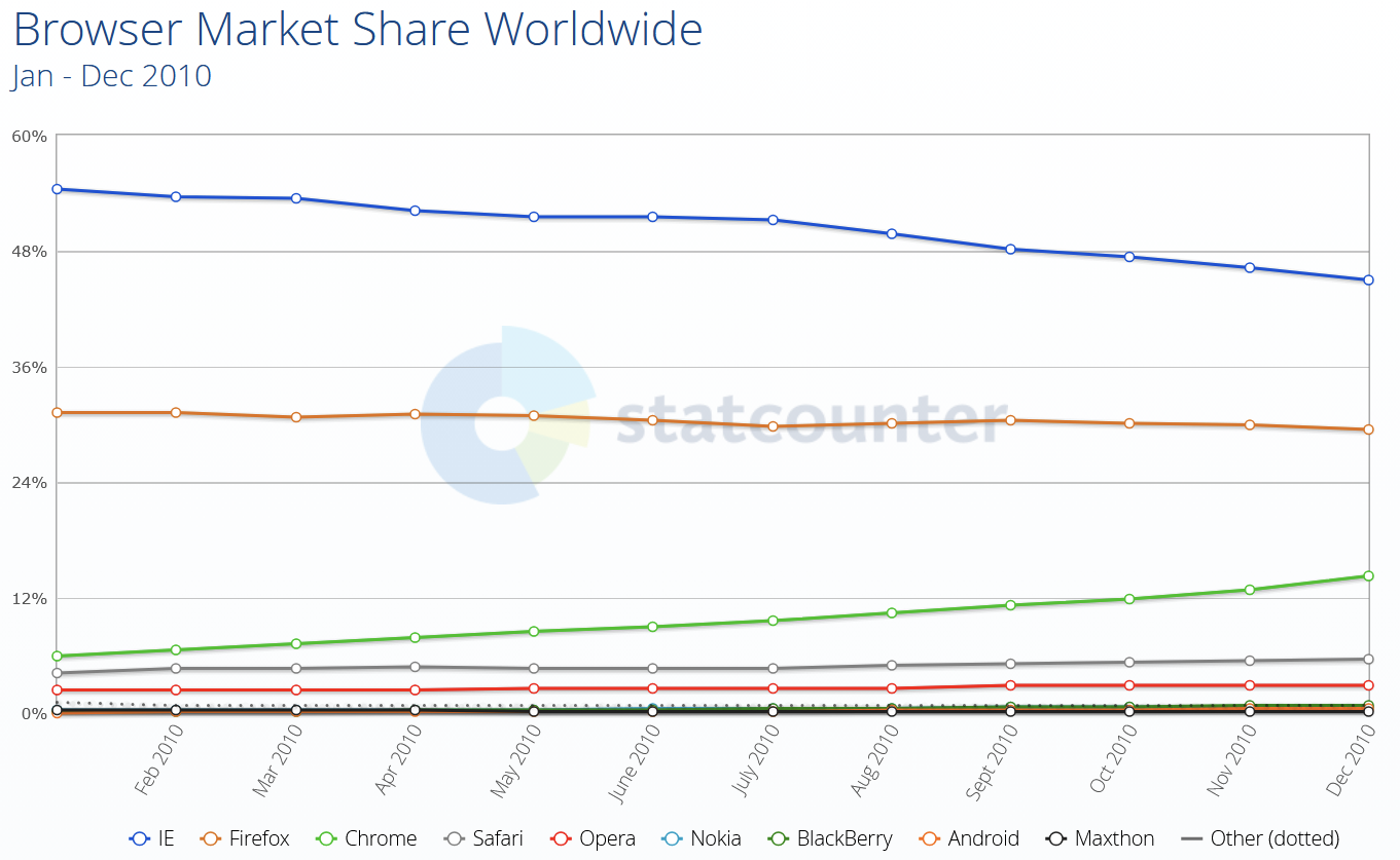
Fifteen years ago, the prevailing wisdom in web development was that JavaScript was the answer to everything. Frameworks sprouted up to handle rounded corners, dynamic content, and page transitions — challenges that seemed insurmountable with pure HTML and CSS at the time. Browser inconsistencies were brutal, with legacy versions of Internet Explorer requiring elaborate workarounds, and the platform itself simply lacked many of the capabilities we now take for granted.

That era fueled the famous notion that any application written in JavaScript would eventually be rewritten entirely in JavaScript. It felt like a mandate to build everything with JS, and learning the underlying platform seemed like a luxury rather than a necessity. Given the browser landscape of the time, relying on JavaScript libraries was often the most pragmatic path forward.
Today, the equation has shifted dramatically. The web platform has caught up, and the rate of new feature adoption across browsers has accelerated. Developers who invest time in understanding what HTML, CSS, and the modern browser APIs offer are now at a significant advantage. Whether you're optimizing for performance, accessibility, or shipping UI features efficiently, knowing the native tools available helps you build better, faster, and with less code.
Native Solutions Replacing Common Dependencies
The features below are now supported in Chromium, WebKit, and Gecko — the three main browser engines — but your specific browser support requirements may still dictate what you can adopt. Understanding these capabilities now is a good first step toward planning migrations where it makes sense.
Dialogs, Popovers, and Tooltips
The Popover API, the <dialog> element, and the ::backdrop pseudo-element can eliminate the need for libraries like Floating UI, Tippy.js, Tether, or React Tooltip. These native APIs handle accessibility and focus management out of the box, are fully customizable with CSS, and can be easily animated.
Accordions Without JavaScript
The <details> element, its name attribute for mutually exclusive groups, and the ::details-content pseudo-element replace accordion components from Bootstrap, MUI, or similar frameworks. Using the native elements means code is easier for developers familiar with HTML and CSS, immune to library breaking changes or discontinuation, and lighter — mutually exclusive accordions open and animate without a single line of JavaScript.
Modern CSS Capabilities
Cascade layers bring organization, CSS nesting reduces verbosity, and new color functions like relative colors and color-mix() replace preprocessor features. New math functions — abs(), sign(), pow(), and others — likewise reduce the need for CSS pre-processors, utility frameworks, and runtime CSS-in-JS libraries. And :has() — long one of the most requested features — removes the need for involved JavaScript solutions for conditional styling.
JavaScript and Set Utilities
Native Array methods like findLast() and at(), plus Set methods such as difference(), intersection(), and union(), make standalone utility libraries like Lodash less necessary.
Container Queries and Modern Layout
Container queries let UI components respond to their container rather than just the viewport, which makes them more reusable across contexts — and eliminates the need for JavaScript-heavy libraries or polyfills.
For layout, Grid, subgrid, flexbox, and multi-column are now firmly among the native capabilities. Looking at survey results like the State of CSS, developers tend to be cautious with adoption, but these features have been Baseline for a long time. They can replace grid systems and column utilities from frameworks like Bootstrap, Foundation, Bulma, Materialize, or Tailwind.
This isn't an argument to rip out your existing frameworks immediately. Teams adopt them for valid reasons, and migration projects are substantial. But the web platform's native capabilities offer a credible, increasingly attractive alternative — with the benefits of fewer dependencies, less code to download, and no third-party wrapper between you and the browser.

What’s Next on the Platform
Several upcoming platform features are worth tracking even if they aren’t ready for production use. They point to where the web is heading and can inform planning for future projects.
Anchor Positioning
CSS anchor positioning handles the positioning of popovers and tooltips relative to other elements, and takes care of keeping them in view — even when moving, scrolling, or resizing the page. This is a natural complement to the Popover API, making it easier to migrate away from more performance-intensive JS solutions.
Navigation API
The Navigation API manages navigation in single-page apps and could complement — or even replace — React Router, Next.js routing, or Angular routing. It provides a native way to handle SPA navigation without framework-specific routing logic.
View Transitions API
The View Transitions API animates between different states of a page. For single-page applications, it makes smooth transitions between states very easy and can help eliminate animation libraries like Anime.js, GSAP, or Motion.dev. The API also works with multi-page applications.
Had the View Transitions API been available years ago, the need to build single-page frameworks primarily to avoid the white flash of page reloads might never have arisen. Beautiful page transitions would have been achievable without the heavy initial download of an entire app.
Scroll-driven Animations
Scroll-driven animations run based on the user’s scroll position rather than over time, making them ideal for storytelling and product tours. Some sites push the technique too far, but when used judiciously it can be a highly effective design tool, potentially replacing libraries such as ScrollReveal, GSAP Scroll, or WOW.js.
Customizable Selects
A customizable select is a standard <select> element that allows full customization of its appearance and content while maintaining accessibility and performance benefits. This long-awaited, highly requested feature means developers can eventually drop the hard-to-maintain JS code used for custom select components.
The job market is filled with web developers skilled in JavaScript and the latest frameworks. If you can already achieve the same results with familiar libraries and frameworks, why invest in learning platform primitives? Shouldn’t browser vendors work with library authors to make those libraries load and run faster, rather than convincing developers to switch approaches?
Browser vendors do collaborate with library authors, and they do improve underlying areas based on how frameworks are used. But using the platform directly brings real, measurable gains.
Less Code on Devices
The primary benefit is shipping far less code to client devices. According to the 2024 Web Almanac, the average site makes around 70 HTTP requests, with most of those being JavaScript — 23 requests per page. JavaScript overtook images as the dominant file type in 2024, with the median number of JS requests up 8% since 2022.
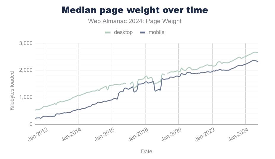
Page size also keeps growing. The median page weight now stands at roughly 2MB, which is 1.8MB more than a decade ago.
While internet connection speeds may have improved, that isn’t true for everyone — and device capabilities vary as widely. Pulling in third-party code for things the platform can handle natively means shipping more code and reaching fewer customers. Poor loading performance drives high abandonment rates and damages brand reputation.
Less Code Running on Devices
The code that does reach customer devices runs faster when it uses fewer JavaScript abstractions on top of the platform. It also tends to be more responsive and more accessible by default, which leads to happier users.
As Alex Russell’s yearly performance inequality gap analysis shows, premium devices remain largely absent from markets with billions of users due to wealth inequality — and this gap is growing over time.
One upcoming web platform feature that deserves particular attention is CSS Masonry.
Understanding Masonry
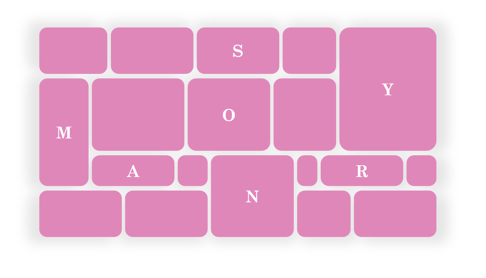
Masonry is a type of layout that was made popular by Pinterest years ago. It creates independent tracks of content within which items pack themselves up as close to the start of the track as they can.

While Masonry works well for portfolios and photo galleries — as seen on Pinterest — it is more versatile than that. Masonry is not limited to waterfall-like layouts.
In a Masonry layout:
- Tracks can be columns or rows:
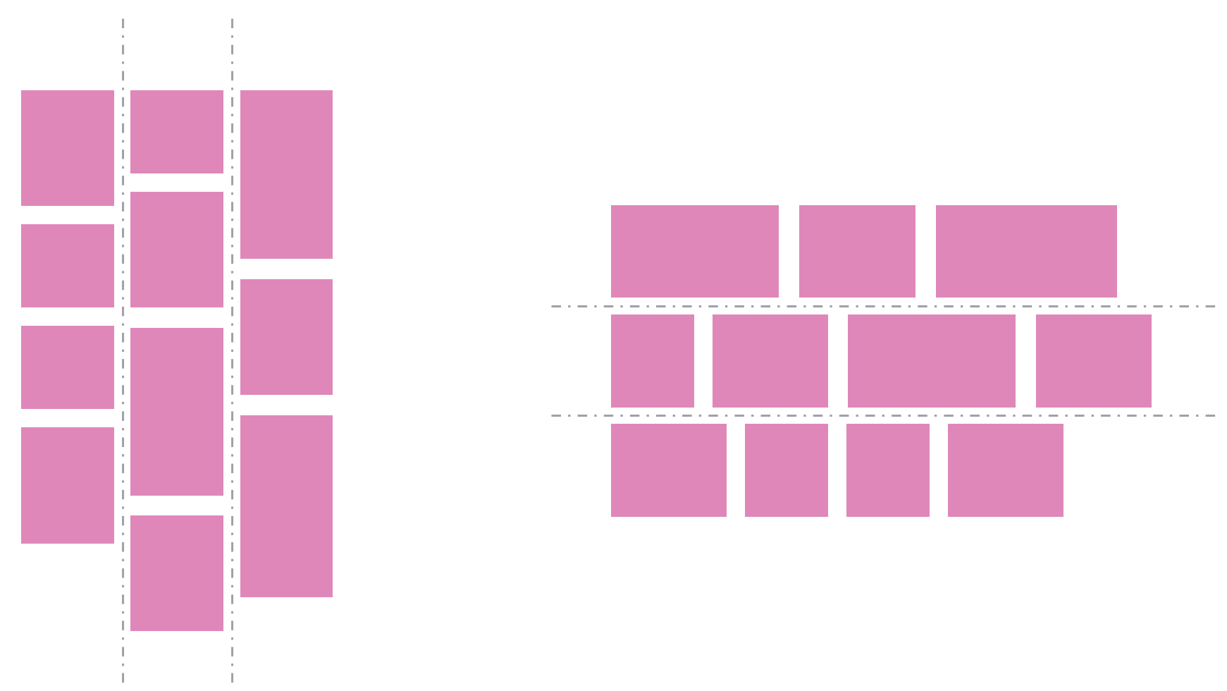
- Tracks don’t all have to be the same size:
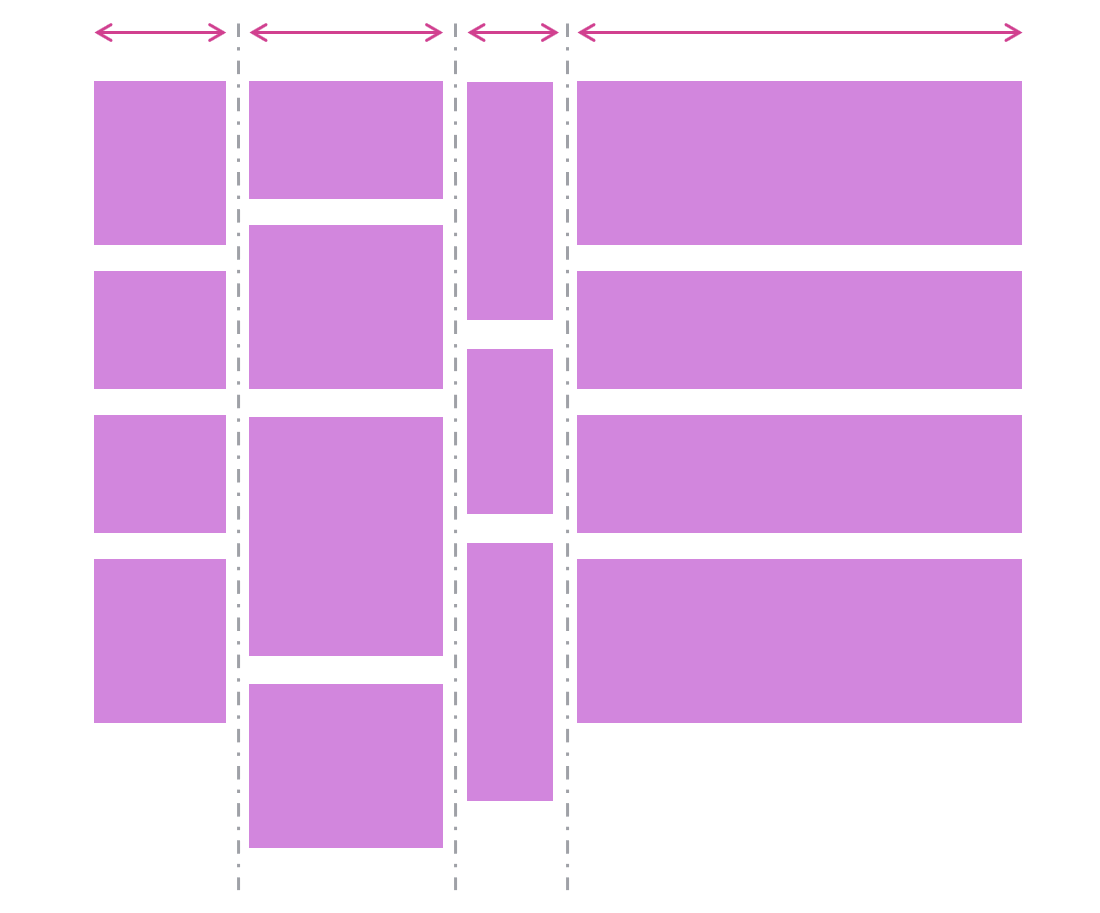
- Items can span multiple tracks:

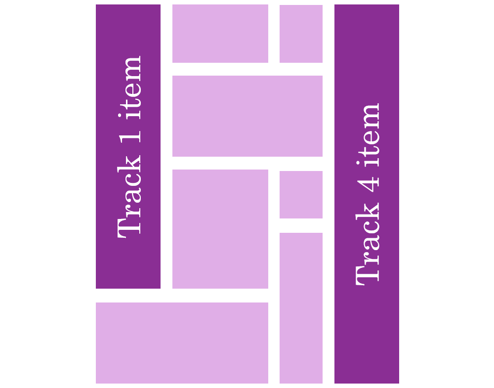
- Items can be placed on specific tracks, rather than always following an automatic placement algorithm:
Demonstrations
These demos use the upcoming implementation of CSS Masonry in Chromium:
- A photo gallery demo shows items (titles, in this case) spanning multiple tracks:


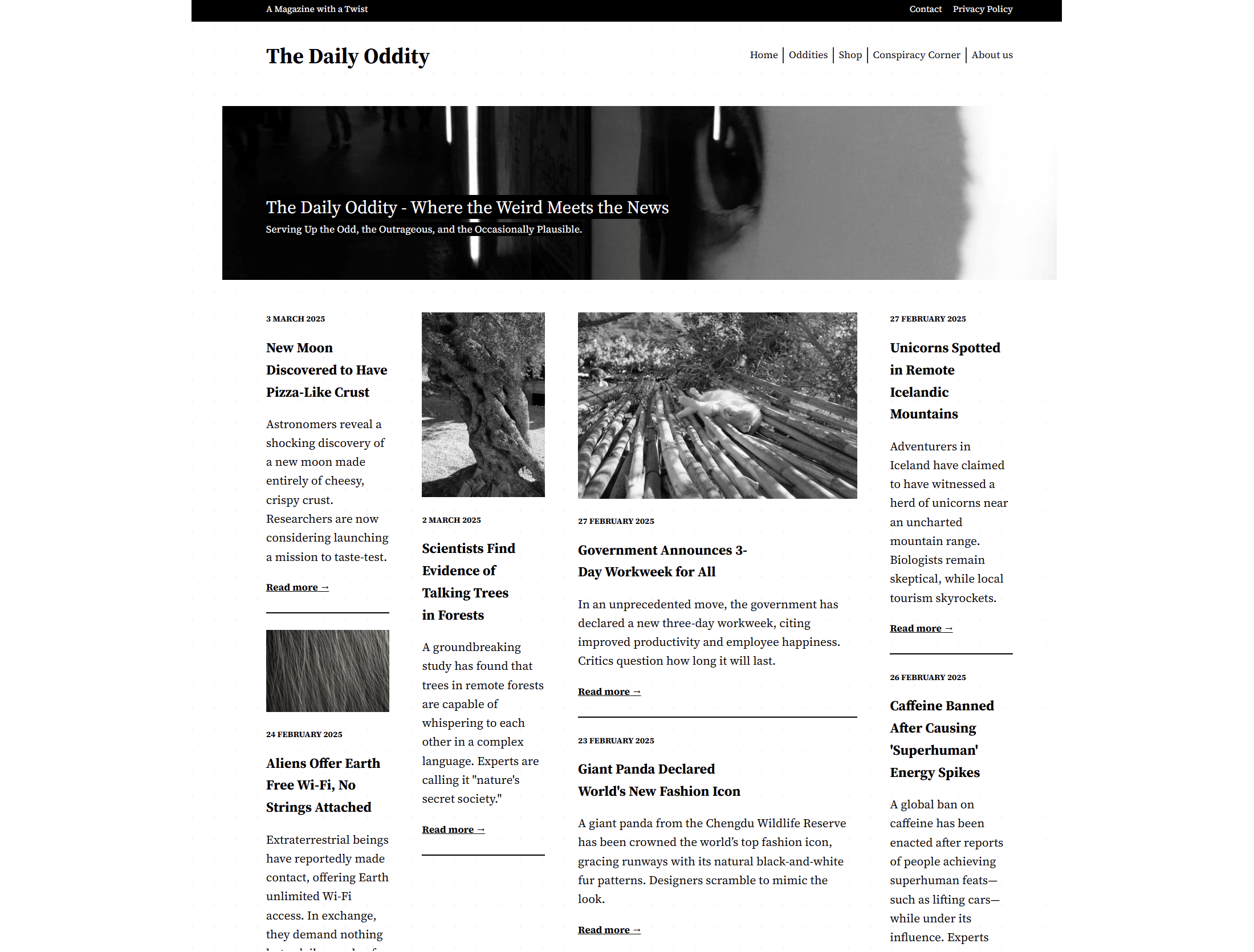
- A news site layout with some tracks wider than others, and some items spanning the entire layout width:
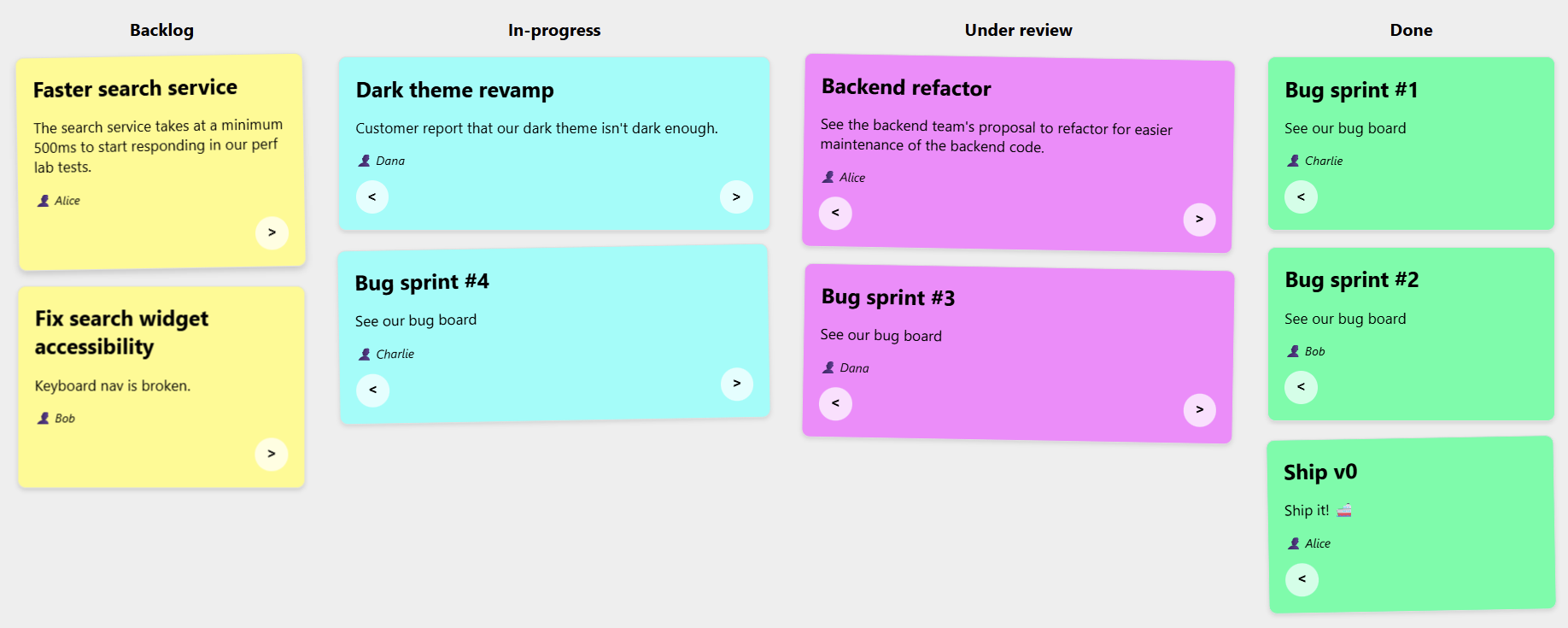
- A kanban board that demonstrates placing items onto specific tracks:
Note: These demos were built with a Chromium version not yet available to most web users, since CSS Masonry is only beginning to appear in browsers.
Masonry in the Wild
Despite the lack of native browser support, developers have built Masonry layouts with libraries for years. The layout appears widely across the web, beyond Pinterest:



Some less-obvious examples include:



One common trick involves using Flexbox: set the direction to column and enable wrapping. This approach places items of different heights in multiple independent columns, giving the impression of a Masonry layout:

But this technique has two significant drawbacks:
- Item ordering differs from a real Masonry layout. Flexbox fills the first column first, then moves to the next once it’s full. Masonry places items in whichever track has available space at that moment.
- More critically, the Flexbox workaround requires a fixed height on the container; otherwise, no wrapping occurs.
Current Library Landscape
For advanced cases, developers turn to dedicated libraries. The most popular — aptly named Masonry — gets downloaded roughly 200,000 times per week according to NPM.
Squarespace offers a layout component that renders a Masonry layout, providing a no-code alternative many sites use. Both of these options rely on JavaScript to position items.
Masonry Moves Into the Browser
CSS Masonry is no longer a distant wish. It’s now being implemented natively in browsers, with the feature set to work much like Grid or Flexbox. The Chromium team at Microsoft has been building support into the open source engine that powers Edge, Chrome, and others. Mozilla was the first to propose an experimental version back in 2020, and Apple has shown serious interest in making this a standard web layout primitive. The CSS Working Group has reached agreement on the direction, including a new display: grid-lanes value for the layout model.
Until the day Masonry is a Baseline feature, developers have to choose between hand-rolled JavaScript or a third-party library. The tradeoffs are real, and they’re worth measuring.
Why Native Masonry Is Faster
A JavaScript-based masonry layout has to run code to measure and place items. That script is render-blocking: until it executes, content is either invisible or incorrectly positioned. For a layout that often sits at the top of the page, this delays the largest contentful paint and hurts both perceived speed and search rankings.
Testing the Masonry JS library on a simple layout under a simulated slow 4G connection shows the cost clearly. The library itself is compact — 24 KB, 7.8 KB gzipped — but that still took 600 ms to load. During that time, no rendering happened.
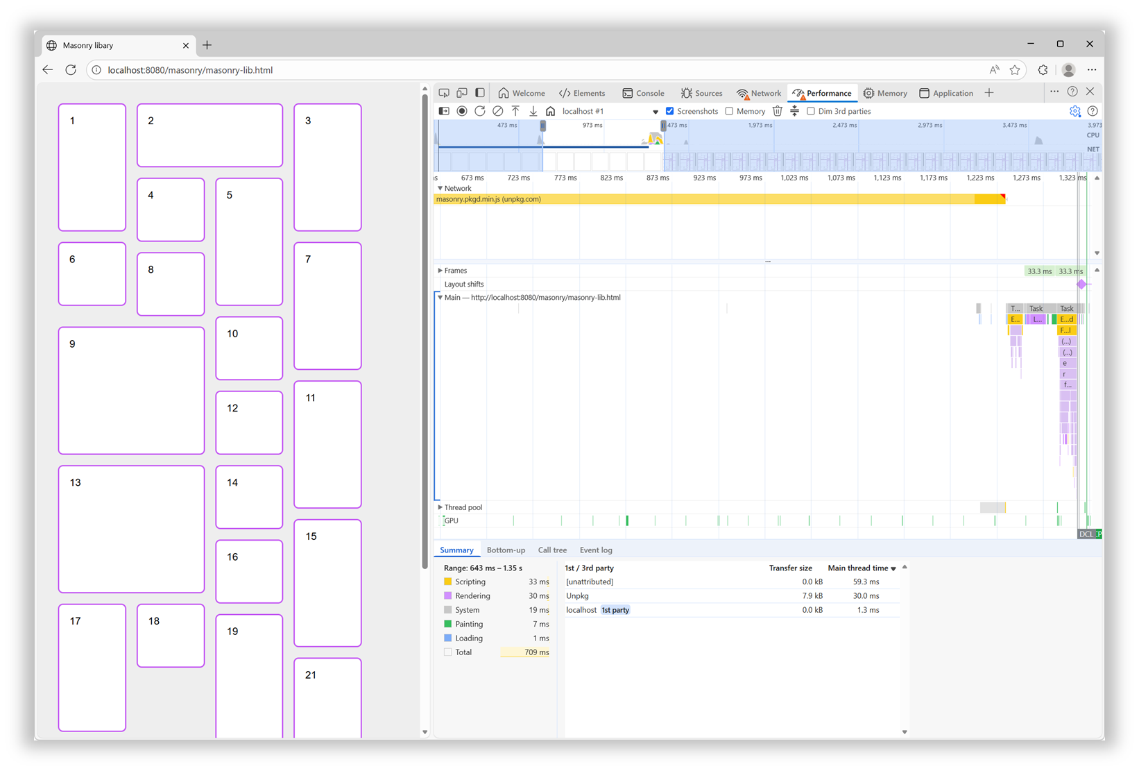
After the download, the browser either parsed and ran the script, adding more blocking time. With a native implementation, the browser engine handles the layout during the initial rendering pass, so none of that overhead exists.
Responsiveness Without the Jank
Resizing the window re-renders the page layout. For the JS library, the script is already loaded, but the placement code must run again. The library itself is quick at this — the problem is that it animates items as they shift to new positions during a resize. That animation adds a jarring, perceptible delay to the adaptation, especially compared to a native layout engine that recalculates without ceremony.
Cleaner Code to Write and Maintain
Beyond user-facing performance, native Masonry simplifies the developer experience. A feature built into the web platform is consistent with existing standards: it works with gap, spans are declared as span 2 just like in Grid, no JavaScript is involved, and the documentation lives on MDN. There are no library-specific initialization data attributes, no hidden elements for configuration, and no risk of encountering unsupported syntax.
For comparison, the JS library requires hidden HTML to define columns and gaps, and spanning a column means manually accounting for the gap width in your CSS:
<script src="https://unpkg.com/[email protected]/dist/masonry.pkgd.min.js"></script>
<style>
  .track-sizer,
  .item {
    width: 20%;
  }
  .gutter-sizer {
    width: 1rem;
  }
  .item {
    height: 100px;
    margin-block-end: 1rem;
  }
  .item:nth-child(odd) {
    height: 200px;
  }
  .item--width2 {
    width: calc(40% + 1rem);
  }
</style>

<div class="container"
  data-masonry='{ "itemSelector": ".item", "columnWidth": ".track-sizer", "percentPosition": true, "gutter": ".gutter-sizer" }'>
  <div class="track-sizer"></div>
  <div class="gutter-sizer"></div>
  <div class="item"></div>
  <div class="item item--width2"></div>
  <div class="item"></div>
  ...
</div>
With native Masonry, the equivalent is compact and declarative:
<style>
  .container {
    display: grid-lanes;
    grid-lanes: repeat(4, 20%);
    gap: 1rem;
  }
  .item {
    height: 100px;
  }
  .item:nth-child(odd) {
    height: 200px;
  }
  .item--width2 {
    grid-column: span 2;
  }
</style>

<div class="container">
  <div class="item"></div>
  <div class="item item--width2"></div>
  <div class="item"></div>
  ...
</div>
Tracking What’s Ready (and What’s Next)
Keeping up with new web platform features is a known pain point. Browser vendors publish their own release notes, but consolidating that information isn't always easy. Fortunately, there are a few good starting points for tracking availability:
- Web platform features explorer — includes release notes and RSS feeds for both newly available and widely available features.
- Web Platform Status dashboard — useful for filtering features by their Baseline status for a given year.
- Chrome Platform Status roadmap.
Browser vendor release notes are also worth reviewing for regular updates: Chrome, Edge, Firefox, and Safari.
Influencing What Gets Built Next
When a feature you need isn’t implemented, it’s worth knowing that browser vendors are listening. Feedback comes from many channels — internal metrics, public forums, and open surveys. If you have the time, there are concrete ways to make your voice heard. The annual State of JS, State of CSS, and State of HTML surveys are closely watched. For specific standards-based APIs, consider submitting a proposal to the Interop project. Companies like Shopify and RUMvision have shared detailed wish lists for future iteration cycles, and that level of detail helps vendors prioritize work.
As the web platform matures, built-in features like Masonry offer tangible gains in performance and code clarity. The question is no longer whether, but when — and soon, for Masonry, the answer will simply be “now.”