
Bringing desktop-publishing layout to the browser
For all its strengths as a text platform, the web has largely been stuck with simple single-column layouts. It is possible to wrap text around images or split content into multiple columns with CSS, but getting true magazine-style presentation — text snaking around irregular shapes, filling linked columns across a page — has required JavaScript hacks or heavy frameworks. Adobe has been pushing two CSS modules designed to change that: CSS Regions and CSS Exclusions. In the first, text from one source can be made to flow automatically through any number of containers. In the second, that text can wrap around arbitrary shapes, not just rectangular boxes.

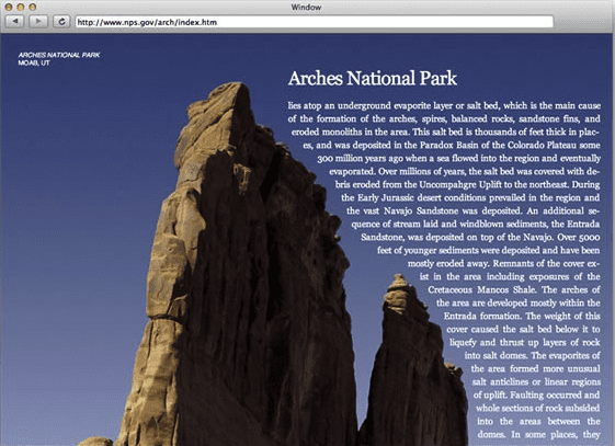
The pair of features shows up clearly in practice. In one example, an article layout uses CSS Exclusions to run body text along the contour of a mountain in a photo:
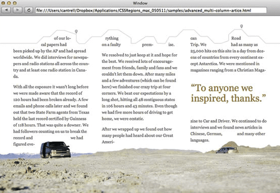
In another layout, text wraps around shapes within images — again via Exclusions — while Regions handles the job of breaking the copy into columns and leaving room for a pull quote:
How CSS Regions works
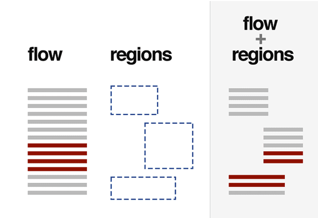
The core idea behind CSS Regions is a clean separation between content and presentation. A block of markup is assigned to a "named flow," and that flow is then routed into one or more designated elements, called regions. The underlying HTML for the content doesn't change; it has no idea how it's being displayed. The regions themselves are ordinary elements, so they can be sized and positioned with normal CSS and can respond to media queries like anything else. Making an element a region is simply a statement that the specified text should flow through it.
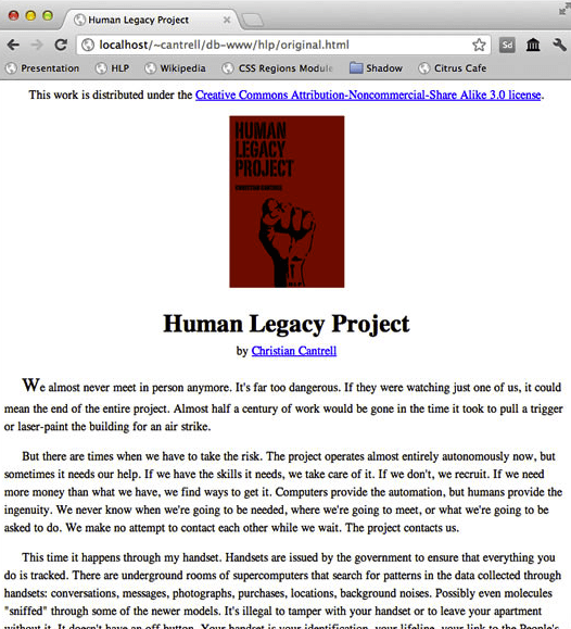
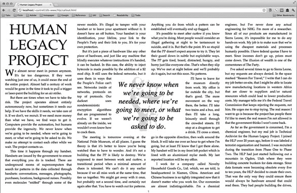
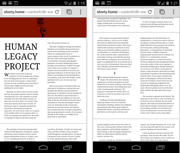
For prototyping paged layouts, Regions lets a document in plain, readable markup be presented with visual variety. One author's fiction, for instance, keeps its source in a very simple structure:
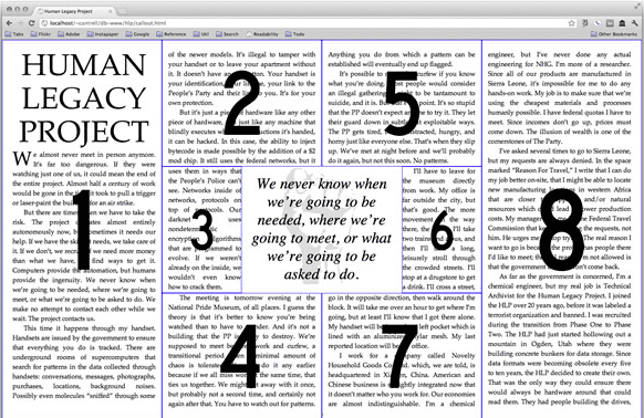
With Regions applied, the same text appears in a layout with column-like regions wrapping around a central graphic and a pull quote:
Setting up a named flow
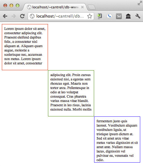
Turning a collection of elements into a multi-region flow takes two declarations. The snippet below assigns a div with the id "content" to a named flow called "article" and designates every element with a class of "region" as the target for that same flow:
<!DOCTYPE html>
<html>
<head>
    <style>
    #content {
        { % mixin flow-into: article; % }
    }

    .region {
        { % mixin flow-from: article; % }
        box-sizing: border-box;
        position: absolute;
        width: 200px;
        height: 200px;
        padding: 10px;
    }

    #box-a {
        border: 1px solid red;
        top: 10px;
        left: 10px;
    }

    #box-b {
        border: 1px solid green;
        top: 210px;
        left: 210px;
    }

    #box-c {
        border: 1px solid blue;
        top: 410px;
        left: 410px;
    }
    </style>
</head>
<body>
    <div id="box-a" class="region"></div>
    <div id="box-b" class="region"></div>
    <div id="box-c" class="region"></div>
    <div id="content">
    Lorem ipsum dolor sit amet, consectetur adipiscing elit. Praesent eleifend dapibus felis, a consectetur nisl aliquam at. Aliquam quam augue, molestie a scelerisque nec, accumsan non metus. Lorem ipsum dolor sit amet, consectetur adipiscing elit. Proin cursus euismod nisi, a egestas sem rhoncus eget. Mauris non tortor arcu. Pellentesque in odio at leo volutpat consequat....
    </div>
</body>
</html>
The result is that the text inside the content element flows automatically through the region elements:
JavaScript access via the CSSOM
The CSS Object Model's additions for Regions give scripts a window into how a flow is being laid out, which makes it possible to handle dynamic content. Key pieces of the API:
document.webkitGetNamedFlows()— returns the collection of named flows in the document.document.webkitGetNamedFlows().namedItem("article")— returns a reference to a specific flow by name.WebKitNamedFlow— object representing a named flow, exposing the propertiesfirstEmptyRegionIndex,name, andoverset(a boolean telling whether the content exceeds the capacity of the defined regions), plus the methodsgetContent(),getRegions(), andgetRegionsByContentNode(node).webkitregionoversetchange— fired on aWebKitNamedFlowwhen layout changes cause a region'swebkitRegionOversetstate to change. Yet to be implemented is a companionwebkitregionfragmentchangeevent, which is intended to fire on finer-grained layout shifts where content moves between regions without affecting the overall fit.Element.webkitRegionOverset— each region element carries this property, reporting one of three values:"overflow"if the region can't hold all the content,"fit"if content ends before the region's boundary, and"empty"if the flow hasn't reached the region.
The main use case for this API is listening to webkitregionoversetchange and dynamically creating or removing regions as content length, viewport size, or font size shifts. A minimal example of extending the set of regions until all text has a home:
var flow = document.webkitGetNamedFlows().namedItem("article")
flow.addEventListener("webkitregionoversetchange", onLayoutUpdate);

function onLayoutUpdate(event) {
    var flow = event.target;

    // The content does not fit
    if (flow.overset === true) {
    addRegion();
    } else {
    regionLayoutComplete();
    }
}

function addRegion() {
    var region = document.createElement("div");
    region.style = "flow-from: article";
    document.body.appendChild(region);
}

function regionLayoutComplete() {
    // Finish up your layout.
}
Declarative paging with CSS Page Templates
The CSSOM approach offers the most flexibility, but to handle straightforward paging, Adobe has also proposed CSS Page Templates. The idea is to obtain paged behavior without writing JavaScript. To define the layout, you first set up named flows and specify the overflow behavior. The snippet declares two flows, "article-flow" and "timeline-flow", and sets horizontal paging on their container through the overflow-style property:
<style>
    #article {
    { % mixin flow-into: article-flow; % }
    }

    #timeline {
    { % mixin flow-into: timeline-flow; % }
    }

    #combined-articles {
    overflow-style: paged-x;
    }
</style>
The page template itself is then constructed with a new at-rule, defining a set of "slots" that correspond to columns, each tied to a specific flow:
@template {
    @slot left {
    width: 35%;
    float: left;
    { % mixin flow-from: article-flow; % }
    }

    @slot time {
    width: 25%;
    float: left;
    { % mixin flow-from: timeline-flow; % }
    }

    @slot right {
    width: 35%;
    float: left;
    { % mixin flow-from: article-flow; % }
    }
}
The outcome resembles a magazine spread: content from one flow fills the columns on the outer edges, and a second flow — even in a different language — runs down the center column. All the paging behavior is declarative, so the document scrolls horizontally without a line of JavaScript:
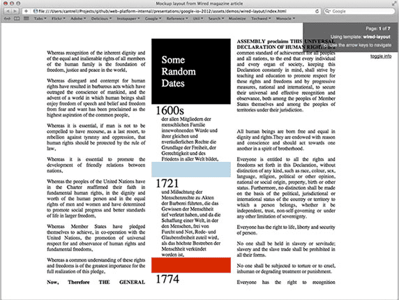
CSS Page Templates remain a proposal, though a polyfill-based prototype is available for experimentation. CSS Regions themselves, meanwhile, can be enabled in Chrome through the chrome://flags interface under the "experimental Web Platform features" section, after which the browser must be relaunched. Once active, Regions and Exclusions open a path toward layouts that look like something from a print design department rather than a standard web page template.
From Shape to Page: How CSS Exclusions Work
While CSS Regions handles the flow of content across containers, CSS Exclusions addresses the other half of magazine-style design: making text interact with irregular graphics. Instead of confining content to rectangular blocks, Exclusions lets text run around the actual contour of an image or shape—or even flow inside it. The screenshots below, taken from a CSS Exclusions prototype, illustrate both cases: text dynamically wrapping around a path matching a rock formation, and text filling shapes that are anything but rectangular.
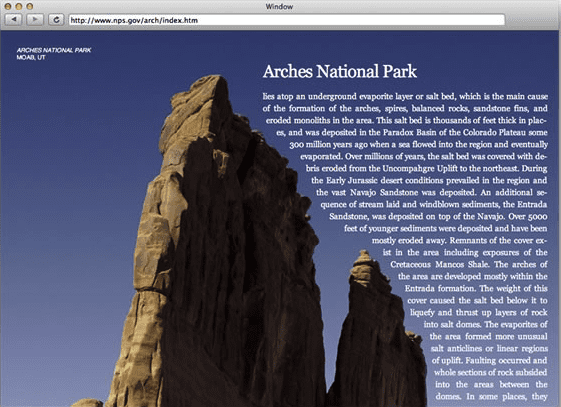
The inverse scenario is just as straightforward: text can be made to flow inside irregularly shaped polygons.
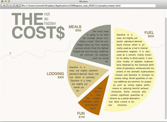
The foundation of this capability lies in the algorithm work required to compute text flow against arbitrary shapes. Adobe is actively developing and optimizing these algorithms, with plans to contribute the implementations directly to WebKit. Once optimized, these core components will serve as the base layer for the rest of the CSS Exclusions feature set.
For further reading, refer to the CSS Exclusions page on html.adobe.com, or dive into the technical details in Hans Muller's blog post, Horizontal Box: Polygon Intersection for CSS Exclusions.
Progress and Browser Support: A Timeline
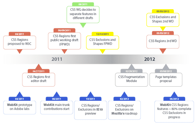
The journey from spec to browser has been swift. At Google I/O 2011, demos of CSS Regions and Exclusions ran exclusively in a custom Adobe prototype browser. Despite the enthusiasm from the audience, there was an obvious letdown when it became clear that no major browser supported the features out of the box.
By Google I/O 2012, the landscape had shifted dramatically. Roughly 80% of the CSS Regions specification was implemented in WebKit, and the feature was already available in the latest version of Google Chrome (behind the chrome://flags flag). Early support had even made its way into Chrome for Android:
Support has also expanded beyond WebKit. Both CSS Regions and CSS Exclusions are present in the Internet Explorer 10 preview, and the features are on Mozilla's 2012 roadmap for Firefox. The next major Safari release is expected to support the bulk of the CSS Regions spec, with follow-up updates covering the remainder.
The timeline below details the milestones from the initial W3C proposal in April 2011 through the current state of implementation:
Where This Leaves Text on the Web
Adobe's deep history with text, typography, and desktop publishing tools like InDesign makes this push a natural fit. The web already handles text well, but the goal here is to push further. CSS Regions and CSS Exclusions work together to keep content semantically structured while enabling true magazine-style layout. The result is a more expressive web, where the presentation catches up to the power of the underlying content.


