Beyond Native HTML: Filling the Gaps with ARIA
Native HTML elements ship with built-in semantics, focus behavior, and keyboard support. But they can't cover every interface pattern. There is no standardized HTML element for a common construct like a pop-up menu, and no native way to express semantics like "the user must know about this immediately." For these cases, the Web Accessibility Initiative's Accessible Rich Internet Applications (WAI-ARIA, or ARIA) specification bridges the gap.
ARIA works by letting you add attributes that change the way an element is translated into the accessibility tree. Consider a list item styled with CSS to look like a custom checkbox:
<li tabindex="0" class="checkbox" checked>
    Receive promotional offers
</li>
Visually, this works for sighted users. But a screen reader exposes no indication that this element is interactive or what state it holds, so low-vision users may miss it entirely. ARIA attributes solve this:
<li tabindex="0" class="checkbox" role="checkbox" checked aria-checked="true">
    Receive promotional offers
</li>
The role and aria-checked attributes explicitly identify the list item as a checkbox holding a checked state. As a result, the element enters the accessibility tree and a screen reader correctly announces it as a checkbox.
That is the extent of ARIA's power: it only modifies the DOM accessibility tree. It does not augment any inherent element behavior. ARIA will not make an element focusable, and it will not attach keyboard event listeners. That work remains the developer's responsibility.
What ARIA Can Do for You
ARIA allows you to modify existing element semantics or add semantics where no native ones exist. More importantly, it expresses UI patterns that HTML never defined, such as menus, tab panels, and other widget-type constructs. Concretely, ARIA can:
- Expose extra label and description text only to assistive technology APIs.
<button aria-label="screen reader only label"></button>
- Express semantic relationships beyond the standard parent/child connection, like a custom scrollbar controlling a specific region.
    <div role="scrollbar" aria-controls="main"></div>
    <div id="main">
    . . .
    </div>
- Designate live regions, parts of the page that immediately inform assistive technology of their own changes.
    <div aria-live="polite">
      <span>GOOG: $400</span>
    </div>
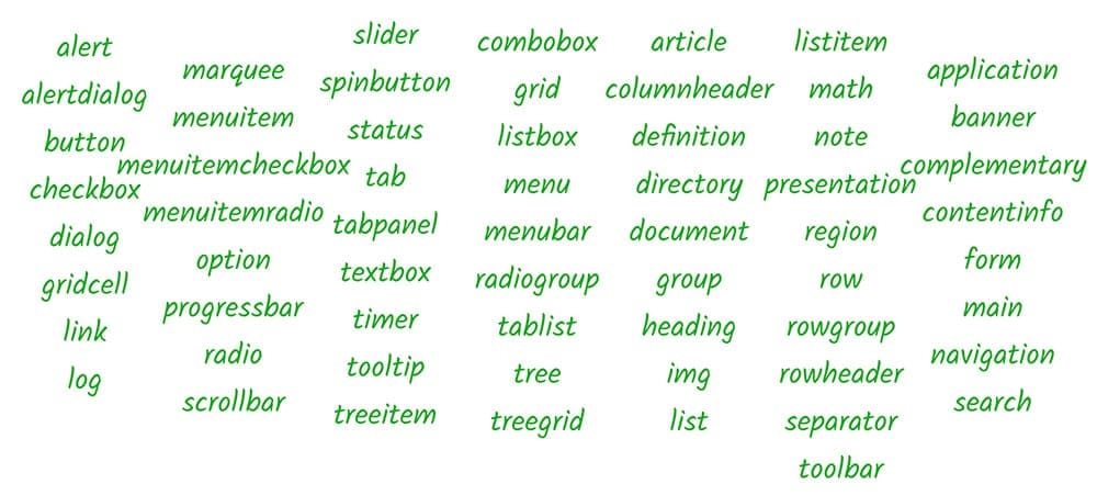
At the heart of ARIA is the role vocabulary. A role is a shorthand indicator for a particular UI pattern, set with the role attribute on any HTML element. When you specify role="checkbox", you tell assistive technology the element follows the "checkbox" pattern: it has a togglable checked state, operable via mouse or spacebar, like a standard HTML checkbox.
When to Apply ARIA Roles
The keyboard-heavy nature of screen reader usage means custom widgets demand care. Apply the role attribute in the same place you apply tabindex; this keeps keyboard events firing at the right element and ensures the element's role is conveyed whenever focus lands on it.
The full ARIA spec details the taxonomy of possible role values and associated ARIA attributes, plus how they work in supported browsers and assistive tech. That document is dense, though; the ARIA Authoring Practices document offers a more approachable starting point for applying roles and properties correctly.
Don't Redefine Default Semantics
A key rule: there's no need to declare what is already implicit. A standard HTML <input type="checkbox"> element never requires role="checkbox" to be correctly interpreted. Some HTML elements also restrict which ARIA roles or attributes you can add. A plain <input type="text"> element, for example, cannot take on a new role or additional attributes. The ARIA in HTML spec documents these restrictions.
Finally, ARIA also adds landmark roles beyond what HTML5 offers natively; consult the Landmark Roles Design Patterns for how to use them.