

Why skeleton screens beat spinners
Traditional spinners and loaders have long been the standard way to signal that content is on its way. But they force users to stare at an animation with no sense of what is coming next. Luke Wroblewski has written about the problem, and Bill Chung's research on skeleton screens confirms the alternative is more effective. Instead of communicating a wait time, a skeleton screen communicates progress: the page structure is visible immediately, and content appears to fill in incrementally as data arrives.
A skeleton screen is essentially a wireframe of the page rendered with placeholder shapes for text and images. Because it mirrors the final layout, users immediately understand the structure of what is loading. The approach goes by several other names — ghost elements, content placeholders, content loaders — and is used by major products including Blockchain.com, YouTube, Facebook, Medium and LinkedIn.
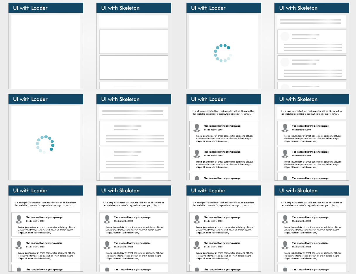
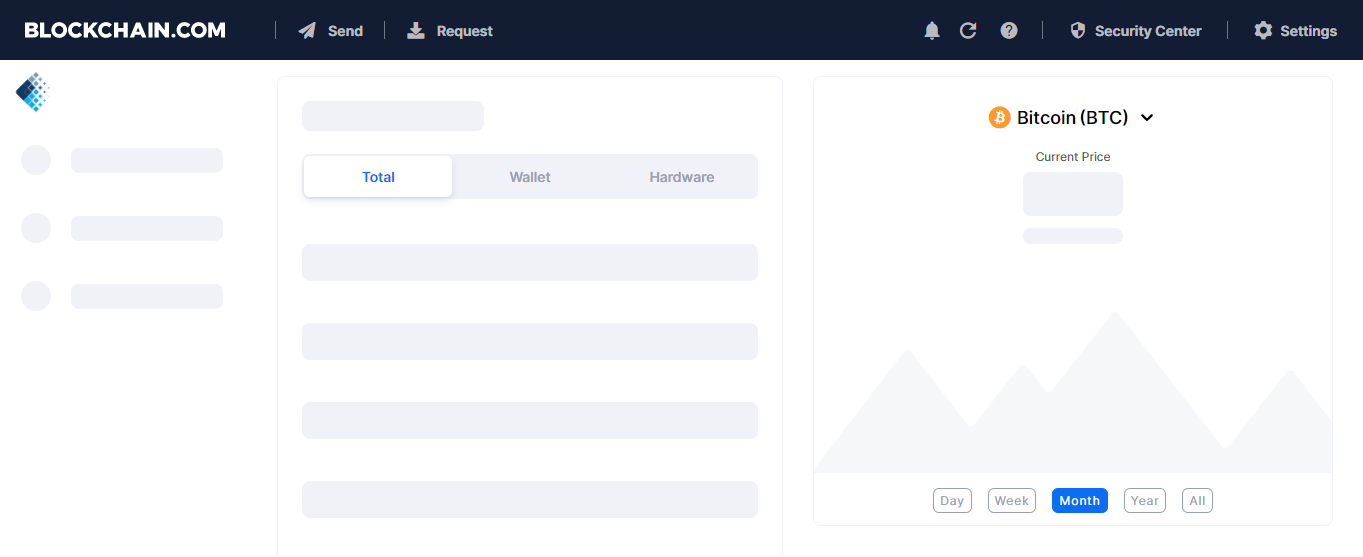
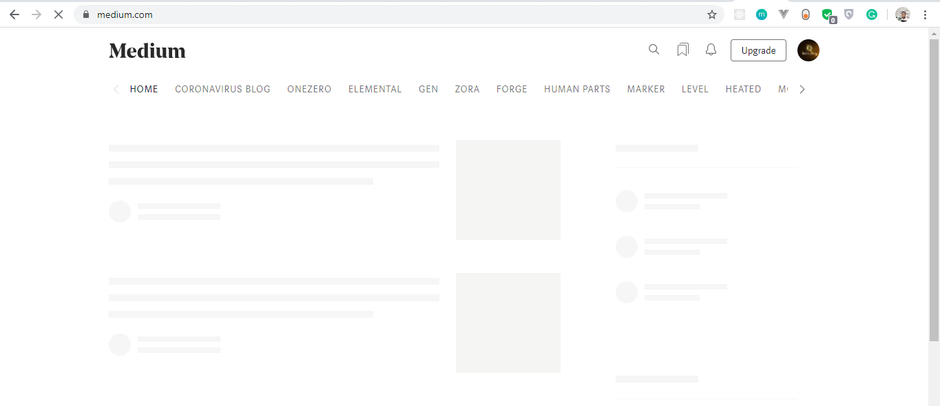
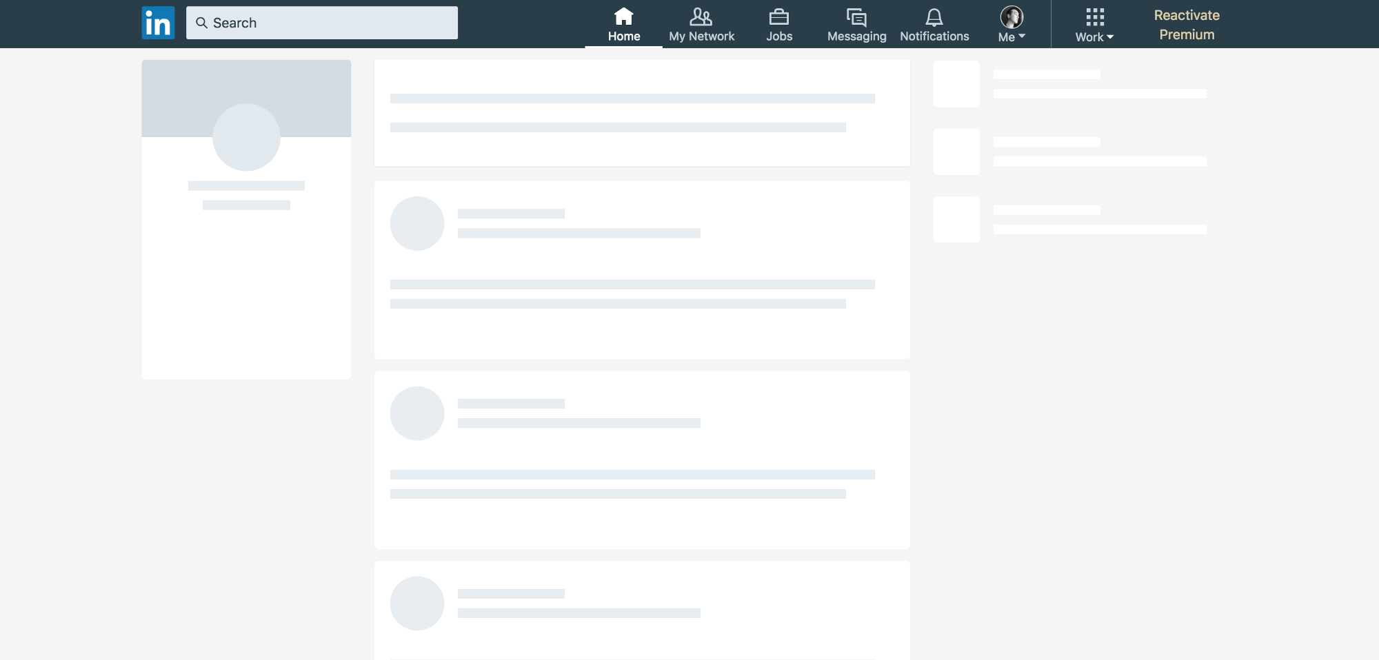
Types of skeleton UIs and the libraries that build them
The two dominant forms of skeleton screens are text placeholders and image (or color) placeholders. Text placeholders are the more popular choice because they are straightforward to build and do not require knowing anything about the actual content's substance. Color placeholders are harder because they demand content details up front.
Two widely used libraries simplify skeleton screen implementation in React: React Placeholder and React Loading Skeleton.
React Placeholder works with dedicated placeholder components, supports pulse animation, and exposes a component-based API. Its drawbacks: skeleton components are maintained separately from the real UI, so style updates to a component can force parallel updates to its skeleton, and the number of distinct components makes the learning curve steeper.
The following skeleton component uses react-placeholder:
import { TextBlock, RectShape } from 'react-placeholder/lib/placeholders';
import ReactPlaceholder from 'react-placeholder';

const GhostPlaceholder = () => (
  <div className='my-placeholder'>
    <RectShape color='gray' style={{width: 25, height: 70}} />
    <TextBlock rows={6} color='blue'/>
  </div>
);
<ReactPlaceholder ready={ready} customPlaceholder={<GhostPlaceholder />}>
  <MyComponent />
</ReactPlaceholder>
The example imports TextBlock and RectShape from react-placeholder/lib/placeholder plus ReactPlaceholder itself. A functional GhostPlaceholder component renders a RectShape — which defines a rectangle's dimensions, color and styles — and a TextBlock, which sets row count and text color. MyComponent is passed as a child of ReactPlaceholder, which receives the ready prop and GhostPlaceholder as the customPlaceholder value.
React Loading Skeleton takes a different path: a single API-driven component with props covering all customization, usable either standalone or inline inside existing components. It also offers theming and pulse animation. The tradeoff is that it is best suited to simple skeletons — complex ones get complicated — and separate skeleton components become harder to maintain as the UI evolves. Documentation is available on its GitHub repository.
import Skeleton, { SkeletonTheme } from "react-loading-skeleton";

const SkeletonComponent = () => (
  <SkeletonTheme color="#202020" highlightColor="#444">
    <section>
      <Skeleton height={50} width={50} />
    </section>
  </SkeletonTheme>
);
That sample imports Skeleton and SkeletonTheme, then renders SkeletonTheme with color and hightlightColor props for theming. Inside it, Skeleton takes explicit height and width values.
Building a YouTube-style skeleton UI
To see a skeleton screen in action, we can build a YouTube-like interface with React Loading Skeleton. The fastest setup is Create React App, which provides a modern build configuration with no manual setup. Run the following to bootstrap the project:
npx create-react-app skeleton-screens && cd skeleton-screens
Once installation finishes, launch the development server with npm start:
Structuring the data and components
We start with dummy data, which stands in for the real API responses a production app would use. Create data.js in your src/ folder:
const dummyData= [
  {
    section: "Recommended",
    channel: "CNN",
    items: [
      {
        id: "fDObf2AeAP4",
        image: "https://img.youtube.com/vi/fDObf2AeAP4/maxresdefault.jpg",
        title: "75 million Americans ordered to stay home",
        views: "1.9M views",
        published: "3 days agos"
      },
      {
        id: "3AzIgAa0Cm8",
        image: "https://img.youtube.com/vi/3AzIgAa0Cm8/maxresdefault.jpg",
        title: "Gupta: The truth about using chloroquine to fight coronavirus pandemic",
        views: "128K views",
        published: "4 hours ago"
      },
      {
        id: "92B37aXykYw",
        image: "https://img.youtube.com/vi/92B37aXykYw/maxresdefault.jpg",
        title: "Willie Jones STUNS Simon Cowell In Pitch Perfect Performance of 'Your Man'!",
        views: "2.47 million views",
        published: "1 month ago"
      },
      {
        id: "J6rVaFzOEP8",
        image: "https://img.youtube.com/vi/J6rVaFzOEP8/maxresdefault.jpg",
        title: "Guide To Becoming A Self-Taught Software Developer",
        views: "104K views",
        published: "17 days ago"
      },
      {
        id: "Wbk8ZrfU3EM",
        image: "https://img.youtube.com/vi/Wbk8ZrfU3EM/maxresdefault.jpg",
        title: "Tom Hanks and Rita Wilson test positive for coronavirus",
        views: "600k views",
        published: "1 week ago"
      },
      {
        id: "ikHpFgKJax8",
        image: "https://img.youtube.com/vi/ikHpFgKJax8/maxresdefault.jpg",
        title: "Faces Of Africa- The Jerry Rawlings story",
        views: "2.3 million views",
        published: "2014"
      }
    ]
  },
  {
    section: "Breaking News",
    channel: "CGTN America",
    items: [
      {
        id: "tRLDPy1A8pI",
        image: "https://img.youtube.com/vi/tRLDPy1A8pI/maxresdefault.jpg",
        title: "Is Trump blaming China for COVID-19? You decide.",
        views: "876k views",
        published: "9 days ago"
      },
      {
        id: "2ulH1R9hlG8",
        image: "https://img.youtube.com/vi/2ulH1R9hlG8/maxresdefault.jpg",
        title: "Journalist still goes to office during pandemic, see her daily routine",
        views: "873 views",
        published: "3 hours ago"
      },
      {
        id: "TkfQ9MaIgU",
        image: "https://img.youtube.com/vi/_TkfQ9MaIgU/maxresdefault.jpg",
        title: "How are small businesses going to survive the economic downturn of the COVID-19 era?",
        views: "283 views",
        published: "4 day ago"
      }
    ]
  }
];
export default dummyData;
The array contains objects with an ID, image URL, title, view count and publication date, mirroring what the YouTube UI displays.
The UI itself is composed of three components:
Card | Holds the details of the video’s thumbnail, title, number of views, publication date, and channel. |
CardList | Returns all cards in a row. |
App | Mounts our dummyData object, loads the skeleton UI for two seconds, and returns the CardList component. |
Inside a new components folder in src, create Card.js:
import React from "react";
const Card = ({ item, channel }) => {
    return (
      <li className="card">
        <a
          href={`https://www.youtube.com/watch?v=${item.id}`}
          target="_blank"
          rel="noopener noreferrer"
          className="card-link"
        >
          <img src={item.image} alt={item.title} className="card-image" />
          <img src={item.image} alt={item.title} className="channel-image" />
          <h4 className="card-title">{item.title}</h4>
          <p className="card-channel">
            <i>{channel}</i>
          </p>
          <div className="card-metrics">
            {item.views} • {item.published}
          </div>
        </a>
      </li>
    );
  };
  export default Card;
The Card component deconstructs item and channel props and renders a single video — thumbnail, title, view count and publication date. Next, CardList.js maps over the items:
import React from "react";
import Card from "./Card";
const CardList = ({ list }) => {
    return (
      <ul className="list">
        {list.items.map((item, index) => {
          return <Card key={index} item={item} channel={list.channel} />;
        })}
      </ul>
    );
  };
  export default CardList;
In CardList, we import Card and pass each item from list.items along with the channel data. The items array comes from the dummyData objects.
Finally, replace the contents of App.js:
import React, { useState, useEffect } from "react";
import "./App.css";
import dummyData from "./data";
import CardList from "./components/CardList";

const App = () => {
  const [videos, setVideos] = useState([]);
  const [loading, setLoading] = useState(false);

  useEffect(() => {
    setLoading(true);
    const timer = setTimeout(() => {
      setVideos(dummyData);
      setLoading(false);
    }, 5000);
    return () => clearTimeout(timer);
  }, []);
  return (
    <div className="App">
      {
        videos.map((list, index) => {
          return (
            <section key={index}>
              <h2 className="section-title">{list.section}</h2>
              <CardList list={list} />
              <hr />
            </section>
          );
        })}
    </div>
  );
};
export default App;
The App component imports useState and useEffect. A video state is initialized to an empty array. Inside useEffect, a setTimeout call assigns dummyData to that state after two seconds, mimicking network latency; the timer is cleared on unmount. The rendered output maps over the video state and returns a section with the list-section class and the CardList component receiving the list as a prop.
Styling and the pre-skeleton experience
The UI references classes that don't exist yet. Clear App.css and add the full stylesheet:
.App {
  max-width: 960px;
  margin: 0 auto;
  font-size: 16px;
}
.list {
  display: flex;
  justify-content: space-between;
  flex-wrap: wrap;
  list-style: none;
  padding: 0;
}
.section-title {
  margin-top: 30px;
}
.card {
  width: calc(33% - 10px);
  margin: 20px 0;
}
.card-link {
  color: inherit;
  text-decoration: none;
}
.card-image {
  width: 100%;
}
.channel-image {
  border-radius: 100%;
  padding: 0, 10px, 0, 0;
  width: 40px;
  height: 40px;
}
.card-title {
  margin-top: 10px;
  margin-bottom: 0;
}
.card-channel {
  margin-top: 5px;
  margin-bottom: 5px;
  font-size: 14px;
}
/* Tablets */
@media (max-width: 1000px) {
  .App {
    max-width: 600px;
  }
  .card {
    width: calc(50% - 22px);
  }
}
/* Mobiles \*/
@media (max-width: 640px) {
  .App {
    max-width: 100%;
    padding: 0 15px;
  }
  .card {
    width: 100%;
  }
}
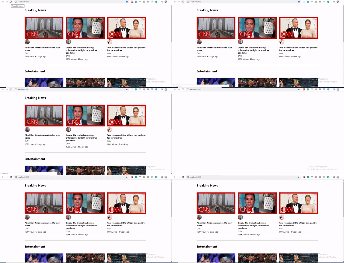
Without a skeleton screen, loading this page shows a blank white screen for two seconds before the data appears:
Why React Loading Skeleton fits here
Most skeleton libraries force you to craft placeholder elements that manually match your content's font sizes, line heights and margins. React Loading Skeleton's advantage is that Skeleton is meant to be dropped directly into a component in place of the content being loaded.
Theming
Theming support is a key feature. SkeletonTheme wraps skeleton components and accepts color props, so changing the palette across an entire app is a matter of editing one wrapper:
import Skeleton, { SkeletonTheme } from "react-loading-skeleton";

<SkeletonTheme color="grey" highlightColor="#444">
  <p>
    <Skeleton height={250} width={300} count={1} />
  </p>

</SkeletonTheme>
<SkeletonTheme color="#990" highlightColor="#550">
  <p>
    <Skeleton height={250} width={300} count={1} />
  </p>

</SkeletonTheme>

Animation duration
Beyond height, width and color, a duration prop controls how long one animation cycle takes:
<Skeleton duration={2} />
The default is 1.2 seconds. For the full set of props and usage patterns, see the React Loading Skeleton documentation.
Building the Skeleton Component
With the package installed, the next step is to create a dedicated skeleton component that mirrors the layout of your video cards. Start by adding a new file, SkeletonCard.js, inside your components directory with the following implementation:
import React from "react";
import Skeleton from "react-loading-skeleton";
const SkeletonCard = () => {
    return (
      <section>
        <h2 className="section-title">
          <Skeleton height={30} width={300} />
        </h2>

        <ul className="list">
          {Array(9)
            .fill()
            .map((item, index) => (
              <li className="card" key={index}>
                <Skeleton height={180} />
                <h4 className="card-title">
                <Skeleton circle={true} height={50} width={50} />
                  <Skeleton height={36} width={`80%`} />
                </h4>
                <p className="card-channel">
                  <Skeleton width={`60%`} />
                </p>
                <div className="card-metrics">
                  <Skeleton width={`90%`} />
                </div>
              </li>
            ))}
        </ul>
      </section>
    );
  };
  export default SkeletonCard;
This component renders an unordered list that uses Array.fill() to generate an empty array matching the length of your dummy data set — nine items in this case. The array is intentionally left without values so that it can be mapped over to produce skeleton placeholders. You can review the Array.fill documentation for details on the method's behavior.
The mapped output specifies the shape of each placeholder, with height and width controlling the rectangular dimensions and circle producing rounded elements where needed. One advantage of react-loading-skeleton is its built-in pulse animation, which is ready to use out of the box and generally preferable to writing custom animations unless you have specific design requirements. If you prefer to customize, you can still build your own rectangles and circles that mimic the page layout directly.
Testing the Loading State
The completed component gives you a functional skeleton screen that displays for five seconds before the actual content appears, providing a smooth transition for users:
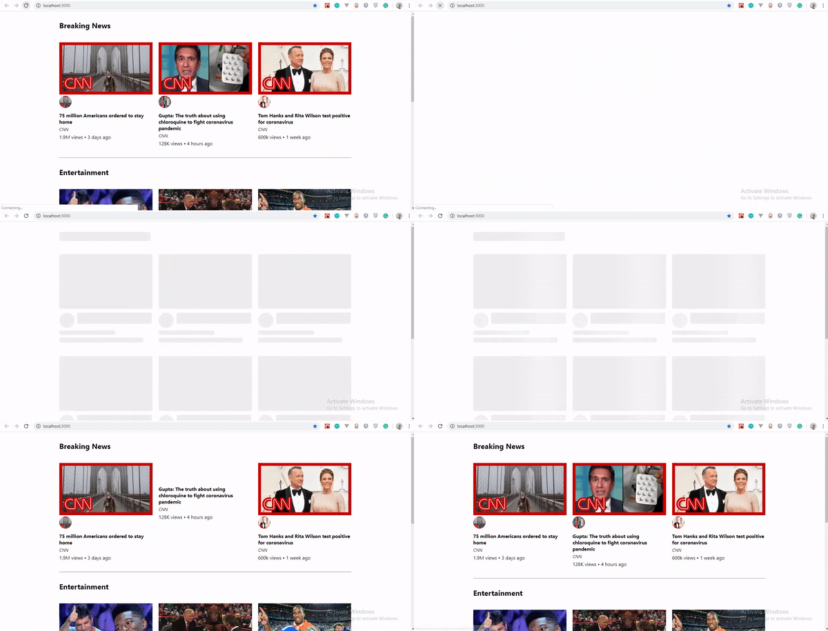
This approach substantially improves perceived performance by preventing the blank-screen experience and giving users a preview of the content structure before it finishes loading. For further exploration of the technique, the full source code is available on GitHub.


