
Pairing labels and inputs
Most form controls work best with a label alongside them; the pairing matters as much for usability as it does for accessibility. There are two ways to link a label to an input: wrap the input inside the label (implicit), or give the label a for attribute and the input a matching id (explicit). One analogy is that implicit labels hug an input while explicit labels hold its hand.
<label>
  Name:
  <input type="text" name="name" />
</label>
With explicit pairing, the for value must match the input's id: if for is name, the input's id should also be name.
<label for="name">Name: </label>
<input type="text" id="name" name="name" />
Not every assistive technology handles implicit labels correctly, even when for and id are present. The explicit form is therefore always the safer choice.
<!-- IMPLICIT LABEL (not recommended for use) - the label wraps the input. -->
<label>
  Name:
  <input type="text" name="name" />
</label>

<!-- EXPLICIT LABEL (recommended for use) - the label is connected to an input via "for" and "id" -->
<label for="explicit-label-name">Name: </label>
<input type="text" id="explicit-label-name" name="name" />
A one-to-one relationship applies in both directions: each input element gets one label, and each label pairs with one input. The exception is a group of related inputs, such as a set of radio buttons or checkboxes, where a <legend> element groups the inputs and serves as the accessible label for the whole group.
Which controls need labels, and what a label should contain
Inputs with type="submit" or type="button" do not need a label, because the value attribute supplies the accessible text. type="hidden" is also fine unlabelled. Every other input — including <textarea> and <select> — benefits from a label.
The label's content should do three things:
- Describe the companion input.
- Stay visible. A visible label can be clicked or tapped to focus its input, which enlarges the interaction target.
- Contain only plain text. Headings and links do not belong inside a label.
A label is also a good place for formatting hints. For <input type="date" id="date">, the label pair is <label for="date">, and a <span> between the label and input can state a required format such as DD-MM-YYYY. Giving that span an id and referencing it from the input's aria-describedby attribute ties the hint to the field.
<!-- Describes what the input is for - should be plain text only -->
<label for="date">Start date</label>
<!-- Describes additional information, usually about formatting -->
<span id="date-format">(DD-MM-YYYY):</span>
<input type="date" id="date" aria-describedby="date-format" min="2021-03-01" max="2031-01-01" />
The result is a clear label describing the field plus an extra hint about the expected entry format.
Keeping label and input together
Preserve the source order
A WCAG success criterion requires that the visual order of a page follow the order of elements in the DOM, because a user with low vision using a screen magnifier alongside a screen reader can be confused when reading order appears to skip around, and a keyboard user can struggle to predict where focus goes next when source order and visual order disagree.
A standard arrangement places the label before the input in the HTML:
<label for="orange">Orange</label>
<input type="checkbox" id="orange" name="orange">
If that form sits in a flexible container and CSS order moves the input ahead of the label visually:
label { order: 2; }
input { order: 1; }
then a screen reader user moving between elements might expect the input to receive focus first, since it appears first, but the label receives focus instead.
For checkboxes and radio buttons the convention is a label on the right-hand side of the input. Placing the label after the input in the HTML keeps the DOM and visual order aligned.
<form>
  <!-- Checkbox with label on the right -->
  <span>
    <input type="checkbox" id="orange" name="orange">
    <label for="orange">Orange</label>
  </span>
  <!-- Radio button with label on the right -->
  <span>
    <input type="radio" id="banana" name="banana">
    <label for="banana">Banana</label>
  </span>
  <!-- Text input with label on the left -->
  <span>
    <label for="apple">How do you like them apples?</label>
    <input type="text" id="apple" name="apple">
  </span>
</form>
Verify with assistive technology
Whatever the origin of an input — hand-written or library-generated — check it with a screen reader and confirm three things:
- All relevant attributes are present, particularly matching
forandidvalues. - The DOM order matches the visual order.
- The label text sounds clear; for instance, "dd-mm-yyyy" is announced differently from its uppercase equivalent (DD-MM-YYYY).

JavaScript libraries such as downshift can turn native elements like inputs or selects into complex widgets such as autocompletes or comboboxes, usually by adding ARIA attributes with JavaScript. Those benefits vanish if JavaScript breaks or is disabled, leaving the control inaccessible. Test for that case and provide a server-rendered, no-JavaScript fallback.
Keep the label visible
Connection between label and input matters, but so does visibility: clicking or tapping a visible label focuses its input, a native behavior that benefits many people.

When a design genuinely requires a hidden label, hide it accessibly. Using display: none or visibility: hidden is a common error — those properties remove the element from screen readers as well as from view. A dedicated visually-hidden technique is the right approach for such cases.
/* For non-natively-focusable elements. For natively focusable elements */
/* Use .visually-hidden:not(:focus):not(:active) */
.visually-hidden {
  border-width: 0 !important;
  clip: rect(1px, 1px, 1px, 1px) !important;
  height: 1px !important;
  overflow: hidden !important;
  padding: 0 !important;
  position: absolute !important;
  white-space: nowrap !important;
  width: 1px !important;
}
Patterns to avoid
Browser-inconsistent input types
Some input types are unsupported in older desktop browsers. type="date", for example, is not supported in Internet Explorer 11 or in Safari 14 (released September 2020) and falls back to type="text". Without a clear label, that silent fallback confuses people.
Placeholders in place of labels
A placeholder attribute is not a substitute for a label:
- Not all screen readers announce placeholders.
- Placeholder values risk being cut off on small devices or when the page is translated in the browser, whereas label text can wrap onto new lines.
- The pale grey text is not legible to everyone, even if a developer can read it easily on a large retina screen in good lighting.
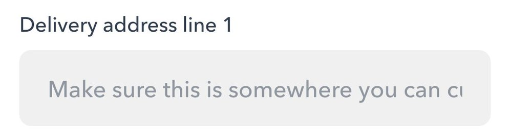

- Once a character is entered, the placeholder disappears — visually and for screen readers — so reviewing earlier entries means deleting text to see the hint again.
- The attribute is unsupported in IE 9 and below; in IE 11 it disappears when the input is focused, and the placeholder colour cannot be changed with CSS in IE 11.
A high-contrast label, by contrast, is always present.
Other stand-ins for labels
Without a label, some screen readers look for adjacent text and announce it, which is unreliable since no such text may exist. In one real-world example, a <span> with no semantic connection to the input replaced the label. The fix is to replace the span with a label carrying for="cardNumber" — the simplest, most robust solution.
A span can be tied to an input through an id matching the input's aria-labelledby, but it cannot be clicked to focus the input the way a label can. Native HTML elements are the better tool.
Interactive content inside labels
Labels should contain plain text only — no headings, no links. Screen readers may mis-announce labels containing other elements, and someone clicking the label to focus the input can hit the link by mistake.
<form>
  <div>
    <!-- Don't do this -->
    <input type="checkbox" id="t-and-c" name="name" />
    <label for="t-and-c">I accept the <a href="https://link.com">terms and conditions</a></label>
  </div>
  <div>
    <!-- Try this -->
    <input type="checkbox" id="t-and-c2" name="name" />
    <label for="t-and-c2">I accept the terms and conditions.</label>
    <span>Read <a href="https://link.com">terms and conditions</a></span>
  </div>
</form>
Examined in the wild
Material UI's floating label
MaterialUI, a React component library based on Google's design system, ships a text input component using the popular floating label pattern.

Clicking the input feels smooth and looks polished, but the qualities are largely skin-deep. At the time of writing, the issues included:
- No option to place the label outside the input, which would enlarge the interactive focus area.
- Hints are associated with the input only by proximity, not through a matching
idandaria-describedby, so not all screen readers connect the helper message to the input. - The label sits behind the input in the DOM, producing incorrect visual order.
- The empty input looks filled out unless it is active.
- The label slides upward on click, which does not suit users who prefer reduced motion.
Huffpost's newsletter form
The Huffpost site includes a newsletter subscription form:

Its email input could be improved on several points:
- No label — an
aria-labelattribute sits on the input instead — so the click or tap target is smaller. - The font size of the
placeholderand input values is only 11px, which is hard to read. - The entire input disappears without JavaScript, leaving no way to sign up.
Why it matters
A large number of people struggle with badly built inputs: people with cognitive, motor and physical disabilities, autism spectrum disorders, brain injuries and poor vision, along with those in a hurry, on poor connections, on small or old devices, and those unfamiliar with digital forms. JavaScript may break or be switched off for many reasons, rendering inputs dysfunctional or unusable.
A form's appearance cannot compensate for its usability. Most people would rather complete an ugly but easy form than struggle through a pretty one that works against them.