

Bringing Face Detection Into Responsive Typography
Responsive design has long relied on viewport size as its primary input. But the physical context of the reader — how close they are to the screen, how many people are looking at it — remains unexplored territory. With TensorFlow.js and the Facemesh model, it’s possible to extract that context from a camera feed and feed it directly into CSS custom properties, opening up new ways to tune typography and layout in real time.
The Toolkit: TensorFlow.js and Facemesh
TensorFlow is Google’s open-source machine learning platform, and its JavaScript SDK makes pre-trained models available directly in the browser. No data science background is required: you load the SDK, load a model, and interpret the output. Facemesh is one such model, built on top of TensorFlow.js, that detects facial landmarks from video frames.
Setting up the stack involves three steps: loading the TensorFlow SDK, loading the Facemesh library, and streaming the user’s camera into a hidden or visible <video> element that Facemesh will analyze frame by frame.
The libraries can be pulled from a CDN or installed via NPM for bundler-based projects:
<script src="https://cdn.jsdelivr.net/npm/@tensorflow/tfjs-core"></script>
<script src="https://cdn.jsdelivr.net/npm/@tensorflow/tfjs-converter"></script>
<script src="https://cdn.jsdelivr.net/npm/@tensorflow/tfjs-backend-webgl"></script>
Facemesh provides the trained model for facial recognition:
<script src="https://cdn.jsdelivr.net/npm/@tensorflow-models/facemesh"></script>
With the model loaded, you define a function that evaluates face data from the video stream:
// create and place the video
const video = document.createElement('video');
document.body.appendChild(video);

// setup facemesh
const model = await facemesh.load({
    backend: 'wasm',
    maxFaces: 1,
});

async function detectFaces() {
    const faces = await model.estimateFaces(video);
    console.log(faces);

    // recursively detect faces
    requestAnimationFrame(detectFaces);
}
Camera access is handled through navigator.mediaDevices.getUserMedia, which prompts the user for permission and pipes the stream into the video element:
// enable autoplay
video.setAttribute('autoplay', '');
video.setAttribute('muted', '');
video.setAttribute('playsinline', '');
// start face detection when ready
video.addEventListener('canplaythrough', detectFaces);
// stream the camera
video.srcObject = await navigator.mediaDevices.getUserMedia({
    audio: false,
    video: {
        facingMode: 'user',
    },
});
// let’s go!
video.play();
Keep in mind that camera permissions require a secure HTTPS context or localhost — a plain index.html opened from disk won’t work. For local testing, tools like http-server for Node or Python’s built-in HTTP server are sufficient.
Case 1: Distance-Aware Typography
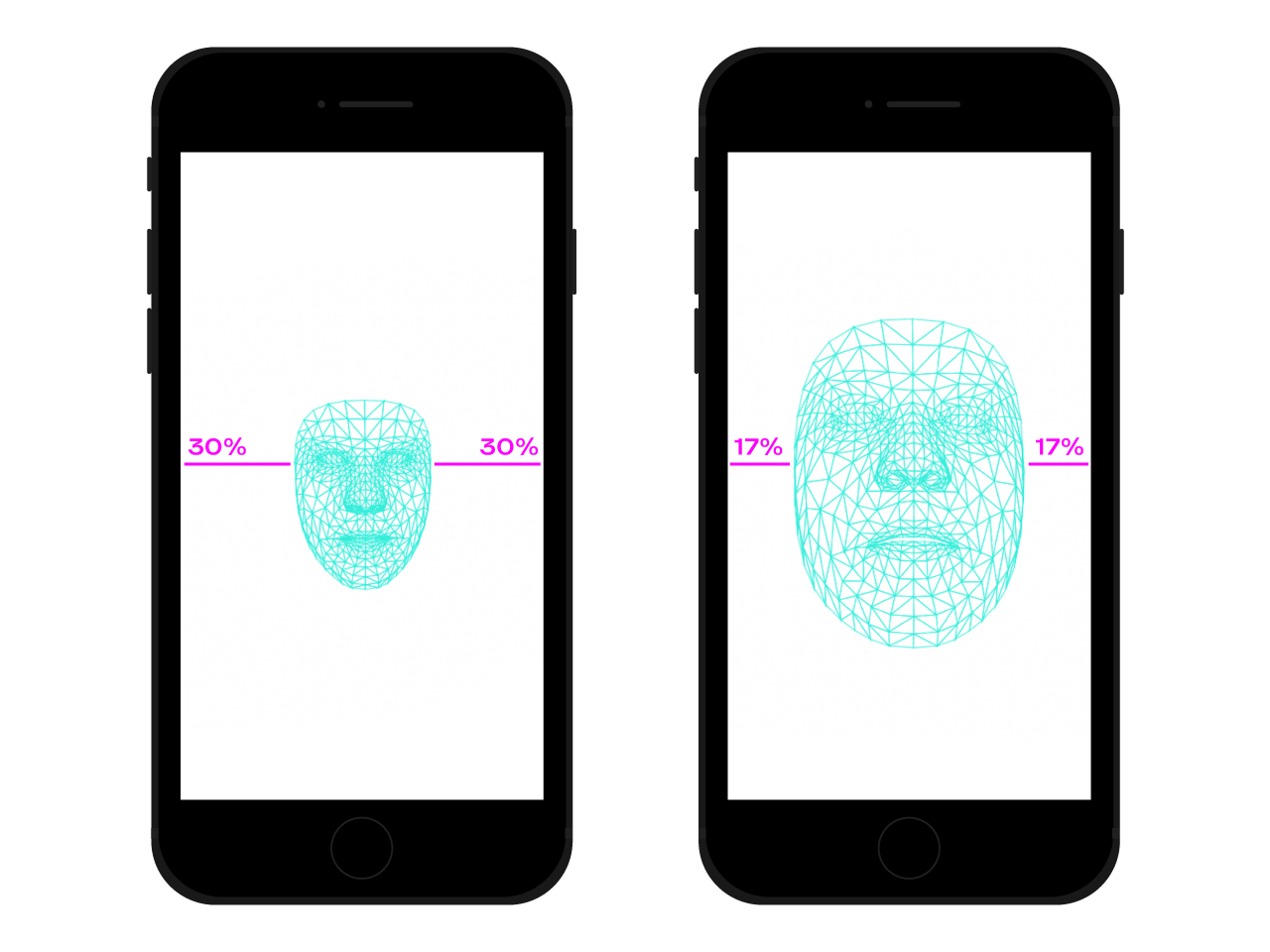
On a crowded train or in a dim room, the distance between a reader’s eyes and their phone changes constantly. That distance has a direct impact on legibility. Facemesh detects eye positions, which lets us estimate how large the face appears in the camera frame — a decent proxy for screen proximity.
A ratio can be derived from facial segment measurements, yielding a value from a rough scale. The larger the face relative to the frame, the closer the user is to the screen:
async function detectFaces() {
    const faces = await model.estimateFaces(video);
    if (faces.length === 0) {
        // is somebody out there?
        return requestAnimationFrame(detectFaces);
    }

    const [face] = faces;

    // extract face surface corners
    let { bottomRight, topLeft} = face.boundingBox;

    // calculate face surface size
    let width = bottomRight[0] - topLeft[0];
    let height = bottomRight[1] - topLeft[1];
    let videoWidth = video.videoWidth;
    let videoHeight = video.videoHeight;
    let adjustWidth = videoWidth / 2;
    let adjustHeight = videoHeight / 2;

    // detect the ratio between face and full camera picture
    let widthRatio = Math.max(Math.min((width - adjustWidth) / (videoWidth - adjustWidth), 1), 0);
    let heightRatio = Math.max(Math.min((height - adjustHeight) / (videoHeight - adjustHeight), 1), 0);
    let ratio = Math.max(widthRatio, heightRatio);

    // recursively detect faces
    requestAnimationFrame(detectFaces);
}
Once the ratio is calculated, it can be passed to the stylesheet as a custom property:
document.documentElement.style.setProperty('--user-distance', ratio);
That single value can drive font-size and weight adjustments via calc(), but a more elegant approach is to use a variable font. Because variable fonts expose parameterized shapes and spaces, the optical size axis can be adjusted dynamically. The ratio needs to be mapped to the font’s optical size scale, ideally constraining the range to subtle increments that improve readability without being noticeable:
.main-text {
    --min-opsz: 10;
    --max-opsz: 15;
    --opsz: calc(var(--min-opsz) + (var(--user-distance) * (var(--max-opsz) - var(--min-opsz))));

    ...
    font-family: 'Amstelvar', serif;
    font-variation-settings: 'opsz' var(--opsz);
}
This technique also extends beyond size: adjusting colors for contrast or detecting the angle of the face to modify ascender and descender heights are viable variations on the same theme. The key is subtlety — typographical changes should enhance the reading experience without drawing attention to themselves.
Case 2: Layout That Counts the Audience
The second scenario is a presentation display in a classroom. A single face in front of an interactive whiteboard calls for a different layout than a full room of students. Rather than relying on a static projection media query, the layout can react to the actual number of people watching.
Facemesh must be configured to detect multiple faces:
const model = await facemesh.load({
    backend: 'wasm',
    maxFaces: 30,
});
Then the count is passed to the stylesheet:
async function detectFaces() {
    const faces = await model.estimateFaces(video);
    document.documentElement.style.setProperty('--watching', faces.length);

    // recursively detect faces
    requestAnimationFrame(detectFace);
}
With that number in hand, a CSS grid layout can shift between two states. The default grid places a long-form article alongside an aside with related images:
<section>
    <article>
        <h1>...</h1>
        <h2>...</h2>
        <p>...</p>
    </article>
    <aside>
        <img src="..." alt="..." />
    </aside>
</section>
The default layout gives the main column a stable foundation:
section {
    display: grid;
    grid-template-columns: repeat(12, 1fr);
    grid-column-gap: 1em;
    width: 120ch;
    max-width: 100%;
    padding: 1em;
}

section article {
    grid-column: 1 / -5;
}

section aside {
    grid-column: 7 / -1;
}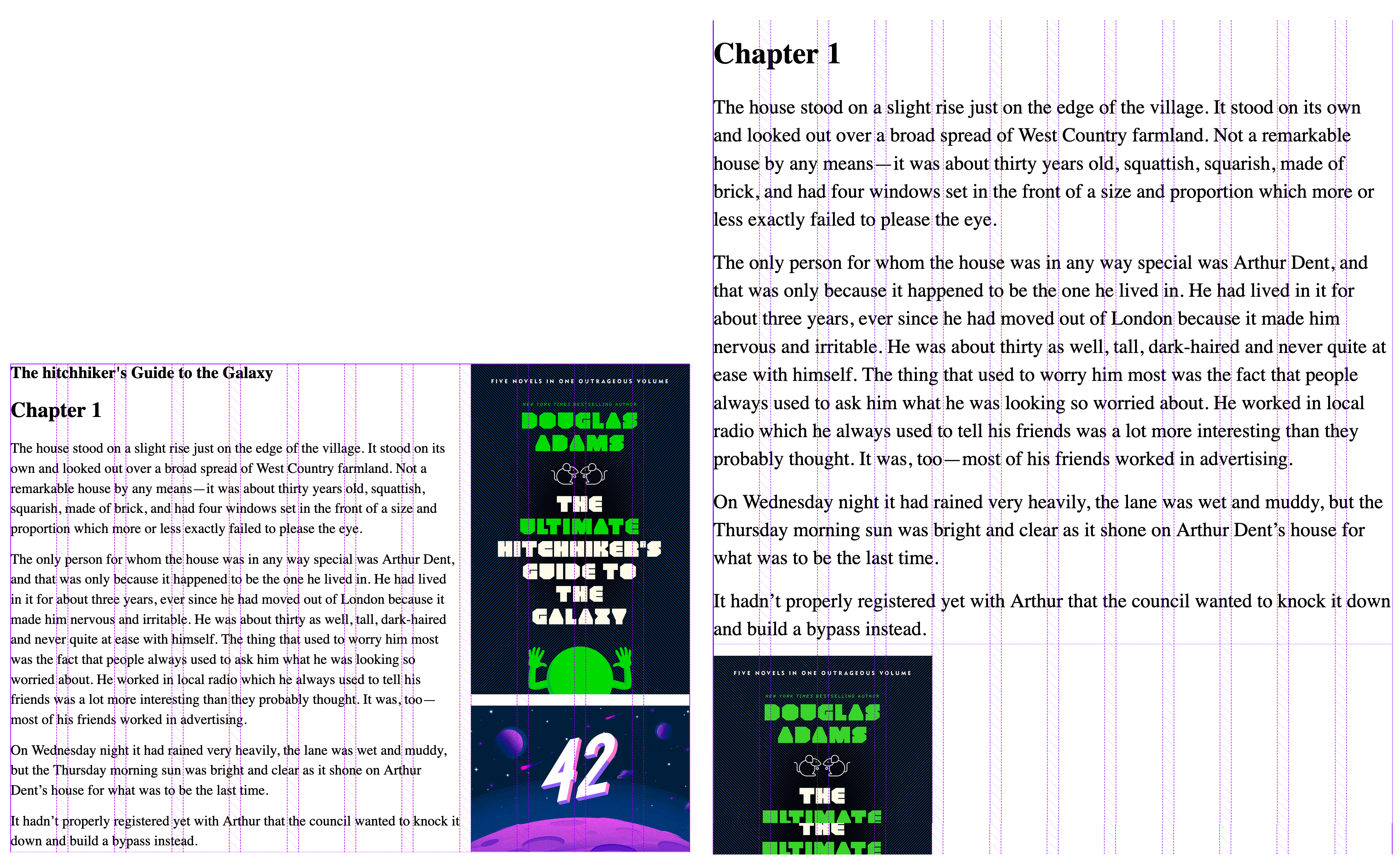
When the face count exceeds a threshold, the grid adjusts: the main column spans more columns, the font size increases, and the aside drops below the article to remove distractions:
:root {
    --watching: 10;
}

section {
    /** The maximum number of people watching for the default layout */
    --switch: 10;
    /** The default number of columns for the text */
    --text: 8;
    /** The default number of columns for the aside */
    --aside: 4;

    grid-template-columns: repeat(calc(var(--text) + var(--aside)), 1fr);
}

section article {
    /**
     * Kinda magic calculation.
     * When the number of people watching is lower than --switch, it returns -2
     * When the number of people watching is greater than --switch, it returns -1
     * We are going to use this number for negative span calculation
     */
    --layout: calc(min(2, (max(var(--switch), var(--watching)) - var(--switch) + 1)) - 3);
    /**
     * Calculate the position of the end column.
     * When --layout is -1, the calculation just returns -1
     * When --layout is -2, the calculation is lower than -1
     */
    --layout-span: calc((var(--aside) * var(--layout)) + var(--aside) - 1);
    /**
     * Calculate the maximum index of the last column (the one "before" the aside)
     */
    --max-span: calc(-1 * var(--aside) - 1);
    /**
     * get the max between --layout-span and the latest column index.
     * -1 means full width
     * --max-span means default layout
     */
    --span: max(var(--max-span), var(--span));

    grid-column-start: 1;
    grid-column-end: var(--span);
}
Conversely, a small audience near the board can be given more details — media files and interactive elements — without cluttering the reading experience for a larger group.
Beyond Face Detection
These two examples scratch the surface of what’s possible. TensorFlow offers other models that can turn a camera stream into layout variables, and smartphones carry additional sensors — GPS, accelerometer, ambient light — exposed through the Sensor APIs. Mood detection via facial expression analysis could even toggle between minimal and detail-rich layouts based on the reader’s state.
CSS media queries have traditionally keyed off viewport dimensions. Newer queries like prefers-color-scheme and prefers-reduced-motion already respect user preferences, moving beyond the device itself. Face detection extends that trajectory: web pages can adapt to the physical environment and the people in it, making interaction design a richer and more contextual practice.


