

Beyond Today's CSS: A Look at What Might Come Next
Each year, the State of CSS survey tracks which features developers are using or hoping to learn. The data helps browser vendors plan their roadmaps, but some ideas are so experimental or speculative that they don't make the cut for the survey at all. That doesn't stop the brainstorming, though. Here are a few CSS proposals and concepts that could shape the future of styling on the web.
A Native Toggle Mechanism
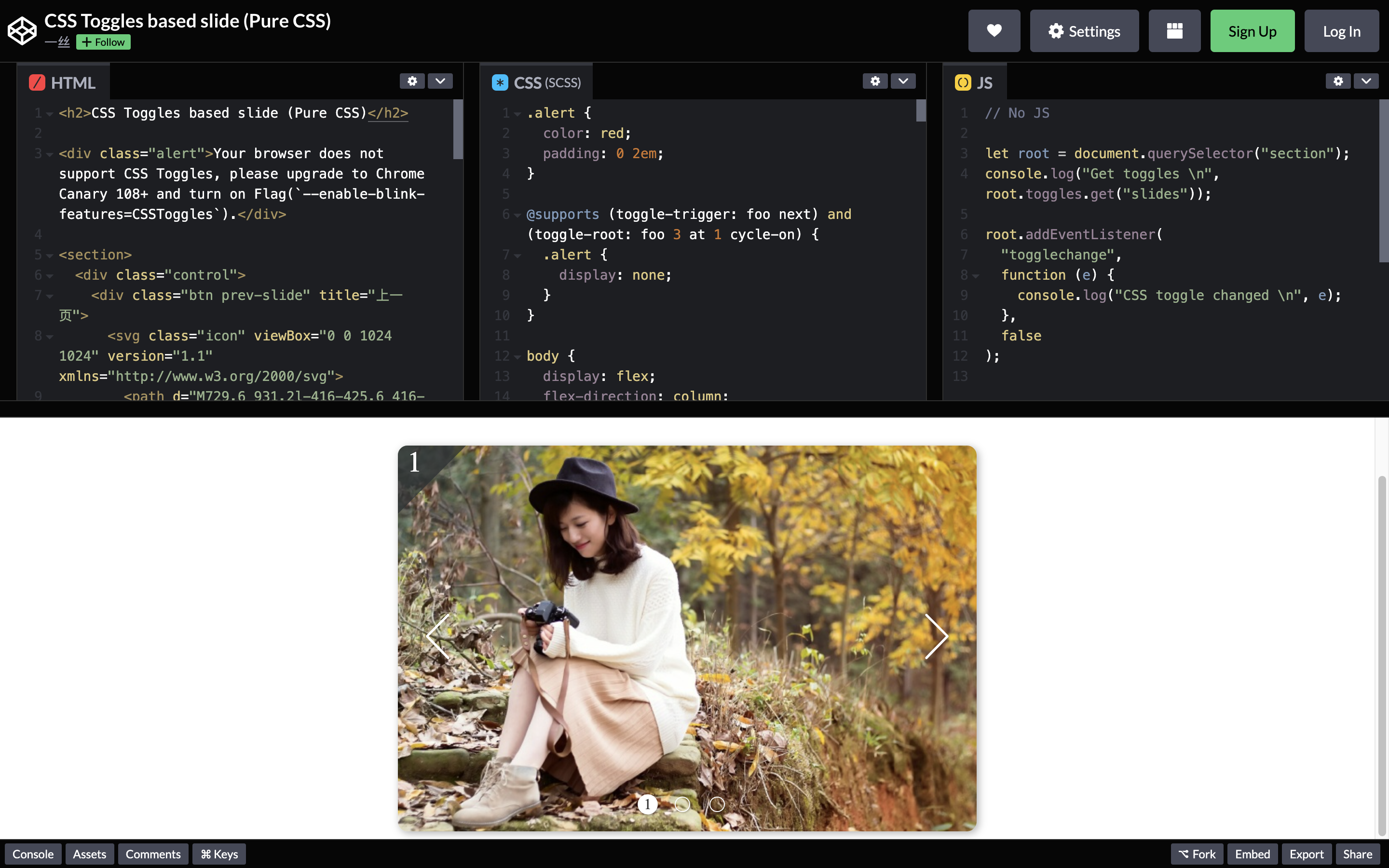
The checkbox hack has been the only pure-CSS approach to toggle effects for over a decade. The CSS Toggles proposal from Tab Atkins and Miriam Suzanne aims to change that by introducing a proper toggle system. This would allow for tabs, accordions, and similar UI patterns without a single line of JavaScript. The proposal is dense with details and edge cases, making it a challenge for browser vendors, but an experimental implementation has already surfaced in Chrome Canary.
Smarter Conditional Styling
Modern web development increasingly needs to serve users with varying temporary or permanent conditions, such as color blindness or motion sensitivity. Miriam Suzanne's switch proposal addresses this by simplifying how we target different states and contexts. Its focus is on checking available-inline-size for grid layouts, but the same syntax could ultimately complement media and container queries across many scenarios.
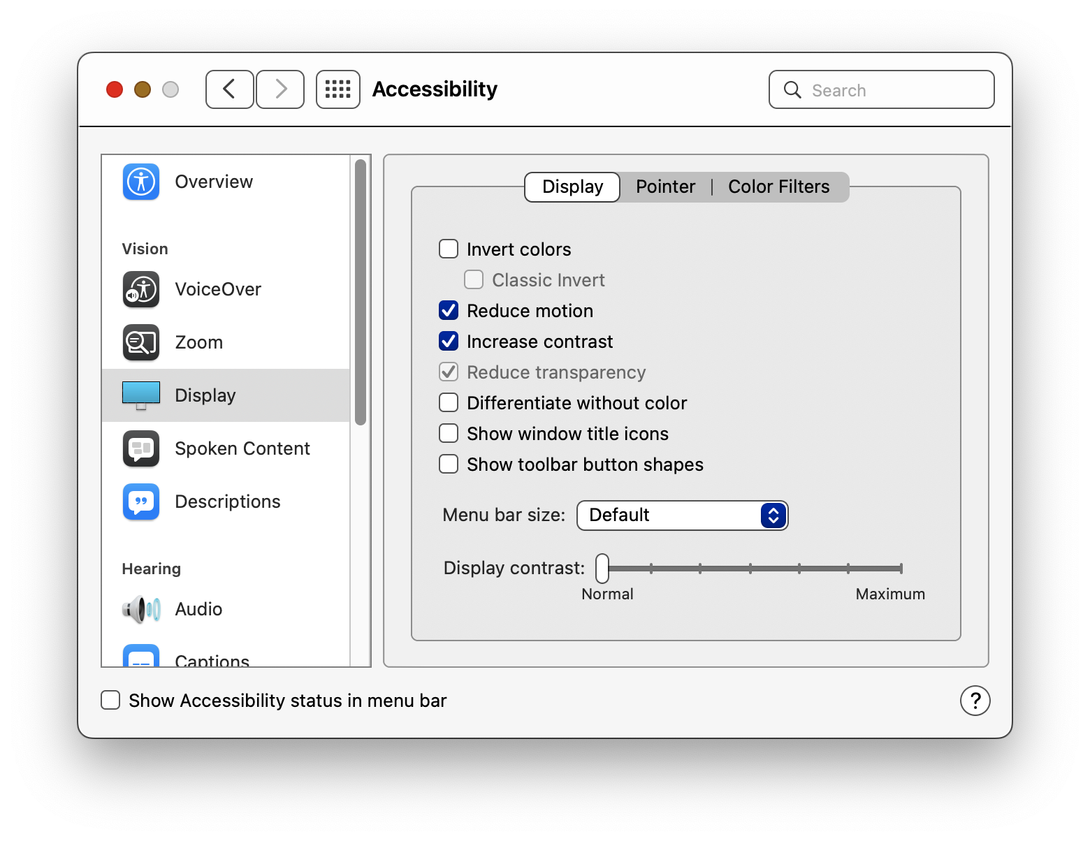
prefers-reduced-motion or prefers-color-scheme. (Large preview).foo {
display: grid;
grid-template-columns: switch(
auto /
(available-inline-size > 1000px) 1fr 2fr 1fr 2fr /
(available-inline-size > 500px) auto 1fr /
);
}
Text That Sizes Itself
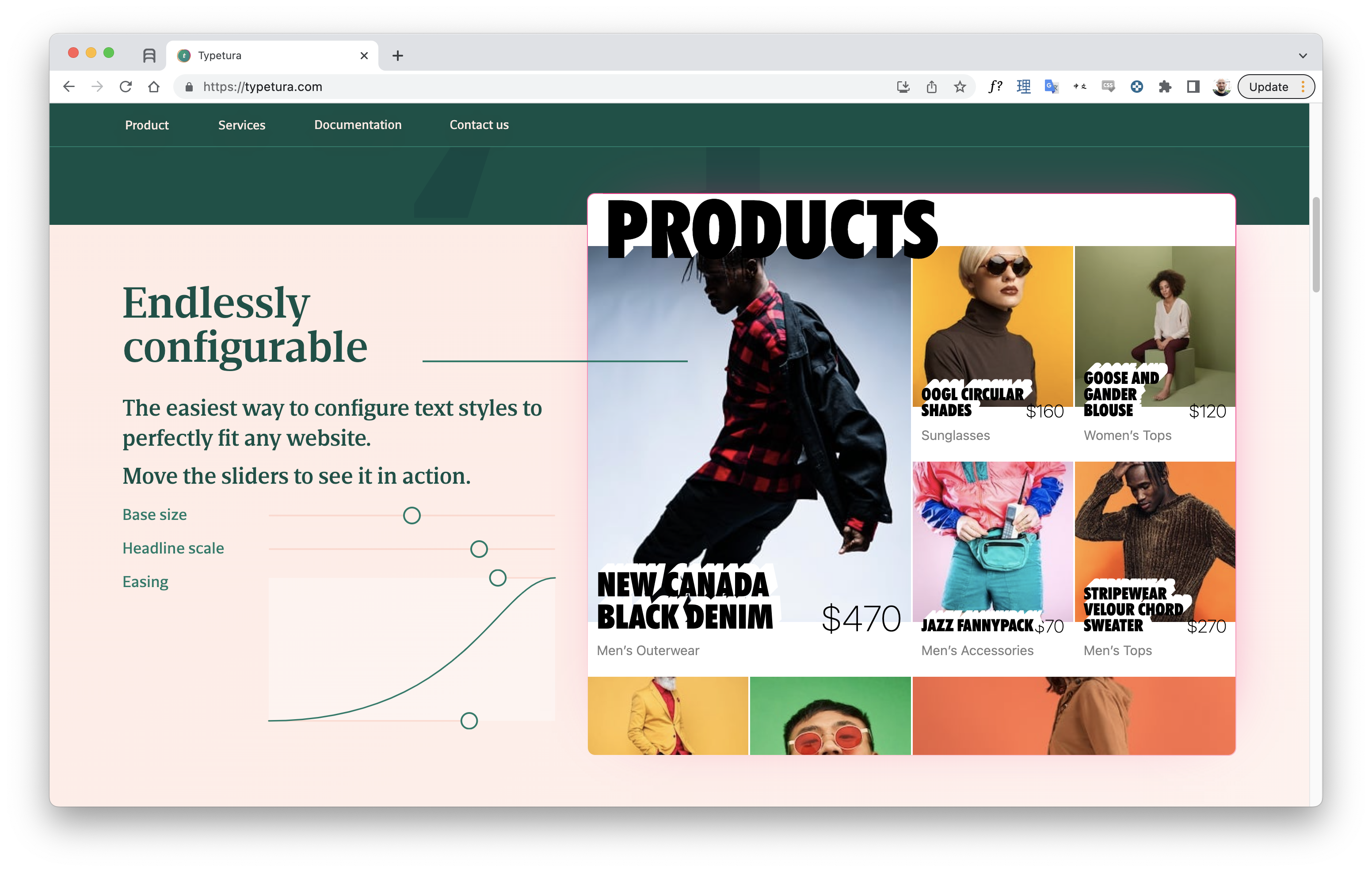
Intrinsic typography, coined by Scott Kellum, flips traditional type sizing on its head. Instead of setting text size per breakpoint, text is given instructions to respond to the dimensions of its container. This enables much more flexible designs with less code. The approach that Kellum's Typetura tool uses is currently JavaScript-dependent, but it's the kind of idea that could eventually make its way into native CSS. Container query units already get us partway there by letting elements reference the size of their containing block.
Functions for Sibling Relationships
Sass developers often write loops to style items based on their DOM position, which generates verbose code and breaks if the number of items changes. The proposed sibling-count() and sibling-index() functions offer a cleaner native solution.
@for $i from 1 through 10 {
  ul:nth-child(#{$i}) {
    padding-left: #{$i * 5px}
  }
}
ul > li {
  padding-left: calc(sibling-index() * 5px);
}
Generative Patterns in CSS
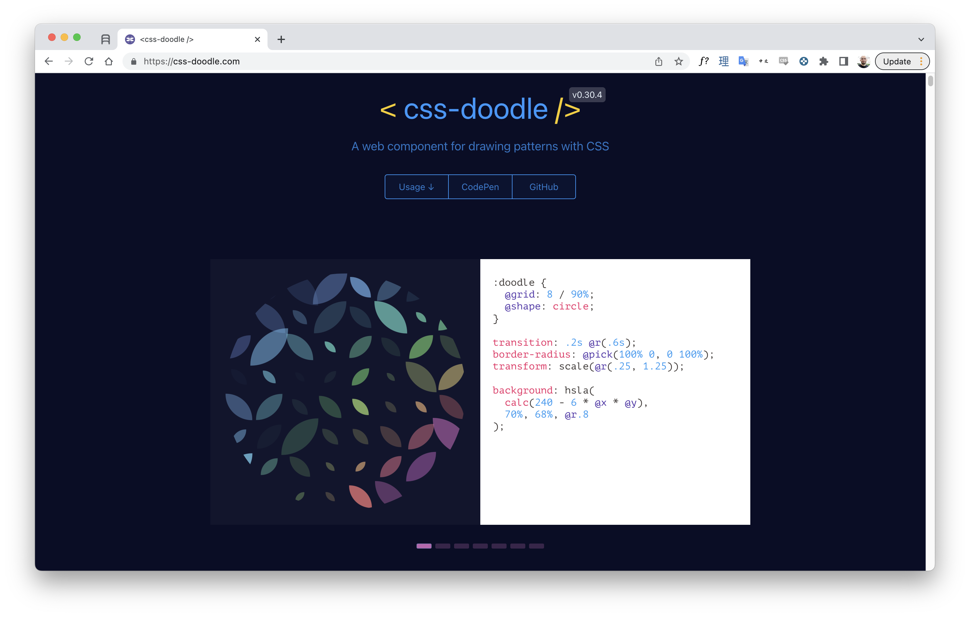
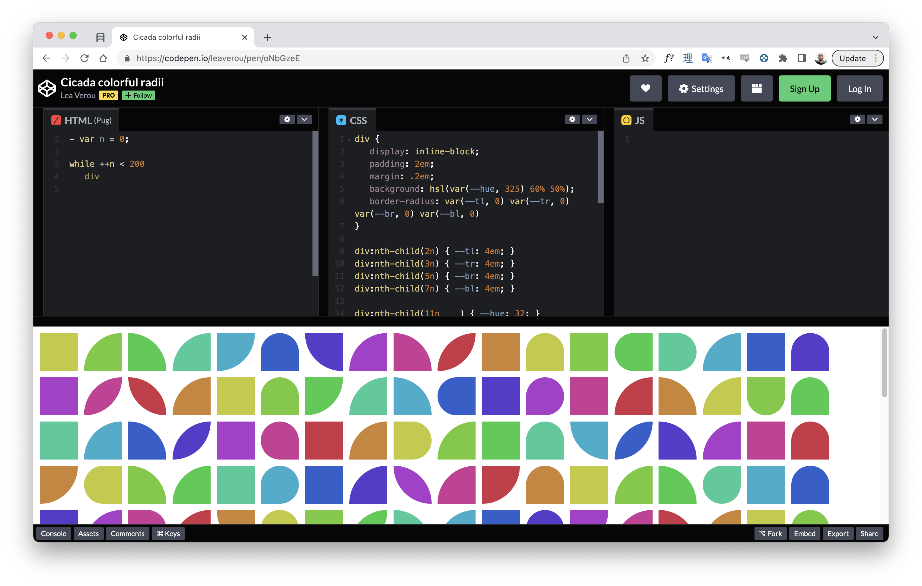
Tools like Patternify let you design patterns and export them as base64 code for CSS. CSS Doodle takes the opposite route: using CSS itself to create patterns. It introduces concepts like randomization and easy grid specification, going beyond the traditional gradient-based patterns. While CSS Doodle is far more complex than a native pattern API would probably be, related proposals like the @image rule suggest a path toward defining and modifying images right inside stylesheets.
Native Charts Without Canvas or SVG
Most web charts rely on SVG or Canvas, but both lack fine-grained responsiveness. You can scale them down proportionally, but you can't adapt layouts with the control offered by CSS Grid. Libraries like Charts.css attempt to style charts purely with HTML and CSS, but complex visualizations quickly require heavy hacks. Imagine instead having native chart elements in the browser, structured something like this:
<linechart>
  <series id="series_a">
    <point x="0" y="2"/>
    <point x="1" y="4"/>
    <point x="2" y="6"/>
  </series>
  <series id="series_b">
    <point x="0" y="6"/>
    <point x="1" y="4"/>
    <point x="2" y="2"/>
  </series>
</linechart>
With markup written this way, you'd control spacing, colors, and layout through standard CSS and container queries. Of course, web components can already achieve this, but native elements would offer unmatched simplicity.
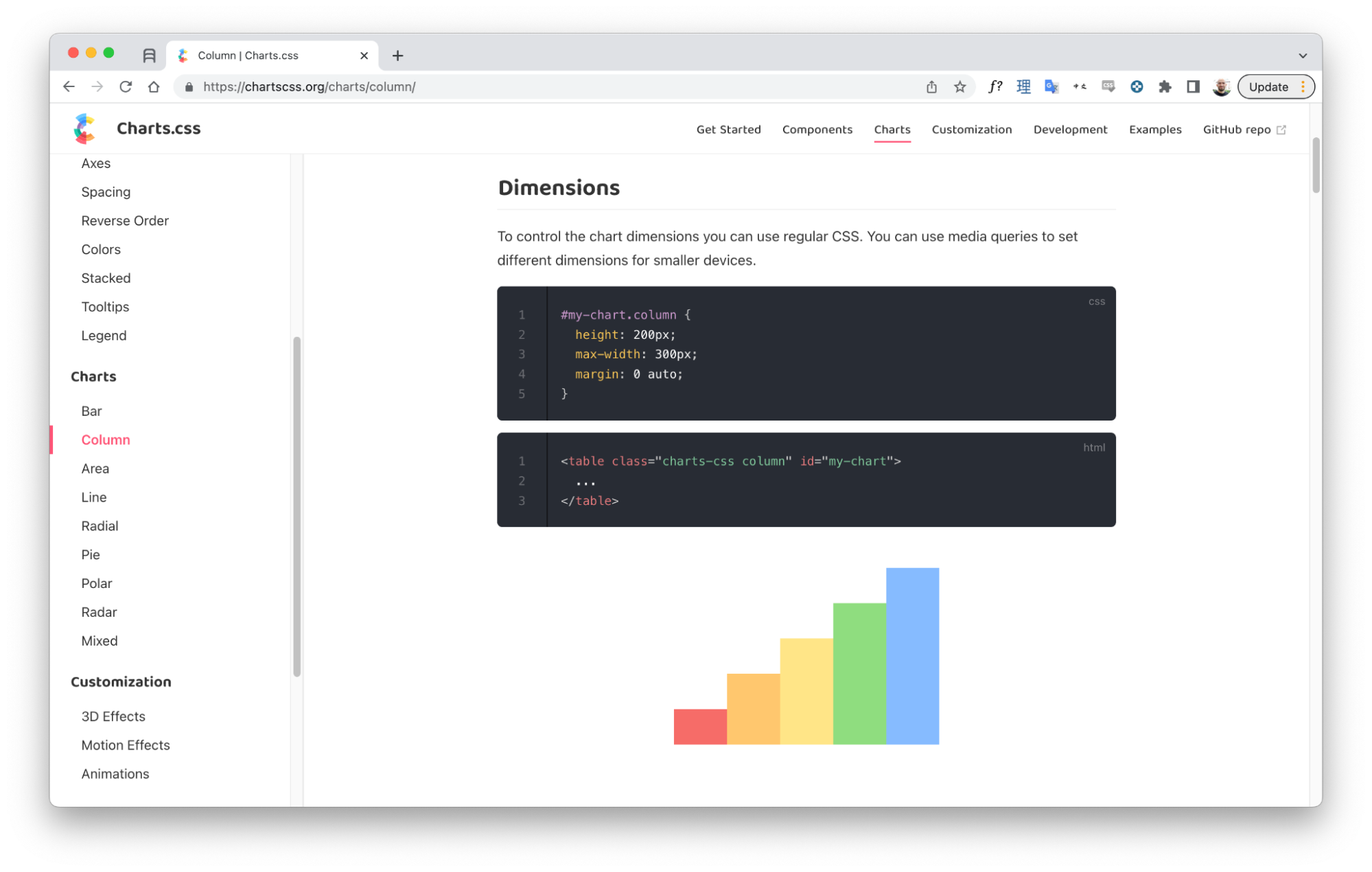
Charts.css: creating charts with only HTML and CSS. (Large preview)If Container Queries, Then Style Queries
Container queries already let you style an element based on the size of its containing block. Container style queries, already under experimental testing in Chrome Canary, extend the concept to a container's style. For example, as described by Geoff Graham, you might write something like:
.posts {
  container-name: posts;
}

@container posts (background-color: #f8a100) {
  /* Change styles when `posts` container has an orange background */
  .post {
    color: #fff;
  }
}
This behavior borders on what :has() could offer if it selected based on stylistic signals rather than just DOM structure.
More Possibilities on the Horizon
- Random numbers in CSS: Hacks exist to fake randomness, using techniques like the Cicada Principle, but a true random number generator proposal has surfaced. Beyond pattern-making, having native randomness would help designs feel more organic.
- Targeting grid coordinates: As Grid and Subgrid grow more widespread, the ability to style items by their position in a layout—say, targeting a specific row or column—could become more valuable.
- Improved form styling: The native form widgets remain notoriously difficult to style, leading UI libraries to rebuild them with
divs at the cost of accessibility. The<selectmenu>element proposal marks a concrete step forward. - Animating to
auto: Transitions between fixed sizes andautodimensions aren't permitted today. Real progress here would require also unlockingautoinsidecalc().
Most of these ideas face steep implementation odds in the near term, let alone cross-browser support. But then again, the same was once said about :has() and CSS nesting, both of which now seem closer than ever. If the past is any guide, CSS's future may arrive quicker than we expect.



