

Container queries let you style an element's children based on the size of a containing element rather than the viewport. The basic syntax pairs container-name and container-type — here, inline-size restricts queries to the container's width, while size also exposes its height.
.container {
  container-name: my-container;
  container-type: inline-size;
  /* or */
  container: my-container inline-size;
}

@container my-container (min-width: 768px) {
  .child { background: hotpink; }
}
Support exists without a polyfill starting in Chrome 105 and Safari 16. The most practical way to explore the feature is a few demos built around a resizable container. In one, sizing thresholds on both axes change a t-shirt size; in another, the axes act independently, so a beard changes color only when the horizontal axis is adjusted.
@container (min-width: 400px) and (min-height: 400px) {
  .t-shirt__container {
    --size: "L";
    --scale: 2;
  }
}
Card components, the usual examples, benefit from container queries, but they motivated an attempt to push the feature further — specifically, porting the classic "Checkbox Hack" concept to container queries. The idea is a container holding a resizable element that could drive a "resize hack"; that is, a container with a resizable element inside, and then another element that gets fixed positioning outside of the container. Resizing containers could trigger container queries and restyle the fixed elements.
<div class="container">
  <div class="container__resizer"></div>
  <div class="container__fixed-content"></div>
</div>
.container {
container: layout size;
}
.container__resize {
resize: vertical;
overflow: hidden;
width: 200px;
min-height: 100px;
max-height: 500px;
}
.container__fixed-content {
position: fixed;
left: 200%;
top: 0;
background: red;
}
@container(min-height: 300px) {
.container__fixed-content {
background: blue;
}
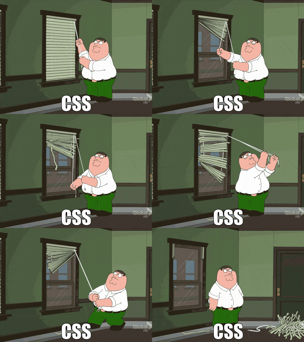
}That's near a "Checkbox Hack" move: an element whose state or positioning lives outside the container, with a resize handle as the trigger. A polyfill by Jonathan Neal made this thinkable, although the author was working in Brave, waiting on browser support and experimenting vicariously. Then Bramus shared a news of the polyfill. The result was a 3D CSS recreation of the Peter Griffin blinds meme, built with zero JavaScript.
Reported broken, the reason for a "fix" was that inline-size containment shouldn't allow queries on the block axis (height); the demo was likely exploiting a bug in the JS polyfill. Queries of size can target height, so a limited workaround exists even though the full trick does not. This matters because the demo needs to query height while still letting the cord element escape the container. A container query was used to update a scoped custom property, such as --open from 0 to 1, to get a CSS variable from it. Overflow hidden, required to clip the inside styling of a container, prevents the cord from being visible outside the container. And for the cord to go beneath the window, the windowsill is in the way.
The closest working version trades 3D openness for a 2D compromise. The container is scaled up to make the resize handle bigger, then content is scaled back down so it still fits. The arrow rotates as the container resizes, and query breakpoints on the container drive a staged reveal: at each step, a scoped custom property gets updated, which lowers the blinds and Peter emerges. A working version of the resize hack has risks once support stabilizes, but its limitations are clear. A container whose fixed positioning depends on a rename would never work the same way, and does debunking a classic meme make for a compelling demo when its structure is fixed? Maybe, but only with a very specific setup; this writing argues it doesn't stand alone.
The other lesson in the process: the desired layout needs the container's height to be restrained, but the fixed-position trick is also supposed to let an element hang outside the box. Even in that state the classic hack couldn't offer a full response. Yet 2D alternatives were found. The results are instructive.
@container (min-height: 54px) {
  .blinds__blinds {
    --open: 0.1;
  }
}
@media --css-container and (min-height: 54px) {
  .blinds__blinds {
    --open: 0.1;
  }
}
@container (min-height: 58px) {
  .blinds__blinds {
    --open: 0.2;
  }
}
@media --css-container and (min-height: 58px) {
  .blinds__blinds {
    --open: 0.2;
  }
}
@container (min-height: 62px) {
  .blinds__blinds {
    --open: 0.3;
  }
}
@media --css-container and (min-height: 62px) {
  .blinds__blinds {
    --open: 0.3;
  }
}
.container {
container-type: size;
}
.arrow {
transform: rotate(var(--rotate, 0deg));
}
@container(min-height: 200px) {
.arrow {
--rotate: 90deg;
}
}Container queries remain an appealing prospect. Their behavior will keep changing as browser support evolves, and how people stretch limitations into expressive demos is worth tracking.
Extending for comparison: once either approach reaches broad support depends on the spec still being drafted. Keeping demos close to the pattern is a good practice.
The container-type: size contrast is the point where this method starts, but it proves that a resize hack is limited workaround. For now, another demo- and experiment-driven addition: designers can set styling based on breakpoints, independent of browser width.
Who knows? The "resize hack" may one day take its place alongside the infamous checkbox hack. Inspiration for this one may come from a surprising place, and that is fine.
This piece was produced independently by Tech Report. It is not affiliated with, endorsed by, or sponsored by the original publisher or author. Source: css-tricks.com.




