

How CSS Resolves an Element's Rendered Size
Declaring a width and height on an element does not guarantee those numbers are what actually render. What follows traces how the browser computes dimensions: starting from the box model, then moving through inline behavior, parent–child dependencies, and the newer sizing functions.
The Box Model and the box-sizing Default
Set an element to 640px wide and 360px tall, then add 10px of padding on each side, and the rendered box is 660×380px. The extra 20px on both axes comes from the box-sizing default of content-box: the rendered size is the declared width and height plus padding and border.
.element {
  width: 640px;
  height: 360px;
}
.element {
width: 640px;
height: 360px;
padding: 10px;
}The upshot is that an element can end up larger than intended, meaning the declared values can differ entirely from what the user sees.
/* Width */
width + padding-left + padding-right + border-left + border-right

/* Height */
height + padding-top + padding-bottom + border-top + border-bottom
Block Versus Inline Elements
The calculation above describes a block element — one that naturally takes up the full available width. Its width stays at 100% no matter how much content it holds, until altered. Elements like <p>, <article>, <main> and <div> belong to this group.
Inline elements behave differently. Their dimensions come from their content, so an inline element such as <span> ignores width, height and top/bottom margin outright. Nest a block element inside an inline one and the inline element's shape breaks, because the block is sized by the available space rather than by content. With a border applied, the visual interruption is obvious: the inline element stops where the paragraph begins and resumes after it, the paragraph having broken the inline flow. Even when width and margin are declared directly on the inline element, they are simply passed over.
Dimensions in Parent–Child Relationships
A parent element contains nested children, and relative units make the two interdependent. An element declared at width: 100% fills the available horizontal space, with the computed value depending on context: 100% resolves to 1,500px on a 1,500px browser and 500px on a 500px browser.
<!-- The parent element -->
<div class="parent">
  <!-- The children -->
  <div class="child"></div>
  <div class="another-child"></div>
  <div class="twins">Whoa!</div>
</div>
<div class="child">
<!-- nothing yet -->
</div>.parent {
width: 100%;
}This is effectively how a child mirrors its parent's width — 100% computes from the actual width of the containing parent. Height follows the same logic relative to the parent's height, so two parents of different heights with identical children yield children of different heights.
Percentages on Padding and Margin
When padding or margin is given as a percentage, it always resolves against the width of the parent — even for vertical edges. Designers exploit this to produce boxes that keep equal dimensions or a fixed aspect ratio as the page resizes, which is useful for video and image content. The pattern is known as the "padding hack," and it is less necessary now that the aspect-ratio property has broad browser support.
Content-Driven Sizing: min-content and max-content
These values tell the browser to size an element from its content. For max-content, the browser pretends it has infinite space, lays the text on a single line, and measures the width. For min-content, it pretends space is zero, placing each word or inline child on its own line.
Inline elements approximate max-content behavior, since they are only as wide and tall as their content allows; display: inline; applies this to most elements. The display: inline-block; value combines the two: an inline element that nonetheless respects margin, width and height through block-level box model computation.
Cyclic Percentage Sizing
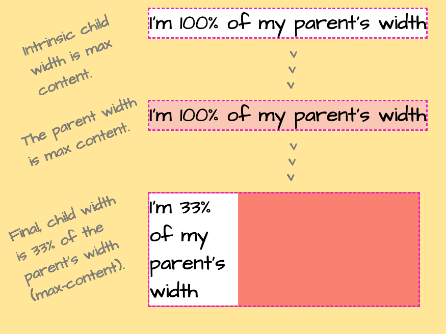
Consider a child at 33% width inside a parent with no declared width. The parent's width falls back to its initial value, auto, and because the parent is display: inline-block, auto acts like max-content — the parent should be as wide as its content. But that content's width depends on the parent's. The CSS Box Sizing Module calls this cyclic percentage sizing.
The browser resolves it in stages. First it assigns the child a temporary auto width, which behaves like max-content and reflects the child's content rather than the declared 33%. That value is used to calculate the parent's width, since the parent must be at least as wide as what it contains. Once the parent resolves, the browser returns to the child and applies the declared 33%.
Constraining Size with min- and max- Properties
min-width, min-height, max-width and max-height place limits on an element's size. An explicit width of 100% can be capped with a max-width:
element {
  width: 100%;
  max-width: 800px;
}
The element grows as far as it needs, up to 800 pixels. Swapping the values — max-width: 100% and width: 800px — appears to produce identical behavior:
element {
  width: 800px;
  max-width: 100%;
}
Wrapped in an inline-block parent, however, the two examples diverge. For the element with width: 100%, the parent width resolves to the width of its text (the child's max-content) bounded by max-width, and that becomes the basis for the child's width. For the element with width: 800px, the parent is 800px wide — just enough for the child — and the child's max-width then resolves against that 800px, so parent and child both end at 800px.
Sizing Functions: min(), max() and clamp()
These functions express responsive sizes without media queries, and their arguments may mix absolute and relative units.
min()returns the smallest of its arguments, e.g.min(800px, 100%).max()returns the largest of its arguments.clamp(MIN, VAL, MAX)resolves asmax(MIN, min(VAL, MAX)), returningVALunless it falls outside the boundaries, in which case the corresponding boundary is returned.
The earlier max-width example can be rewritten as a single property:
.element {
  width: min(800px, 100%);
}

/* ...is equivalent to: */
.element {
  width: 800px;
  max-width: 100%;
}
That sets 800px while ensuring the parent's 100% is never exceeded. Wrapped in an inline-block parent, it behaves differently from the max-width version: the children are 800px in both cases, but the second parent ends up larger. Because no width is declared on the parent and the child's width uses relative units, the browser ignores that value while sizing the parent and instead uses the child's max-content, driven by its long text.
An explicit width and height do not fix an element's rendered dimensions — the producing values frequently differ from the declared ones. The box model alone is enough to account for much of that gap. Beyond it, CSS Flexbox and Grid add further factors: axes and track lines also influence an element's rendered size.




