
CSS Grid's auto-placement and layout features have already been covered in earlier work, including image grids with zooming hover effects. This time the target is a different kind of grid: one built around non-rectangular shapes, like hexagons or rhombuses. The approach combines the same Grid techniques with clip-path and mask to produce image grids in nearly any shape.
The markup constraint
Achieving these layouts is not the hard part; doing it with the same HTML markup is. Extra wrappers and divs could simplify things, but the goal is to keep the HTML to a minimum and still reach every grid variant, since styling should not dictate markup and markup should not dictate styling. The starting point is nothing more than a container holding the images:
<div class="gallery">
  <img src="..." alt="...">
  <img src="..." alt="...">
  <img src="..." alt="...">
  <img src="..." alt="...">
  <!-- as many times as we want -->
</div>
That container and its images are all the markup required throughout.
Hexagonal (honeycomb) grids
The first step is to apply clip-path to the images so each becomes a hexagon, then stack them all in the same grid area so they overlap.
.gallery {
  --s: 150px; /* controls the size */
  display: grid;
}

.gallery > img {
  grid-area: 1/1;
  width: var(--s);
  aspect-ratio: 1.15;
  object-fit: cover;
  clip-path: polygon(25% 0%, 75% 0%, 100% 50%, 75% 100%, 25% 100%, 0 50%);
}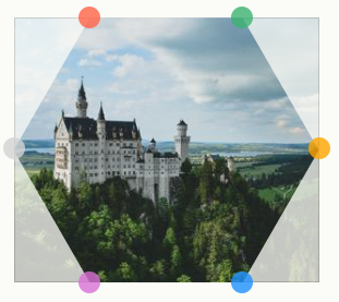
clip-path: polygon(25% 0%, 75% 0%, 100% 50%, 75% 100%, 25% 100%, 0 50%)At this stage every image sits on top of the others, so the result looks like a single hexagon-shaped image even though seven elements are present. The next step is translating each image into position on the grid.

One image stays in the center while the rest are placed around it with CSS translate and geometry. The mock formulas for each image are:
translate((height + gap)*sin(0deg), (height + gap)*cos(0))
translate((height + gap)*sin(60deg), (height + gap)*cos(60deg))
translate((height + gap)*sin(120deg), (height + gap)*cos(120deg))
translate((height + gap)*sin(180deg), (height + gap)*cos(180deg))
translate((height + gap)*sin(240deg), (height + gap)*cos(240deg))
translate((height + gap)*sin(300deg), (height + gap)*cos(300deg))
After calculations and optimization, the resulting CSS is:
.gallery {
  --s: 150px; /* control the size */
  --g: 10px;  /* control the gap */
  display: grid;
}
.gallery > img {
  grid-area: 1/1;
  width: var(--s);
  aspect-ratio: 1.15;
  object-fit: cover;
  clip-path: polygon(25% 0%, 75% 0%, 100% 50% ,75% 100%, 25% 100%, 0 50%);
  transform: translate(var(--_x,0), var(--_y,0));
}
.gallery > img:nth-child(1) { --_y: calc(-100% - var(--g)); }
.gallery > img:nth-child(7) { --_y: calc( 100% + var(--g)); }
.gallery > img:nth-child(3),
.gallery > img:nth-child(5) { --_x: calc(-75% - .87*var(--g)); }
.gallery > img:nth-child(4),
.gallery > img:nth-child(6) { --_x: calc( 75% + .87*var(--g)); }
.gallery > img:nth-child(3),
.gallery > img:nth-child(4) { --_y: calc(-50% - .5*var(--g)); }
.gallery > img:nth-child(5),
.gallery > img:nth-child(6) { --_y: calc( 50% + .5*var(--g)); }
Native trigonometry functions in CSS would eventually make this simpler. Each image is translated through the --_x and --_y variables derived from those formulas. The nth-child(2) selector is absent because that image is the centered one; any image could take that role with a different order. The order used here is:

A hover effect on the images adds polish. Swapping the values inside clip-path and exchanging --x with --y values is all it takes to produce a second hexagon grid from the same CSS.
Rhombus grids
A rhombus is a square rotated 45 degrees, and the same HTML applies. The build begins with a 2×2 grid of images:
.gallery {
  --s: 150px; /* controls the size */

  display: grid;
  gap: 10px;
  grid: auto-flow var(--s) / repeat(2, var(--s));
  place-items: center;
}
.gallery > img {
  width: 100%;
  aspect-ratio: 1;
  object-fit: cover;
}
The grid property here is uncommon but useful: it is a shorthand that declares a complete grid in one declaration, less intuitive and readable than the individual properties, but worth exploring.
grid: auto-flow var(--s) / repeat(2,var(--s));

/* is equivalent to this: */
grid-template-columns: repeat(2, var(--s));
grid-auto-rows: var(--s);
It defines two columns equal to the --s variable and sets all row heights to --s as well, so four images land in a 2×2 grid. An equivalent written out in individual properties is:
grid-template-columns: repeat(2, var(--s));
grid-template-rows: repeat(2, var(--s));
and the same, reduced with the shorthand:
grid: repeat(2,var(--s)) / repeat(2,var(--s));With the grid set, both the grid and the images are rotated with CSS transform. Both use 45deg but in opposite directions; rotating the images in the negative direction keeps them straight relative to the page rather than inheriting the grid's rotation. Then a clip-path cuts a rhombus out of each image.
.gallery {
  /* etc. */
  transform: rotate(45deg);
}
.gallery > img {
  /* etc. */
  transform: rotate(-45deg);
}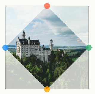
clip-path: polygon(50% 0, 100% 50%, 50% 100%, 0 50%)One more correction is needed: the image currently sits within the green circle, the inscribed circle of its grid area, but must be enlarged to fit the red circle, the circumscribed circle, or the images stay spaced too far apart to read as a grid.
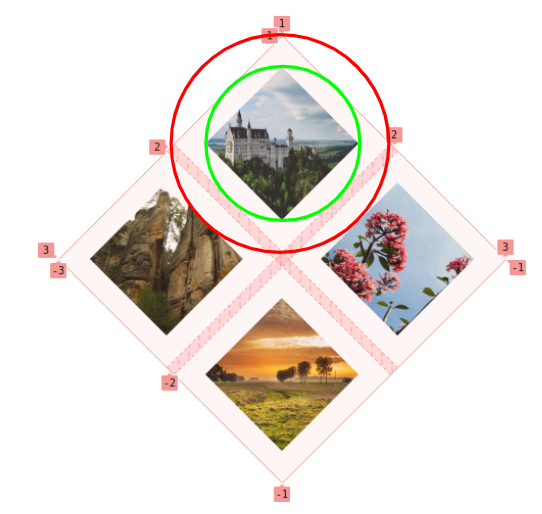
The ratio between the two radii is the square root of 2 (sqrt(2)), so the image is scaled by 100%*sqrt(2) = 141%. The same zooming hover effect from the hexagon grid can be layered on.
.gallery {
  --s: 150px; /* control the size */

  display: grid;
  grid: auto-flow var(--s) / repeat(2,var(--s));
  gap: 10px;
  place-items: center;
  transform: rotate(45deg);
}
.gallery > img {
  width: 141%; /* 100%*sqrt(2) = 141% */
  aspect-ratio: 1;
  object-fit: cover;
  transform: rotate(-45deg);
  clip-path: polygon(50% 0, 100% 50%, 50% 100%, 0 50%);
}
Triangular grids
The main challenge remains finding the right clip-path for each shape. Here every element gets its own value rather than sharing one consistent shape, so a handful of different triangles combine into a rectangular grid.
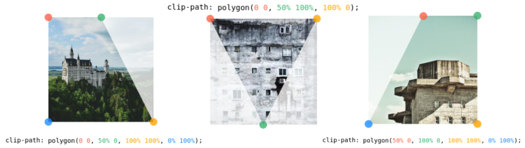
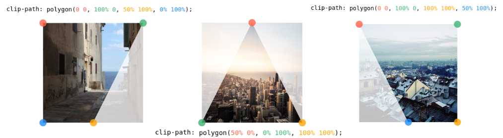
They sit in a 3×2 grid via this CSS:
.gallery {
  display: grid;
  gap: 10px;
  grid-template-columns: auto auto auto; /* 3 columns */
  place-items: center;
}
.gallery > img {
  width: 200px; /* controls the size */
  aspect-ratio: 1;
  object-fit: cover;
}
/* the clip-path values */
.gallery > img:nth-child(1) { clip-path: polygon(0 0, 50% 0, 100% 100% ,0 100%); }
.gallery > img:nth-child(2) { clip-path: polygon(0 0, 100% 0, 50% 100%); }
.gallery > img:nth-child(3) { clip-path: polygon(50% 0, 100% 0, 100% 100%, 0 100%); }
.gallery > img:nth-child(4) { clip-path: polygon(0 0, 100% 0, 50% 100%, 0 100%); }
.gallery > img:nth-child(5) { clip-path: polygon(50% 0, 100% 100%, 0% 100%); }
.gallery > img:nth-child(6) { clip-path: polygon(0 0, 100% 0 ,100% 100%, 50% 100%); } }
The last step, similar in intent to the rhombus spacing fix but different in approach, is setting the middle column width to 0 to close the gaps between images:
grid-template-columns: auto 0 auto;The clip-path values were tuned so the shapes appear to interlock like a puzzle. The images do overlap when the middle column has zero width, but the slicing makes the illusion convincing:

Adding border-radius and overflow to the grid or to the triangular shapes yields a pizza-pie-style grid.
Puzzle-piece grids with mask
This grid uses the CSS mask property to make images look like puzzle pieces. CSS gradients do the work here, since they produce the round notches in the piece shapes. Setup of the grid itself is routine, so the focus is the mask.
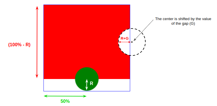
Two gradients create the final shape: one draws a circle and the other creates the right curve while filling in the top part.
--g: 6px; /* controls the gap */
--r: 42px;  /* control the circular shapes */

background:
  radial-gradient(var(--r) at left 50% bottom var(--r), green 95%, #0000),
  radial-gradient(calc(var(--r) + var(--g)) at calc(100% + var(--g)) 50%, #0000 95%, red)
  top/100% calc(100% - var(--r)) no-repeat;
Two variables control the shape. --g is simply the grid gap, accounted for so the circles are placed to overlap perfectly when the puzzle is assembled. --r sets the size of the circular parts.
Updating a few values in the same CSS produces the three other piece shapes. The shapes exist, but each image is confined to its own grid cell, so the edges that should overlap appear jumbled:
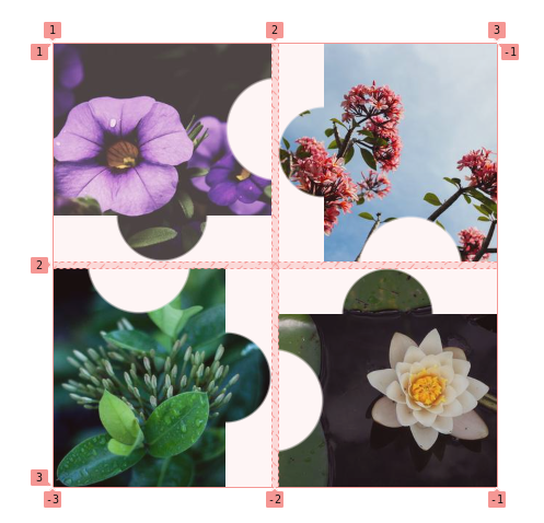
An overflow fixes this: increase the height of the first and fourth images and the width of the second and third, scaled with the --r variable.
.gallery > img:is(:nth-child(1),:nth-child(4)) {
  width: 100%;
  height: calc(100% + var(--r));
}
.gallery > img:is(:nth-child(2),:nth-child(3)) {
  height: 100%;
  width: calc(100% + var(--r));
}
That creates the overlap, but by default images overlap either to the right when width grows or to the bottom when height grows, which is wrong for the second and fourth images. Putting place-self: end on those two corrects it.
The same underlying HTML and CSS also support a conic gradient in place of the radial gradient, producing triangular puzzle pieces. A final variant uses clip-path; since it is animatable, updating the custom property that controls the shape produces a hover effect.
Where the series goes next
Combining the Grid techniques with clip-path and mask yields grids of many different shapes, all from the same markup: a container with a handful of image elements. The second part turns to more complex-looking grids with fancier shapes and hover effects, starting from the expanding-image-panel demo and rebuilding it as zig-zag image panels, one example among several.




