

Why Viewport Media Queries Fall Short For Components
Media queries tie styles to the viewport. That works for page-level layout, which is by definition bound to the screen. But the same product-card component dropped into different sections of a page will behave differently depending on the container it lives in — a grid column, a sidebar, or a full-width band. The viewport is only one possible container, and often not the one that actually constrains a component.
Developers typically paper over this by adding context-specific CSS classes or extra viewport breakpoints tuned to each placement. That approach multiplies code and invites specificity conflicts. At its core, the problem is that viewport breakpoints force you to guess a “magic” screen width that roughly corresponds to the width at which a component breaks — but that mapping between viewport and element dimensions is indirect and fragile. Move the component into a narrower or wider context and the guess stops holding.
Container queries address this by making styles react to the dimensions of the component’s own container. That yields three practical wins:
- Components adapt to whatever container they are placed in.
- No need to reverse-engineer viewport values that match component widths.
- No extra classes or duplicated media queries for each context.
Enabling The Experimental Feature
Container queries are still experimental. At the time of writing, support exists in Chrome Canary behind a flag. To test the demos in this article locally, navigate to the browser’s settings URL and enable the container queries option:
chrome://flags/#enable-container-queries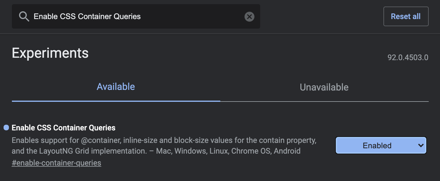
If you are not running a supporting browser, each demo below is accompanied by a static image of the expected result.
Setting Up A Query Container
Unlike media queries, container queries require you to designate a containment context on an element before you can query it. The CSS contain property — already supported in around 75% of browsers — tells the browser that a subtree can be rendered independently, which is what allows the browser to re-render only that component when its children change.
For container queries, use the layout and style values plus an axis-specific containment value:
inline-size: containment on the inline axis; has the broadest use cases and is implemented first.block-size: containment on the block axis; still in development and not currently available.
Applying containment requires a nesting change: the element you want to query must be a child of the contained element. Keep the container as close to the target as possible. Wrapping a distant ancestor with contain is counter-productive — the browser may have to invalidate and render more than necessary, and in the worst case containment can break layout outright.
<section>
  <article class="card">
      <div class="card__wrapper">
          <!-- Card content -->
      </div>
  </article>
</section>
.card {
contain: layout inline-size style;
}
.card__wrapper {
display: grid;
grid-gap: 1.5em;
grid-template-rows: auto auto;
/* ... */
}Writing Container Queries
With the contain property in place on the wrapper, you can write a container query against any descendant. Syntax mirrors media queries — use min-width or max-width and nest selectors inside — but the keyword is @container instead of @media:
@container (min-width: 568px) {
  .card__wrapper {
    align-items: center;
    grid-gap: 1.5em;
    grid-template-rows: auto;
    grid-template-columns: 150px auto;
  }

  .card__image {
    min-width: auto;
    height: auto;
  }
}
In the updated product card demo, the regular media queries are replaced with container queries and the separate narrow-container classes are no longer needed. Both card__wrapper and card__image are children of the element carrying the contain property, so they respond correctly regardless of where the card is placed:

One caveat: container queries do not yet surface in Chrome’s developer tools, making debugging harder until support is added.
Progressive Enhancement And Polyfills
Full browser support is still a ways off, but you can layer container queries onto existing code. CSS feature queries with @supports can detect whether a browser understands the containment value. Note that you cannot test for @container itself, so checking contain: layout inline-size style is the practical proxy — the assumption being that a browser supporting that value also supports container queries:
/* Check if the inline-size value is supported */
@supports (contain: inline-size) {
  .card {
    contain: layout inline-size style;
  }
}

/* If the inline-size value is not supported, use media query fallback */
@supports not (contain: inline-size) {
    @media (min-width: 568px) {
       /* ... */
  }
}

/* Browser ignores @container if it’s not supported */
@container (min-width: 568px) {
  /* Container query styles */
}
That approach risks duplicating styles, since the same rules apply under both container query and media query. A preprocessor such as SASS or a post-processor like PostCSS can centralize the shared block and avoid duplicate source code.
If you prefer not to hand-manage fallbacks, two actively maintained JavaScript polyfills provide container query behavior:
cqfillby Jonathan Neal — polyfill for CSS and PostCSS.react-container-queryby Chris Garcia — custom hook and component for React.
Migrating An Existing Codebase
Refactoring an existing project from media queries to container queries requires changes to both HTML and CSS. A straightforward migration path:
First, wrap the root element carrying the media query in a new element, and apply the containment property to that wrapper:
<section>
  <article class="card">
      <div class="card__wrapper">
          <!-- Card content -->
      </div>
  </article>
</section>
@supports (contain: inline-size) {
.card {
contain: layout inline-size style;
}
}Then, keep the existing rule intact but gate it inside a feature query that excludes containment support, and add the container query alongside:
@supports not (contain: inline-size) {
    @media (min-width: 568px) {
    .card__wrapper--wide {
       /* ... */
    }

    .card__image {
       /* ... */
    }
  }
}

@container (min-width: 568px) {
  .card__wrapper {
     /* Same code as .card__wrapper--wide in media query */
  }

  .card__image {
    /* Same code as .card__image in media query */
  }
}
This produces duplicated CSS in the output unless the shared rule is extracted with SASS or PostCSS. Once container queries have solid browser support, the @supports not (contain: inline-size) fallback blocks can be removed and the container query can stand on its own.
One final note: the container query spec is still experimental, so both the API and browser behavior may shift in future releases. If you adopt it now, plan to revisit and update as the specification matures.
Where Container Queries Fit
Container queries earn their keep with highly reusable components whose layout needs to respond to their immediate surroundings — not the viewport. This makes them a natural fit for pieces like cards, form elements, banners, and other modular UI that may appear in narrow sidebars as often as wide content columns. The same component can then adapt automatically to whichever parent it lands in.
Beyond cards, the technique supports adaptable layout patterns where a widget reflows its internal structure based on the space it has, pagination controls that shift between compact and expanded functionality, and even creative experiments driven by CSS resize interactions.
Current State And Practical Adoption
The specification is still experimental, and its details are subject to change before wide browser support lands. For projects that can’t wait, adoption requires a deliberate strategy:
- Progressive enhancement with feature detection so container queries apply only where supported.
- JavaScript polyfills to emulate the behavior in browsers that lack native support.
Both routes add overhead and complexity to the codebase. Anyone building on container queries today should plan for a refactor once native support is universal — the underlying API or behavior may shift in the interim.
Why The Shift Matters
If the spec reaches maturity and browsers rally behind it, container queries could change how we structure responsive CSS. Today’s viewport-based media queries force a distant, indirect relationship between a component’s styles and the context that actually affects them. Container queries move that decision-making down to the component level, where the query sits close to the code it controls.
The payoff is more robust, reusable components that adapt to their host container without needing viewport-level workarounds or context-specific overrides. That is a meaningful step toward maintainability when the same component must serve multiple layouts across a page.
For now, treat container queries as a forward-looking tool: useful in isolated cases with clear fallbacks, but requiring careful planning and an eye on the evolving spec.
Further Reading
- Container Queries: A Quick Start Guide — David A. Herron
- Say Hello To CSS Container Queries — Ahmad Shadeed
- CSS Containment In Chrome 52 — Paul Lewis
- Helping Browsers Optimize With The CSS Contain Property — Rachel Andrew
- Modern CSS Layouts: You Might Not Need A Framework For That
- In Praise Of The Basics
- Solving Media Object Float Issues With CSS Block Formatting Contexts


