

Compound Components: Shared State With a Cleaner API
Compound components give React developers a way to keep the state and behavior of a group of components in one place while leaving rendering control with the consumer. The pattern mirrors familiar HTML like the <select> and <option> tags, where the parent manages the UI state and the children declare how that UI should behave.
<select>
  <option value="volvo">Volvo</option>
  <option value="mercedes">Mercedes</option>
  <option value="audi">Audi</option>
</select>
The main benefit is avoiding prop drilling — the practice of passing props through multiple intermediary components. Beyond being a code smell, prop drilling causes unnecessary re-renders down the tree whenever the parent updates. The React Context API solves this by letting state flow directly to the components that need it.
The Pattern in Practice
A good example is the Menu component from the @reach UI package. Rather than exporting a single monolithic component, Reach UI exports a parent Menu component alongside its children: MenuButton, MenuList, MenuItem, and MenuLink.
import {
  Menu,
  MenuList,
  MenuButton,
  MenuItem,
  MenuItems,
  MenuPopover,
  MenuLink,
} from "@reach/menu-button";
import "@reach/menu-button/styles.css";
Usage looks like this:
function Example() {
  return (
    <Menu>
      <MenuButton>Actions</MenuButton>
      <MenuList>
        <MenuItem>Download</MenuItem>
        <MenuLink to="view">View</MenuLink>
      </MenuList>
    </Menu>
  );
}
When to Use Compound Components
Reach for this pattern when you want to:
- Build reusable components without tangled prop chains.
- Keep components highly cohesive but minimally coupled.
- Share logic between components in a declarative way.
Trade-Offs to Consider
Strengths
- Clear separation of concerns. All UI state logic lives in the parent and is communicated internally to children, which makes responsibility boundaries obvious.
- Less complexity. Each child receives only its own props instead of a growing list of forwarded properties.
A Known Limitation
The basic form of this pattern only works with direct children. Wrapping a child component in another component breaks the implicit communication channel.
export default function FlyoutMenu() {
  return (
    <FlyOut>
      {/* This breaks */}
      <div>
        <FlyOut.Toggle />
        <FlyOut.List>
          <FlyOut.Item>Edit</FlyOut.Item>
          <FlyOut.Item>Delete</FlyOut.Item>
        </FlyOut.List>
      </div>
    </FlyOut>
  );
}
The fix is to use the flexible compound component pattern with React.createContext. Context passes data through the tree without manual prop forwarding at every level, which gives end users far more flexibility in how they compose the UI.
Building an Accordion With Compound Components
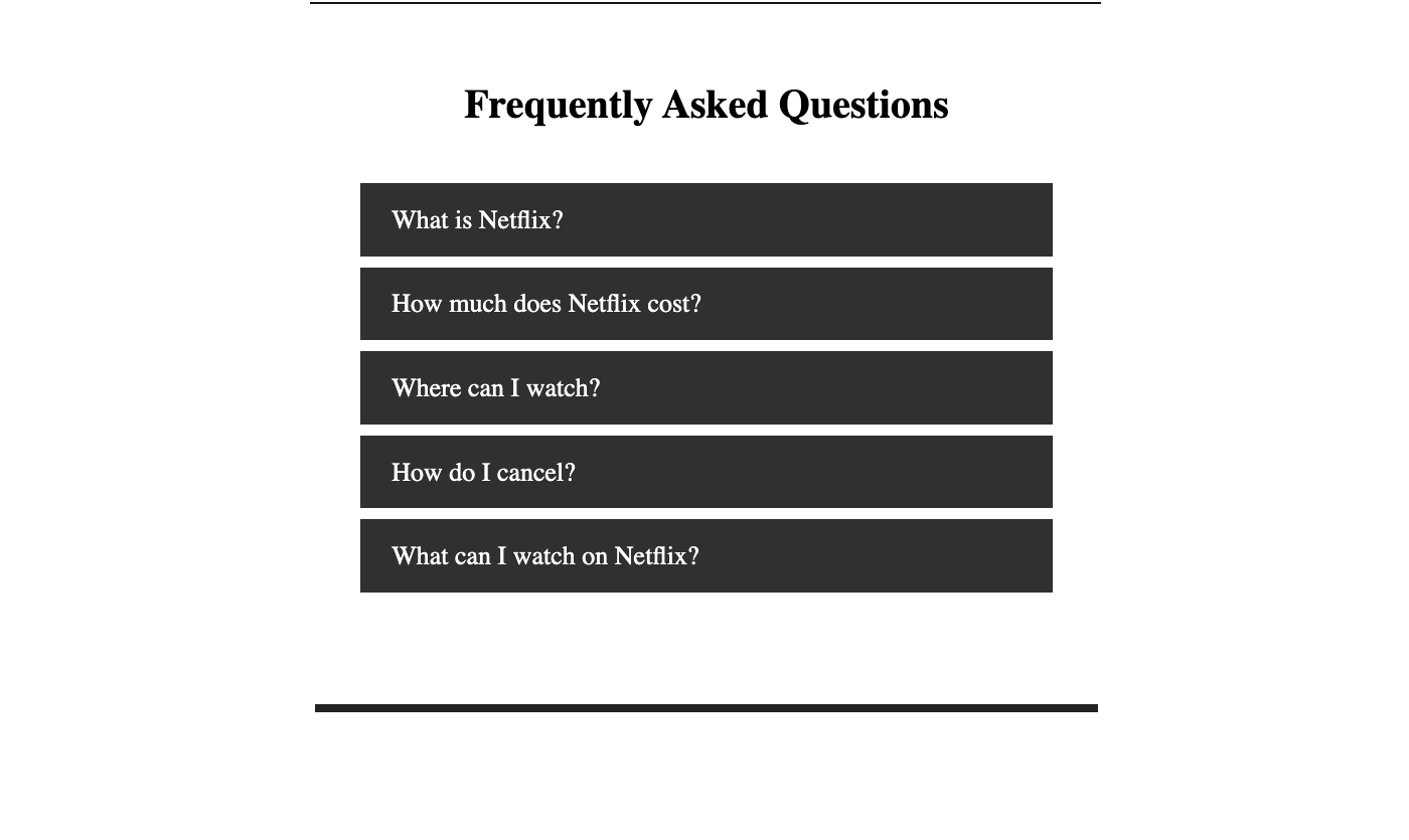
To see the pattern in action, we will build an accordion component that shares state through the Context API. The result is a reusable component that requires no prop drilling from the consumer. You will need a basic React setup and styled-components for styling.
Create a new project and start the development server:
npx create-react-app accordionComponent
cd accordionComponent
npm start
or
yarn create react-app accordionComponent
cd accordionComponent
yarn start
Install the styling library:
yarn add styled-componentsor
npm install --save styled-componentsInside src, create a components folder with two files: accordion.js and accordion.styles.js. The styles file holds the CSS-in-JS styling for the accordion.
import styled from "styled-components";

export const Container = styled.div`
  display: flex;
  border-bottom: 8px solid #222;
`;
Add the remaining styles to the same file:
export const Frame = styled.div`
  margin-bottom: 40px;
`;
export const Inner = styled.div`
  display: flex;
  padding: 70px 45px;
  flex-direction: column;
  max-width: 815px;
  margin: auto;
`;
export const Title = styled.h1`
  font-size: 40px;
  line-height: 1.1;
  margin-top: 0;
  margin-bottom: 8px;
  color: black;
  text-align: center;
`;
export const Item = styled.div`
  color: white;
  margin: auto;
  margin-bottom: 10px;
  max-width: 728px;
  width: 100%;
  &:first-of-type {
    margin-top: 3em;
  }
  &:last-of-type {
    margin-bottom: 0;
  }
`;
export const Header = styled.div`
  display: flex;
  flex-direction: space-between;
  cursor: pointer;
  margin-bottom: 1px;
  font-size: 26px;
  font-weight: normal;
  background: #303030;
  padding: 0.8em 1.2em 0.8em 1.2em;
  user-select: none;
  align-items: center;
  img {
    filter: brightness(0) invert(1);
    width: 24px;
    user-select: none;
    @media (max-width: 600px) {
      width: 16px;
    }
  }
`;
export const Body = styled.div`
  font-size: 26px;
  font-weight: normal;
  line-height: normal;
  background: #303030;
  white-space: pre-wrap;
  user-select: none;
  overflow: hidden;
  &.closed {
    max-height: 0;
    overflow: hidden;
    transition: max-height 0.25ms cubic-bezier(0.5, 0, 0.1, 1);
  }
  &.open {
    max-height: 0px;
    transition: max-height 0.25ms cubic-bezier(0.5, 0, 0.1, 1);
  }
  span {
    display: block;
    padding: 0.8em 2.2em 0.8em 1.2em;
  }
`;
Now let us build the component itself. Start with the imports and the Context object in accordion.js:
import React, { useState, useContext, createContext } from "react";
import {
  Container,
  Inner,
  Item,
  Body,
  Frame,
  Title,
  Header
} from "./accordion.styles";
The createContext() method produces a context object. When React renders a component that subscribes to this context, it reads the current value from the closest matching Provider above it in the tree. This file also sets up the base Accordion component, which accepts children and any other props:
const ToggleContext = createContext();
export default function Accordion({ children, ...restProps }) {
  return (
    <Container {...restProps}>
      <Inner>{children}</Inner>
    </Container>
  );
}
The dot notation — Accordion.Item, for example — connects each child component to its parent. Each child also accepts a children prop and restProps.
Continue by adding the child components:
Accordion.Title = function AccordionTitle({ children, ...restProps }) {
  return <Title {...restProps}>{children}</Title>;
};
Accordion.Frame = function AccordionFrame({ children, ...restProps }) {
  return <Frame {...restProps}>{children}</Frame>;
};
Accordion.Item = function AccordionItem({ children, ...restProps }) {
const [toggleShow, setToggleShow] = useState(true);
return (
<ToggleContext.Provider value={{ toggleShow, setToggleShow }}>
<Item {...restProps}>{children}</Item>
</ToggleContext.Provider>
);
};
Accordion.ItemHeader = function AccordionHeader({ children, ...restProps }) {
const { isShown, toggleIsShown } = useContext(ToggleContext);
return (
<Header onClick={() => toggleIsShown(!isShown)} {...restProps}>
{children}
</Header>
);
};
Accordion.Body = function AccordionHeader({ children, ...restProps }) {
const { isShown } = useContext(ToggleContext);
return (
<Body className={isShown ? "open" : "close"}>
<span>{children}</span>
</Body>
);
};Inside the Item component, state is initialized with the useState hook. The context Provider passes down both the current state value, toggleShow, and the setToggleShow method. The Header component reads those values from the context and changes the state on click. The Body component reads toggleShow to decide whether its contents are visible.
To test the accordion, create a data.json file with some content:
[
  {
    "id": 1,
    "header": "What is Netflix?",
    "body": "Netflix is a streaming service that offers a wide variety of award-winning TV programs, films, anime, documentaries and more – on thousands of internet-connected devices.\n\nYou can watch as much as you want, whenever you want, without a single advert – all for one low monthly price. There’s always something new to discover, and new TV programs and films are added every week!"
  },
  {
    "id": 2,
    "header": "How much does Netflix cost?",
    "body": "Watch Netflix on your smartphone, tablet, smart TV, laptop or streaming device, all for one low fixed monthly fee. Plans start from £5.99 a month. No extra costs or contracts."
  },
  {
    "id": 3,
    "header": "Where can I watch?",
    "body": "Watch anywhere, anytime, on an unlimited number of devices. Sign in with your Netflix account to watch instantly on the web at netflix.com from your personal computer or on any internet-connected device that offers the Netflix app, including smart TVs, smartphones, tablets, streaming media players and game consoles.\n\nYou can also download your favorite programs with the iOS, Android, or Windows 10 app. Use downloads to watch while you’re on the go and without an internet connection. Take Netflix with you anywhere."
  },
  {
    "id": 4,
    "header": "How do I cancel?",
    "body": "Netflix is flexible. There are no annoying contracts and no commitments. You can easily cancel your account online with two clicks. There are no cancellation fees – start or stop your account at any time."
  },
  {
    "id": 5,
    "header": "What can I watch on Netflix?",
    "body": "Netflix has an extensive library of feature films, documentaries, TV programs, anime, award-winning Netflix originals, and more. Watch as much as you want, any time you want."
  }
]
Finally, wire everything together in App.js. Map over the data and pass each item’s content to the respective component. Notice there is no state management or prop forwarding here — the Context API handles all internal communication.
import React from "react";
import Accordion from "./components/Accordion";
import faqData from "./data";
export default function App() {
  return (
    <Accordion>
      <Accordion.Title>Frequently Asked Questions</Accordion.Title>
      <Accordion.Frame>
        {faqData.map((item) => (
          <Accordion.Item key={item.id}>
            <Accordion.Header>{item.header}</Accordion.Header>
            <Accordion.Body>{item.body}</Accordion.Body>
          </Accordion.Item>
        ))}
      </Accordion.Frame>
    </Accordion>
  );
}
The final result:
A Note on Alternatives
The Render Props API is a common alternative for sharing code between components. A render prop is a function that returns a React element, invoked by the component instead of its own render logic. However, when components are deeply nested, using Context to share data avoids the prop drilling that render props can still fall into.
Weighing Flexibility Against Simplicity
The compound component pattern is a valuable addition to any React developer’s toolkit, particularly when building design systems or any library of reusable UI pieces. Its core strength is the flexibility it grants consumers: they can reorder, wrap, or omit sub-components as their layout demands, all while the internal state and logic stay coordinated through a shared context.
That flexibility, however, is not without a trade-off. For simpler, self-contained components where the internal structure is unlikely to change, a Render Prop or even a plain prop-driven API is often the more pragmatic choice. Compound components shine when you are confident that the parent-child relationship you have designed will remain stable and that the consumers genuinely need that level of control over the rendered output.
Throughout this walkthrough, we have explored how to implement this pattern using the Context API to share state seamlessly between the accordion container and its parts—whether those are titles, content panels, or custom trigger elements. The pattern also promotes a cleaner separation of concerns, letting the parent manage state and the children focus purely on presentation.
A working version of the accordion we built is available on CodeSandbox for reference.
Further Reading
If you are interested in exploring related front-end topics, the following articles are a good starting point:


