Supporting both light and dark modes has historically meant juggling prefers-color-scheme media queries, building a separate override path for visitors who want to deviate from their OS setting, and reworking a palette so it stays accessible in both directions. Modern CSS removes most of that work.
The native dark theme
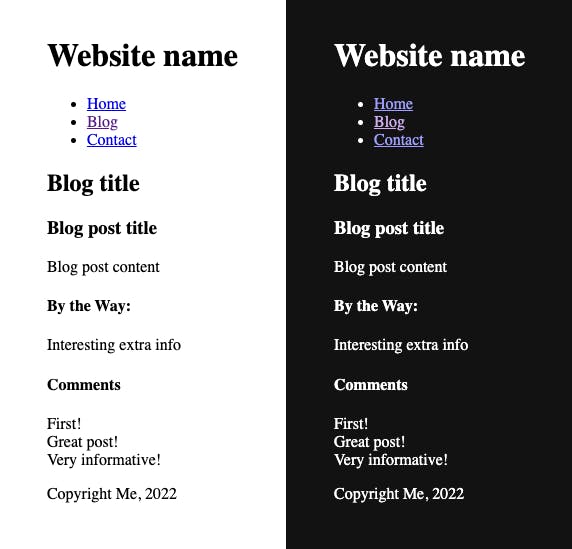
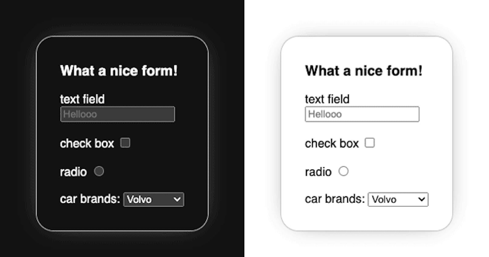
HTML ships with more than the familiar black-on-white rendering: there is also a native white-on-black version. Using it as the foundation for a dark interface means form inputs, buttons and other interactive elements already look right without extra fixing.
Switching via color-scheme
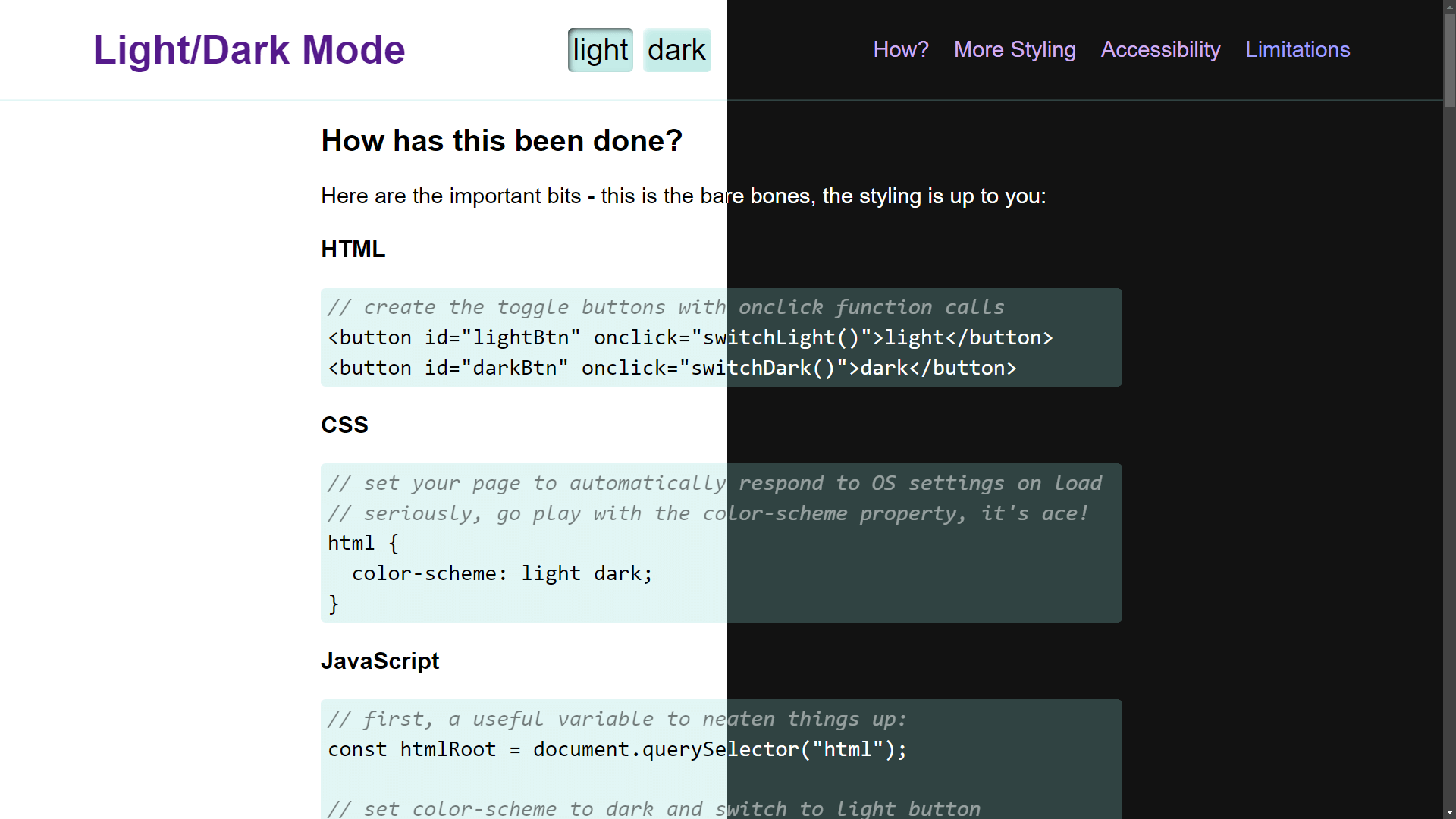
A single declaration of color-scheme: light dark on the root element makes the browser apply whichever scheme matches the visitor's OS setting — no media queries, no other CSS. The same instruction can be issued from HTML with a <meta> tag:
html {
  color-scheme: light dark;
}
<meta name="color-scheme" content="light dark">Both routes do the same thing: they tell the browser that both schemes are available and that the one matching user preference should be applied. No prefers-color-scheme blocks are needed just to swap colors.
The property also accepts single values. color-scheme: light is redundant because light is already the default. Either the <meta> tag or the CSS declaration can be driven by JavaScript. You can also scope the property to individual elements rather than the whole page, though scoped elements then need explicit color and background-color, since otherwise they stay transparent and inherit their text color.
System colors that flip themselves
The blacks and whites in these native themes are usually off-black and off-white to soften contrast, and the exact values differ between browsers. Crucially, the current default background and text colors are exposed as <system-color> values that flip automatically along with color-scheme: Canvas for the background and CanvasText for text.
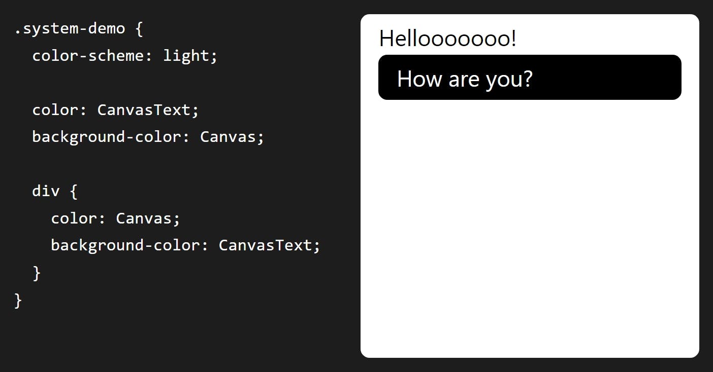
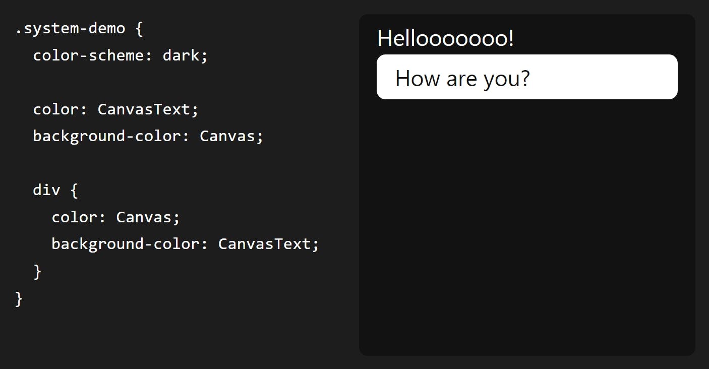
CanvasText behaves roughly like currentColor, except it stays the default text color and does not change when you assign a color. MDN documents 19 <system-color> keywords in total. These names are case-insensitive and typically written in camelCase or PascalCase:
AccentColor/AccentColorText— background and text for accented UI controls.ActiveText— text color of active links.ButtonBorder,ButtonFace,ButtonText— base border, background and text colors for controls.Canvas/CanvasText— application or document background and its text color.Field/FieldText— background and text colors for input fields.GrayText— text color of disabled items.Highlight/HighlightText— background and text colors for selected items.LinkText— color of non-active, non-visited links.Mark/MarkText— background and text colors for<mark>content.SelectedItem/SelectedItemText— background and text colors for selected items such as a checked checkbox.VisitedText— color of visited links.
Rendering is not perfectly consistent. Even though evergreen browsers broadly support these keywords, implementations vary across operating systems and browsers, and some fail to flip with color-scheme as intended. Egor Kloos (dutchcelt) tracks their status in a CodePen and uses them in his classless framework system.css.
Three ways to declare colors for both modes
Once automatic switching works, the question becomes how to express colors so a single declaration serves both schemes. Ranked from least to most preferred:
1. Opacity
Keep the same background colors in either mode but make them translucent, e.g. rgb(128 0 0 / 0.5) or #80000080, so Canvas shows through. The result can look muted and the trick is unusable for text colors, but it themes a page quickly — the author used it for code blocks in an older demo.
2. color-mix()
color-mix(in oklab, Canvas 75%, RebeccaPurple);Mixing is the more controlled cousin of opacity, and system colors can be mixed directly: one operand may be Canvas or CanvasText so backgrounds always blend with Canvas and text always blends with CanvasText. The first argument to color-mix() sets the color space; OKLAB is a rectangular space like sRGB, so mixing it with sRGB values gives predictable results, though cross-space mixes are permitted. The remaining arguments are the colors and optional proportions, defaulting to a 50/50 split; if the stated percentages don't total 100%, the function normalizes them.
This suits designs that keep the same hues and saturations in both modes.
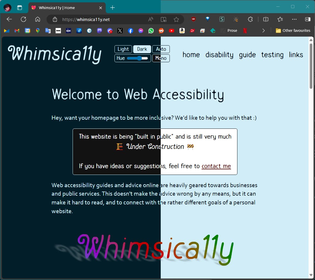
The author's example pairs OKLCH and HSL theme colors and notes that the HSL version looked far "flashier" as the hue slider moved. Polar spaces like HSL make it easy to walk lightness and saturation, but achieving consistent perceived lightness across multiple hues — and enough contrast across the spectrum — is hard. OKLCH is also polar: pick a hue, then adjust chroma (roughly HSL saturation) and lightness. Both OKLCH and OKLAB are built to track human perception of brightness and color better than transitions in sRGB, so contrast between computed colors stays stable even when the site-wide theme color changes.
3. light-dark()
light-dark(lavender, saddlebrown);Where color-mix() ties a light-mode color to a mechanically derived dark counterpart — pale lavender becoming very dark lavender — light-dark() gives each mode an independent choice, such as pale lavender against deep burnt sienna brown. color-mix() can still be nested inside it. The function requires color-scheme: light dark (or the matching meta tag) so it can honor the system preference or whichever single value is set. Note that browser support sat at just over 80% of all users at the time of writing, so a fallback may be warranted.
Why this beats media queries
Querying prefers-color-scheme in @media only ever follows the OS setting, which breaks down once you want to offer a choice decoupled from the device preference. That has traditionally required extra classes, duplicated rules or custom properties.
color-scheme delivers three things at once:
- A basic monochrome dark mode for free.
- Native switching driven by OS preference.
- Colors declared inside
light-dark()follow a mode toggled from JavaScript.
The mechanics reduce to setting the scheme to light, dark, or automatic. Offering those three as separate options simplifies life: a new visitor lands in auto mode, which is the least jarring default, and there is no need to detect the preferred mode in order to pick the right icon or toggle action, nor to keep a prefers-color-scheme listener — the CSS declaration handles changes.
Switching without JavaScript
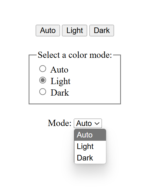
A pure CSS switcher is possible with some caveats: it cannot use <button> (only radio inputs or <option> elements in a <select>), it works per page rather than per site so the choice is lost on reload, and it relies on the :has() pseudo-selector, which most modern browsers support but some older devices do not.
/* default, or 'auto' */
html {
  color-scheme: light dark;
}

html:has([value="light"]:checked) {
  color-scheme: light;
}

html:has([value="dark"]:checked) {
  color-scheme: dark;
}
The latter two rules match any element carrying a value of "light" or "dark" and impose the matching color-scheme only while that element is :checked. On large pages the selector should be narrowed; the examples below scope the value check to an element with id="mode-switcher".
html:has(#mode-switcher [value="light"]:checked) { color-scheme: light }
/* Did you know you don't need the ";" for a one-liner? Now you do! */
A <select> or a radio group both work. Checkboxes are deliberately excluded — they aren't meant for mutually exclusive options, and if several are checked the last matching declaration wins (dark in these snippets).
Switching with JavaScript
Buttons as controls, or persistence across visits, require script — a case for Jeremy Keith's maxim that JavaScript should only do what only JavaScript can do.
Via the <meta> tag
<meta name="color-scheme" content="light dark">const colorScheme = document.querySelector('meta[name="color-scheme"]');colorScheme.setAttribute("content", "light"); // to light mode
colorScheme.setAttribute("content", "dark"); // to dark mode
colorScheme.setAttribute("content", "light dark"); // to auto modeVia the <html> element
When the property lives in CSS instead of a meta tag, select the root element rather than grabbing a constant:
html { color-scheme: light dark; }const html = document.querySelector('html');html.style.setProperty("color-scheme", "light"); // to light mode
html.style.setProperty("color-scheme", "dark"); // to dark mode
html.style.setProperty("color-scheme", "light dark"); // to auto modeWrapping the manipulations in reusable functions keeps things tidy:
function switchAuto() {
  html.style.setProperty("color-scheme", "light dark");
}
function switchLight() {
  html.style.setProperty("color-scheme", "light");
}
function switchDark() {
  html.style.setProperty("color-scheme", "dark");
}
Or, favoring DRY, something along these lines:
function switchMode(mode) {
  html.style.setProperty("color-scheme", mode === "auto" ? "light dark" : mode);
}
Event handling can use onchange and onclick attributes, which read cleanly, though attaching a change event listener works equally well and is preferable when other actions must fire on change. An onclick button still responds to Spacebar and Enter.
Remembering the choice
Nothing so far survives the visitor leaving. The Web Storage API offers two ways to fix that.
localStorage
Data stays on the device, never expires and is never sent to your server, but is lost when the visitor clears cookies and cache. Store the preference with .setItem() under a key of your choosing:
localStorage.setItem("mode", "dark");const mode = localStorage.getItem("mode");The stored value can then be read back and applied on return visits.
sessionStorage
Session storage is discarded once the visitor leaves for another site or closes the window/tab, but persists while they move between pages on the same domain. The API call looks much the same:
sessionStorage.setItem("mode", "dark");
const mode = sessionStorage.getItem("mode");
Choosing between them
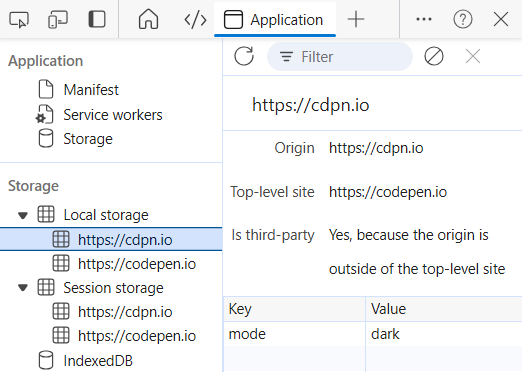
The author started with sessionStorage to keep the site simple and avoid a GDPR-compliant cookie banner triggered by retaining a preference past the session. Sites dominated by new visitors are the same case. Sites with many returning visitors are better served by localStorage, where the convenience is worth the compliance work. To inspect a localStorage implementation, open developer tools (F12 on Windows; CTRL+click and "Inspect" on macOS), go to the Application tab and find https://cdpn.io among stored items — the demo's key mode holds dark or light and updates as the controls are clicked.
Accessibility
Offering both versions helps real people: those with strong eye floaters may prefer dark mode, while people with astigmatism may focus more easily in light mode. Fewer visitors end up straining to read.
Contrast
Pure black-on-white or white-on-black is striking but can trigger migraines in people who do better with lower contrast. High contrast, meanwhile, genuinely helps people whose visual impairment makes sharp focus impossible, and WCAG minimum contrast levels should be exceeded. The prefers-contrast media query accepts no-preference, more, less and custom. In the author's example, built with :has() and color-mix(), a <select> exposes contrast settings: "Low" applies a page-wide contrast(75%) filter, while "High" uses unmixed CanvasText and Canvas for text and background. Combined with dark and light, that yields three contrast levels × two modes — six color schemes.
ARIA
ARIA exists for extra information to screen readers and assistive tech where needed, and no ARIA is better than bad ARIA. Native HTML elements generally suffice out of the box, especially with descriptive button text. The one ARIA addition here is aria-pressed on the mode buttons, since unlike a radio group or select it would otherwise be unclear which button is active; a screen reader then announces the name plus pressed or unpressed state. Each button has an id used to build handy consts; on every mode change the selected button's aria-pressed becomes true while the other two become false:
const html = document.querySelector("html");
const mode = localStorage.getItem("mode");
const lightSwitch = document.querySelector('#lightSwitch');
const darkSwitch = document.querySelector('#darkSwitch');
const autoSwitch = document.querySelector('#autoSwitch');

if (mode === "light") switchLight();
if (mode === "dark") switchDark();

function switchAuto() {
  html.style.setProperty("color-scheme", "light dark");
  localStorage.removeItem("mode");
  lightSwitch.setAttribute("aria-pressed","false");
  darkSwitch.setAttribute("aria-pressed","false");
  autoSwitch.setAttribute("aria-pressed","true");
}

function switchLight() {
  html.style.setProperty("color-scheme", "light");
  localStorage.setItem("mode", "light");
  lightSwitch.setAttribute("aria-pressed","true");
  darkSwitch.setAttribute("aria-pressed","false");
  autoSwitch.setAttribute("aria-pressed","false");
}

function switchDark() {
  html.style.setProperty("color-scheme", "dark");
  localStorage.setItem("mode", "dark");
  lightSwitch.setAttribute("aria-pressed","false");
  darkSwitch.setAttribute("aria-pressed","true");
  autoSwitch.setAttribute("aria-pressed","false");
}
<button id="autoSwitch" aria-pressed="true" type="button" onclick="switchAuto()">Auto</button>
<button id="lightSwitch" aria-pressed="false" type="button" onclick="switchLight()">Light</button>
<button id="darkSwitch" aria-pressed="false" type="button" onclick="switchDark()">Dark</button>On load, the "Auto" button is active by default; if localStorage holds another mode, it is applied immediately through switchLight() or switchDark(), both of which carry the corresponding aria-pressed updates. aria-pressed also works as a styling hook:
button[aria-pressed="true"] {
  background-color: transparent;
  border-width: 2px;
}
The result is a button switcher that displays and announces its state and remembers the visitor's choice on return — or on reload, in the case of the session-based approach.




