Instagram’s new Story text tools: fonts, animations, and the engineering behind them
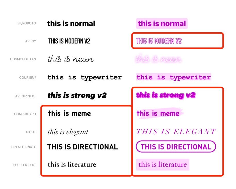
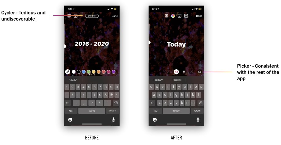
In August 2020, Instagram overhauled the text tools for Stories and Reels, introducing a set of dynamic text styles and animations. It was the first major update to those tools since 2016. Beyond the new styles (which now come in decorated and non-decorated versions for every style, plus an updated picker for browsing them), the project involved nontrivial work on font delivery, animation design, and handling text rendering edge cases across platforms. iOS users also get an extra hidden text style as an Easter egg.
Android fonts: from APK to a custom storage solution
On iOS, all the fonts needed for the new styles ship with the OS. Android is different: those fonts aren’t available by default, and the historical workaround—bundling font files inside the APK—was no longer viable. App size directly hurts adoption; per Google Play data cited in the engineering process, every 6 MB increase in APK size corresponds to a 1% drop in install conversion rate. The required fonts totaled 4.5 MB, which could mean roughly 700K fewer monthly installs.
Google’s Downloadable Fonts framework was tried next. It handles downloading and caching fonts across apps, but after building it out, the team found it missing a couple of essential fonts. The final approach was a custom solution built on Everstore, an internal BLOB storage system (based on Haystack). Working with asset management experts, the team built a generic repository with a client API for fetching, registering, and caching assets, usable anywhere in the app—not just Stories. This avoided third-party dependency and gave full control over the product.
When engineering hits a design wall
The collaboration between engineering and design was central to this project. Engineers often worked from initial designs and built their own implementations per platform, which meant plenty of math and parsing design files to reproduce shapes and animations. When technical constraints made a particular visual difficult, live collaboration with designers enabled pragmatic evolutions of the design.
That was the case for a style called Directional, whose decorated version was originally intended to look like this:
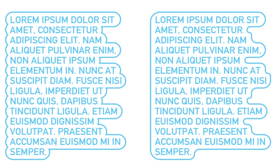
Design’s guidance was to build whichever version was easier to implement. Both approaches came with complications.
Drawing arcs: Using Apple’s addArcWithCenter:radius:startAngle:endAngle:clockwise: to draw arcs between points defining the text shape produced scenarios where arcs didn’t meet perfectly.
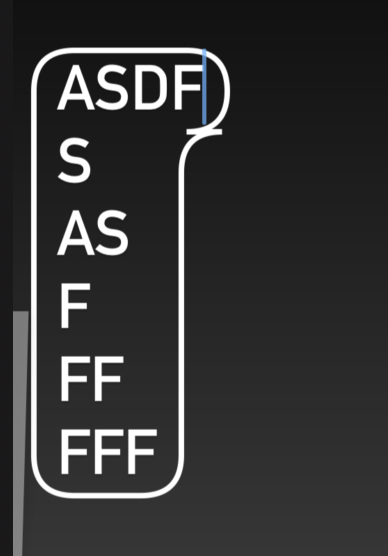
Switching to a bezier path for the outline—appending either a quadratic curve or a line depending on the text shape—yielded the same misalignment.
A bezier path around many bezier paths: For the left-side version, the approach was to create one large bezier path outlining many smaller ones. Bounding rectangles were created for each line of text, then rounded.
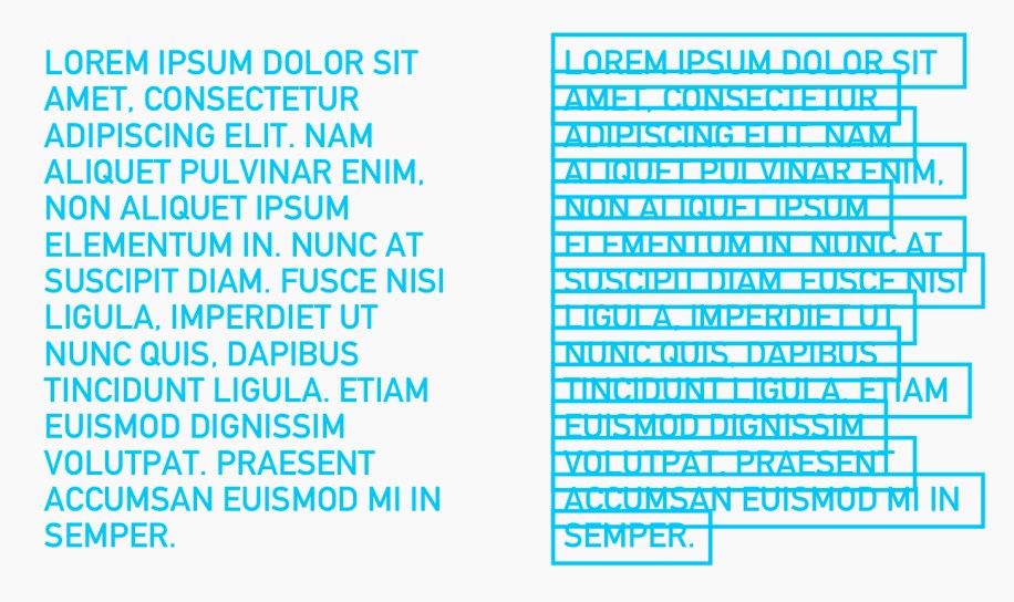
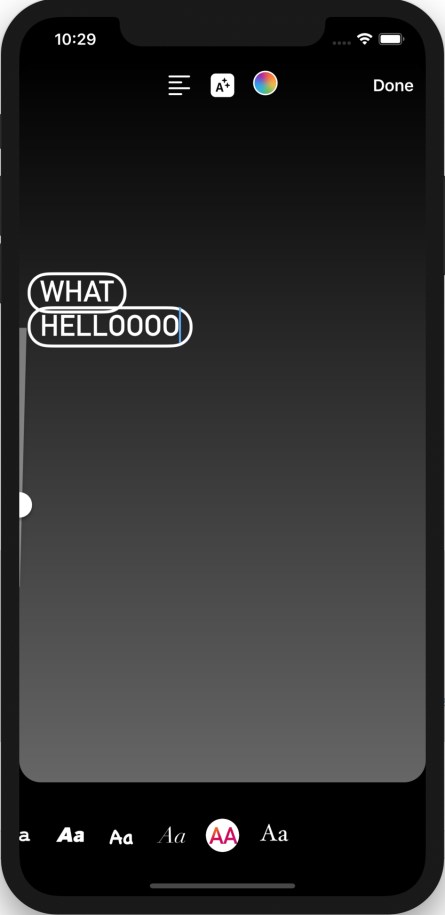
A function defined the outline shape by returning a BOOL for whether a point was inside or outside it. That function was then used to assign an edge type to every point in a rectangle, producing a contour that an existing function could convert to a bezier path. It worked for most cases, but got noticeably laggy with large amounts of text. Consulting with design, the team revised Directional’s decorated version to use a filled background behind the text instead.

Animating text word by word, properly
The Classic text style animates by revealing one word at a time. The first question is: what’s a word? Splitting on spaces doesn’t generalize across all languages. iOS offers natural language processing APIs—NSLinguisticTagger (now replaced by the Natural Language framework)—which break strings into linguistic tokens. The team used that to implement the word-by-word reveal.
During the animation, three text ranges matter: the fully revealed portion, the word currently being revealed, and the still-hidden remainder. These ranges are computed from animation progress and total duration using the language-aware word splitting.
Debugging a crash that wasn’t where it seemed
New features on Instagram are tested via A/B testing on small user samples before full rollout. The new fonts were tested against a control group, which unexpectedly showed slightly higher crash rates in the test group. Because the infrastructure for fetching and caching fonts from storage had been used and tested before, the team spent roughly a month investigating elsewhere. The real culprit turned out to be in that tested infrastructure itself: it failed to clean up files it allocated.
Character-by-character reveals get complicated
Typewriter and Literature use character-by-character reveal animations with a blinking cursor. On Android, story text and stickers are powered by Drawables, making it tempting to store character offsets and draw each character individually based on animation progress. But several text features complicated that: ligatures, emojis, text alignment (especially RTL vs. LTR), selective color for some fonts, text emphasis, and special handling for #hashtags and @mentions—the last three being powered by custom Spans.
These had to work across all the new animation styles. A teammate spotted a bug in RTL text (e.g., Persian) during development, which led to finding more RTL and ligature issues—particularly in emphasized versions of new styles.
Ligatures were the biggest challenge for character-by-character reveal animations: a ligature combines two or three characters into a single one, so revealing each character individually doesn’t display correctly. For example, the Persian word عشق (love) drawn character-by-character reads ع ش ق, which is not legible. The right approach was to build on top of each character as revealed.
The first attempted solution used TextPaint and Canvas#drawText(). Keeping a reference to the full rendered text and drawing only a portion (based on progress from start to the latest revealed character) handled ligatures, since characters were rendered grouped together, not one at a time. Emojis were handled using BreakIterator#getCharacterInstance() to find the correct position of the latest revealed character.
This approach covered most text features via TextPaint color APIs, but it didn’t support underlines for @mentions and #hashtags, text emphasis, or selective colorized text (where users can choose different colors for portions of text) out of the box. Those were implemented as custom spans affecting layout, which Canvas#drawText() wouldn’t account for.
The second approach cached StaticLayouts for text portions to be rendered at different frames, drawing each line and character based on animation progress. This supported Spannable text (underlines, selective color) and layout parameters like alignment, which also worked correctly for RTL vs. LTR languages.
Canvas#drawTextRun() was also considered—it would have been ideal for drawing individual characters while respecting ligatures—but it’s only available on API 23+. In favor of simpler, cleaner code, the implementation used StaticLayout instead.
iOS had similar challenges with emojis and multi-character sequences, but the solution was more straightforward: once the assumption that every letter or emoji is a single character was removed, most bugs were resolved.
Process lessons from a text-animation project
Beyond the technical implementation, two process-related lessons stood out. The first was the value of a dedicated engineering and design chat for fast iteration. The channel was restricted to individual contributors—no managers—which created a low-pressure setting focused on craft and polish. Engineers could raise edge cases without hesitation, and because both Android and iOS teams shared the same channel, everyone received the same feedback simultaneously.
This setup proved especially useful for small refinements. For instance, settling on the ideal line height multiple for a text style came down to exchanging a few screenshots back and forth in the chat. The approach is documented in more detail in a related thread on the benefits of a combined engineering/design chat.
The second takeaway was the necessity of continuous regression testing. Text rendering is packed with edge cases—emojis, right-to-left scripts, ligatures—and a single QA pass was insufficient. Fixing one bug frequently introduced unexpected breakage elsewhere, so repeated testing across multiple languages from the start would have caught issues earlier.


