
When Viewport-Only Thinking Fails
Responsive design introduced media queries over a decade ago, letting developers adapt layouts to viewport size. That approach served the industry well as mobile browsing exploded. But the modern component-driven workflow—building isolated components meant to work anywhere—exposes a gap: components often need to respond to the space they actually occupy, not the overall viewport.
Frameworks like Bootstrap patched this with responsive grid utility classes. Those classes add an orchestration layer and can produce awkward nested layouts. CSS Grid and Flexbox offer partial solutions by letting items reflow, but they can't adjust other properties like padding or font size based on container width.
CSS container queries fill that gap. Instead of responding only to the viewport, a component can respond to the width of its own container. You can still use a global grid for page structure, while inner components change their own styles depending on whether they're placed in a wide or narrow column.
Container queries let you define a component's full range of behavior precisely, adjusting padding, typography, background images, or even the display property of children based on the container's size.
Setting Up a Container
The queried "container" is the element you measure, but the rules you write inside a container query only affect that container's descendants. For example, you might designate main, article, or even list items as containers.
The core property is container-type, which you set to inline-size to create the containment context. Without it, queries won't resolve.
.container {
  container-type: inline-size;
}
You can name a container with container-name or use the shorthand container property, which takes the name first, then a slash, then the containment type.
.container {
  /* shorthand: name / type */
  container: my-container / inline-size;
}
Two important behaviors to remember:
- Container queries modify descendants, never the container element itself.
- Containers can nest. A queried element uses its nearest ancestor with containment applied, which makes results potentially surprising when nested containers exist.
Writing the Query
The syntax mirrors media queries, starting with @container and using conditionals like (min-width: 300px). The comparison runs against the computed width of the nearest container.
Assume you've placed a container class on <main> that holds several <articles>. You can then write a query that adjusts the articles' styles based on main's width.
<main class="container">
  <article>...</article>
  <article>...</article>
  <article>...</article>
</main>
A useful mental model is "narrowest container first": write base styles for the smallest expected width, then layer container queries to enhance styles as the container grows.
article {
  padding: 1rem;
  font-size: 1rem;
}

@container (min-width: 60ch) {
  article {
    padding: 2rem;
    font-size: 1.25rem;
  }
}
Note that font-relative units like ch or em are intended to reference the container's font size, but at the time of writing they still fall back to the root font size. The spec may expand to allow querying other properties later.
Nested Containers and Layout Pitfalls
If you use Flexbox or Grid to lay out multiple children inside a container, direct querying gets more complicated. Suppose main is a flex container and articles are flex items. You might expect each article to switch styles when its own width falls below the query threshold.
main {
  display: flex;
  flex-wrap: wrap;
}

article {
  flex: 1 1 30ch;
}
But because main is the only containment context, articles won't change until main itself narrows. Flex or grid layout can't be queried directly on the items. The fix: wrap each article in its own container element.
<main class="container">
  <div class="container article"><article>...</article></div>
  <div class="container article"><article>...</article></div>
  <div class="container article"><article>...</article></div>
</main>
Move the flex definition to the new wrapping div, which also carries the container class:
.article {
  flex: 1 1 30ch;
}
Now the layout behaves as expected: when the flex items wrap and one spans the full width, that last item adopts the wider container's styles.
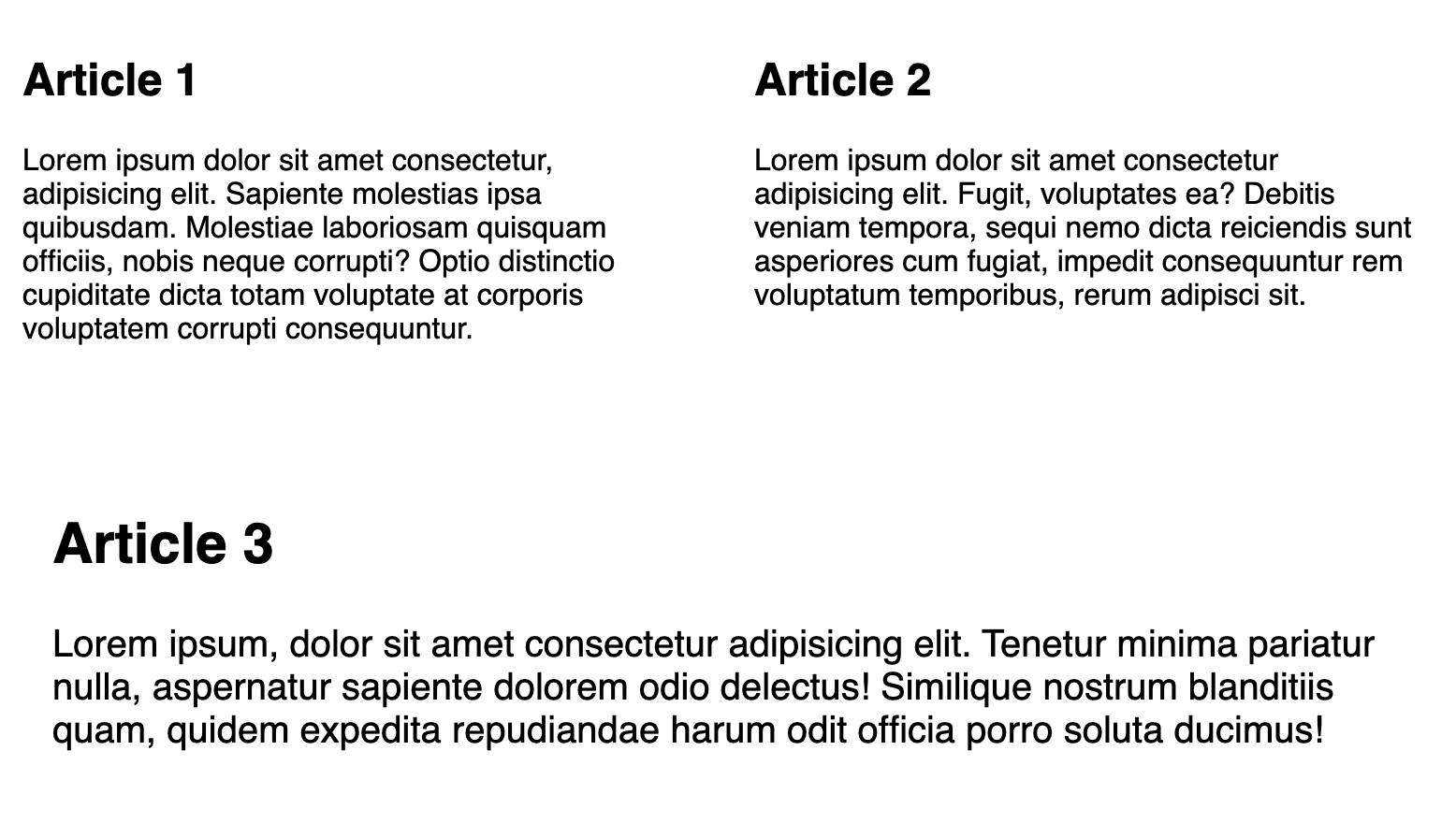
In this setup, main remains a container too. That means any rules matching the article class are interpreted against main's width, not the wrapper's width. Mixing containers at different nesting levels will likely be the biggest source of confusion during implementation.
Keeping main as a container also means rules that target the article element respond to the width of main, not the article's own wrapper. This layered behavior demands careful bookkeeping.
As the spec matures, two techniques should help:
- Query only one level up within a
@containerblock. - Name containers with
container-nameto make queries explicit.
The trade-off is additional DOM elements—wrappers for flex children, for example—which can muddy semantics.
Finally, if a query is defined but the element has no ancestor with containment, the query simply won't resolve. Containment context is required for the feature to work at all.
Selector Rules on Containers
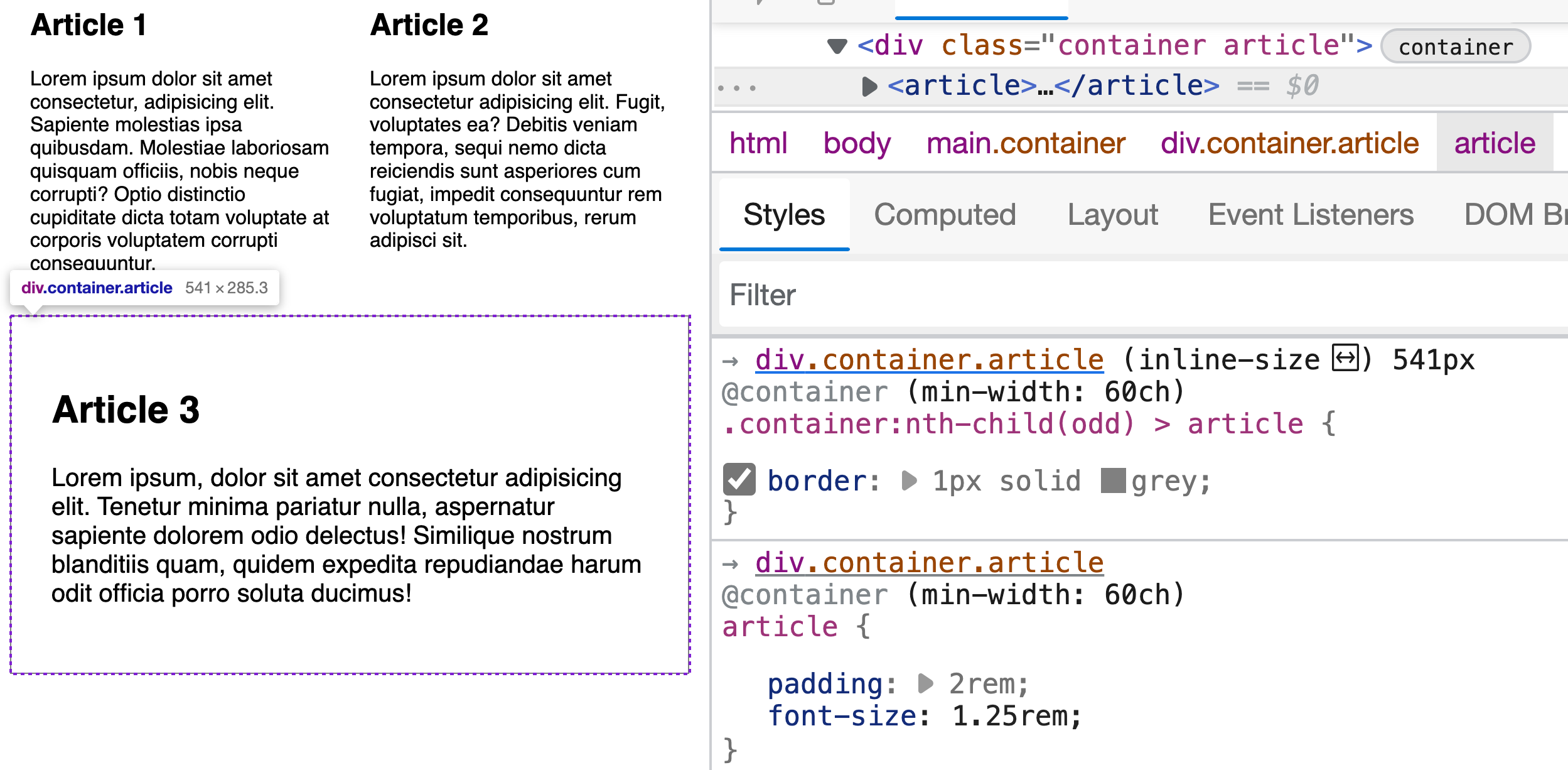
A container can't be styled from within its own query, but it can appear as part of a selector targeting its children. That's useful for retaining pseudo-classes like :nth-child that originate on the container.
For the article example, adding a border to every odd article starts with the container class, then the pseudo-class:
@container (min-width: 60ch) {
  .container:nth-child(odd) > article {
    border: 1px solid grey;
  }
}
This approach benefits from less generic container class names so the relationship between container and queried rule stays readable.
From Viewport Rules Toward Container Rules
On a Smashing author profile page such as Stephanie Eckles’s, the article teasers rearrange themselves along with the viewport. At narrow widths, the avatar and name stack above the headline, while the reading time and comment stats sit between the headline and the excerpt body. A bit wider, and the avatar floats left against the content. At the largest widths, those stat links move to the right alongside the excerpt.
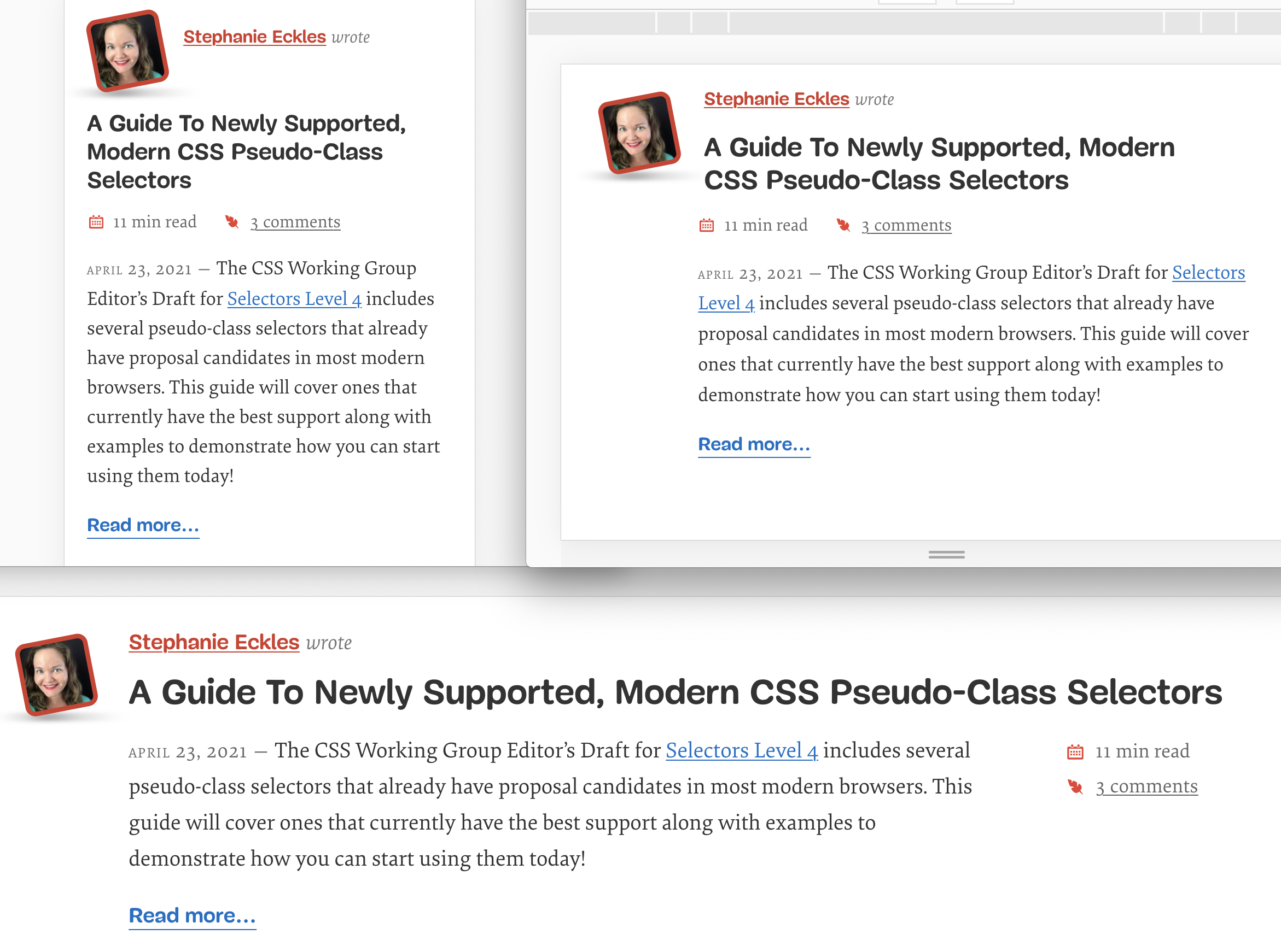
That same component can instead respond to the container it lives in by pairing container queries with CSS grid template areas. Start with the narrow layout — browsers without container-query support will pick up that base arrangement too. The demo carries over the minimum Smashing styles needed, changing just one part of the existing DOM: the headline moves into the component's header and becomes an h2.
<article class="article--post">
  <header>
    <div class="article--post__image"></div>
    <span class="article--post__author-name"></span>
    <h2 class="article--post__title"></h2>
  </header>
  <footer class="article--post__stats"></footer>
  <div class="article--post__content"></div>
</article>
Treat each teaser as a direct child of main and define that parent as the container:
main {
  container-type: inline-size;
}
The narrow state stacks three sections — header, stats, excerpt — in ordinary block flow. Assigning a grid template now, plus placing each element into named areas, lays the groundwork for later container-width adjustments.
.article--post {
  display: grid;
  grid-template-areas:
    "header"
    "stats"
    "content";
  gap: 0.5rem;
}

.article--post header {
  grid-area: header;
}

.article--post__stats {
  grid-area: stats;
}

.article--post__content {
  grid-area: content;
}
Named grid template areas make rearranging far more readable, and grid’s layout engine fits this component better than flexbox for resizing the areas between queries. The header also needs a template of its own so the avatar, author name, and headline can move independently:
.article--post header {
  display: grid;
  grid-template-areas:
    "avatar name"
    "headline headline";
  grid-auto-columns: auto 1fr;
  align-items: center;
  column-gap: 1rem;
  row-gap: 0.5rem;
}
That template puts the avatar in the first row’s first column and the name beside it; the second row gives the headline both columns, signified by repeating the same area name. Because the default behavior would split both columns evenly at 1fr, grid-auto-columns is set so the first column is only wide enough for the avatar while the name gets the remaining space. Then the matching child elements are placed:
.article--post__image {
  grid-area: avatar;
}

.article--post__author-name {
  grid-area: name;
}

.article--post__title {
  grid-area: headline;
  font-size: 1.5rem;
}
A base font-size on the title is set here too; it grows with the container. The stats list gets a horizontal flex arrangement that holds until the widest container state:
.article--post__stats ul {
  display: flex;
  gap: 1rem;
  margin: 0;
}
A note: gap with flexbox is supported in all current browsers.
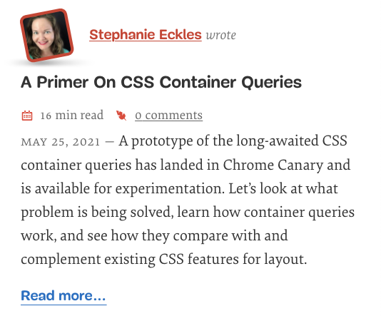
Querying the Container Instead of the Viewport
The first of two query steps builds the medium view, this one keyed to the container’s width in characters — 60ch — rather than pixels. Font-relative lengths tie layout changes to line length, which works well where text-heavy components are involved.
At this size the article-level and header-level templates both adjust:
@container size(min-width: 60ch) {
  .article--post header {
    grid-template-areas:
      "avatar name"
      "avatar headline";
    align-items: start;
  }

  .article--post {
    grid-template-areas: "header header" ". stats" ". content";
    grid-auto-columns: 5rem 1fr;
    column-gap: 1rem;
  }

  .article--post__title {
    font-size: 1.75rem;
  }
}
The header now spreads the avatar across the first column of both rows; the name occupies row one, column two, and the headline row two, column two. Because the avatar becomes flush to the content’s top, the header adds align-items: start.
On the article grid, the header claims there are two columns in the top row. An unnamed area — the . — is placed in column one of rows two and three so the avatar appears to hang in its own column. grid-auto-columns again narrows that first column to match the avatar’s width.
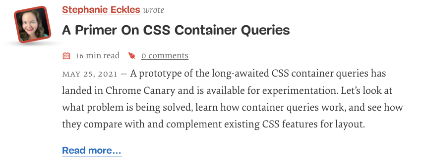
And The Wide Container State
The widest tiers move the stats list onto the right of the excerpt but keep it under the headline. The second query uses 100ch:
@container size(min-width: 100ch) {
  .article--post {
    grid-template-areas: "header header header" ". content stats";
    grid-auto-columns: 5rem fit-content(70ch) auto;
  }

  .article--post__stats ul {
    flex-direction: column;
  }

  .article--post__title {
    max-width: 80ch;
    font-size: 2rem;
  }

  .article--post__content {
    padding-right: 2em;
  }
}
That step operates across three columns. All three come first on row one as the header area, while row two’s first column is shared by the excerpt content and the stats via the same unnamed marker.
The real Smashing article page never spans its full layout width, so the column length is capped within grid-auto-columns using fit-content. That reads as “fill the space up to my intrinsic maximum, but no more than the value supplied” — here 70ch. The column can still shrink when space is tight. The stats column follows with auto, so it takes only the inline width its own content demands.
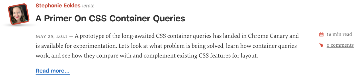
Letting The Teaser Respond to Its Surroundings
The approach might look like viewport-based media queries under another name. In this particular demo the single article sits inside one parent that itself responds only to the viewport, so the symptoms are the same. What has actually happened is that the component is now ready to work on an article page or inside the multi-column home page. Part of making those distinctions real means the element carries its own container along with it.
The parent is changed from main to an explicit wrapper on each article:
<div class="article--post-container">
    <article class="article--post"></article>
</div>
That wrapper is assigned as a container:
.article--post-container {
  container-type: inline-size;
}
Place teasers in a flex-based grid like the intro example — one article set alone over a two-column flex grid — and each container now changes layout independent of the viewport:
[Embedded video]
That freedom is the point of container queries. The full working demo, flex grid included, is available as a CodePen: Container Queries Case Study: Smashing Magazine Article Excerpts by Stephanie Eckles.
Container Queries as a Progressive Enhancement
Because container queries are only supported in newer browsers, the safest path today is to treat them as a progressive enhancement. Start with styles that work without container queries, then layer query-driven rules on top. Browsers that don't support container queries will still render a functional — if less refined — layout.
The real appeal of container queries is that they let layout and styling respond to the size of the component itself, independent of the viewport. That opens up several useful patterns, along with a few considerations worth keeping in mind.
Fluid Typography and Container Relative Units
Responsive typography has typically been handled with clamp() and viewport units. Container queries add a dedicated set of units — "container query length units" — that correspond to a percentage of the container's size in a given direction. The cqi unit, for example, represents 1% of the container's inline size and can replace vw in fluid type solutions, letting text scale with the element that actually holds it.
That flexibility comes with an accessibility caution. If text shrinks dramatically in narrower containers (which may also happen when a user zooms the page), it can prevent a user from ever reaching a 200% increase in base font size. As container query usage grows, expect more guidance on balancing fluid typography with zoom and font-size accessibility requirements.
Changing Display Behavior
Container queries make it possible to switch a component's display from grid to flex, or to completely replace its grid template definitions. This is where many current demos focus: repositioning children based on the container's available width. For example, a newsletter form might alternate between horizontal and stacked layouts, grid sections could flip their ordering, or contact cards could dynamically shift avatar and content placement depending on whether they sit in a sidebar or span the full page.
This level of control is more precise than viewport-driven media queries, which often require utility layers to approximate the right layout. With container queries, the component's own behavior can adjust exactly as its containing space changes. As with any reordering, keep a logical tab order for interactive elements like links, buttons, and form fields.
Show, Hide, and Rearrange
For complex components, container queries can handle variations that media queries handle poorly. A navigation menu with many links is a good example: when the container narrows, certain links could hide while a dropdown takes their place. Container queries can watch individual sections of the navigation bar independently, rather than forcing a single viewport breakpoint onto the whole component.
Build Once, Deploy Everywhere
The promise for design systems and component libraries is significant. Components that self-manage their layout within any given space reduce the friction of dropping them into an existing layout. In practice, however, dynamic resizing isn't always desirable. A component might assume a certain font-size change, but a particular instance with unusually long or short content would be better served by fixed rules. The likely answer is an opt-in approach — perhaps a modifier class — so that automatic behavior isn't forced everywhere and doesn't require heavy overrides.
Spec Status and Likely Changes
The container query spec is still evolving. It reached Public Working Draft status in December 2021, and the syntax has already shifted from the early contain property to the current container-type, container-name, and shorthand container properties. Miriam Suzanne maintains a GitHub issue tracker for the spec where community feedback is welcome.
Several important points have been resolved:
- If no ancestor has containment defined, the container query simply fails — the
bodyandhtmlelements do not get default containment. - Container-relative units (such as
cqi) are part of the spec. - Queries based on style features, including custom property values, are included in the spec, though browser implementations are still in progress.
Tangent to container queries, size queries allow comparison operators in the query condition, like @container (width > 100px). Size queries shipped in Chromium 105+ and Safari 16.
Resources and Demo Collections
For browsers that don't support container queries, Google Chrome Labs offers a polyfill, with an overview article from Una Kravets.
- Miriam Suzanne's CodePen collection of container query demos
- Current syntax guidance from Miriam Suzanne
- Ahmad Shadeed's practical overview
- Andy Bell on using container queries as a progressive enhancement for cards
- Awesome-Container-Queries, a growing repository of links
- David A. Herron's quick start guide with rate-based reflow demos
- Container queries on MDN



