
Starting Every Project with the Same Foundation
Every new front-end project begins the same way for me: I strip away the browser's default styling and establish a clean, predictable foundation. For years, that meant applying Eric Meyer's classic CSS Reset. It served its purpose well, but it hasn't been touched in over a decade, and the web platform has evolved significantly since its heyday.
These days, I rely on a custom reset I've assembled from a collection of small but impactful CSS tricks. These rules don't impose any particular visual style—they simply smooth over inconsistencies and make the authoring experience more pleasant, regardless of your project's design language.
Box-Sizing: The Rule That Pays for Itself
The single most important rule in the reset is the global application of border-box sizing. By default, the width and height properties in CSS apply to the content box, which means padding and borders are added on top. This makes responsive layouts fragile, as a fixed width plus padding can quickly overflow its container.
The reset changes the universal selector so that width and height include the padding and border. This makes intuitive sense for layout thinking: if you declare an element to be 100 percent wide, it will stay that width no matter what padding you add later.
Margins, Headings, and Images: Simple Defaults
Browsers apply margins to many elements by default, most notably headings and paragraphs, which can throw off any spacing system you try to build. The reset flattens these margins with a universal rule, then reintroduces spacing only where it's needed with a targeted margin-bottom selector. This gives you a clean slate to implement your own vertical rhythm.
The reset also tells img, svg, video, and other embedded elements to be block-level by default. It's a frequent surprise for developers when an image sits a few pixels lower than expected inside a div; this is the fine print descender space that inline elements leave around themselves. Making media elements display: block eliminates that phantom gap. It also caps their maximum width at 100 percent, preventing them from breaking out of their parent containers.
Taming Text Overflow and Input Styles
A variety of text and form quirks are also corrected. When text-size-adjust is missing a value for auto, mobile browsers may inflate the font size when you rotate a device from portrait to landscape. To give users complete control over font size without fighting the browser, the reset sets this property to 100% on the root element and enables it to be adjusted by user preference.
Beyond typography, the font for form elements is normalized so that inputs inherit the same font family and size as the rest of the page, rather than the browser's unique fallback. The line-height for inputs is also normalized; iOS and Android often render text fields with a line-height of normal, which can cause text to be clipped or misplaced.
Another refinement targets a popular user pattern: toggling a password field's visibility by switching the input type between password and text. When the browser swaps types, it can leave the text rendered in the style of the newer type, abandoning custom font settings. The fix is to preserve font settings on the root element, which the browser then respects when re-rendering the input.
Pointer Events and the Case of the Sticky Backdrop
Two lesser-known hacks round out the reset. The first prevents the creation of a second main landmark in the accessibility tree. The second concerns the backdrop-filter effect: on iOS Safari, if an ancestor element has overflow: hidden, the backdrop-filter will stop working. The workaround is a whitelist selector that restricts this ancestor's ability to contain the filter.
When a pointer is pressed on an element and then moved over a child element, browsers will generate mouseover/mouseout events for the new child. To prevent a series of event listeners from firing spuriously, the reset assigns a style rule to specific container element types. These elements commonly house standalone buttons or links that sit near each other, and this style prevents the event churn without a deep copy of styles.
This behavior is not purely an edge case: it also corrects a visual bug where saving an element with pointer events could cause a popover or other interactive element to stick around incorrectly after a long press, a scenario that has actually locked up some financial sites in a static state.
What About Prefers-Reduced-Motion?
One legitimate critique of this reset is its decision to entirely remove the animation and transition of a web page when prefers-reduced-motion is set to reduce. This blanket rule disables all transitions and animations, which is a bulk approach that could be confused with a utilitarian safety mode.
According to the spirit of the web accessibility guidelines, however, a reduced-motion setting is a request to minimize motion. The bulk rule removes movement artifacts from UI elements—such as button toggles, menu fades, and carousel slides—which typically are flashy decorative elements, not essential content. If a site's core content relies on motion to be understood, you'd likely want to keep that motion, and you'd add additional, more granular exceptions.
A Living Set of Defaults
This reset is the result of fixes accumulated from necessity and persistent issues in modern browsers. It is a living set of rules that are rarely the source of a project's problems. While CSS resets like Mayer's were once essential to manage a host of layout inconsistencies, this modern approach targets just the quirks you're most likely to run into today, giving you a reliable starting point while leaving ample room for your own brand of CSS customization.
A Modern CSS Reset, Dissected
Here is the reset itself:
/* 1. Use a more-intuitive box-sizing model */
*, *::before, *::after {
  box-sizing: border-box;
}

/* 2. Remove default margin */
*:not(dialog) {
  margin: 0;
}

/* 3. Enable keyword animations */
@media (prefers-reduced-motion: no-preference) {
  html {
    interpolate-size: allow-keywords;
  }
}

body {
  /* 4. Increase line-height */
  line-height: 1.5;
  /* 5. Improve text rendering */
  -webkit-font-smoothing: antialiased;
}

/* 6. Improve media defaults */
img, picture, video, canvas, svg {
  display: block;
  max-width: 100%;
}

/* 7. Inherit fonts for form controls */
input, button, textarea, select {
  font: inherit;
}

/* 8. Avoid text overflows */
p, h1, h2, h3, h4, h5, h6 {
  overflow-wrap: break-word;
}

/* 9. Improve line wrapping */
p {
  text-wrap: pretty;
}
h1, h2, h3, h4, h5, h6 {
  text-wrap: balance;
}

/*
  10. Create a root stacking context
*/
#root, #__next {
  isolation: isolate;
}
It’s a compact stylesheet, but each rule carries significant weight. Let’s break down the reasoning behind every declaration.
Global Box-Sizing
By default, an element’s specified width applies to its content box, not its total rendered size. If you set a box to width: 100% inside a 200px parent, that percentage resolves to 200px on the content box. Adding 20px of padding and a 2px border on each side results in a visible element that is 244px wide—overflowing its parent.
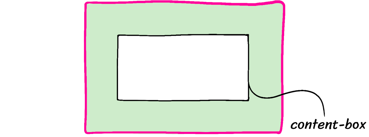
Setting box-sizing: border-box globally forces percentages and explicit sizes to be calculated against the border box. In the same scenario, the element remains 200px wide, and the content box shrinks internally to accommodate padding and borders. This behavior is much more intuitive and is a widely-accepted best practice.
*, *::before, *::after {
  box-sizing: border-box;
}
Removing Default Margins
*:not(dialog) {
  margin: 0;
}
Browsers apply default margins to elements like <p> for readable unstyled documents. However, when you’re building a custom design, that automatic spacing often gets in the way. This reset removes margin from nearly all elements, leaving spacing decisions to your application’s styles. An intentional exception is <dialog>, which relies on its default margin: auto to center itself in the viewport.
Enabling Size Keyword Transitions
@media (prefers-reduced-motion: no-preference) {
  html {
    interpolate-size: allow-keywords;
  }
}
Animating an element’s height from 0 to auto has historically been impossible without JavaScript measurement tricks. The new interpolate-size property changes that, allowing CSS transitions to work between fixed sizes and derived ones like auto or fit-content.
.accordion {
  height: 0px;
  transition: height 300ms;
  overflow: hidden;
}

.accordion[data-state="open"] {
  height: auto;
}
In March 2025, support is limited to Chromium-based browsers. The graceful degradation—where the animation simply doesn’t run—is acceptable for most components, so progressive enhancement is a valid approach. Placing the declaration inside a prefers-reduced-motion query respects users with motion sensitivities. When performance matters, using transform: scale is still preferable to animating layout properties.
Setting a Comfortable Line-Height
body {
  line-height: 1.5;
}
Default line-height values hover around 1.2, which can make dense text blocks feel cramped. A unitless value of 1.5 is widely considered more legible and accessible for body text. This applies proportionally to the font size, so it works across all text. You may still want to reduce it for large headings, but that’s a design decision left to individual components.
<style> * { line-height: 1.5; }</style><p> This paragraph has a 1.5x ratio for line-height, and it feels pretty good, right? I think this text is legible and pleasant.</p><h1> But it's a bit much on headings!</h1>
Adjusting Text Rendering on macOS
body {
  -webkit-font-smoothing: antialiased;
}
Older macOS guides recommended against changing font smoothing. Those arguments predate high-DPI displays and Apple’s own decision to disable subpixel antialiasing system-wide in 2018. However, macOS browsers still default to this obsolete technique. Turning it off with -webkit-font-smoothing: antialiased provides crisper rendering on modern hardware. This rule has no effect on other operating systems.
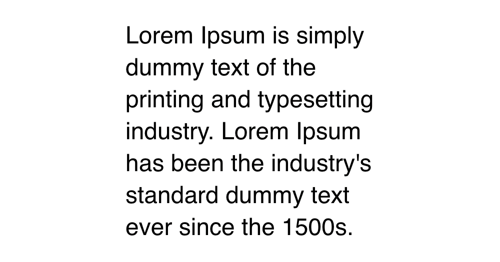
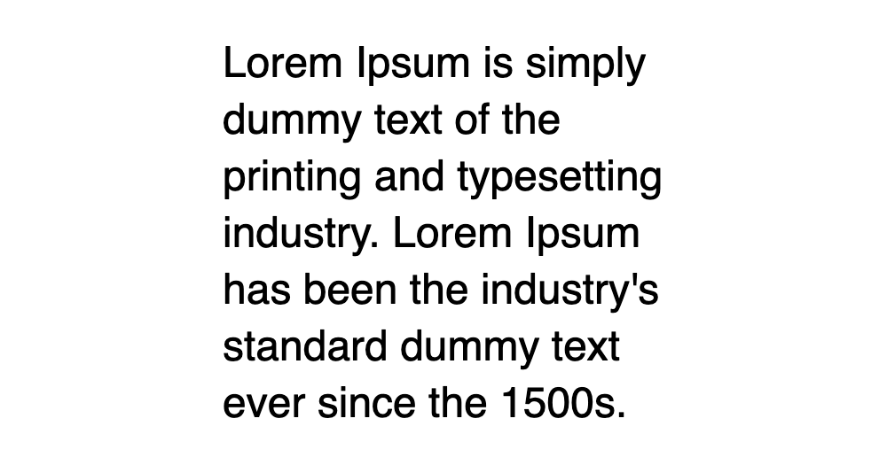
<p> This paragraph uses the default subpixel antialiasing.</p><p class="antialiased"> This paragraph does not use subpixel antialiasing.</p>
Better Media Defaults
img, picture, video, canvas, svg {
  display: block;
  max-width: 100%;
}
Images are inline elements by default, which causes phantom gaps and layout oddities when treated as layout blocks. Making them display: block avoids those issues. The max-width: 100% declaration is also crucial. Image elements are replaced elements with intrinsic sizes; without this constraint, a large image will overflow a smaller container instead of shrinking to fit.
Consistent Form Typography
input, button, textarea, select {
  font: inherit;
}
Form controls like buttons and inputs intentionally do not inherit text styles. This leads to tiny font sizes—13.333px in Chrome—that trigger mobile browsers to auto-zoom when the field is focused. That zoom disrupts the page layout and is a poor experience.
input, button, textarea, select {
  font-size: 1rem;
}
input, button, textarea, select {
font: inherit;
}Using the font shorthand with inherit forces all form controls to match the typography of their surrounding environment. As long as your body text isn’t absurdly small, this single rule eliminates the auto-zoom problem at its source.
Preventing Text Overflow
p, h1, h2, h3, h4, h5, h6 {
overflow-wrap: break-word;
}<div class="wrapper"> <p> This is a narrow column of text, with a very long word: antidisestablishmentarianism. </p> <p> The same problem happens with URLs: https://www.somewebsite.com/articles/a1b2c3 </p></div>
Text breaks only at spaces and hyphens by default. A long, unbroken string will overflow its container and distort the layout. The overflow-wrap property permits breaking mid-word when necessary, preserving layout integrity even if it’s not typographically perfect.
<style> p { overflow-wrap: break-word; }</style><div class="wrapper"> <p> This is a narrow column of text, with a very long word: antidisestablishmentarianism. </p> <p> The same problem happens with URLs: https://www.somewebsite.com/articles/a1b2c3 </p></div>
The hyphens property can also mitigate the issue by adding hyphens to hard breaks. This works well for narrow columns but can be distracting; it is often better to apply it contextually rather than globally.
p {
overflow-wrap: break-word;
hyphens: auto;
}Refining Line Wrapping
p {
text-wrap: pretty;
}
h1, h2, h3, h4, h5, h6 {
text-wrap: balance;
}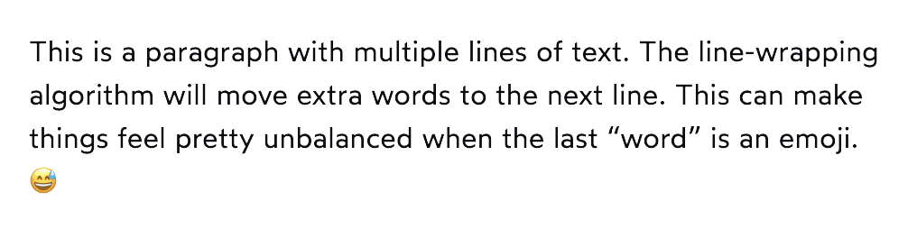
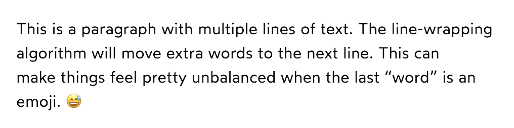
Standard line wrapping can strand a lone word or emoji on the final line. The text-wrap property offers better algorithms. Setting pretty on headings guarantees at least two words on the last line for a more finished look. For body text, no rule is set. Browser support is measured at 72% for pretty as of November 2024, but being a progressive enhancement means lack of support simply falls back to the old behavior.
Establishing Root Stacking Context
#root, #__next {
isolation: isolate;
}If you’re building a single-page app with a framework like React, adding isolation: isolate to your top-level container creates a new stacking context. This prevents internal elements—like modals or dropdowns—from conflicting with the rest of the document’s z-indexes. Modify the selector in the reset to match your framework’s root element, such as #root.
The reset, ready to use
Here's the complete reset in a condensed, copy-friendly format:
/*
Josh's Custom CSS Reset
https://www.joshwcomeau.com/css/custom-css-reset/
*/
*, *::before, *::after {
box-sizing: border-box;
}
*:not(dialog) {
margin: 0;
}
@media (prefers-reduced-motion: no-preference) {
html {
interpolate-size: allow-keywords;
}
}
body {
line-height: 1.5;
-webkit-font-smoothing: antialiased;
}
img, picture, video, canvas, svg {
display: block;
max-width: 100%;
}
input, button, textarea, select {
  font: inherit;
}
p, h1, h2, h3, h4, h5, h6 {
  overflow-wrap: break-word;
}
p {
  text-wrap: pretty;
}
h1, h2, h3, h4, h5, h6 {
  text-wrap: balance;
}
#root, #__next {
  isolation: isolate;
}The code is released with no restrictions into the public domain. Feel free to use it in your own projects, and a link back to this post is appreciated if you want to keep the attribution.
This reset is intentionally not published as an NPM package. You should own your reset. Bring it into your project and adapt it over time as you pick up new techniques or discover fresh tricks. If you want to reuse it across multiple projects, rolling your own package is always an option. The point is that this code belongs to you and should evolve with you.
Credit goes to Andy Bell for his Modern CSS Reset, which helped shape the thinking behind this one and inspired this post.
Beyond the reset
This reset is deceptively compact, only 12 declarations, yet it warrants an entire post of explanation. There's even more depth we didn't get into. CSS is a surprisingly complex language. Without understanding what happens underneath the surface, it can feel unpredictable and inconsistent. An incomplete mental model leads to problems.
When you take time to learn how the language actually works, though, everything becomes more intuitive and predictable. Writing CSS can be genuinely enjoyable.
For the last few years, the focus has been on helping JavaScript developers build a better relationship with CSS. That effort produced CSS for JavaScript Developers, a comprehensive, interactive online course.
If you've wished you were someone who likes and understands CSS, this course was built for you. Learn more at the link below:
Revision history
March 2026 — Clarified the
line-heightexplanation to align with WCAG requirements.December 2025 — Removed the
<dialog>tag from the margin-stripping rule.March 2025 — Added the
interpolate-sizeproperty to enable animations toauto/fit-contentvalues.October 2024 — Introduced rule #8 to improve line wrapping with
text-wrap.June 2023 — Dropped
height: 100%fromhtmlandbody. This rule previously enabled percentage-based heights within the app, but the now well-supported dynamic viewport units make that approach unnecessary.
Last updated on June 3rd, 2026.


