

Why ‘Pending Approval’ Beats ‘In Approval’
During a routine design review at a fintech company, content designer Oleksii noticed a label in the expense management flow: “In approval.” For the native English speakers on the team, it was unremarkable. To Oleksii, a non-native speaker, it raised questions: “Where is it? Are the results in? Where can I find them?” The ambiguity around the status of submitted expenses created real anxiety.
The team settled on “Pending approval” — wording that makes it explicit that an approval process exists and hasn’t been completed yet. No further action is needed from the user. The distinction may seem minor, but such confusion carries measurable costs: more customer service queries, lower adoption, higher churn, and a general sense of distrust.
The Native Speaker Blind Spot
Most global products default to English, which makes sense. But the audience for that content is not what many teams assume. Roughly 75% of English-speaking users are not native speakers — three out of every four people reading your UI.
Native speakers often write on instinct, relying on intuition rather than deliberate validation. That autopilot approach results in content that can be culturally specific, vague, or needlessly complex — and it goes unchecked precisely because everyone reviewing it shares the same linguistic background. Content clarity becomes assumed, not tested.
The consequences go beyond aesthetics. A study from the National Library of Medicine found that US adults who were proficient in English but didn't use it as their primary language were significantly less likely to complete the process of securing health insurance — even with identical service levels. The barrier wasn't comprehension of the language itself; it was unclear or inaccessible communication. If users abandon something as critical as healthcare coverage, checkout flows and onboarding sequences don’t stand a chance.
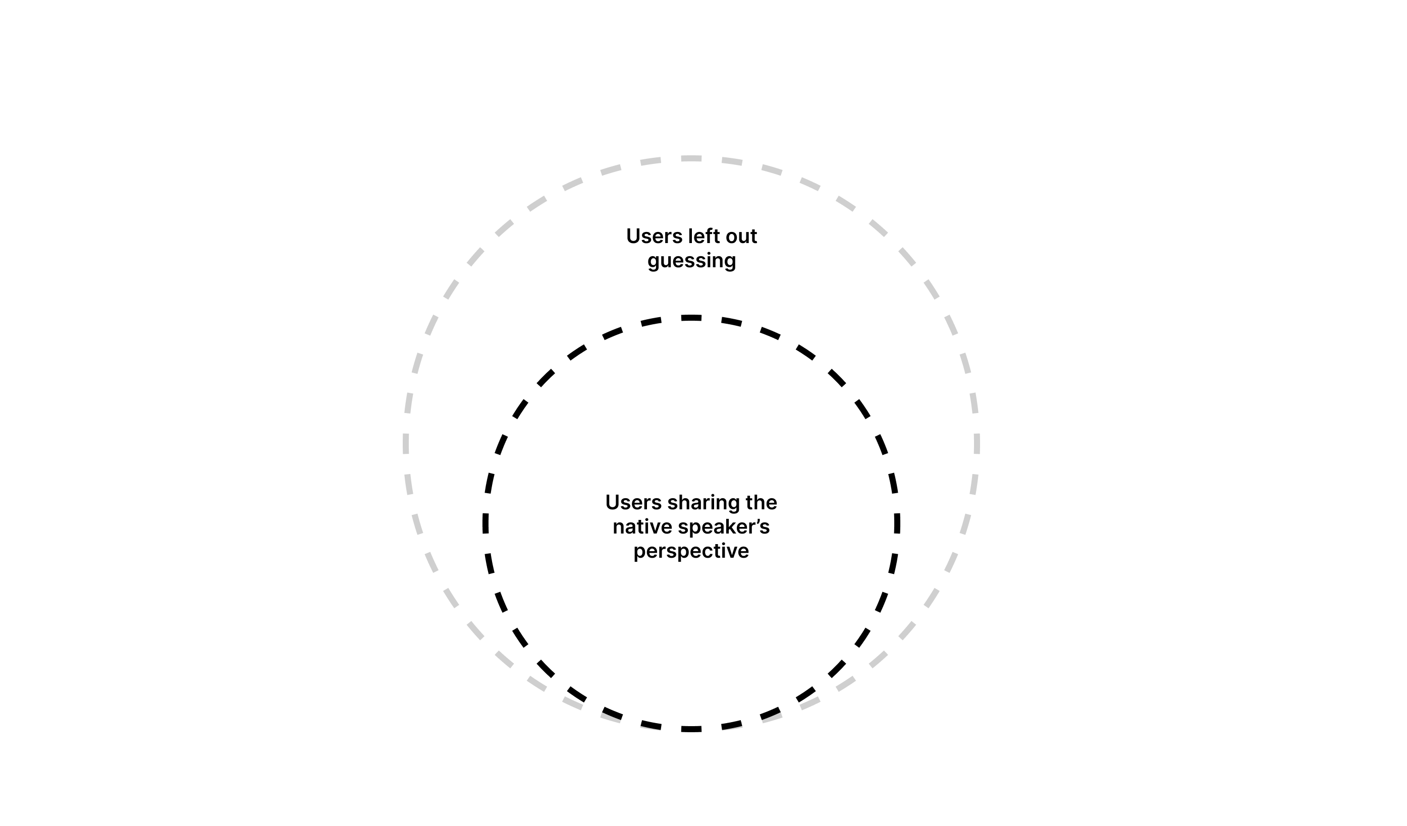
Non-native content designers instead write with deliberate attention. Their own experience learning English makes them more sensitive to nuance, complexity, and cultural exclusivity that natives don’t notice. That awareness is the difference between designing for everyone and designing for one in four.
What Non-Native Designers Bring to the Table
Identifying Cognitive Friction
When a non-native speaker must pause, re-read, or question a phrase, they experience a real friction point. Research confirms that non-native speakers read more slowly than native speakers — a critical factor when users need to scan and understand time-sensitive content.
Consider an ATM displaying rapid-fire instructions. Even when each message is clear, the sheer pace can overwhelm users who struggle to finish reading one update before the next appears. Every extra second spent decoding text increases the chance of abandoning the task or making an error. For non-native designers, these moments stand out immediately; for natives, they’re invisible.

Advocating for Plain English
Non-native designers tend to revisit and rewrite more aggressively to find the clearest way to express a message. What a native speaker finds acceptable can be needlessly dense for someone reading in a second language. Simple phrasing scales better across countries, languages, and cultural contexts.
Challenging Cultural Assumptions
When something doesn't make sense, non-native speakers question it. Native speakers often operate under the assumption that their life experience is universal among English users — not just idioms, but shared references and context. Even within a globally shared language, regional differences create friction. The word “soccer” versus “football” is a trivial example, but these details can confuse or alienate users from different regions.
Empathy Grounded in Experience
Non-native designers have personally wrestled with products that didn't communicate clearly. They understand what it feels like to be the global user on the other side of an unclear interface. That lived experience makes them more likely to advocate for design decisions that account for diverse linguistic and cultural backgrounds.
Practical Steps for Global Content That Actually Works
Reading about the value of non-native perspectives won’t change your product overnight. What will are concrete adjustments to your design workflows and hiring routines. Below are actions you can take now to make sure your content serves a global audience.
Bring Non-native Readers Into Copy Reviews
Standard QA sessions typically cover visuals and interactions, but content is often treated as “fine” as long as it’s grammatically correct. If your team lacks a non-native perspective, you’re missing a crucial layer of review.
You don’t need a dedicated localisation team to start. At one company, we created a “clarity heroes council” — a small group of non-native English speakers from varied cultural and linguistic backgrounds. Their questions routinely exposed gaps:
- What’s a “grace period”?
- What will happen when I tap “settle the payment”?
Flagging these issues early prevents thousands of customer service tickets and protects both budget and reputation.
Audit Existing Flows for Clarity
Even without major releases, products accumulate small changes over time. Those fixes and “improvements” rarely get proper QA attention. Schedule regular reviews of business-critical flows — onboarding, checkout, and similar — quarterly or annually depending on your product’s size.
A proper audit involves a cross-functional team: product designer, content designer, engineer, product manager, and researcher. Together you walk through the flows, review research insights, and examine customer feedback. A non-native speaker on this task force is essential. If you’re new to audits, this template covers what you need to get started.
Make Content Guidelines Global-ready
Your voice and tone documentation should explicitly state the level of English your product targets. Work with the brand team to ensure the brand voice comes through without sacrificing clarity. Use examples that distinguish between sounding smart or playful versus sounding clear.
Excessive brand personality often trips up non-native users. Consider a banking app that used “Dang it” as its sole call-to-action.
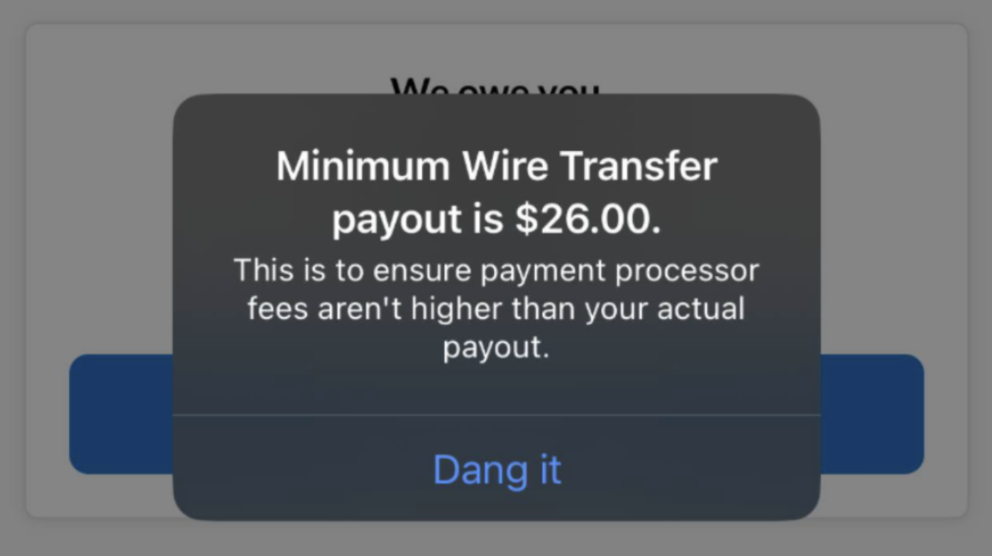
Users with different linguistic backgrounds may not recognise this expression — or worse, may interpret it as an action, leaving them uncertain what tapping it actually does.
Given how much content is now generated with AI, your guidelines must cover both tone and clarity. When you feed these requirements into an AI tool, the output will be grammatically correct and easy to understand.
Add Global English Heuristics to Your Definitions of Success
Heuristic principles like the Nielsen Norman Group usability heuristics are a common baseline. Add your own to complement them:
Aim for global understanding: Content and design should communicate clearly to any user regardless of cultural or language background.
Evaluate against concrete criteria:
- Action transparency: Is it clear what happens next when the user proceeds?
- Minimal ambiguity: Is the content open to multiple interpretations?
- International clarity: Does this content work in a non-Western context?
Involve Non-native Perspectives in Research
Collaboration between research teams and non-native writers is often overlooked but highly effective. Before sending out surveys or conducting interviews, have non-native speakers review the questions for complex or ambiguous language.
A study in the Journal of Usability Studies found that 37% of non-native speakers couldn’t answer a question containing a word they didn’t recognise — in this case, “cumbersome to use.” Unreliable data from such questions skews your UX measurements.
Another study in the Journal of User Experience showed that even familiar phrasing can mislead: most people read “How do you feel about … ?” as “What’s your opinion on … ?”, but some took it literally and described their emotions. Defining key terms and concepts with participants prevents these misinterpretations and yields more accurate results.
Standardise Vocabulary With a Shared Glossary
At Klarna, inconsistent translations were a recurring problem. A well-defined English term could have three to five different Italian or German versions. Even the same features or sections were referred to differently depending on the market, confusing users.
The solution was a shared term base — a controlled vocabulary containing:
- English term,
- Definition,
- Approved translations for all markets,
- Approved and forbidden synonyms.
Term selection came from user research, not team assumptions or preferences.
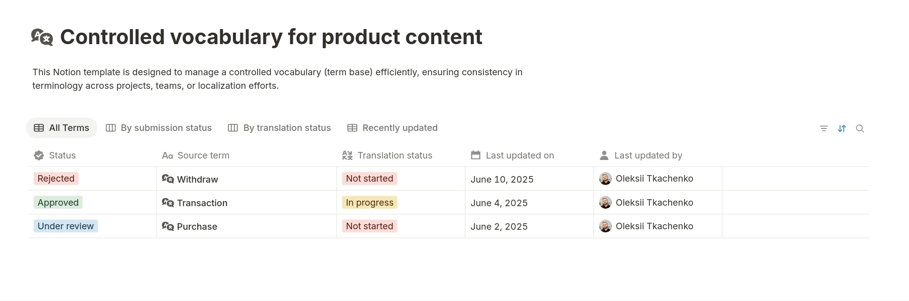
If you’re unsure where to start, use this free Notion template and begin adding terms.
Klarna shared its glossary across teams from product to customer service. The result: an 18% reduction in support tickets related to unclear UI language or navigation directions. That included finding payment instructions for less popular methods like bank transfers, locating late fee details, or postponing payments. All these features existed — and were believed to be easy to find.
A glossary can also live as an add-on to your content guidelines. It helps new joiners ramp up faster, keeps product copy localisation-ready, and strengthens your position with stakeholders.
Rethink Hiring Requirements
“Looking for a native speaker” still shows up in UX Writer and content designer job listings. It’s rarely intentional discrimination — more often a misunderstanding. The real job is building user experience, not producing grammatically perfect prose.
- Remove the “native speaker” and “fluency” requirement. Focus instead on clear communication, simplification ability, or experience writing for global audiences.
- Judge the work, not the accent. Studies consistently show accent bias makes people with foreign accents seem less hirable. Even if internal communication is slightly affected, it doesn’t justify overlooking strong portfolios and ideas.
Accent performance can vary with context. When I feel comfortable, my English flows naturally. In stressful situations with native speakers, I might default to a Slavic accent. Does that make my content design expertise worse? Not in the slightest.
Evaluate candidates based on their portfolios, the reasoning behind their answers, and their whiteboard challenge presentations — not on accent-driven assumptions about writing ability.
Why Non-native Designers Make Products Better
Non-native content designers don’t weaken your writing — they sharpen it by viewing content through the lens of your real user base. In a globalised market, linguistic purity no longer serves your product’s user experience. Apply these practical steps and use the non-native perspective to design better international products.


