A System Grown Beyond Its Original Job
Figma’s website was rebuilt around a single purpose back in 2020: introducing a new design tool. By 2024, the company’s scope had shifted from tool to platform, and the web presence had to follow. The Brand Studio team’s refresh of figma.com’s design system shows how they reworked components, adopted variables, and used prototyping to validate choices before a single line of production code changed.
The old system had grown organically, and it showed. Component libraries contained near-duplicate elements, making it hard for designers and content authors to pick the right one. The color architecture couldn’t stretch to fit an evolving palette, and typography wasn’t set up for the volume of content the site now publishes. The visual brand refresh—anchored by the new Figma Sans typeface and an overhauled illustration style—became the forcing function to fix those underlying issues.
Cutting Component Sprawl With Data
The Web Experience team ran a script to see which components were actually in use across pages, how frequently they appeared, and where. That audit directly shaped simplification work. Their “flex” component—a foundational building block—had accumulated 48 variants as options were bolted on over time. Usage data let the team trim it to 24 variants without losing core functionality.
The audit also drove some decisive consistency calls. Centered text was removed as an option, making left-aligned text the default across the whole web system. The result was a tighter property panel that simplifies the component for its users. The team also created templates for common page layouts and a set of composable “building block” components, which makes producing on-brand pages more straightforward than assembling elements from scratch.
This marks a structural shift from the original “FLEGO” (Figma + LEGO) approach, where every variation was its own stand-alone component—separate text containers for every alignment and background combination. The current system treats components as more integrated, relying on nested components and variables to handle variation. That reduces redundancy and means updates can be made in fewer places.
Prototyping Before Building
Because Figma’s culture is prototyping-heavy, designers could explore the new visual language without being locked into existing system constraints. They could try out different interactions, test at various screen sizes, and experiment with motion before committing.
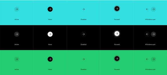
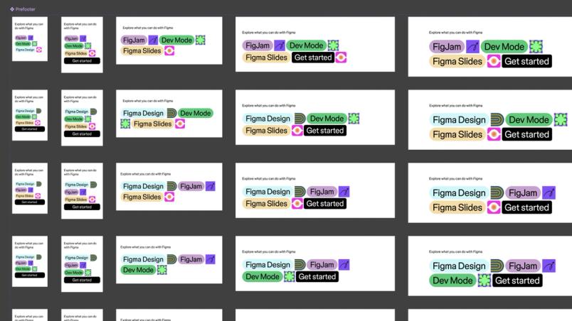
Buttons were a major focus because of their ubiquity. The team generated a grid of more than 50 button prototypes to test states, animations, and responsive behavior against the still-developing brand direction. Testing in prototypes was critical for rejecting ideas that looked good in isolation but failed in context. A “deconstructed button” with color-blocking and a hover-triggered arrow expansion was a favorite—until prototypes showed its expanding size broke layouts like the pricing grid, which needs consistent button widths.
The same iterative process refined larger patterns. The sign-up outro CTA that closes out pages was prototyped to examine its effect on user flows and product storytelling at different breakpoints. Product hero sections were tested for sizing and content order before the team handed validated specs to Senior Web Developer Matt McDonald. Prototyping also tightened collaboration between UI and motion design, making it possible to specify exact transition timings and easing curves that developers could implement without the usual back-and-forth of QA finessing.
Branching for a Moving Brand Target
Because the visual refresh was running concurrently, designers needed to test in-progress brand elements like the beta Figma Sans across the web system without destabilizing the main file. Figma’s branching let them switch between versions and see how different weights and widths of the typeface performed at various sizes—from headlines to body copy—within the real type stack. Feedback from these tests went back to type foundry Grilli Type, refining the font based on how it actually rendered across the site.
File organization also mattered for developer collaborators who built in phases. Each page in the Figma file carries a unique component name and an introductory paragraph explaining what each component does. Type style organization was restructured for the same reason: instead of maintaining separate stacks for mobile, tablet, and desktop breakpoints, styles are grouped by headline and body size. That simplifies implementation when type changes roll out and makes the library easier for other users to navigate.
Variables Replace Variant Explosion
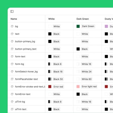
Before variables, a quote component in white-on-black and one in black-on-white each required a unique component. With variables, that duplication disappears. The new brand palette is composed of 29 colors, 25 of which serve as web backgrounds. For accessibility, color applications were codified—black or white for body text and three distinct red shades reserved for form errors. Designer Catherine Bui structured these into color variables and themes that scale consistently throughout the system.
In the design tool itself, the updated eyedropper improved how those values are handled. It can capture colors that respect the existing variable and style system, apply them instantly, or spawn new ones when needed. Tab-through color formats (hex, RGB, HSL, HSB) with direct clipboard copying keep handoff to developers on the Web Experience team efficient.
The upfront work paid off in library maintenance: dark and light component variants are largely unnecessary now. Variable modes swap background and text color combinations while preserving contrast and accessibility. And global brand updates, like adjusting a single color value, propagate through the system automatically, letting the Brand Studio make sweeping changes without opening dozens of files.
Annotations and real-time review in Dev Mode
Dev Mode became a central part of the workflow for this update, especially for design-to-development handoff. The team relied heavily on annotations to document design considerations across every component and breakpoint. Annotations were also used to specify exactly how many columns each item occupied in the layout, which helped designers standardize their width decisions per breakpoint and gave developers precise specifications to build against.
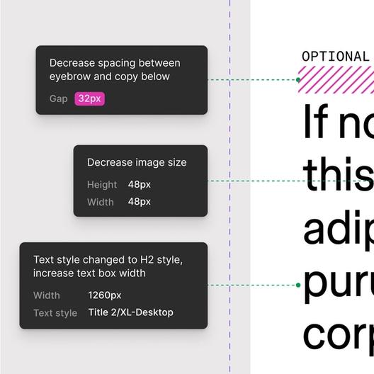
Web Developer Winter LaMon noted the shift away from scattered comments and sticky notes to organized, contextual annotations made the handoff process considerably smoother. Previously, design files were littered with comment bubbles and supplemented by Slack threads, which created a lot of overhead. With Dev Mode, developers could inspect designs directly in Figma with all relevant styles and variables in place, cutting down on the back-and-forth that previously slowed progress.
Moving away from scattered comments and sticky notes to organized, contextual annotations made our handoff process much smoother.“Moving away from scattered comments and sticky notes to organized, contextual annotations made our handoff process much smoother.”
For moments where documentation wasn't enough, the team used cursor and audio chat to hold impromptu design reviews and solve problems in real time. As a distributed team working on a complex project, this feature enabled quick, spontaneous collaboration while looking at the same file, bringing immediacy to remote work that was otherwise hard to replicate.
Standardized naming conventions across design and code
After organizing the file and establishing global styles for typography, grid, and UI elements, the team turned to responsiveness. Each component was carefully designed for key breakpoints, with names and ordering structured from XS to XXL, a nomenclature endorsed by the development team. Thinking through each layout at every breakpoint helped surface potential issues before they reached the code.
Web Developer Manager Meaza Abate emphasized the importance of consistent naming across the board. By ensuring that elements, variables, and colors were named identically in Figma and in the code base, inspecting designs in Dev Mode became a reliable process. When developers checked a component, they knew exactly what to expect in the code.
Previously, designers could opt out of the naming process, leaving developers to make naming decisions during implementation. By shifting that responsibility to the Brand Studio, the team added a checkpoint that also helped reveal whether certain modules were redundant.
Tracking QA with a shared Notion database
To keep pace with development, Program Manager Ricky Ramsaran built a detailed Notion document to manage ongoing QA edits. The database allowed the team to assign tasks, prioritize tickets, and track progress. As the Web Experience team batched component development by group, the QA process was batched to match, running in tandem. This approach made it possible to identify patterns early and apply learnings to subsequent batches, rather than waiting until the entire project was complete only to revisit every component for changes.
What the redesign taught us
This project was ultimately about finding a Figma workflow that worked efficiently for our team. There is no one-size-fits-all method for evolving a web design system. Each team has its own rhythms, challenges, and goals, so the most effective approach is one that adapts to the team's needs and supports thoughtful, collaborative work.
The process reinforced the idea that the best tools fade into the background, leaving room for creativity and collaboration to take center stage. Through sharing this workflow, we hope to encourage others to explore what's possible with Figma and develop their own approach to building design systems.