

Why GitHub’s color overhaul started with foundations
GitHub’s open source design system, Primer, serves more than 100 million developers. Its color system underpins every UI component across light and dark modes, including default, dimmed, high contrast, and color vision deficiency themes. As part of GitHub’s broader accessibility strategy, the Primer Design team set out to fix color contrast in both modes—a task that went far beyond adjusting a handful of hex values.
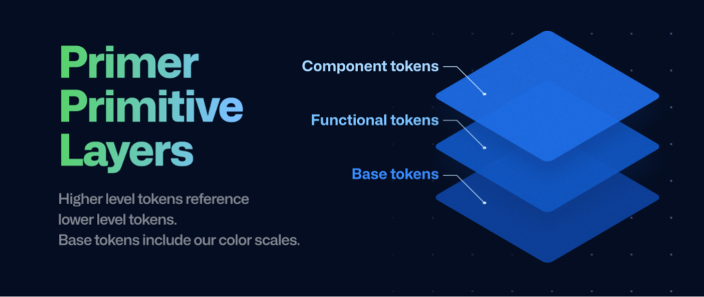
The team’s approach was to make changes at the foundation level, specifically in Primer Primitives. These functional color tokens style everything from text and backgrounds to borders and icons, and they are shared across all Primer patterns. By editing tokens in one place, the team could propagate accessibility fixes across the entire system without reworking individual components.
Scope was a key constraint. The team initially experimented with broader brightness and hue adjustments to the UI, but ultimately partnered with the brand team to keep changes limited to accessibility improvements. The goal was to make the smallest possible visual impact while meeting contrast targets, leaving larger brand-affecting changes for a separate initiative.
Auditing a system at scale
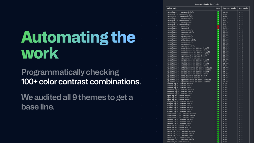
The first step was a comprehensive audit of Primer primitives across all themes—hundreds of variations in total. The team then mapped how components actually used colors, which quickly surfaced over 100 color pairs (for example, text paired with a background) that needed to meet WCAG contrast requirements.
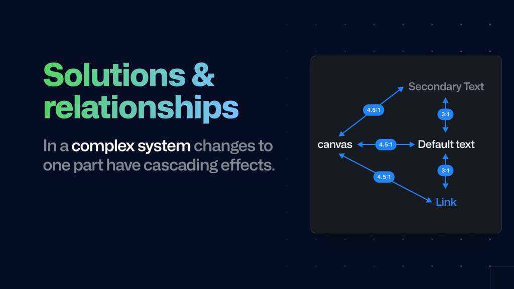
Some colors proved more challenging than others because they had to satisfy contrast ratios against multiple partners. Default text, for instance, needs 4.5:1 contrast against default and muted backgrounds, but also 3:1 contrast against link and secondary colors. Adjusting one pair often risked breaking another, making manual testing in Figma impractical.
Automating contrast checks
The team turned to code to accelerate the work. They modified tokens in the source code and built a script that automatically ran contrast checks for every token across every theme. Once the required ratios were defined for all pairs, the script generated a command line interface (CLI) table so the team could instantly see which combinations passed and failed.
Semi-transparent colors introduced an extra layer of complexity, since the effective contrast depends on the background. The team solved this with a two-step process:
- For every color pair, check if the background is semi-transparent. If so, use a blend algorithm to produce a solid color against the page background, generating new color pairs.
- For each of those pairs, check if the text color is semi-transparent. If so, blend it with the now-solid background to create a solid text color.
Contrast can then be calculated between the two solid colors. The script runs in seconds, compared to the time-consuming manual process, and it was soon integrated as a GitHub Action that runs on every pull request to Primer. Any change that breaks contrast is now caught before it reaches production.
Rollout and results
Before shipping, the team introduced the changes gradually via a feature flag. Qualitative user interviews with colleagues across teams helped gauge reactions, and after enabling the flag for all staff, the team monitored feedback for several weeks.
The foundation-first strategy paid off: it resolved hundreds of accessibility issues across more than a thousand use cases while keeping the visible impact minimal. The team also documented the guidelines, recommendations, and best practices throughout the process, ensuring designers and developers can continue building accessible experiences with Primer.


