Contrast complaints are difficult to evaluate by eye. A design that reads well for one person may be illegible for another, so subjective judgment is an unreliable measurement. Two quick checks — viewing the site on a phone or tablet in bright sunlight (not reliable) or applying a CSS filter to mimic grayscale — give a rough sense of the problem, but neither replaces arithmetic.
The W3C's Web Content Accessibility Guidelines (WCAG) 2.1 define the target scores. For a passing AA grade, most body text needs a contrast ratio of at least 4.5:1, while larger text needs 3:1. The AAA grade requires at least 7:1.
Where the ratios came from
The WCAG thresholds were built for people using a standard browser with no assistive technology. They began with earlier contrast standards and were adjusted for newer display technologies such as antialiased text, so content stays readable for people with a range of visual or cognitive difficulties caused by age, illness, or other losses of visual acuity. The practical goal is readability for someone with 20/40 vision — roughly the vision of an 80-year-old, meaning they can read at 20 feet what someone with 20/20 vision could read at 40 feet.
Antialiased text, though smoother on screen, sacrifices some contrast and lowers the ratio. WCAG also drew on other standards, including the Human Factors Engineering of Computer Workstations (ANSI/HFES 100-2007), an American ergonomics standard published in 2007 that merged two earlier standards from separate committees. It was designed to accommodate 90% of computer users and covers visual displays and contrast among many other aspects of computer use.
Reading a contrast ratio
A contrast ratio expresses the difference between the lightest and darkest brightness in a range, computed from each color's relative luminance. Take teal text on a light gray background:
<h1>Title of Your Awesome Site</h1>h1 {
background-color: #888888;
color: #1ABC9C;
}
Some tools flag this automatically — WordPress, for instance, shows a notice in the sidebar when a text/background pairing contrasts poorly.

That combination scores 1.47:1, far below either threshold. The formula itself looks simple:
(L1 + 0.05) / (L2 + 0.05)L1is the relative luminance of the lighter of the colors.L2is the relative luminance of the darker of the colors.
The work is in finding those two values.
Computing relative luminance
Relative luminance is the relative brightness of a color on a scale from 0 (black) to 1 (white). Start with the RGB notation, converting from HEX if necessary; the teal #1ABC9C becomes 26, 188, 156. Divide each channel by 255 to get a linear value between 0 and 1:
| Component | Equation | Value |
|---|---|---|
| Red | 26/255 | 0.10196078 |
| Green | 188/255 | 0.73725490 |
| Blue | 156/255 | 0.61176471 |
Next, apply gamma correction to each channel. If a component's linear value is less than .03938, divide it by 12.92; otherwise add .055, divide the total by 1.055, and raise the result to the power of 2.4. The corrected channels for teal:
| Component | Equation | Value |
|---|---|---|
| Red | ((0.10196078 +.055)/1.055) ^ 2.4 | 0.01032982 |
| Green | ((0.73725490 +.055)/1.055) ^ 2.4 | 0.50288646 |
| Blue | ((0.61176471 +.055)/1.055) ^ 2.4 | 0.33245154 |
This step matters because gamma correction translates what a computer "sees" into human perception of brightness. Computers record light directly, where twice the photons means twice the brightness; human eyes perceive more levels of light in dim conditions and fewer in bright ones. Devices perform gamma encoding and decoding constantly to make screens match how we see.
Finally, weight each channel by how bright it appears to the human eye: red by .2126, green by .7152, and blue by .0722. Green carries the highest weight.
| Component | Equation | Value |
|---|---|---|
| Red | 0.01032982 X 0.2126 | 0.00219611973 |
| Green | 0.50288646 X 0.7152 | 0.35966439619 |
| Blue | 0.33245154 X 0.0722 | 0.02400300118 |
Add the three results to get luminance:
L1 = 0.00219611973 + 0.35966439619 + 0.02400300118 = 0.38586352The same process applied to the second color gives L2 = 0.24620133. Make sure the larger number is always L1, and divide it by the smaller, darker L2. Compare the result against the success criteria: 4.5 or better for standard text between 18–22 points, 3 for larger text, and 7 or better for AAA. The teal-on-gray example fails all of them.
Automated contrast checkers skip all of this hand calculation, and doing the steps manually is error-prone — results are easy to get wrong until checked against a tool. A demo is available that logs each step of the math to the console; try it with #1ABC9C and #888888.
Fixing contrast in practice
Several accessibility resources will audit a site. A practical starting workflow:
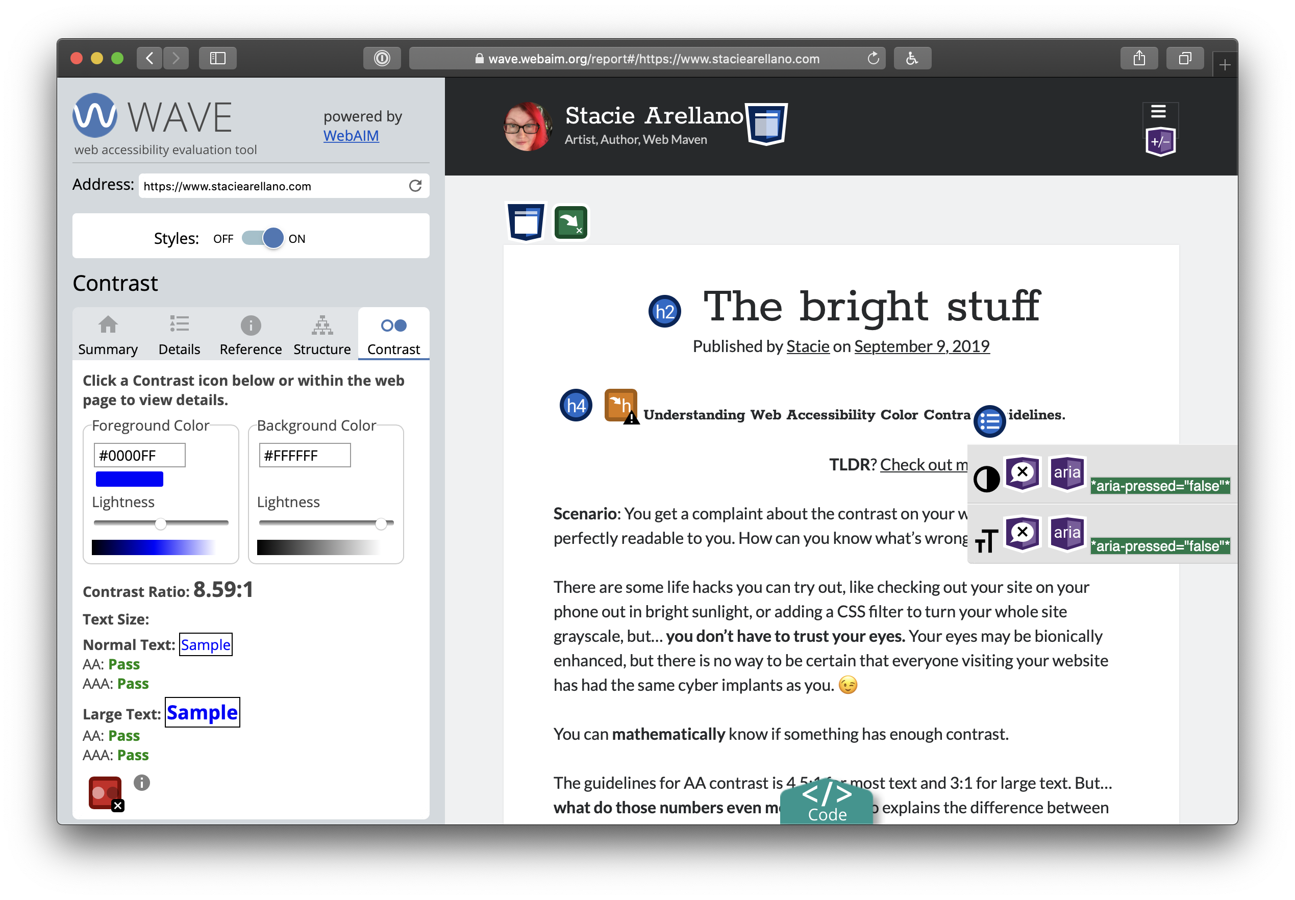
- Find the problem areas. Run the site through the WAVE accessibility tool, which reports contrast results and flags trouble spots.
- Apply the audit's suggestions. Once errors are identified, click the color box in WAVE to open a color picker and experiment until the errors clear; what remains is what to change in the code.
- Re-run the test to confirm the changes improved things. The fix benefits all users, not only those affected by the original accessibility errors.
Preventing the problem
The cheapest path is to make accessibility part of the requirements for both technology and design on new products. That avoids potentially hundreds of hours of remediation and potential legal complaints. U.S. government and education sites are required to comply, and other industries are frequently held to account for not making sites equally available.
Where possible, build on established, tested frameworks and libraries — Bootstrap or Google's Material Design — that have already worked out balanced theme colors. You can often take only what is needed (just the CSS, for instance) or at least study their palettes. Still verify: standard text options may follow WCAG contrast ratios while alert and message styles may not (Bootstrap, notably, has fallen short here). Derek Kay maintains a list of web frameworks reviewed with an accessibility focus, and the U.S. Web Design System shows one way to handle color and contrast puzzles through CSS tokens that label colors so differences are obvious, plus links to further contrast resources.
Understanding what a contrast ratio actually measures makes it easier to keep contrast in mind when designing sites, web apps, and other software — and easier to remember who poor contrast affects.