
Props: Where Design and Engineering Speak Past Each Other
Designers and developers alike work with components and their properties, or “props.” Both groups understand that props define how a reusable element can be expressed. Yet the same word can carry different weight depending on the environment. In Figma, props almost exclusively describe visual differences—variants, boolean toggles, instance swaps, text overrides. In a codebase, props also cover non-visual concerns like event handlers and data. This is not a failure of communication; it is the natural result of two disciplines optimizing for their own workflows. The risk appears when we assume we are describing the same thing when we are not.
Two Buttons, Five Components
A button seems like the simplest possible shared concept. In practice, a button in Figma is not the same entity as a button in a codebase. Designers focus on visual consistency across files; developers focus on interactivity and rendering. The tension becomes visible during a migration to a design system.
Consider a real-world case: a React and TypeScript application migrating to a front-end compatible with a design system built on Material UI (MUI). The stated goal was to make the component library intuitive enough for full-stack engineers whose focus was backend integration, reducing the cognitive load around styling. In Figma, the team maintained two components: Button and IconButton. They shared some props like size and color variants, but did not share a primitive component—Figma lacks inheritance in that sense. The separation was a deliberate design-side decision.
The codebase, meanwhile, contained five button-related components. The Figma Button and IconButton matched the name and concept of their coded counterparts, but not their purpose or scope. When a component is optimized for the designer’s or developer’s experience, it is tailored for that role. A shared name does not make them equivalent.
The codebase arranged its components in a hierarchy:
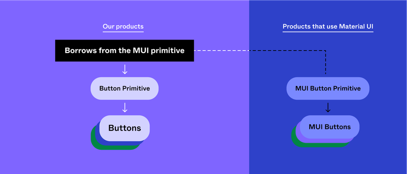
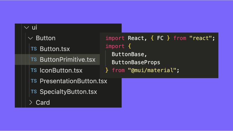
The coding team did not start from scratch. MuiButtonBase, an existing MUI component, provided core property definitions under the hood. ButtonPrimitive was a custom base component forming an ideological layer that protected the engineer-facing components from the customization work needed to adapt MUI’s base.
Accessibility Enforced by Prop Shape
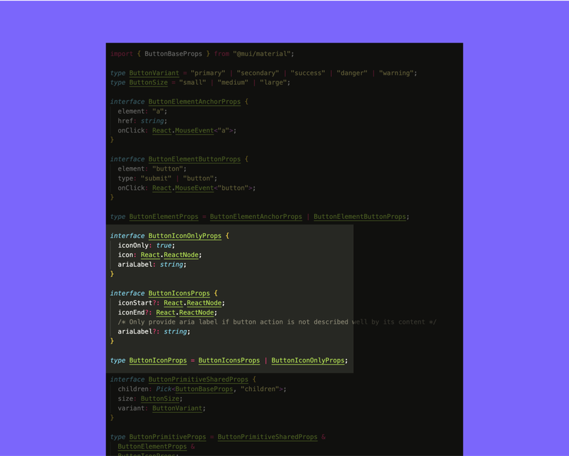
The primitive layer proved valuable for baking in accessibility requirements. For buttons, best practice dictates that an aria-label is only necessary when the button content does not describe its action—for example, an icon-only button. Rather than documenting this rule and hoping developers followed it, the team encoded it directly into the prop types.
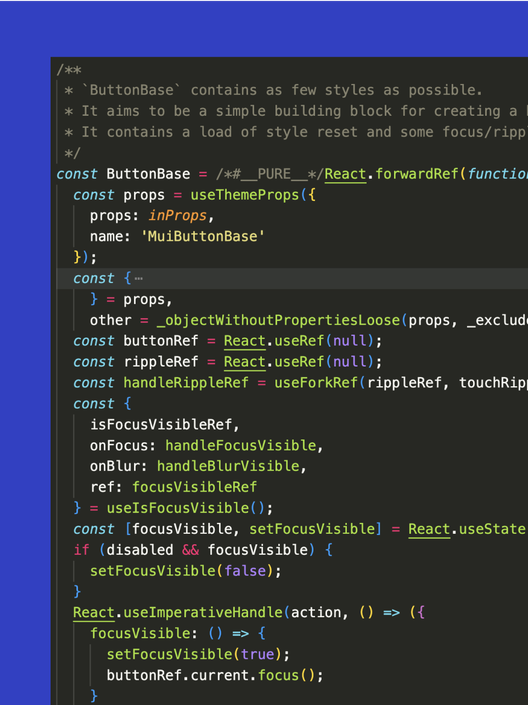
When the ButtonPrimitive was wrapped by a higher-level component, that logic was hardcoded. The Button component set iconOnly={false} behind the scenes, while IconButton set iconOnly={true}. Implementing an IconButton therefore forced the developer to provide both an aria-label and an icon—the type system communicated the requirement, and comments in the editor supplied the rationale.
Names Are Not Enough
Components in a codebase serve purposes beyond the visual layer. A design system may have multiple coded components for one apparently simple UI element, while its Figma counterparts diverge. This discrepancy is not a defect. Design components and code components do not have to mirror each other’s structure or terminology. They need only enough shared context for each side to implement their part correctly.
Finding common ground in component language
Variant properties such as size: "small" | "medium" | "large" or variant: "primary" | "secondary" | "basic" | "danger" | "success" are the easiest place to align design and code terminology—and they often make up most of what a developer needs to know when implementing a component. Despite that, simple casing differences frequently become an unnecessary hurdle. Agreeing to name props and variant options identically is one quick fix. Designers are often strong at naming; developers bring requirements about format, and the answer is almost always camelCase.
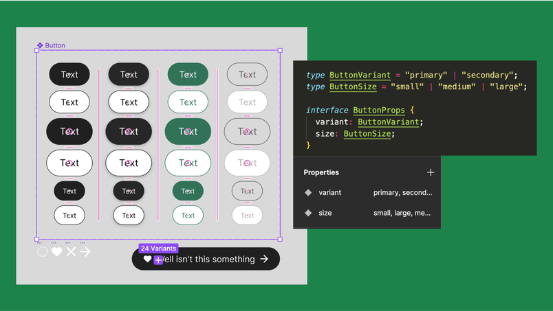
Even this straightforward case has caveats. The only way to model interactive default, hover, focus, and pressed states of a component in Figma is with variants. But state is not a variant property on the web—it's a style within a theme variant like "primary" or "danger." One solution is adding a prefix like ":state" or "*state" so it's clear in Figma that the property doesn't map directly to a code property.
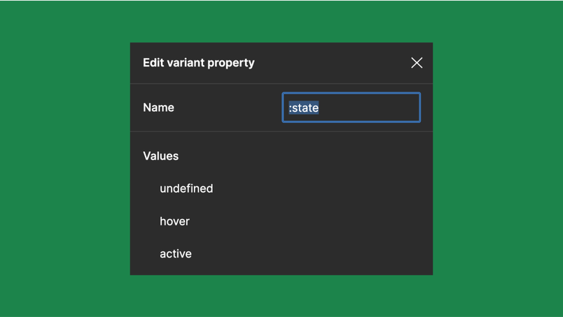
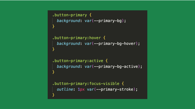
You can also align state terminology with the platform's language. On the web, that might mean preferring "initial, focus-visible, active" over "default, focus, pressed"—though the distinction between :focus and :focus-visible in CSS is far more nuanced than at the design variant level. How deep to take that alignment is a judgment call; bringing the full CSS implementation nuance into component language might muddy things more than it clarifies. There are opportunities to align in both directions, and understanding each other's needs helps you make such concessions together.
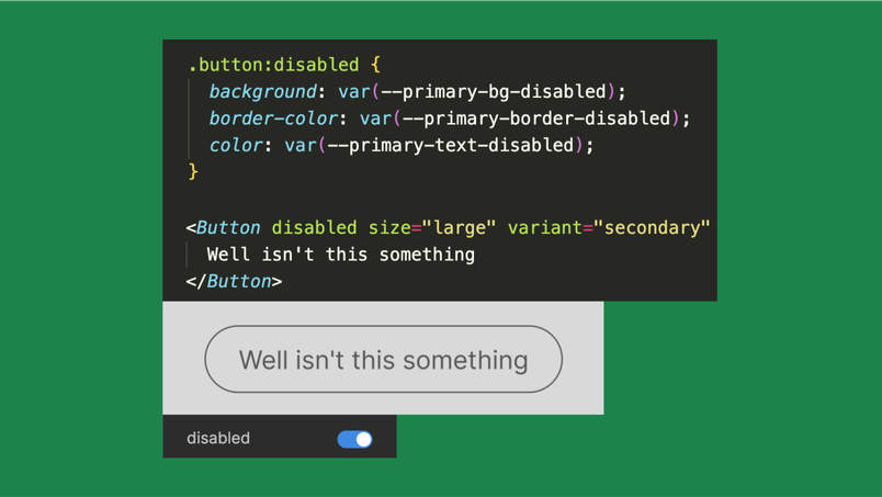
Consider the disabled state. A designer might add "disabled" to a ":state" variant since it's mutually exclusive with the other states—that makes sense. In code, disabled is often its own boolean prop in addition to a separate style. In that case, keeping it as a state variant in Figma while also exposing a disabled boolean property in the codebase is perfectly reasonable. Differences in how you describe components don't have to be a problem; you can still agree on the spelling of the word "disabled."
At Figma, evolving the product means adopting implementation patterns where needed, but also thinking about designer ergonomics the way engineers think about developer ergonomics. Speeding up product development requires embracing the design experience in a design tool just as fully as the developer experience in development tools.
That inevitably produces differences in language because the environments differ. The important thing is recognizing those differences and working to describe what you're building with the language each tool defines—rather than forcing a conformity that leaves needs unmet and always trails behind.
Today, what’s most important is that we learn to recognize these differences and focus on how we can work together to describe what we are building with the language defined by the tools in front of us.“Today, what’s most important is that we learn to recognize these differences and focus on how we can work together to describe what we are building with the language defined by the tools in front of us.”
How the Component Inspector plugin works
To explore translation across contexts in practice, I built a plugin: the Component Inspector. It generates code for component definitions and instances across Angular, React, Vue, and Web Components. The focus is the language of properties, not their visual styling. It deliberately ignores property language on either side that doesn't overlap, generating just enough code to translate visual styles precisely for developers.
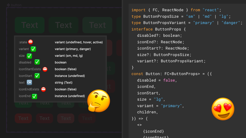
I shipped the plugin before Dev Mode launched. With Dev Mode now live—a dedicated workspace that gives developers what they need when they need it—I've added a section that displays code with plugins in Figma.
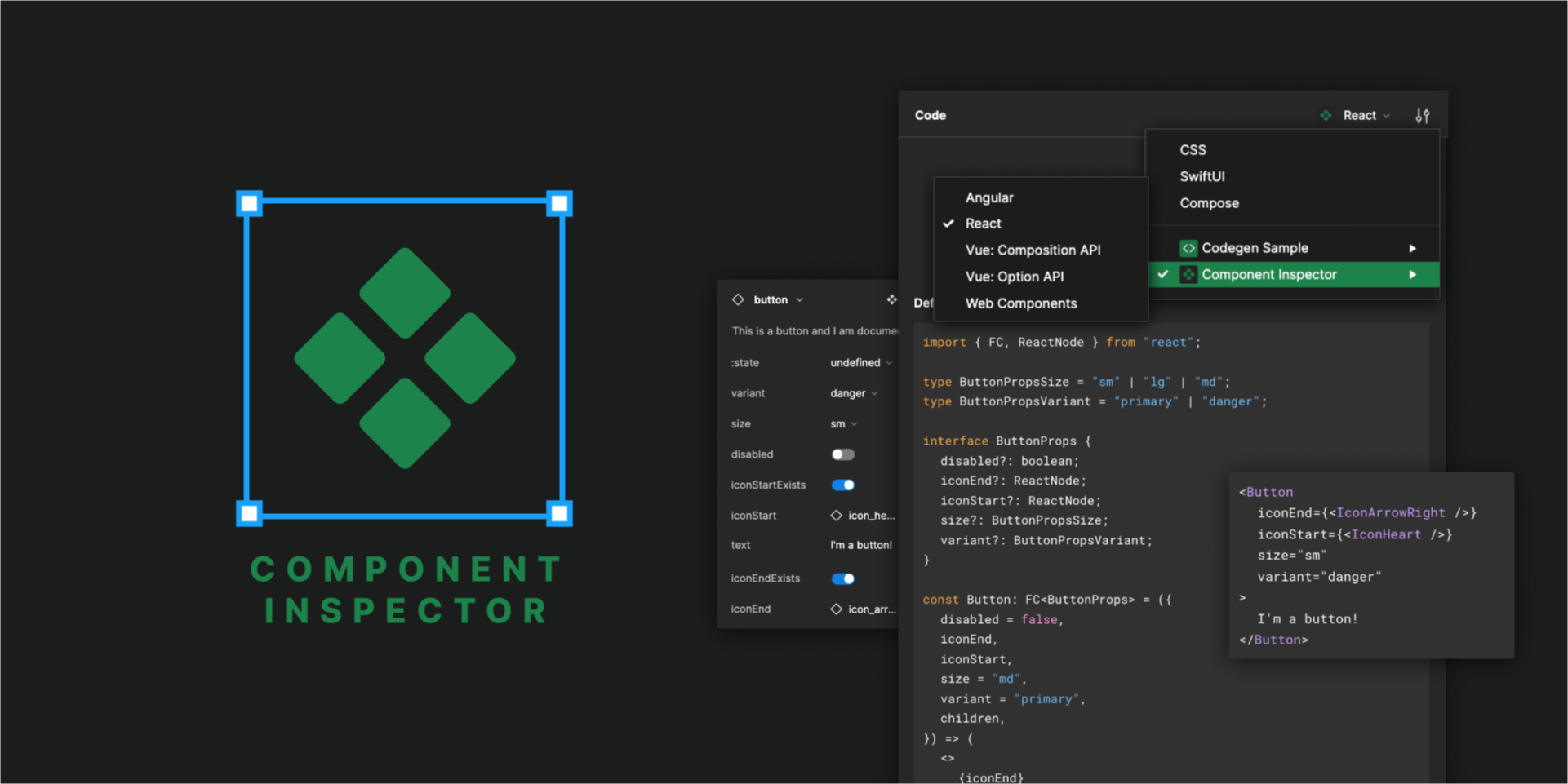
Specifying that the plugin runs in Dev Mode was the first step. While keeping the same Figma functionality for now, I added support in my manifest.json to indicate the plugin is codegen-enabled in Dev Mode and to declare which languages it generates.
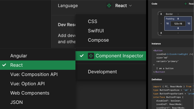
{
  "name": "Component Inspector",
  "editorType": ["dev", "figma"],
  "capabilities": ["codegen"],
  "codegenLanguages": [
    { "label": "Angular", "value": "angular" },
    { "label": "React", "value": "react" },
    { "label": "Vue: Composition API", "value": "vue-composition" },
    { "label": "Vue: Options API", "value": "vue-options" },
    { "label": "Web Components", "value": "web" },
    { "label": "JSON", "value": "json" }
  ],
  "codegenPreferences": [
    {
      "itemType": "select",
      "propertyName": "boolean",
      "label": "Boolean properties on instances",
      "options": [
        { "label": "Implicit", "value": "implicit", "isDefault": true },
        { "label": "Explicit", "value": "explicit" }
      ]
    },
    {
      "itemType": "select",
      "propertyName": "comments",
      "label": "Comment generation in definitions",
      "options": [
        { "label": "Disabled", "value": "disabled", "isDefault": true },
        { "label": "Enabled", "value": "enabled" }
      ]
    },
    {
      "itemType": "select",
      "propertyName": "defaults",
      "label": "Default values on instances",
      "options": [
        { "label": "Shown", "value": "shown", "isDefault": true },
        { "label": "Hidden", "value": "hidden" }
      ]
    },
    {
      "itemType": "action",
      "propertyName": "settings",
      "label": "More Settings"
    }
  ]
}
In codegen mode, the plugin returns code whenever the codegen event fires.
if (figma.mode === "codegen") {
  figma.codegen.on("generate", async (event) => {
    const { node, language } = event;
    if (language === "html") {
      return [
        {
          title: `My HTML`,
          code: `<p>${node.name}</p>`,
          language: "HTML",
        },
      ];
    } else if (language === "css") {
      return [
        {
          title: `My CSS`,
          code: `.${node.name} { color: red; }`,
          language: "CSS",
        },
      ];
    }
  });
}
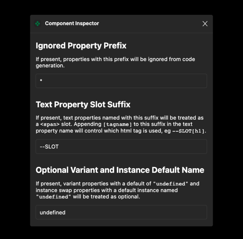
The plugin has always incorporated several ideas covered here. You can ignore a property prefix—":" in ":state"—so developers only see code for relevant component properties. It also supports configuring text properties as slots, letting you specify the element type rendered in that slot.
Handling optional patterns
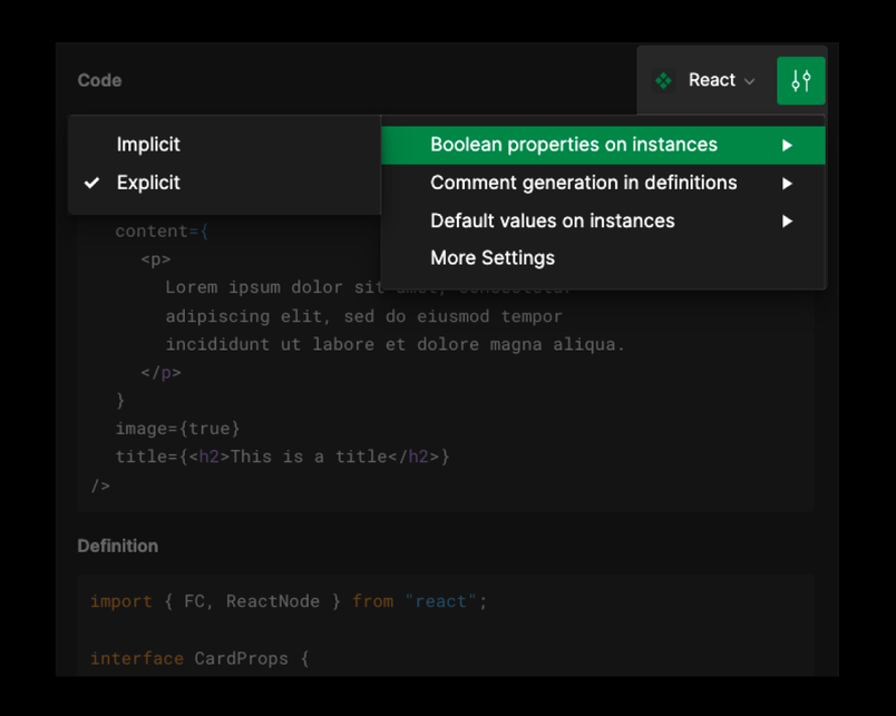
An optional element property is common in code frameworks—an "icon" prop, for example, that may be absent. In Figma, this requires two properties: "hasIcon" (boolean) controlling the visibility of an "icon" (an instance swap). In code, it's a single optional icon property; "hasIcon" is implied when the property is undefined. To transform the two Figma properties into one, the plugin must detect when an instance swap's visibility references a boolean property, then mark the icon property optional and omit "hasIcon" from the generated code.
Another optional pattern shows up when a variant value can be undefined, which Figma has no direct way to express. The plugin lets you name a default variant value with a keyword like "undefined," detects that case, and treats the variant property as optional. Codegen plugins can expose user-specific settings like this in a pop-up or preferences UI, which is where the Component Inspector settings live: "implicit or explicit boolean props on instances" and "show or hide default values on instances."
This plugin isn't perfect for everyone, and that's the point. Developers have specific needs—and plugins, especially private plugins, are the best way to tailor the translation of design language to codebase-specific requirements.
Resources for building plugins
- Component inspector source code
- Plugin samples repository
- Codegen samples and Dev Mode samples
- Import/export and styles to variables samples
- Plugin API documentation
- Figma Engineer Sawyer Hood's talk on building plugins for Dev Mode
There's no flawless translation between design and development, but embracing the differences in each environment—and the nuances in how each side talks about them—makes building together more efficient. That means loosening strict definitions of terms like variable, component, and property in ways that add precision instead of distortion.


