

Why Color Is a Functional Layer of UX
Color does more than decorate a screen. In well-structured interfaces, it creates visual hierarchy, flags interactive elements, and supplies real-time feedback. A saturated accent can pull the eye toward a primary action, while consistent color coding helps users navigate complex systems without reading every label.
Color also underpins accessibility. Evaluating contrast ratios and pairing color with non-color cues—icons, patterns, labels—lets designers serve users with visual impairments rather than excluding them.
Brand Recognition and Emotional Response
In the digital space, color often substitutes for physical presence. A deliberate palette can distinguish a brand and encode its personality at a glance. Per research cited by the American Marketing Association, vibrant colors carry a particular magnetism, making them more noticeable and more memorable online. Muted tones rarely achieve the same effect.
Consistency reinforces this signal. When the same hues appear across a website, app, and social channels, they coalesce into a recognizable visual language. The psychology supporting this is not mysterious: bold reds tend to read as passionate or exciting, while bright yellows often signal optimism and creativity. Insights Psychology and other sources note that matching these inherent associations with stated brand values creates emotional resonance—but the relationship is never universal, and context matters.
The colors we choose are the silent language of our digital products, and speaking it fluently is essential for success.
Quantifying Color: The HSB Model
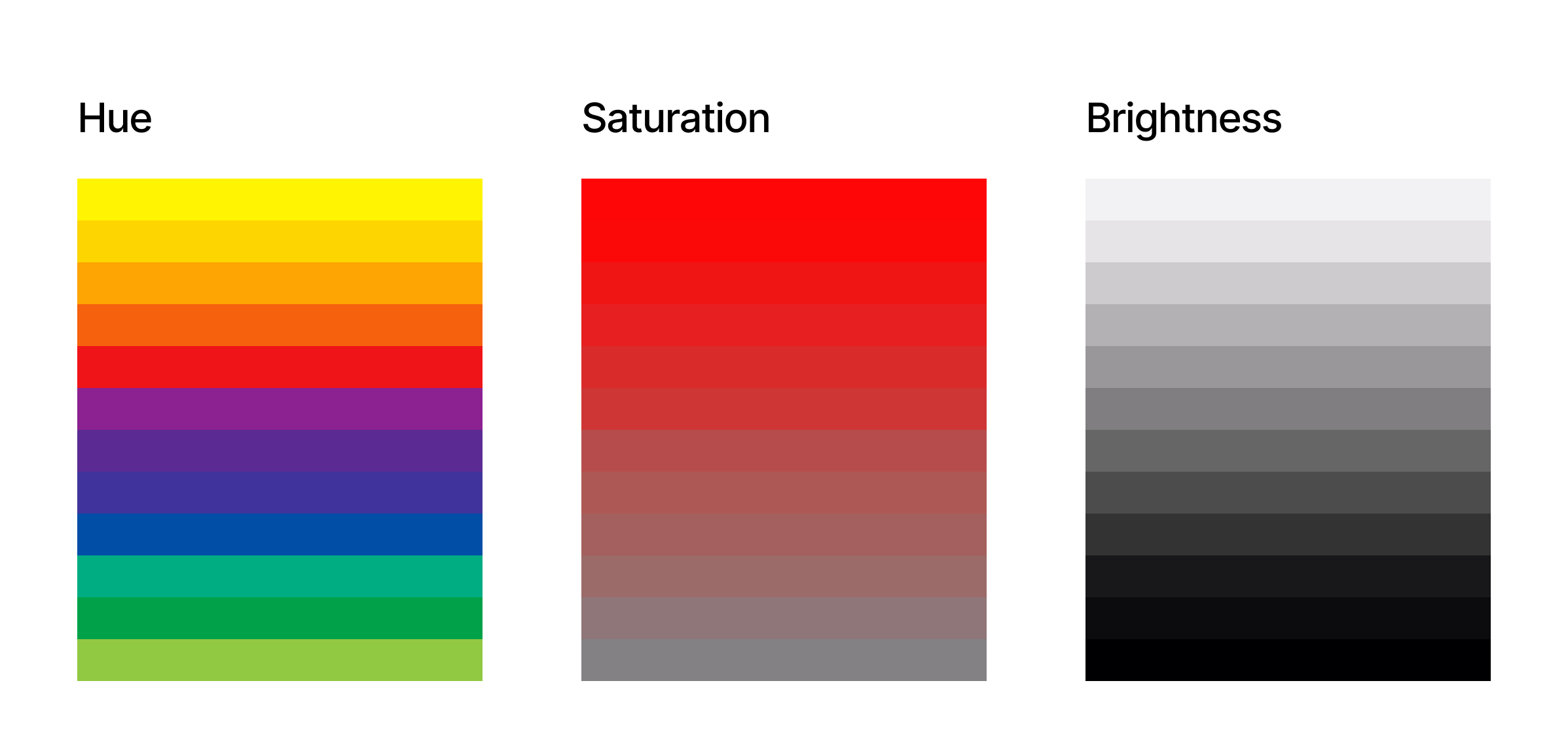
To use color strategically, designers need a precise vocabulary. Digital tools generally rely on the HSB model—Hue, Saturation, Brightness—which offers a more intuitive framework than RGB for making deliberate adjustments.
Hue
Hue is the named color itself, measured as an angle from 0 to 360 degrees on a color wheel. Red sits at 0, green at 120, blue at 240. Selecting base hues is often an exercise in brand alignment, since hue carries the most obvious psychological weight.
Saturation
Saturation describes the intensity of a hue, ranging from 0% to 100%. At 0%, a color collapses to gray; at full saturation, it appears vivid. In UI design, saturation is a tool for emphasis. Interactive or critical elements often employ highly saturated colors, while backgrounds and secondary content lean on reduced saturation to recede visually.
Brightness
Brightness determines how light or dark a color appears, expressed from 0% (black) to 100% (white). It is the primary lever for contrast and readability. Sufficient brightness contrast between text and background is a baseline accessibility requirement, and subtle shifts in brightness can create depth between interface panels.
Common Color Meanings in Interfaces
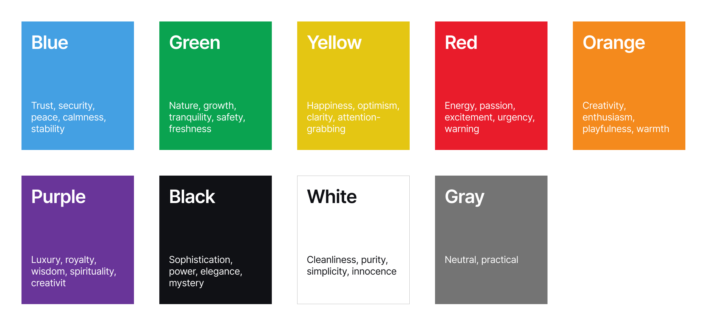
Interpretation of color is not fixed across cultures, but certain patterns tend to recur. Designers should treat these as starting points, not rules.
Blue
Trust, stability, calm. The sky and water anchor these associations, making blue a frequent choice for financial and enterprise platforms. An electric blue skews modern; a deep navy reads more authoritative.
Green
Nature, growth, health, prosperity. Green appears often in wellness, sustainability, and finance contexts. A lime green feels youthful, while forest green suggests groundedness.
Yellow
Optimism, happiness, energy. Yellow captures attention, but bright applications should be restrained—overuse creates visual fatigue. In UI, it suits highlights, alerts, and approachable brand voice.
Red
Excitement, passion, urgency, danger. It commands notice, which fits error messages, sales, and bold branding. Repeated or widespread use can induce anxiety.
Orange
Enthusiasm and creativity without red’s intensity. Orange works well for calls-to-action, promotions, and brands with an approachable, innovative tone.
Purple
Royalty, luxury, wisdom, mystery. It suits beauty, spiritual, and premium experiences crafted to feel distinctive.
Black and White
Black conveys sophistication, power, or mystery; white indicates purity, simplicity, and space. Together they anchor minimalist designs and high-contrast layouts.
Gray
Neutral and practical. Gray stands in for typography, borders, and secondary structure without competing for attention.
From Psychological Effect to Design Decision
Understanding hue, saturation, and brightness yields more consistent palettes that align with brand personality and guide behavior. Recognizing the psychological baggage colors carry allows designers to make informed choices—not assumptions about a universal color language. The most effective digital products use color both to communicate intent and to respect the physiological responses that underpin every interface experience.
Emotion And Meaning In Interface Color
Consider an elegant furniture app. Its designers might rely on soft desaturated blues and greens, paired with muted earth tones. The blues can gently lower arousal, supporting the app’s promise of calm, while the greens reinforce messages of wellness and mental clarity. Earthy browns ground the experience, adding a sense of stability and connection to nature.
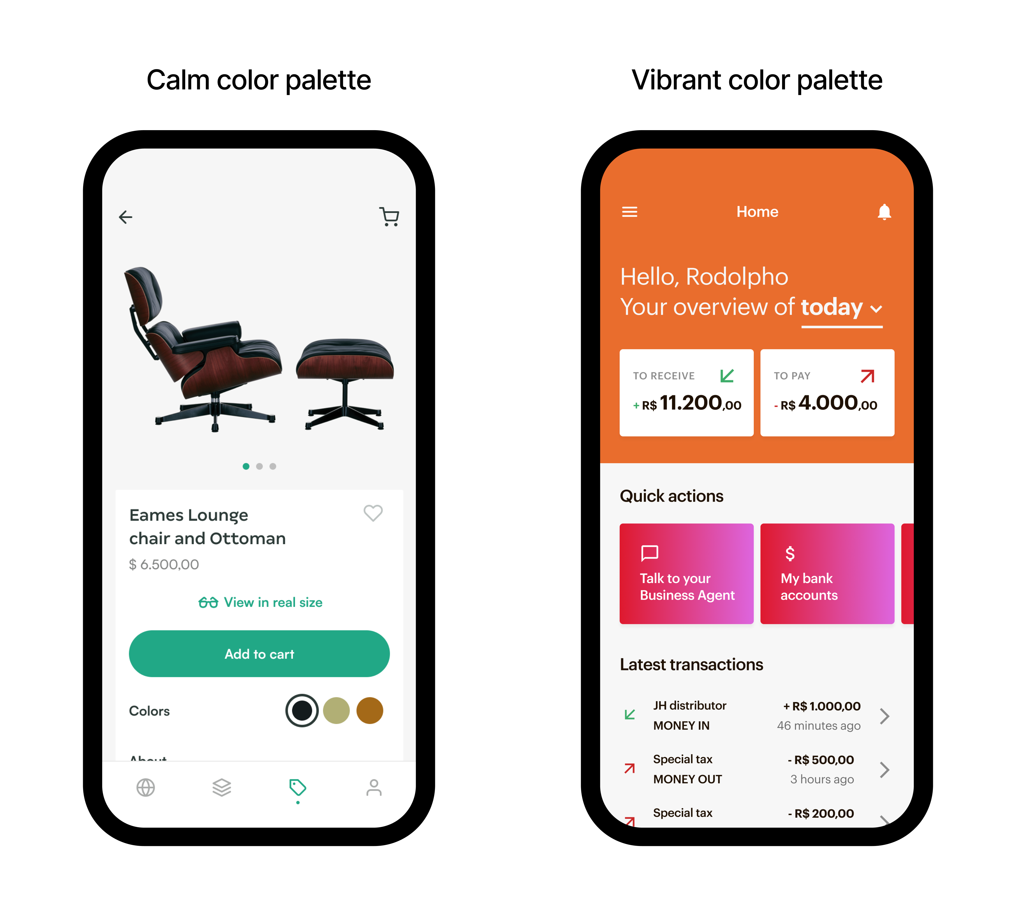
For a platform aimed at extreme-sports enthusiasts, the palette may flip toward high-energy oranges and reds against stark blacks and sharp whites. Oranges suggest excitement and adventure; bold red amplifies adrenaline and intensity. Black and white introduce dynamism and a modern edge that mirrors the pace of the activity itself.
The lesson is not to treat color as decoration but as a behavioral tool. When associations are chosen deliberately, designers move past aesthetics into crafting interfaces that feel intuitive and resonant. The result is a product that engages users emotionally and performs more effectively for it.
Color As A Usability Tool
Color decisions also determine whether an interface can be used at all. Poor contrast or color-dependent meaning can exclude users with visual impairments, turning an otherwise thoughtful design into a barrier. Accessibility here is not an optional layer of ethical polish — it is core to making digital products inclusive and universally usable.
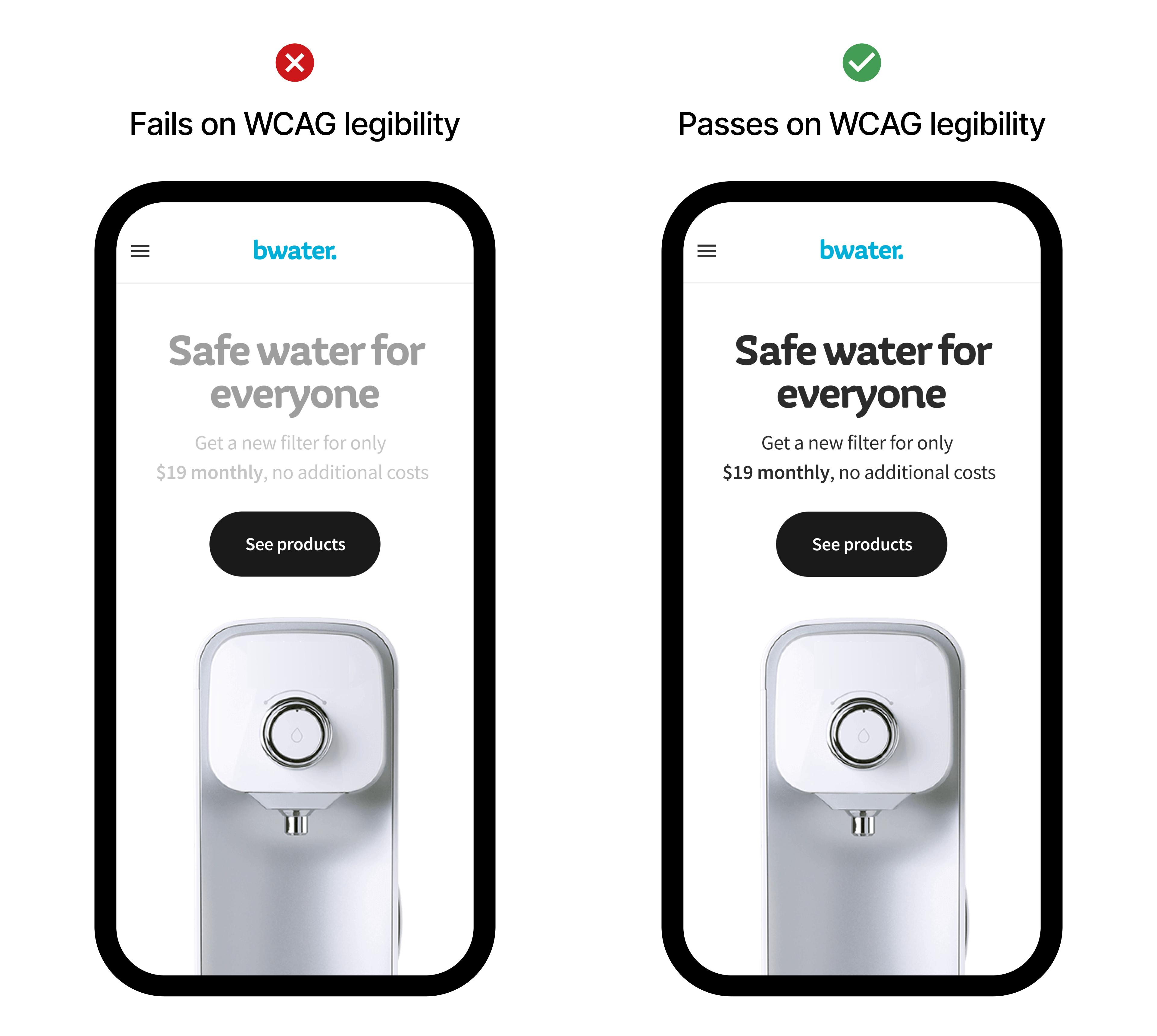
For people with low vision, sufficient contrast between text and background is essential. Light gray text on white, though fashionable, fails even mildly impaired readers. Following the contrast ratios set by the Web Content Accessibility Guidelines (WCAG) keeps content legible and understandable.
Color blindness affects a meaningful share of users and demands redundant cues. A form that signals an error purely by turning a border red leaves colorblind users guessing. Pairing color with text, icons, or patterns routes information through multiple channels, ensuring no one is locked out of critical context.
Building A Defensible Palette
Assembling a palette strategically means moving through several deliberate steps rather than picking hues on taste alone.
Start With Strategy
The first move is a deep read of the brand. What are its core values? Is its personality playful, authoritative, avant-garde? Audit existing brand guidelines, profile the target audience, and review the product’s stated goals. The palette has to operate as a visual extension of that identity. A financial app gunning for trust typically lands on blues and greens; a creative studio may take relief in more unconventional color.
Factor In Psychology And Culture
Even if broad color associations are not universal, they still provide a valuable starting grid. Decide on the emotional register the interface should hit, then research how the target demographic actually reads those colors, including cultural variation that can flip an interpretation entirely.
Set Core And Supporting Hues
Isolate a primary color first — usually drawn from the logo or established visual identity. From there, select one or two secondary colors that add hierarchy and visual interest without fighting the primary hue. These are the colors that give different UI elements their recognizable roles.
Construct The Full System
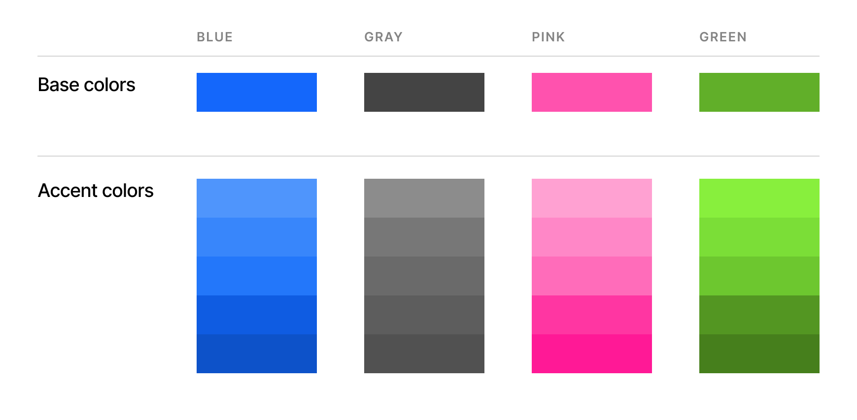
A usable palette is more than a handful of base colors. You need tints and shades of the main hues, functional accent colors, and a set of neutrals. This system ensures every state and component has a place to go without improvisation.
Validate For Usability
Check that text, backgrounds, and interactive elements meet WCAG contrast thresholds with standard ratio-checking tools. Then run the palette through color blindness simulators to spot where meaning is lost without access to certain cones. Finally, check visual hierarchy: the eye should know where to land first, and important actions should stand apart from the general field.
Iterate In Context
Test the palette on real mockups and prototypes before committing. Use stakeholder review and — where possible — actual user sessions to surface problems you cannot predict on your own. Loop through refinement until the palette does its job, then keep testing as the product evolves.
A color system meant for a production digital product must satisfy several requirements at once. It needs to be:
- Consistent,
- Scalable,
- Accessible,
- Brand-aligned,
- Emotionally resonant, and
- Functionally effective.
Handled that way, the palette becomes a strategic engine for accessible and effective user experience, not just a surface layer.
Consistency As A Trust Signal
Uniformity across a color system does more than please the eye. When interactive elements, navigation cues, and information displays share a predictable color language, the user’s journey feels stable and trustworthy.
That stability builds recognition: repeated exposure to the same hues binds them to the brand itself. Consistent use of color becomes part of a visual signature rivaling a logo in recall value. The same palette should carry through marketing channels, social media, and all digital touchpoints so the entire ecosystem reads as one brand. In practice, that coherence increases user loyalty and makes an interface easier to navigate without second-guessing.



