

Drupal’s Olivero Theme and the Complexity of Primary Navigation
Primary navigation is one of the most important parts of any website, yet it is deceptively hard to get right. Drupal’s new default theme, Olivero, introduced in version 9.4, had to balance usability, accessibility, robustness, and aesthetics from the start. Since Olivero is the default theme, its navigation will be used by a massive number of sites over time, which meant the team needed to build a system that works under unpredictable conditions: content editors can add one menu item or hundreds, text length is unknown, and languages may be right-to-left.
The result is a navigation system built on tested patterns, careful event handling, and a commitment to WCAG 2.1 AA standards — not just meeting the letter of the guidelines but making the experience genuinely usable for assistive technology users.
Markup Strategy: Buttons and Disclosure Widgets
Olivero’s menu markup starts with a standard <nav> element. It uses an aria-labelledby attribute that points to a visually hidden h2, giving screen reader users a clear name for the navigation and making it findable by heading. This pattern also helps users identify the navigation element among multiple navigations on a page.
For menu items that have children, the theme relies on a link disclosure widget pattern. Where the top level is a hyperlink, Olivero injects a <button> after the link, styled with a "down chevron" icon. This button is initialized with aria-controls (pointing to the ID of the nested <ul>) and aria-expanded. If JavaScript never loads, the button stays purely presentational and the submenu remains visible, so nothing is lost for users without scripting.
The button contains visually hidden text that repeats the menu item’s name followed by "sub-navigation." This lets keyboard users who tab through controls immediately understand what each button controls.
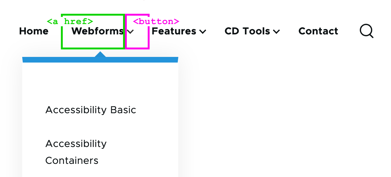
<nav aria-labelledby="block-olivero-main-menu-menu">
  <h2 class="visually-hidden" id="block-olivero-main-menu-menu">Main navigation</h2>
  <ul>
    <li>
      <a href="/">Webforms</a>
      <button aria-controls="primary-menu-item-12" aria-expanded="false">
        <span class="visually-hidden">Webforms sub-navigation</span>
      </button>
      <ul id="primary-menu-item-12">
        <!-- Submenu items -->
      </ul>
    </li>
    <!-- More top-level navigation items here. -->
  </ul>
</nav>
Desktop Behavior: Opening, Closing, and Preventing Conflicts
On desktop, submenus open on hover, click, and tap. The challenge is preventing these events from colliding, especially on touch devices where a tap may fire a hover event first, causing the menu to open and close instantly. Point-scanning assistive technology can trigger the same rapid sequence of events.
To handle this, Olivero listens for a touchstart event and, if one fires, it skips processing mouseover. When mouseover does run, the click handler is disabled for half a second. This layered approach ensures that no matter the input method, the menu behaves predictably and doesn’t flash open and closed.
Closing a submenu is just as specific:
- Pressing the
Escapekey closes the submenu and returns focus to the parent item. - A
mouseoutevent closes the menu unless focus is still inside the submenu. - On a
blurevent, submenus close so they never overlap or obscure one another, which protects the WCAG 2.4.7 focus-visible criterion.
Handling Overflowing Menus
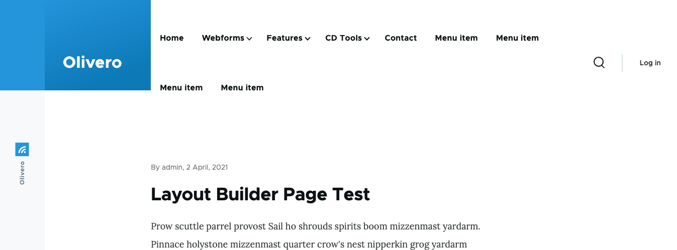
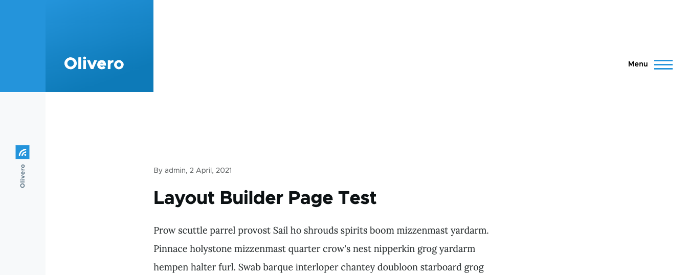
Because Olivero can’t limit how many items an editor adds, the theme supports unlimited items by letting the mobile-style menu be enabled at any screen width. Still, there is an edge case: at medium widths, the menu may wrap or overflow despite having enough room.
The theme solves this by checking, via a resize observer, whether the menu text has wrapped. If it has, the mobile menu is enabled, and the theme remembers to switch back to the desktop layout when the viewport grows large enough.
const navMenu = document.querySelector('.primary-nav');
const navItem = navMenu.querySelector('.primary-nav__menu-item');

function checkIfDesktopNavigationWraps() {
  if (isDesktopNav() && navMenu.height > navItem.clientHeight) {
    enableMobileNav(); // Enable the mobile navigation.
    // Remember when to switch back to desktop navigation.
    const navMediaQuery = window.matchMedia(`(max-width: ${window.innerWidth + 15}px)`);
    navMediaQuery.addEventListener('change', () => {
      // Double check to see if the navigation is wrapping to prevent edge
      // cases where the mobile menu should still be enabled.
      if (navMenu.clientHeight > navItem.clientHeight) {
        disableMobileNav(navMenu, navItem);
      }
    }, { once: true });
  }
}

const resizeObserver = new ResizeObserver(checkIfDesktopNavigationWraps);
resizeObserver.observe(navMenu);
Constraining Submenus to the Viewport
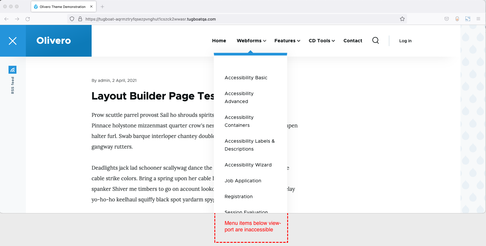
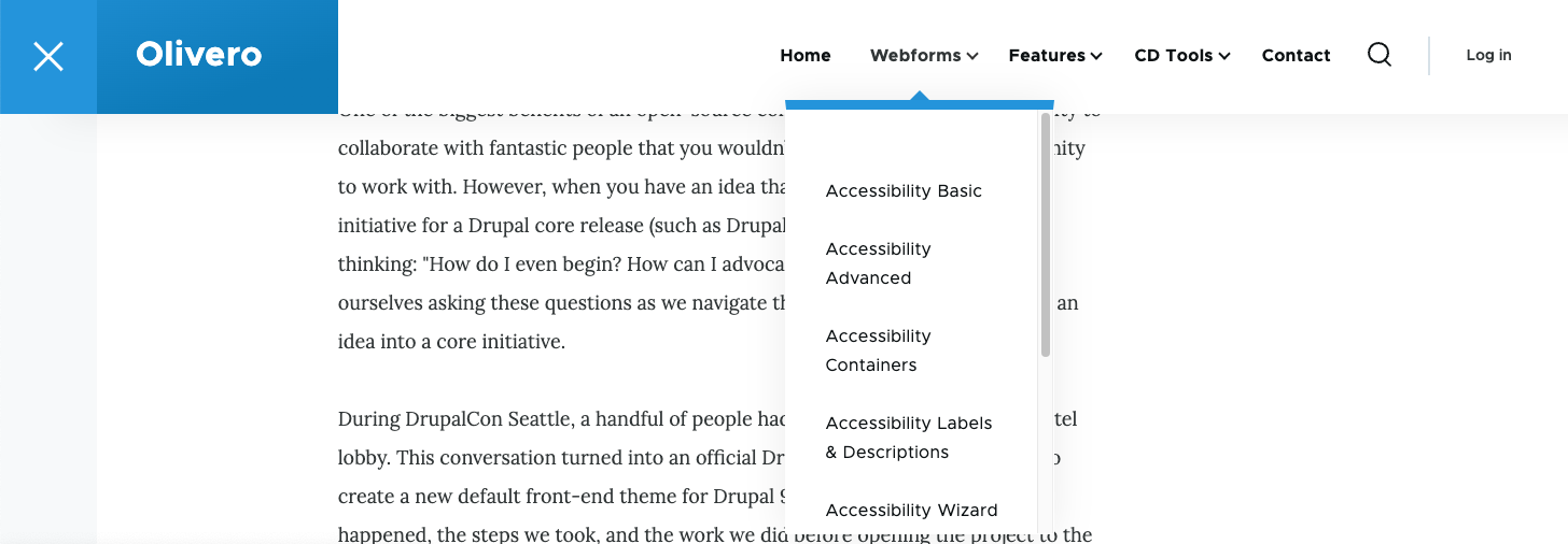
Olivero’s menu is fixed to the top of the viewport. If the page is shorter than a submenu, the user can’t scroll to the bottom of that submenu, which fails WCAG 2.4.7 again. The fix is to measure the header’s height and then set max-height and overflow: auto on the submenu.
.submenu {
  max-height: calc(100vh - var(--header-height));
  overflow: auto;
}
With these CSS rules, the submenu never exceeds the viewport height. If it’s too long, the browser handles scrolling internally, and when the user tabs to the bottom, the browser automatically scrolls hidden items into view.
Non-JavaScript Desktop Support
Since Drupal renders server-side markup, it can support no-JS environments. To make the submenus work there, Olivero applies :hover and :focus-within styles directly on the parent menu item, so the submenu is reachable even without JavaScript.
body:not(.js) .menu-item:is(:hover, :focus-visible) .menu-level-2 {
  visibility: visible;
}
Mobile Menu: Focus Management and Links
The mobile menu mirrors the desktop behavior with one exception: no hover reactions. The aria attributes remain consistent. The menu is toggled by a button that is hidden at desktop widths and carries the same aria-expanded and aria-controls attributes.
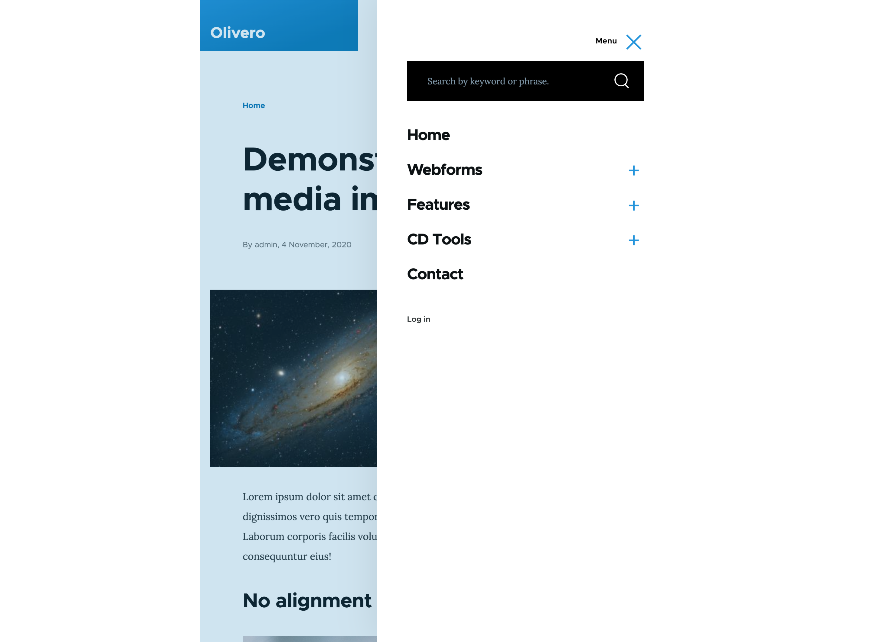
Clicking the toggle opens the menu. Users can close it by tapping outside or by pressing Escape, which returns focus to the toggle button. Because the menu overlays the page, hidden content can’t accidentally capture focus. Oliveo implements a focus trap inside the menu so keyboard users can’t tab out of the overlay.
Anchor links presented their own edge case: clicking one would scroll the page while the mobile menu stayed open. JavaScript now detects anchor targets and automatically closes the mobile menu for those links.
// If hyperlink links to an anchor in the current page, close the mobile menu after click.
navWrapper.addEventListener('click', (e) => {
  if (e.target.matches(`[href*="${window.location.pathname}#"], [href^="#"]`)) {
    closeNavigation();
  }
});
For mobile users without JavaScript, the menu must appear immediately, not after a button press. To avoid a flash of the menu on load when JavaScript is available, the no‑JS stylesheet is placed inside a <noscript> tag in the <head>. Browsers only parse those rules when scripting is disabled.
Focus, Forced Colors, and Ongoing Testing
Focus Styles
Olivero’s focus styles are deliberately designed to match the theme’s overall look. They’re treated as a core part of the user experience, not an afterthought.

Forced Colors Mode
The navigation has been broadly tested in Windows high-contrast mode across Edge, Chrome, and Firefox, using light-on-dark, dark-on-light, and custom color schemes. Icons are created either from borders, which adapt naturally to forced colors, or styled with the forced-colors: active media query. The mobile menu overlay’s background uses the CanvasText system color to keep a visible boundary in any scheme.

Accessibility Is Ongoing
The team behind Olivero tested the theme extensively on numerous devices and with assistive technology, including additional screen reader testing with the National Federation of the Blind. Still, the project treats accessibility as an ongoing effort — problems will inevitably surface over the theme’s lifetime, and they will be addressed as they are reported. The code is open source under the GPL, and the simplified examples in the theme are shared with the hope that these lessons help improve navigation across the web.


