

When Data Looks Right but Says Nothing
Every function in an organisation now has dashboards. The tools are cheap, the data is plentiful, and yet the weekly review still ends the same way: numbers are shown, heads nod, and no decision is made. The usual suspect is the data itself — not granular enough, not complete enough. In practice, the data is rarely at fault. The dashboard was never designed to deliver an insight. The chart reflects what was available, not the question that needed answering; the audience was assumed, not understood; and the intended outcome of viewing the data was never defined.
Data visualisation and UX share a core problem: getting the right information to the right person so that something changes. Treat them as complementary disciplines rather than separate crafts, and a dashboard stops being a passive chart collection and starts doing functional work. This matters for designers working with data, analysts presenting to non-technical audiences, and anyone whose numbers are meant to drive action.
Beyond the Data-Ink Ratio
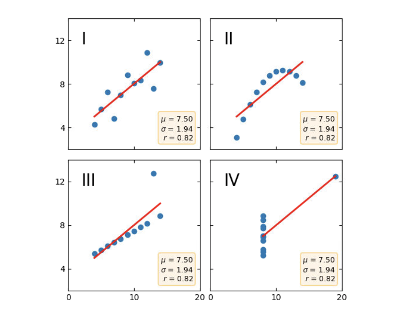
In 1973, statistician Francis Anscombe published a set of four datasets that are statistically identical — same mean, same variance, same correlation coefficient, same regression line — yet plot into entirely different shapes. The lesson was diagnostic: visualisation exposes operational truths that raw numbers conceal.
Visualisation is also communicative, and the chosen form determines whether understanding emerges or gets lost. Visual Capitalist’s History of Pandemics is a strong example. Instead of presenting a dense table of casualty counts, it uses a proportional bubble layout on a single timeline to map the death toll of major pandemics.
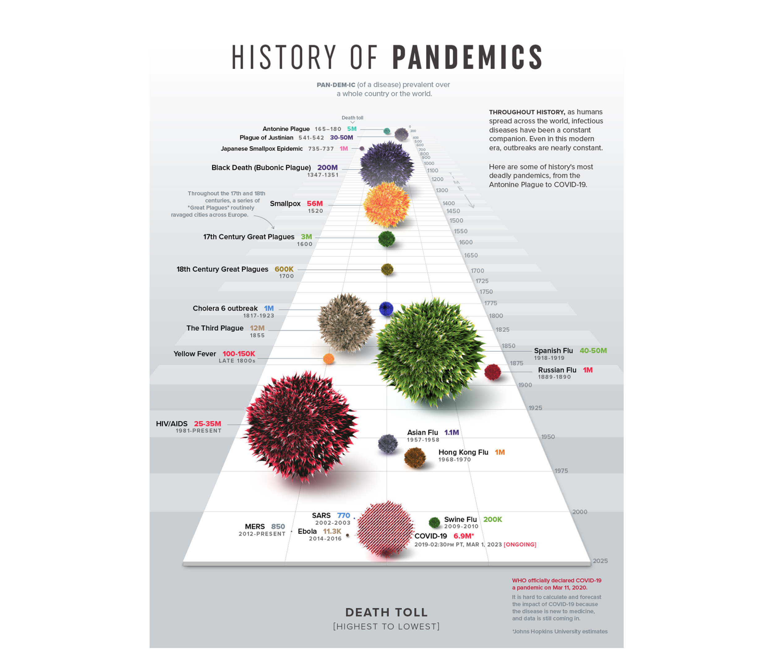
Before reading a single figure, the visual system grasps the scale of the Black Death relative to everything else on the page. The right visualisation does not merely plot data — it makes the story impossible to miss.
Edward Tufte’s data-ink ratio — every mark on a chart should serve the data, not decorate it — remains a widely used framework. It assumes that clarity and visual hygiene are the goal. For a chart in isolation, that holds. But a chart is never read in isolation; it reaches a person in a specific context under specific pressure. Stripping a chart to its cleanest form can remove the exact layer of context a decision-maker needs. The goal is not simplicity for its own sake, but appropriate complexity. A dashboard that signals the right amount depends on who is receiving it — and that points to a core principle of data UX: roughly 80% of the work that determines whether a dashboard succeeds happens before a single chart is drawn.
The Three Questions to Ask Before Opening a Tool
The high-leverage work happens upstream, before any tool is opened, any dataset is pulled, or any design decision is made. It reduces to three questions. Once they become habitual, they change what you notice, what you ask, and what you push back on at the start of any project.
- Context: What are we trying to show with this data?
Define the precise operational questions the visualisation must serve before touching raw data. Writing them down with enough specificity determines what gets pulled and what gets filtered — and produces a dashboard that aids decision-making. - Audience: Who is this for, and how do they think?
The empathy step. Knowing who is in the room, what they are accountable for, and how they engage with data determines how much complexity the visualisation can carry and how it should be presented. - Insight: What should change once this data lands?
A decision, a new direction, a shift in understanding. If the intended strategic outcome is unclear during design, it will remain invisible once the dashboard goes live.
Context: Start with the Question, Not the Data
Most data projects start backward, pulling whatever metrics internal analytics tools already track and building visualisations around them. The question the data was supposed to answer gets assumed or never asked, because teams anchor on the data in front of them as the boundary of possibility.
Defining a goal first sounds obvious but rarely happens with clarity. “Show me how the product is performing” is not a goal; “identify which features drive retention among users who signed up in Q1” is — it includes a metric, a population, and an implied action. That specificity converts an open-ended exploration into a constrained, answerable design problem. It determines what gets included, what comparisons matter, and what gets left out entirely.
Consider a UX team working on a leaky checkout flow for an e-commerce site. The data-first approach pulls everything available — clicks, scroll depth, device types — and yields a massive dashboard that leaves everyone asking what to actually change. The context-first approach starts with a constraint: “At which step of the checkout do users drop off?” By filtering out 90% of the noise, the team builds a simple funnel chart, spots a bottleneck on the payment screen, and knows exactly what to redesign.
Audience: Familiarity and Accountability Set the Density Dial
Designing for an audience comes down to two factors: familiarity and accountability.
Familiarity is data literacy. A dense, multi-layered dashboard that an analyst reads instinctively can create friction for a Head of Sales. Handing both the same view is like giving a map to someone who navigates by landmarks and someone who reads grid coordinates — the data is accurate, but it functions for only one of them.
Accountability dictates how complexity must be presented. A chart showing a 12% decline carries very different weight for the executive responsible for that number versus the analyst reporting it. Data is never processed neutrally when performance is on the line. Together, familiarity and accountability decide one practical thing: how much you can put in front of someone.
In data visualisation, simplicity is not a fixed virtue — the right level of it is contingent on who is reading, and what they need to do.
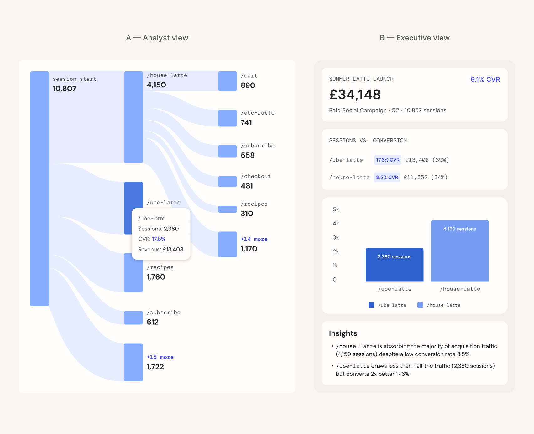
An analyst needs high density for diagnostic discovery — isolating individual behaviour nodes and mapping raw user flows to interrogate the data at its atomic level. An executive needs a highly synthesised translation of that same data to immediately identify what drives commercial growth. Tailoring a dashboard to the audience means adjusting the density dial to deliver maximum signal with appropriate complexity for the specific brain in the room.
Insight: Information Is Not the Same as Action
Many data projects assume that if a chart is accurate and clear, the insight will take care of itself. But information and insight are different states. Information is what the data shows; insight is the specific decision, shift in understanding, or course correction someone makes from seeing it. If the intended business change is not defined before design begins, the dashboard defaults to passive reporting instead of driving action.
Marketing and engineering teams feel this gap whenever a core metric suddenly drops. A dashboard built for information simply sounds the alarm with a chart of a sharp 15% drop in booking rates. Because the data lacks depth, leadership defaults to panic, calls the UX team, and assumes the app is broken. Without data that pinpoints the problem, the result is a costly, misplaced fire drill.
A dashboard built for insight isolates the variables needed for an informed decision. Instead of a flat booking metric, the visualisation maps the drop against traffic sources and campaign launches — revealing that app performance and core user conversion are stable, while the sitewide rate was diluted by a massive influx of low-intent click traffic from a newly scaled campaign. The team does not waste time redesigning a functioning app; it gets the insight needed to pause the underperforming campaign and adjust acquisition strategy.
Radar Charts, Role Splits, And The Real Driver Of Engagement
A dashboard project for a B2B talent-management platform built on Pegasystems skills exposed what usually goes wrong when teams try to visualise a vast telemetry archive. The client had the data and the ambition — “present it to enterprise teams” — but no clear definition of what users were supposed to do with it.
The risk was obvious: chart everything captured and hand users a data graveyard. The design work therefore became less about interface polish and more about building a practical tool that people would open routinely and trust to tell an honest story about their workflows.
Choosing Metrics That Mean Something
“Performance” needed a concrete definition before any visualisation made sense. What separates advancement from passive usage? The obvious candidate, time spent per product, is tracked by every platform and easy to display. It also only proves presence, not progress.
The more meaningful signals turned out to be competency scores by area, certification completion rates, and historical performance trajectories. Time spent still had value, but as a supporting layer: it revealed which modules users underutilised and whether that correlated with lagging scores.
Granularity was the second defining question. The same metric carries different weight depending on the viewer. An individual contributor tracking their own completion rate needs to know if they are pacing correctly. A manager reviewing a team aggregate needs to know exactly who requires immediate support. That distinction shaped every downstream decision about data exposure and filtering.
Two Audiences, Two Narrative Structures
The lazy solution would have been identical charts with an individual view and an aggregated team view. That approach just rescales the same visualisation and calls it personalisation.
A genuine audience analysis exposed a deeper split. Individual contributors needed a workspace that functioned as a tailored mirror — granular, honest and personal. The design drew on the familiar frustration of opening an e-learning tool with no sense of current standing, core strengths, or slipping metrics.
Managers needed the opposite starting point. Their interface bypassed individual milestones to show a macro pulse check on team vulnerabilities: how is the group progressing, where are the consistent gaps? The aggregate picture came first, with an intuitive path down to tactical day-to-day coordination.
Designing The Mental Model Early
The insight strategy was settled before wireframing began. The goal was not a dense, passive log but a paced narrative arc. For individual contributors, the Monday-morning glance had to produce a clear weekly priority list. For managers, the aim was to shift the timing of operational conversations — intervening before a skill gap became a critical project failure, not after.
When The Shape Of Data Decides The Chart
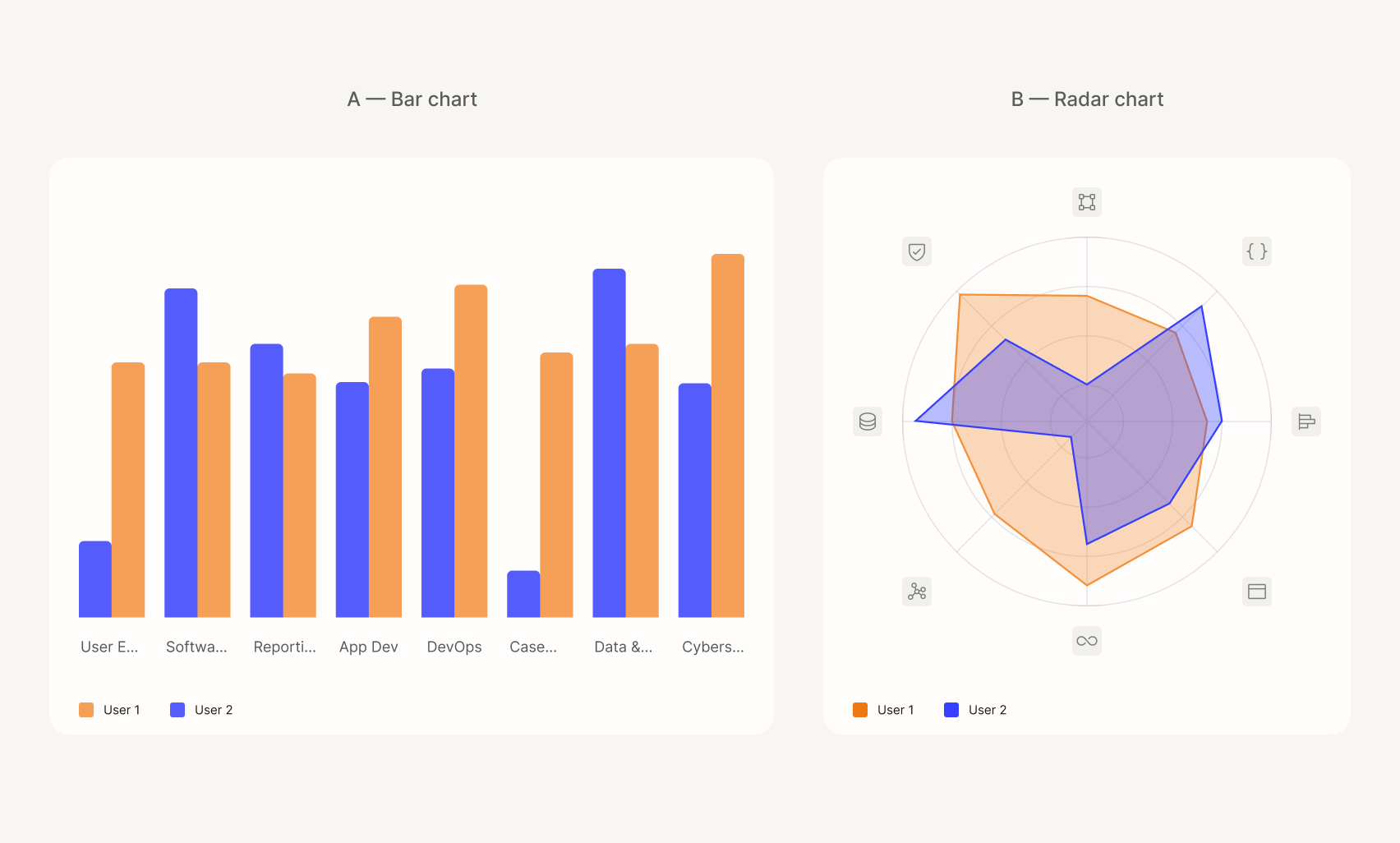
The core design problem for individual users was answering one question at a glance: across eight competency areas, where are the relative strengths and gaps? The data’s geometric nature led to a radar chart.
Polar coordinates radiating from a central point connect the variables into a single unified polygon. A balanced shape signals well-rounded proficiency; a skewed shape pinpoints the outlier. A linear bar chart would have forced the viewer to scan eight bars and mentally calculate variance. With all dimensions sharing an identical scale and scoring method, the radar chart is not stylistic decoration — it is the most functional tool for multi-dimensional analysis.
The colour system followed the same upstream logic. Each of the three products got a colour during branding, and that colour was built into the data model from the start — consistent across every chart, filter and breakdown. By the first dashboard visit, the mental model was already in place. Users were not taught the language; they already knew it.
The Unasked-For Feature That Won
Manager and individual dashboards were easy to anticipate. The comparison tool was not in any brief: what if a manager wants two specific team members side by side against identical metrics? That view grew from a design assumption and became the most resonant feature of the project.
The decisions that mattered most were not in the initial request. They involved capturing data the client had not thought to ask for and structuring it to answer questions they had not previously known how to articulate. That is the core differentiator of a user-centric data strategy.
What Changed After Deployment
The shift from passive information to active insight showed up in usage patterns. After the personalised dashboards and side-by-side comparison tools launched, weekly active engagement with analytics features rose noticeably, per internally reported figures. Managers stopped opening the tool monthly for static reports and started using it every Monday to plan the week.
Revenue and user growth improved over the following two quarters, though isolating the dashboard’s exact contribution is difficult with other changes happening in parallel. The client reported churn falling to one of its lowest points on record. The clearest signal came from qualitative feedback: managers used the visualisations to spot slipping performance and schedule a quick supportive check-in before it became a real gap, instead of dissecting a bad month after the fact.
Where Dashboard Design Actually Starts
Data design works when visual presentation is an upstream architectural choice, not a downstream formatting step. Three principles carry that idea:
- Upstream framing: Ground every visual choice in a specific operational question rather than defaulting to the metrics you already have.
- Calibrated density: Tune complexity to the literacy and accountability of the specific reader, not to the volume of available data.
- Decision-driven insight: Structure data to expose strategic outcomes, turning visual signals into operational momentum instead of isolated stats.
For the next dashboard, executive report or public-facing infographic, step away from the canvas and the BI tools first. Put the initial effort into the human decisions behind the screen. That is when data stops being a passive archive of the past and starts steering the future.



