Focus indicators: adopting :focus-visible safely
Chrome now relies on :focus-visible rather than :focus in its user agent stylesheet, which means the default focus ring no longer appears when a button is clicked or tapped. That change gives developers a reason to move their custom keyboard focus styles over to the same pseudo-class.
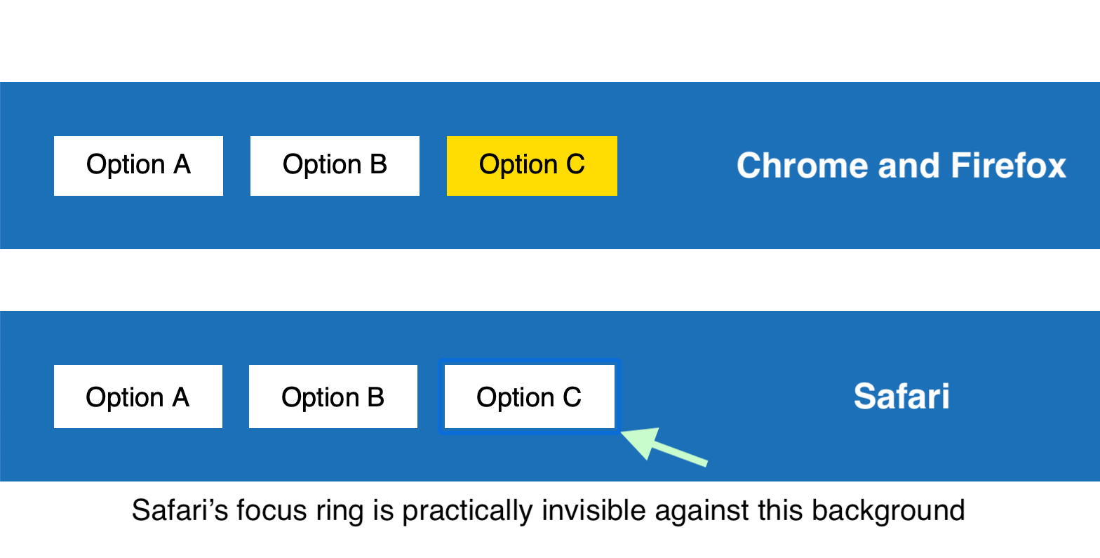
The migration needs care. Keyboard focus indicators should remain clearly visible in every browser, not only those that support :focus-visible. If you style the pseudo-class alone, older engines fall back to their default ring, which in some designs "may not be sufficiently clear or visible at all."
button {
  background: white;
}

button:focus-visible {
  outline: none;
  background: #ffdd00; /* gold */
}
A pattern that works across browsers today is to declare the focus styles in a :focus rule and then undo them in a :focus:not(:focus-visible) rule. It is not the most elegant approach, but its behavior is predictable:
- Browsers without
:focus-visiblesupport apply the:focusstyles and ignore the second rule entirely, since the selector is unknown to them. - Supporting browsers let the second rule cancel the
:focusstyles whenever:focus-visibleis not also active, so the custom indicator only shows when it should.
button:focus {
  outline: none;
  background: #ffdd00; /* gold */
}

button:focus:not(:focus-visible) {
  background: white; /* undo gold */
}
Reith: a typeface built for screens and mixed abilities
The BBC commissioned its own typeface, Reith, named for founder Sir John Reith. The brief called for a font covering multiple languages and easier to read, particularly on small devices; it was tested with user groups of mixed abilities, including people with dyslexia and vision impairment, and across screen sizes.
We [the BBC] were using Helvetica or Arial. We also had Gill Sans as the corporate typeface. These typefaces were designed a hundred years ago for the printed page [and] don’t perform well on today’s modern digital screens.
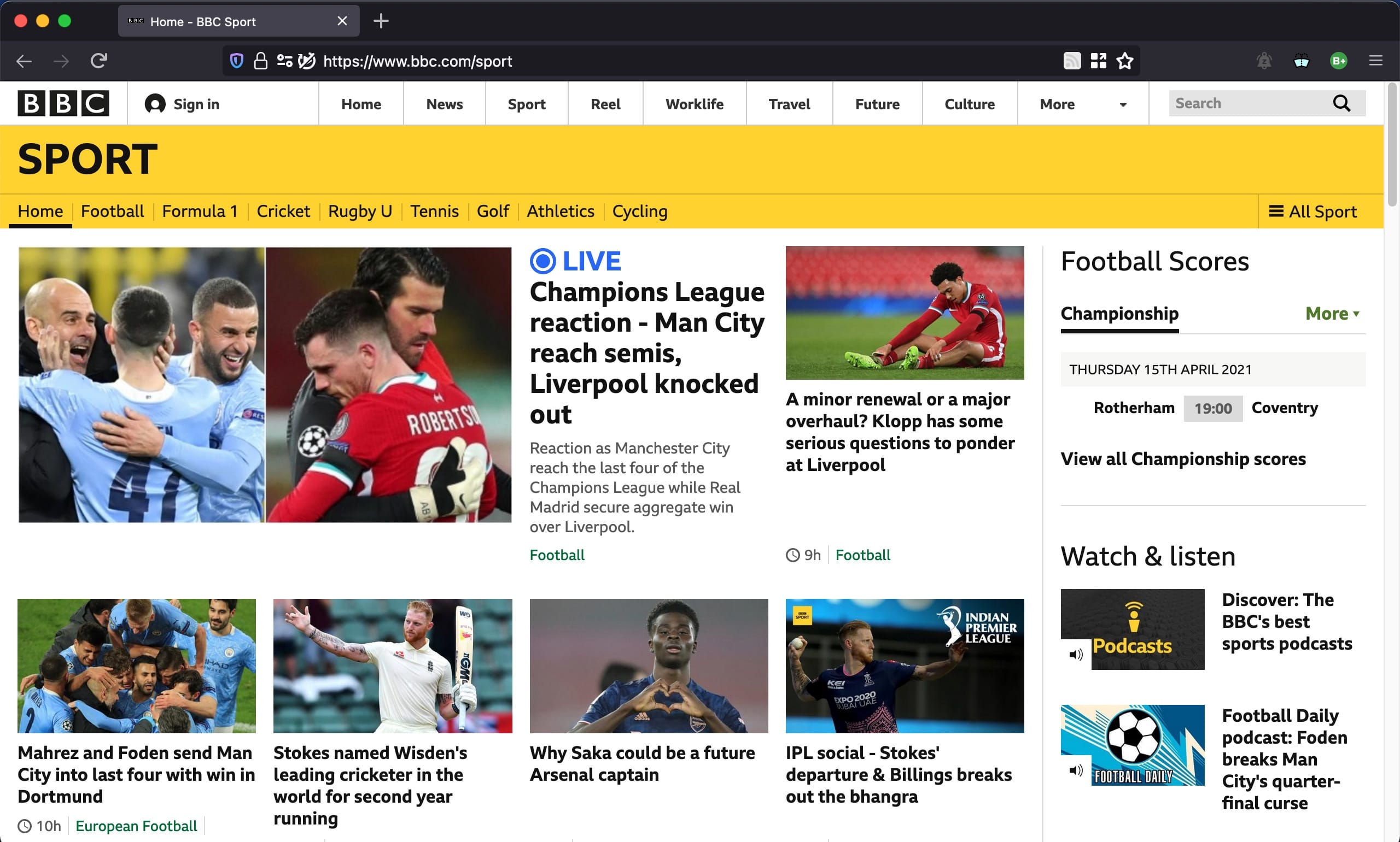
To examine Reith Sans and Reith Serif in Wakamai Fondue, open the Fonts pane in Firefox’s DOM inspector on the BBC site and pull the WOFF2 URLs from the “All fonts on page” section.
display: contents and the Safari accessibility tree
The display: contents value has shipped since 2018. An element using it generates no boxes and is effectively replaced by its children, which is handy in flex and grid layouts: deeply nested elements can become flex or grid items while the semantic document structure stays intact.
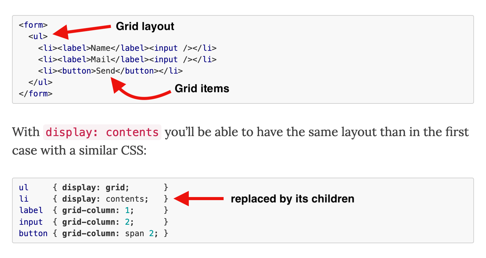
The feature originally shipped with an implementation bug that dropped the element from the browser’s accessibility tree — a <ul> given display: contents, for instance, was no longer announced by screen readers. Firefox and Chrome have since fixed it, the latter in its latest version.
In Chrome and Firefox, a screen reader reports a “Main, navigation” region containing “list, 2 items.” Safari omits the second part because the <ul> and <li> elements are absent from the accessibility tree. Until Apple resolves the WebKit bug, use the value cautiously on semantic elements and verify the result with screen readers in Safari.
Placeholder text: styling the contrast-sensitive parts
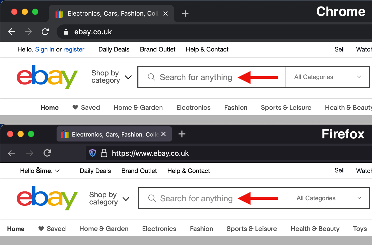
Accessibility guidance generally discourages placeholders, since they can be mistaken for pre-filled values and vanish once typing starts. Even so, they remain common in single-field forms such as search boxes, on sites like Wikipedia and GOV.UK.

The ::placeholder pseudo-element is widely supported for styling this text. When a design specifies a custom placeholder color, set both color and opacity: Firefox applies opacity: 0.54 to ::placeholder by default, and leaving that value untouched can leave the text with insufficient contrast in that browser.
.search-field::placeholder {
  color: #727272;
  opacity: 1; /* needed for Firefox */
}
Declarative shadow DOM and style encapsulation
Style encapsulation is a core shadow DOM capability: outer page rules don’t match elements inside the shadow tree, and the reverse holds too. Using it normally means attaching a shadow DOM tree to an element — usually a custom element such as <my-element> — and copying in the element’s template, typically taken from a <template> in the DOM. Both steps require JavaScript.
When only encapsulation is needed and the element has no dynamic behavior, the smallest possible script for a custom element with a shadow DOM looks like this:
customElements.define(
  "my-element",
  class extends HTMLElement {
    constructor() {
      super();

      // find <template id="my-template"> in the DOM
      let template = document.getElementById("my-template");

      // make a copy of the template contents…
      let content = template.content.cloneNode(true);

      // …and inject it into <my-element>’s shadow DOM
      this.attachShadow({ mode: "open" }).appendChild(content);
    }
  }
);
Miriam Suzanne’s <media-object> element on CodePen demonstrates the effect; its scoped styles live in the <template> element in the HTML pane, where simple selectors such as article match only elements within <media-object>’s shadow DOM.
Chrome became the first browser to ship Google’s Declarative Shadow DOM proposal. Should it become a standard, this kind of encapsulation will no longer depend on JavaScript in modern browsers, and Shadow DOM will also become usable alongside server-side rendering.