The Right Way to Ask for Push Permission
Getting a PushSubscription and saving it to your server is straightforward, but just triggering a push message skips a crucial step: the experience of asking the user for permission. Too few sites think through how they request this, and it shows. Here's a breakdown of better patterns and the one mistake to avoid.
Ask When the Value Is Obvious
The best time to request push permission is when the benefit is immediately clear. Consider a user who has just completed a checkout on an online store; offering delivery updates at that exact moment makes sense. The user has already invested in your service and can see exactly what they get for granting access.
Other good moments follow the same logic:
- An out-of-stock item becomes available and the user wants to be notified.
- A breaking news story will get updates, and the user wants to follow along.
- The user is the highest bidder and wants to know if they are outbid.
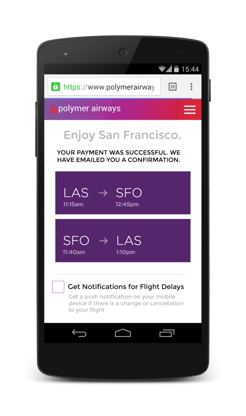
This mock of an airline website demonstrates the approach. Right after a flight booking is confirmed, the site asks if the user wants notifications about flight delays. Note the use of a custom UI element here, not the raw browser prompt.
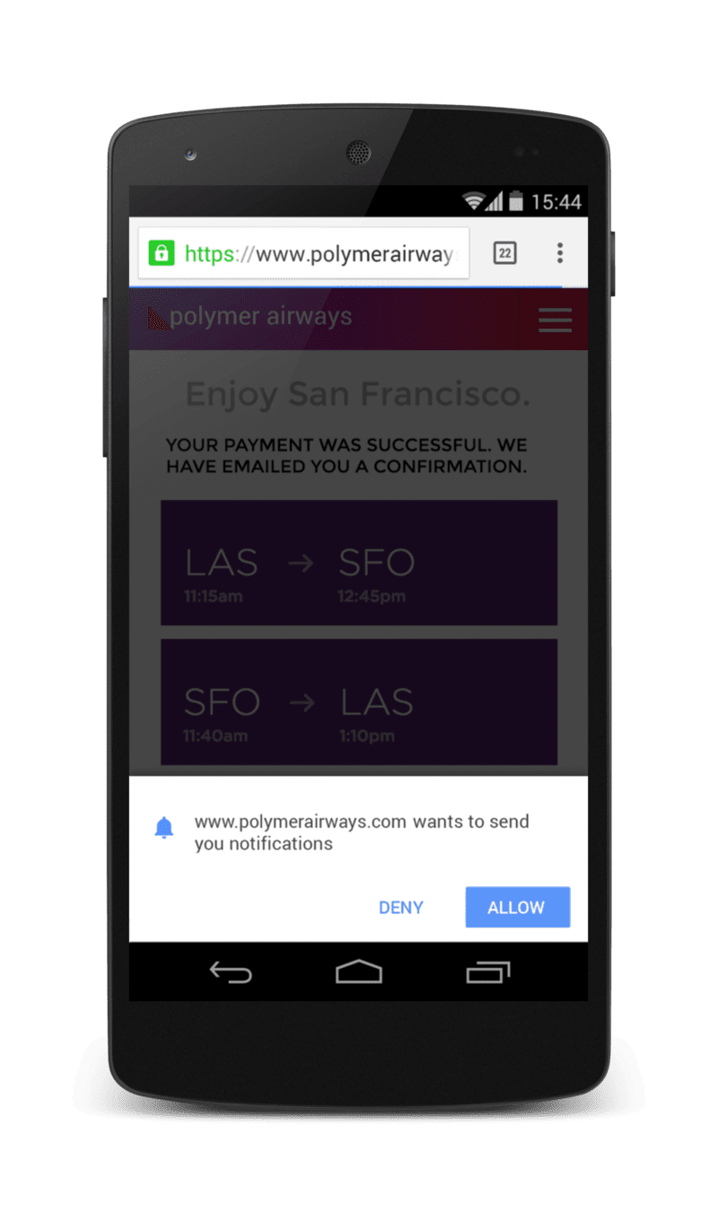
One thoughtful detail from this example: if the user clicks to enable, the site renders a semi-transparent overlay across the whole page before showing the permission prompt. That directs focus exactly where it needs to be.
The opposite approach, and clearly the bad one, is to fire the permission prompt the moment a user lands on the airline's homepage.
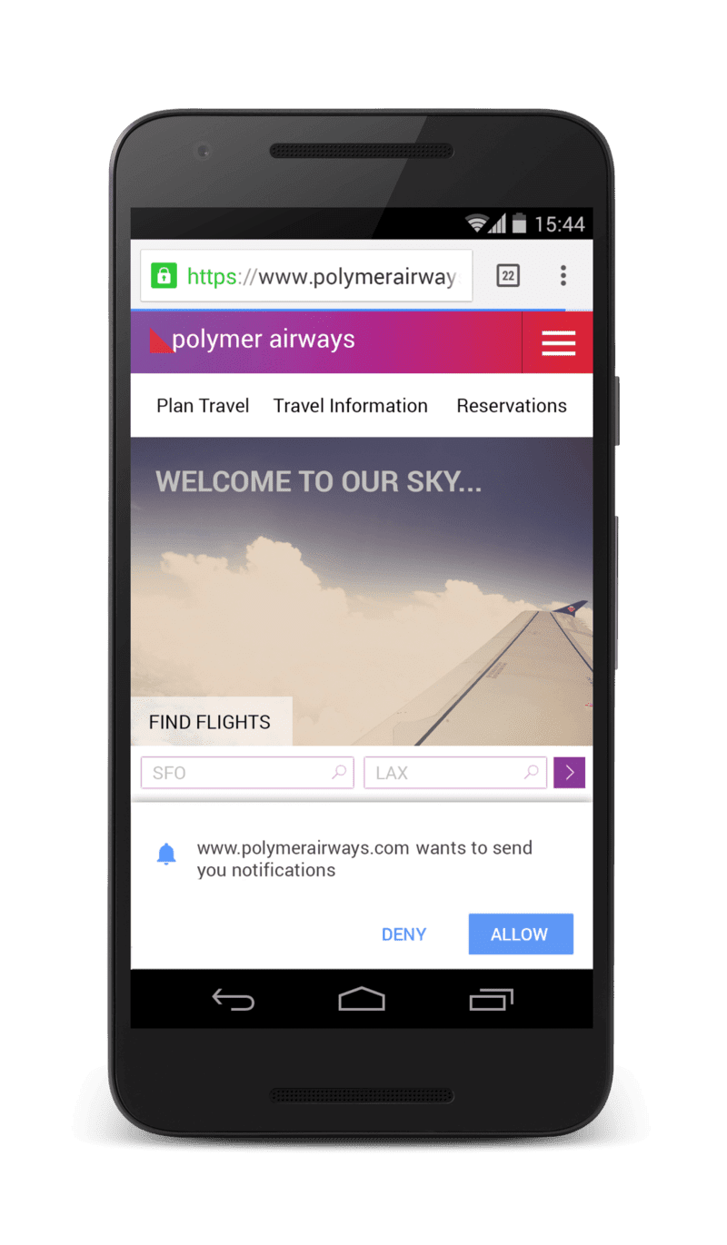
That immediate prompt gives the user no context for why notifications are useful. It also blocks them from what they came to do, like booking a flight, which makes denial more likely.
The Double Permission Pattern
Some product categories, such as instant messaging or email clients, have an obvious reason to ask for push immediately. Showing a new message notification is an established behavior on other platforms. Even so, these sites should consider the double permission pattern.
Here’s how it works: first show a dialog that your website controls, and explain the value proposition. Present buttons that explicitly trigger the official permission request or politely decline it. If the user opts in, present the browser's real prompt. If they choose no, your custom dialog simply disappears and respects their wish. This method avoids the risk of the user being permanently blocked because they were startled by an unexpected prompt.
You can dig deeper into permissions best practices and see a real-world implementation in how Google Meet reworked its flow.
Use a Settings Panel
Notifications don't have to live front and center. Putting them in a settings panel gives users control without cluttering the main interface.
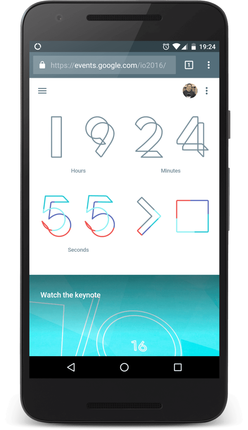
The Google I/O site is a good model. When you first visit, you're not asked to do anything; explore the site without interruptions.
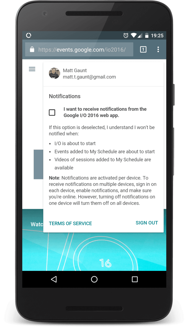
After a few visits, the menu option opens a settings panel where notifications can be managed.
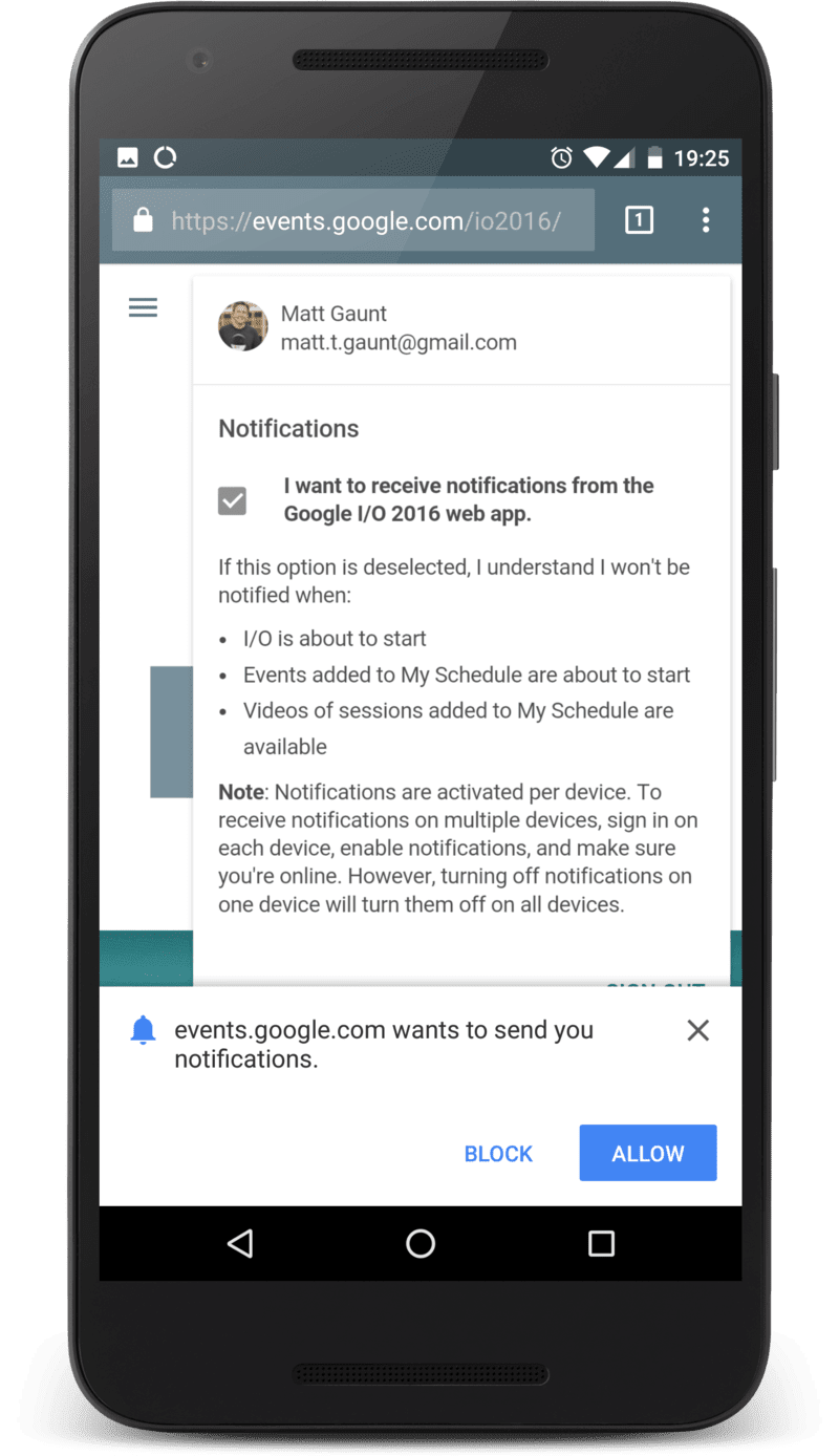
Clicking the checkbox there surfaces the permission prompt. The user controls the timing and gets no surprises. Once granted, the checkbox is marked, and the user can flip the setting on and off from that single spot on the site.
The Passive Approach
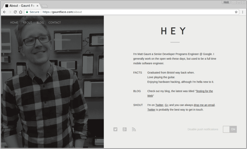
For blogs or sites with a healthy bounce rate, a simpler option is to keep a toggle for push notifications in a consistent location on each page, like the footer. Regular readers looking for updates will eventually find it without bothering first-time visitors.
One example is a personal blog that includes such a toggle in the footer:
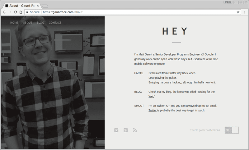
The toggle keeps its state as the user navigates around, offering a reliable way to control subscriptions.
Avoid the Blocked-Opportunity Trap
The worst pattern on the web is showing the permission dialog immediately on page load. Visitors have no frame of reference for why you're asking, and they may not even understand what your site is about yet. Often, they'll block the request out of annoyance because it gets in the way of their task.
Remember that if a user blocks your permission request, your web app cannot ask again. The only recovery path requires the user to change the permission manually in the browser's obscure UI, which is a frustrating experience. Avoid the immediate ask and instead tie your request to a clear incentive.
Always Offer a Way Out
Consider how users will unsubscribe with the same care you apply to subscribing them. Far too many sites demand permission on arrival and then never present any interface for turning notifications off. Provide clear guidance on how to disable push. If you don't, the user may take the extreme option and permanently block permissions, cutting off any future opportunity to re-engage.


