Reading Jepsen Histories at a Glance
Much of Jepsen’s work—testing distributed systems for consistency and fault tolerance—comes down to staring at large histories of operations and trying to build intuition about what a system actually did. A new visualization in the Jepsen library aims to make that easier by turning operation histories into a single, readable plot.
A Jepsen test records every operation it attempts, and those operations typically fall into a few categories. In a queue test, for example, writes might be acknowledged, read back later, lost, or appear without ever being enqueued. A checker classifies each operation and produces statistics plus concrete examples of each flavor. Here is one such breakdown from the NATS test suite:
{:valid?             false,
 :attempt-count      529583,
 :acknowledged-count 529369,
 :read-count         242123,
 :ok-count           242123,
 :recovered-count    3
 :hole-count         159427,
 :lost-count         287249,
 :unexpected-count   0,
 :lost               #{"110-6014" ... "86-8234"},
 :holes              #{"110-4072" ...  "86-8234"},
 :unexpected         #{}}
Numbers alone tell part of the story: most writes were acknowledged, about half were read back, a handful were “recovered” (their outcome was unknown but they later appeared), and roughly half were lost—acknowledged but never seen again. Examples in the output let you dig into the history to investigate specific writes.
But statistical summaries miss qualitative patterns. Were lost writes clustered in time or spread out? Did data loss happen in bursts after a fault, or uniformly? Did an event destroy everything before a certain point, or did some records survive? Was the loss truly permanent, or could it be explained by slow delivery?
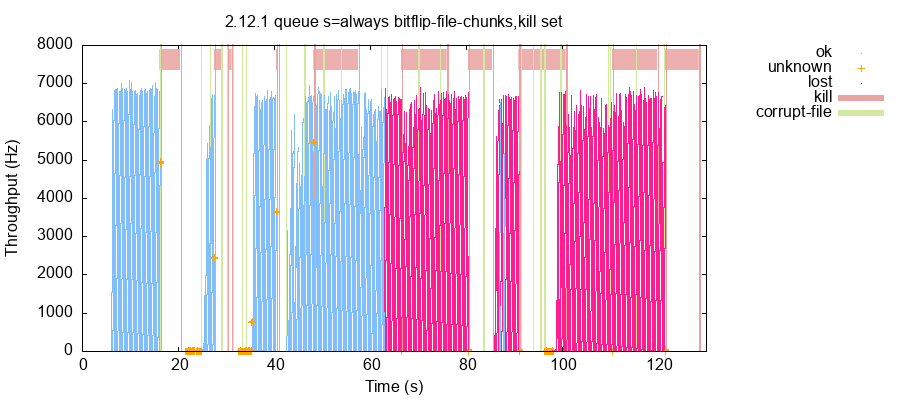
The new plot answers those questions directly. Time runs left to right; each operation becomes a single point, colored by its outcome. Operations are stacked vertically so the silhouette of the plot tracks throughput over time. Fault-injection events appear as vertical lines, with process kills shown as horizontal bars spanning their duration.
Reading this particular plot, data loss is clearly not random. It occurs in two large blocks, beginning near a file-corruption operation around 65 seconds and continuing to the end of the test. A handful of writes survived around the 87-second mark, but everything after that was lost. Those surviving records in the middle are important: they suggest the loss is genuine, not merely a lagging reader. Throughput holds steady at roughly 6,800 records per second for both OK and lost operations, while unknown operations run far slower—likely due to timeouts. The plot also shows that some, but not all, process kills caused throughput to collapse; certain kills halted the cluster until nodes restarted, while others were absorbed after a few seconds.
Design Constraints
Jepsen histories range from a handful of operations to hundreds of millions, so the plot must adapt. In this instance, frequent operations like ok and lost are rendered as single-pixel dots, while the few unknown operations are drawn with a larger cross marker. Infrequent operations are often the most interesting, and this ensures they do not vanish into the noise.
The visualization is still a work in progress. There are, by the author’s own admission, too few distinguishable colors to represent every fault type, and the current red/green pairing is awkward for color-blind readers. The point-layout algorithm—which divides history into 512 time windows, sizes each window by throughput, and spreads points uniformly along the y axis—produces some moiré artifacts. An adaptive transparency scheme over overlapping dots might approximate a density field more clearly, though it risks muddying windows that contain very few points.
Even in its current state, the plot has proved useful for triage: judging how bad a run is at a glance, deciding where to focus a deeper investigation, and refining checker logic. Because the same approach could apply to many problem shapes—lost elements of a set, SQL transaction anomalies, or read-only versus read-write query behavior under faults—the author is holding off on a definitive name and calling them “op color plots” for now. They are available in the current Jepsen 0.3.10-SNAPSHOT release.


