
Type patterns and the print-design lineage
The concept has a long pedigree: desktop publishing tools have shipped "paragraph styles" for decades. The idea is centralisation — you define how a piece of typography behaves in one place, and that definition can be redefined project-wide, exactly as a book designer changes every heading across hundreds of pages on the fly. Paragraph styles map to block-level elements; character styles map to inline-level ones, such as bold runs or unique spans.
Under the hood those style panes are just key: value pairs, which is structurally identical to CSS property: value pairs. The + marker beside a style name in print software flags that a definition has changed locally, with a click to redefine it globally.
The analogy suggests that a CSS class already solves this. It doesn't quite, because a website has no fixed canvas: it might render on a small mobile device, a large desktop monitor, or a monochrome tablet. Classes therefore need to be contextual and respond to their context.
The baseline: semantic HTML and browser defaults
A simple approach gets surprisingly far. Semantic headings paired with CSS that targets those elements and scales them in descending order works. User agent styles give this approach headroom: browsers add font-weight, margin and collapsing margins to headings before any author CSS exists, so a hierarchy stands even with no stylesheet at all. That is beginner-friendly and fallback-friendly.
h1 {
  font-size: 50px; /* key: value pairs */
  color: #ff0066;
}

h2 {
  font-size: 32px;
  color: rgba(0,0,0,.8);
}

p {
  font-size: 16px;
  color: deepskyblue;
  line-height: 1.5;
}
As pages, modules and components multiply, the approach creaks. Special-situation classes appear first, then classes on everything — a pattern many CSS methodologies actively encourage. Developers unsure how to reset defaults end up fighting the browser styles instead of declaring intent, and the pull toward margin-top: -20px descends into papering over problems rather than stating how things should behave.
The handoff problem: Photoshop documents and style guides
A pixel-perfect Photoshop document holding many pages and many type styles requires taking inventory: which styles can be combined, and in which combinations. Days can disappear into decoding such documents. Sometimes small screens are not considered at all; when they are, the patterns are not always shared between breakpoint groups — one font goes from 16px up to 18px, another to 19px and turns italic. Spotting a context change in a static mockup is not straightforward. Sometimes this is deliberate; often the designer works by feel and rounds up or down to build reusable patterns. The remedy is to have that conversation much earlier in the process.
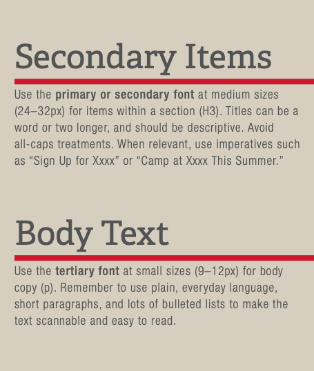
A style guide may arrive, but it can lack the specificity needed to identify contexts. Some are formal and generic with no pixel sizes or notes on varying screen sizes; others are thorough and pleasant-looking but completely mismatched with the accompanying Photoshop file; still others contain unholy amounts of detail for every heading and combination imaginable. Both extremes are hard to parse, even when everyone means well.
The naive response is to transcribe every pixel spec, which produces heavy duplication: repeated declarations across selectors. Hoisting common declarations onto body can work on small projects, and there are genuine ways to use the cascade to your advantage — but as in an object-oriented language, you don't want everything inheriting everything. Code like this functioned well enough to build most of the web; the goal is simply something better.
Revisions expose the weakness
Then a meeting happens and the typography changes. Now 293 places in the CSS file need edits (a boon only for hourly billing). Adjustments start conflicting: a rule that served two cases now serves one, or new opportunities for reuse appear. Temptation to delete the CSS and restart follows.
The usual landing spot is a reusable class applied to elements rather than duplicating declarations. That is a liberating option for mixed-skill teams — a new intern can plug and play — and double liberation if headings and paragraphs of shared styling can influence each other's margins, giving an inverted, balanced stack instead of ad hoc numbers.
<header class="site-header">
  <h1 class="page-title heading-1">
    Be <mark>excellent</mark> to each other
  </h1>
</header>

<main class="page-content">
  <section class="welcome">
    <h2 class="medium-heading">Party on <em>dudes</em></h2>

    <p class="standard-text">And yeah. I'm just regular</p>
  </section>
</main>
The key discipline is separating typography from layout. Layout classes govern structure; modules are derived composition that we apply around the pieces of type. Not every .medium-heading element should share margins or colours — that depends on location. Styling by context this way avoids using the cascade as a weapon without fighting it either.
When you can't touch the HTML
Not every project lets you add classes. A quick CodePen or a personal site makes these concerns look like overkill. A CMS is the opposite: you may receive an unpredictable dump of HTML from a templating language and must plan for anything and everything.
With no control over markup, plug-and-play classes are useless. One option is pasting the declarations into a large .article { } class that defines a kitchen sink. Sass mixins offer a cleaner tool: define a reusable type pattern once and apply it wherever needed.
@mixin standard-type() { /* define the mixin */
  font-family: Serif;
  font-size: 16px;
  line-height: 1.4;
  letter-spacing: 0.02em;
}

.context .thing {
  @include standard-type(); /* employ it in context */
}
Less, Sass and Stylus each have their own syntax. Calling heading-1() and heading-2() is common — many big-name style guides do it — but it ties patterns to element semantics. What about applying a heading's style to something that is not a heading? Headings can serve needs that aren't headings: "mean" and "stout." Instead, define type patterns by the voice the content should carry — the idea Jason Santa Maria describes in On Web Typography as "type for a moment" and "type to live with." Pick patterns by content role (e.g. for pop-outs, bylines, quotes and captions), not by element. This keeps names meaningful, supports cross-discipline conversation about tone and content strategy, and the paragraph voice belongs somewhere other than body, since you'll want paragraphs, list items and the like to opt into it.
Styling the unknown article is where explicit combinators earn their keep. You can't assume document order or which elements appear: a CMS author may place three <h3> elements in a row. Writing rules for "any <h2> that follows a paragraph," down to the specific situations that carry the most weight, covers those outcomes. The written content is what people came to read, and it needs dialling in once, in one place.
On syntax: the same ideas make a case for wanting a future browser mechanism that supports these patterns natively. Stylus, with its stripped-down syntax, is delightful to write, and the author loves it for demonstrations and prototyping UI. But its tooling has fallen behind; it can't be recommended for production. It earns its mention for a different reason: it's important to dream and to describe what you want, because unspecified wishes don't get implemented.
Type patterns in practice
Whatever you call the mechanism — pattern, mixin or class — the core gains are plug-and-play authoring and compatibility with what we already have. Utility classes can coexist.
Publishing a living style guide
A style guide is the shared artifact. It can live on a "brand" subdomain or ship at /style-guide; plenty of examples exist and many good open source style guides consider all of that. Standalone or integrated, a live guide that supports the pieces you actually build with lets you develop in one place with global reach, and makes the guide part of the development process rather than a snapshot. It is not reserved for big companies. One caveat: style guides serve different purposes depending on who uses them and how, so diving into someone else's can create confusion instead of clarity.
Variable fonts and screen size
Sometimes the problem is variable font sizing across breakpoints with no fluid middle. Designing breakpoint-specific patterns invites gap risk.
@mixin attention-voice() {
  font-family: Serif;
  font-size: 20px;
  line-height: 1.4;
  letter-spacing: 0.02em;
  @media (min-width: 700px) {
    font-size: 24px;
  }
  @media (min-width: 1100px) {
    font-size: 30px;
  }
}
Breakpoint-based sizing can leave gaps if a pattern is applied at intermediate viewports and no pattern rule matches. Fluid sizing with clamp() and vmin instead of the breakpoint set.
@mixin attention-voice() {
  font-family: Serif;
  font-size: clamp(18px, 10vmin, 100px);
  line-height: 1.4;
  letter-spacing: 0.02em;
}
The trade-off is that patterns must be checked for conflicting props. In principle you can move between patterns in the same CSS—always with an eye on coherence and pitfalls. And new variable fonts also have size and look options: heading weight or cap height can be adjusted for smaller screens or spatial constraints.
The critique: duplication
Yes, the mixin approach does create more CSS. That's a real concern, but authoring and maintenance pleasure matters more than byte count. The correct place to solve the byte problem is elsewhere in the pipeline upstream of author output — the same logic that explains why nobody writes machine code by hand — and build-time processing could handle it, possibly before the CSSOM. In spirit, type patterns simply follow the utility-class model of Bootstrap or Tailwind. Human-readability is an added benefit over raw byte count.
Where design systems fall short
InDesign and Illustrator have always had paragraph and character styles for exactly these reasons, but they don't account for variable screen sizes. A type system for the web can start with a few in-pixel patterns in a Photoshop file, extend them across breakpoints, and formalise colour, padding and line-width conventions — values such as $thick, $thin or $pad*2 — so the taxonomy is consistent. Pixel perfection matters less than a coherent set of patterns.
The human case
With patterns in place, visual designers can spend more energy on their craft. More and more work is done in the browser, sometimes starting from something like Style Tiles for feel, typography and colour, while developers organise data, resource structures and layouts — and everyone works simultaneously. Communication is clearer and understanding shared; the whole team is mindful of design. Living style guides reduce pixel-pushing, give visual designers more room to think and prototype, and leave the brand with a single source of truth. This even scales down to very small sites that ship their own style guide.
The workflow starts with inspiration in the graphics program and moves straight to the live style guide, where people of all backgrounds play with styles in a CodePen and dial values in across devices. The details get decided in the browser, together.