
Writing for the scanning reader
Studies of reading behavior have consistently shown that people do not read web pages so much as scan them, taking in only 20–28% of the content on average. Reading from screen is also measurably slower than from paper. The US government's writing guide reaches a blunt conclusion: unless information is easy to access and understand, visitors will leave.
The implication is straightforward. Put your main points first — ideally within the first four paragraphs, roughly 70 words, per BBC guidance — and write in the active voice, oriented toward the actions your visitors hope to take. UK government research pushes the same direction: use plain language, short words, and simple sentence structures, even for technical audiences. If in doubt, write in a conversational tone that an intelligent 11-year-old could follow.
The constraints of the next billion users
This minimalist approach matters more as the web expands beyond desktop. Many of the next billion users coming online will arrive via low-cost phones: small viewports, lower quality displays, and metered data plans. They will not spend their data budget navigating long-winded text, and may not be reading in their first language. Trim aggressively: short sentences, minimal punctuation, paragraphs of no more than five lines, and single-line headings.
Responsive text — using shorter headlines on smaller viewports — is possible, though not without tradeoffs. A leaner text base also makes content easier to localize and internationalize, and increases the chance your material gets quoted in social media. The rule of thumb for everything: keep it simple, reduce clutter, get to the point.
Cutting page bloat at the source
Web pages are growing in byte size, and HTML alone now averages nearly 70k across more than nine requests per page, per HTTP Archive. A heavy HTML payload often signals content bloat — more elements, more text, or both. Trimming that weight improves load latency, simplifies localization, and makes responsive design easier to plan and debug.
Before reshuffling content for multiple viewports, eliminate what is unnecessary. Ask what visitors are trying to achieve, and whether any page component helps them. Removing one step before value can retain users; the same logic applies to content. Do not merely hide content on mobile: aim for content parity, since guessing what mobile users will not miss inevitably fails someone. If resources permit, craft alternative versions of the same content for different viewport sizes.
Images deserve the hardest look
Images are the most common source of needless weight. They consume real estate, add bytes, and increase file requests — and latency worsens as connectivity does. They also drain batteries: after the screen, the radio is the second largest power consumer on a device, and rendering images draws power proportional to their size and count, according to the Stanford report Who Killed My Battery?
Before adding an image to the page, ask whether it genuinely helps the user's goal. If so, consider these alternatives:
- Designs can be text-only and still beautiful. Avoid splash screen images entirely.
- Never save headings as graphics. Text in images does not respond to viewport changes, cannot be searched, and is invisible to screen readers. Web Fonts and CSS deliver real typography without the penalty.
- Use CSS gradients, shadows, rounded corners, and background textures — all supported by modern browsers. Note that CSS rendering still has a processing cost, especially on mobile.
- Background images rarely work well on small screens; use media queries to drop them on small viewports.
- Unicode symbols and icons or icon fonts can replace image assets entirely, though be aware of icon-font accessibility concerns.
- Inline SVG or Data URIs keep response counts low, and optimizers shrink SVG size meaningfully.
- Use
<video>over animated GIFs; animation is far more efficient as video.
Further guidance is available in Image Optimization and Eliminating and replacing images.
Designing content for any viewport
Responsive design is not a feature for mobile users — it is a baseline approach that builds for the range of devices people actually use. That starts with designing with real text and images, not placeholders. As Jeffrey Zeldman put it: "Content precedes design. Design in the absence of content is not design, it's decoration."
Reading on a low-resolution 3.5" or 4" screen is hard work, and many of the next billion users come online on exactly that hardware. Layouts that render correctly at small sizes can still fail on legibility, and quality displays produce blurry text and color casts that compound the problem.
Structure content with the viewport in mind. Since readers scan in an F-shaped pattern, put the most important content at the top, so users get value before scrolling. Then be ruthless with everything else: visual and textual embellishments, legacy content, excessive links, and social sharing icons — the coding for sharing icons alone can slow loading.
Design responsive layouts for content, not for fixed device sizes. With this content-first priority clearly in view, remember the simplest test of all: try reading and interacting with your own site on an inexpensive phone. Combining that reality check with low-bandwidth, high-latency emulation and a simple device lab — or OpenSTF for remote Android testing — produces a far more honest assessment than any screenshot preview. Mobile is no longer just for communication and games; it is how much of the world reads the web. Make sure your content holds up when it arrives there.
Why page weight matters
The average page weight for the top one million sites now exceeds 2MB, according to HTTP Archive. Users actively avoid sites they perceive as slow or data-hungry, so understanding what each component of your page costs to load is essential. Cutting page weight can also open new revenue opportunities: when YouTube reduced its watch page from 1.2MB to 250KB, the change made the service viable in markets where it previously wasn't.
Measuring bytes
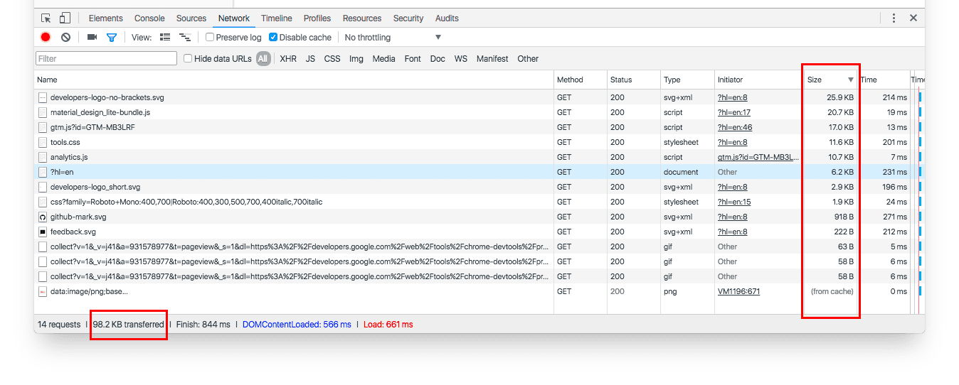
Several tools help quantify page weight. The Chrome DevTools Network panel reports total byte size for all resources and lets you isolate individual asset types, while also showing which files were served from the browser cache. Firefox and other browsers include similar inspectors.
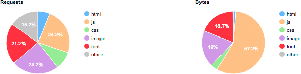
For more detailed analysis, WebPagetest can measure first and repeat loads. You can automate scenarios—such as logging in—with its scripting feature, or drive tests through its RESTful APIs. A test of developers.google.com/web, for example, demonstrates successful caching when repeat visits require zero additional network requests. The tool also provides a breakdown of requests and transferred bytes by MIME type.
From bytes to money
For many users the cost of data is not just a performance metric but a direct financial bill. What Does My Site Cost? estimates the real price of loading a page under a prepaid data plan. The histogram it produces for amazon.com illustrates the point.
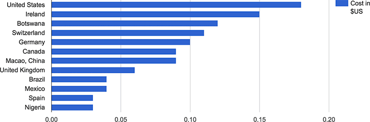
That calculation does not account for income disparities. Research from blog.jana.com highlights how the relative burden of data costs varies dramatically.
| 500MB data plan cost (USD) |
Hourly minimum wage (USD) |
Hours of work to pay for 500MB data plan |
|
| India | $3.38 | $0.20 | 17 hours |
| Indonesia | $2.39 | $0.43 | 6 hours |
| Brazil | $13.77 | $1.04 | 13 hours |
The issue extends beyond emerging markets. Many users in developed countries are on capped mobile plans, and even "unlimited" contracts often impose a threshold beyond which speeds are throttled or access is blocked. When users judge that your page is heavy, they may simply move on. Being upfront about how much data your page consumes builds trust; specific guidance on transparency is available in this Medium post on cost transparency.
In the end, heavier pages hurt both performance and the user's wallet. To keep both under control, apply the techniques discussed in Optimizing content efficiency.


