Behind every designer is a set of influences and habits worth unpacking. In this conversation, a design manager walks through the project that has consumed his recent years: a book documenting a century and a half of keyboard design.
On writing as a craft
- A writer describes her own practice for the same interview series.
Prototyping a book
Wichary describes his working method as that of a prototyper regardless of the medium: think of something, build a piece of it, look at it again, use it or hand it to someone else. He designs this way, builds prototypes this way, and even prepares talks this way.
Shift Happens followed the same pattern, though unusually for a book: he began flowing photos into the layout before the writing was finished. That required writing plugins and software to keep text and images moving into the print program. It cost time and led him down blind alleys, but he ordered a print-on-demand prototype as soon as the first manuscript existed, before checking typos.
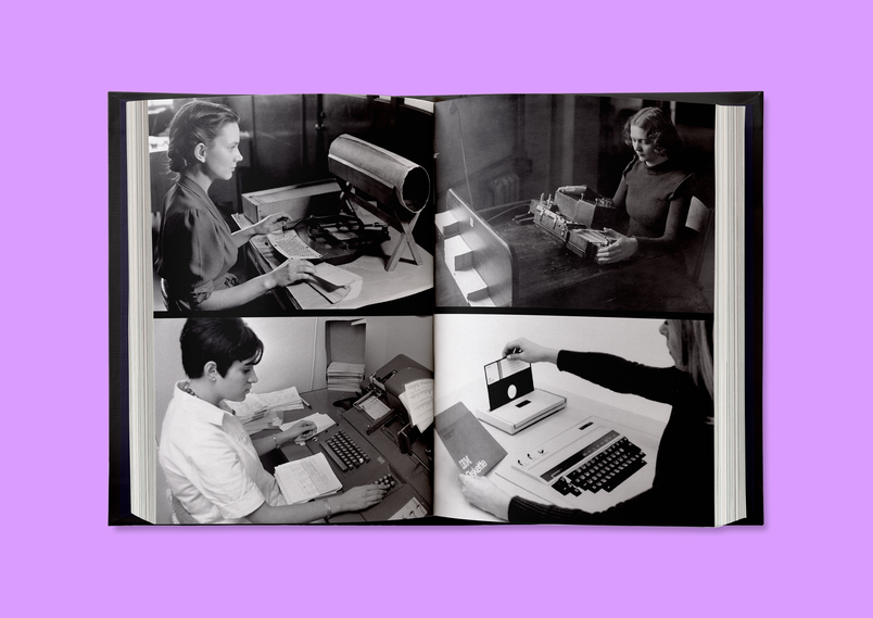
Even with the Kickstarter running, he had a printer produce a single chapter on the paper he wanted, at the correct size. As with software, he chose edge cases for the prototype: a spread printed on black, one with vivid colors, one photo with a lot of fine detail. A prototype also went to a fellow designer for review. Surprises will remain, but he hopes many have been eliminated.
The approach has a cost. You quickly reach a point where everything feels almost there—the words, the photos, the typesetting—and then you iterate and return to the beginning. It feels messy and all over the place, but getting used to that feeling lets you negotiate it, at least partly.
Keeping the work fun
Having never written a book before, especially one so dense and long, Wichary knew he had to keep the process interesting. Staring at a blank page or tracking down the owner of a single photo found online can take days, and the effort can become overwhelming. So he built small toys along the way—some useful for research, some semi-related to the book, others less so.
He reverse engineered vintage keyboards and connected them to modern computers. He typed on really bad keyboards and really good ones. He turned his piano into a typing keyboard and built very strange keyboards. He also wrote mini-games and a typewriter simulator. Each experiment had some rationale, but he didn't always care how it turned out; the point was to remember why he loves the work.
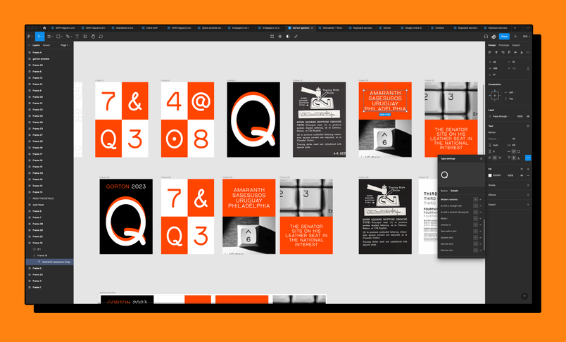
He also revived a font. Gorton, a technical typeface from CNC machinery that was popular on keyboards in the eighties, never existed as a TTF. Wichary drew it in Figma, then moved it into Glyphs for proper type design. The exercise let him use Figma's type details font UI, which had been his first project at the company, this time as a real type designer. He found bugs immediately—the curse of knowing something well.
Figma as a shared workspace
Figma served many roles across the project: moodboards for how the book and its renders should feel, plus selection colors and document colors. His files are messy, mixing print, website, Kickstarter campaign and newsletter work, so features that supplied the feeling of a design system without requiring one were crucial. He relied on auto layout and wrote plugins for the more complex designs, particularly while laying out the book repeatedly.
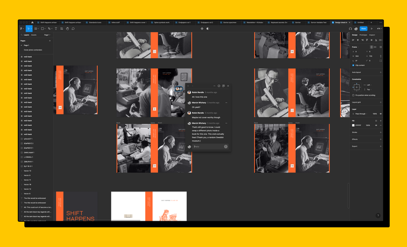
Small details, such as section breaks, were settled with a friend over Zoom. Sharing a URL meant someone who had never heard of Figma could open the file immediately, so he could send several cover ideas and ask what people thought. Many jumped in with feedback; he once sent a link to the wrong person—no context, just a matching first name—and that person contributed anyway. Comments and voting supported this, as did scribbling on the canvas, which he calls simple but underappreciated; with 3D renderers on the other side of the world, he would type or draw all over the renders to work things out together.
Getting feedback that helps
Feedback has long interested Wichary, and he notes that getting the right kind is hard. Sending a first draft to ten friends and hearing nothing back is heartbreaking. His learned secret is twofold: approach specific people and explain why you chose them—their expertise, their writing—and then ask for the feedback you actually want, whether that's whether the story holds together or whether a particular metaphor works.
To make the exchange enjoyable on both sides, he wrote an app for collecting reactions to the book. He could place a chapter behind a secret URL, where readers selected emoji or typed quick responses. Dozens of friends used it and produced genuinely useful feedback, and building an app with one narrow purpose was a pleasant break from writing and a different part of his brain. It also contrasted with editing in Microsoft Word, which can feel very serious.
The detail nobody will notice
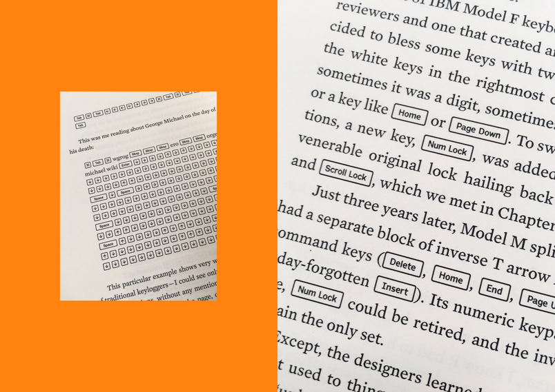
Keys appear throughout the book, and Wichary wanted them rendered as keys rather than set in italics or color—a treatment with a small border that resembles a keycap. On the web this is trivial: a border, inline block, a little padding, rounded corners, three lines of CSS. In print it is hardly possible. He finds the contrast interesting, given the notion that the web discarded centuries of typesetting perfection; that's true to a degree, though some of it is gatekeeping, and the web also supplies better tools that we forget about.
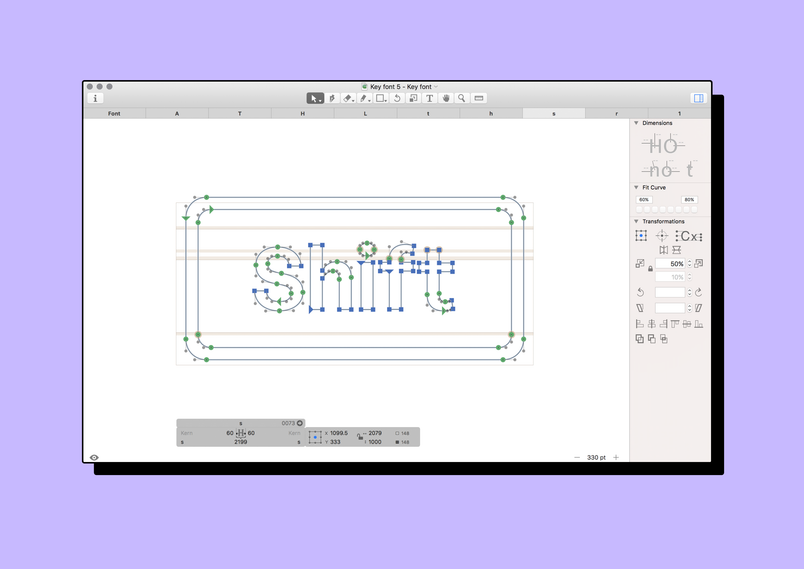
Achieving the effect became a Rube Goldberg puzzle. He expected an evening's work; it took weeks. He produced a special font—a meta version of the existing Output Sans, in which each letter is a keycap containing the original letterform—in collaboration with that font's designer. He wrote a special plugin for the font-making software to typeset the keys, including kerning, which he says isn't usually done inside such software, and he wrote in Python, which he doesn't normally do.
Nobody will know. The result looks like the obvious solution, yet he wonders whether any other book has it, precisely because it is so hard to achieve. He is proud of it, learned a lot from it, and believes it elevates the writing. Important details are like that: you never notice whether they look good or do their job, but they are there.