
Why removing focus breaks the page
Focus is the visual signal telling a user that an element is active, whether they got there by keyboard, mouse, trackpad or assistive technology. Links, buttons and form controls are interactive by nature, and the indicator lets people know where they are and what their next action will affect.
The temptation to strip it out should be resisted outright:
:focus {
  outline: 0;
}

/*** OR ***/

:focus {
  outline: none;
}
Removing focus removes accessibility for everyone, so preserving it is the default. If a site genuinely must suppress it in some context, a readable :focus fallback is mandatory. Those fallback styles can follow brand colors, provided the palette itself passes contrast checks. When marketing or design objects to the browser's default ring, the right response is a conversation about how to put an accessible indicator back, not deletion.
Introducing :focus-visible
This pseudo-class behaves much like the regular :focus selector, adding an indicator to whatever currently holds focus. Setup is straightforward:
:focus-visible {
  /* ... */
}
Scoping it to a specific element follows the usual pattern:
.your-element:focus-visible {
  /*...*/
}
The appeal is a focus state that can be as loud and distinctive as you like, without it appearing on click or tap interactions. Skip it entirely and visitors get the user agent's default focus ring, which plenty of people find unattractive.
How browsers decide when to draw a ring
Before :focus-visible, user agent styling put a :focus outline on most focusable elements — buttons, links and the rest. Because that ring was widely judged ugly, authors deleted it without leaving a replacement, which lowered usability and made experiences unusable for keyboard navigation.
Today's browser generally withholds a visible focus indication and instead relies on heuristics — what Khan Academy defines as "a technique that guides an algorithm to find good choices." In practice the browser detects whether input is coming from a keyboard, mouse or trackpad and applies or skips the ring accordingly.
The pseudo-class had a pre-standard life: Alice Boxhall and Brian Kardell's polyfill handled the ring in its early days, and Mozilla shipped its own :moz-focusring before the official specification existed.
Behavior in practice
On the demo, a mouse pass and a keyboard pass (both recorded with the author visible on screen) produce different results. Keyboard navigation puts a ring on every element; the mouse only focuses the input, and the buttons do not take focus. Strip :focus-visible and the browser falls back to its default ring. The stylesheet applies the selector to all focusable elements:
:focus-visible {
  outline-color: black;
  font-size: 1.2em;
  font-family: serif;
  font-weight: bold;
}
To target only a label or a button, prepend the selector with input or button respectively:
button:focus-visible {
  outline-color: black;
  font-size: 1.2em;
  font-family: serif;
  font-weight: bold;
}

/*** OR ***/

input:focus-visible {
  outline-color: black;
  font-size: 1.2em;
  font-family: serif;
  font-weight: bold;
}
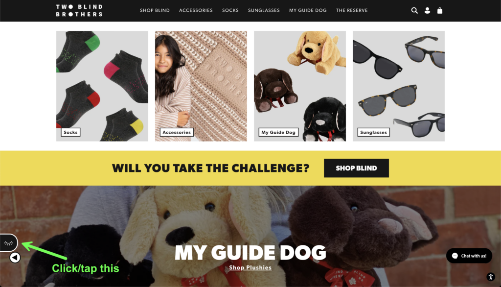
Why it matters beyond correctness: on Two Blind Brothers, a site run by Bradford and Bryan Manning, who were diagnosed young with Stargardt's Disease, a form of macular degeneration that will leave both fully blind, visitors can tap the closed eye in the bottom-left corner and see a simulation of how the brothers perceive the page. Navigating with partial or total sight loss makes knowing your exact position essential — and the focus ring supplies that.
Fallbacks, contrast and consistency
Where :focus-visible isn't supported, a fallback keeps the interaction intact. MDN Playground's example uses the @supports at-rule — a "feature query" — to test support. The rule must sit at the top of the code or be nested inside another group at-rule.
<button class="button with-fallback" type="button">Button with fallback</button>
<button class="button without-fallback" type="button">Button without fallback</button>
.button {
margin: 10px;
border: 2px solid darkgray;
border-radius: 4px;
}
.button:focus-visible {
/* Draw the focus when :focus-visible is supported */
outline: 3px solid deepskyblue;
outline-offset: 3px;
}
@supports not selector(:focus-visible) {
.button.with-fallback:focus {
/* Fallback for browsers without :focus-visible support */
outline: 3px solid deepskyblue;
outline-offset: 3px;
}
}Two further checks when building out the experience:
- Any colors chosen for the focus indicator must meet the contrast requirements in the WCAG 2.2 Non-text Contrast (Level AA).
- Cognitive overload causes users distress, so styles across different interactive elements should stay consistent.
Browser support
Version data below comes from Caniuse, where a number means support from that version onward.
Desktop
| Chrome | Firefox | IE | Edge | Safari |
|---|---|---|---|---|
| 86 | 4* | No | 86 | 15.4 |
Mobile / Tablet
| Android Chrome | Android Firefox | Android | iOS Safari |
|---|---|---|---|
| 157 | 160 | 157 | 15.4 |