A typeface for a changing brand
Alongside a broader visual identity overhaul—new color palette, illustration style, and more—Figma commissioned Swiss type foundry Grilli Type to create a custom typeface. The result, Figma Sans, replaces Whyte, which had served the brand since 2019. Whyte’s inktrap variation had become a signature, but as Figma’s toolkit and audience expanded, the brand team wanted something that could carry more weight.
The new typeface had to work across a widening set of surfaces and speak to a diverse audience: product managers, developers, newcomers, and veteran designers. “We wanted something that embodied our spirit but was easy to use everywhere,” says Design Manager Taryn Cowart. “It needed to work well for display type and be performative and beautiful for reading text on surfaces like the Help Center.”
After evaluating off-the-shelf options like Marr Sans by Commercial Type and Agipo by RP Digital Type Foundry without finding the right fit, the Brand Studio—including Creative Director Damien Correll and Brand Designers Leandro Castelao, Jefferson Cheng, Maria Chimishkyan, and Andy Luce—decided a bespoke typeface was warranted. “We knew the process of working with a type foundry would help us clarify what we were looking for,” says Taryn.

Settling the brief
Grilli Type typically spends two to three years developing a typeface, but for this collaboration they worked with a different kind of input. The process began with a mood board in Figma itself. “The main question was finding the central tension in the brief,” says CEO and Co-founder Thierry Blancpain. “‘Opinionated’ was an anchor word throughout. It’s about knowing who you are and what you want, and having a no-frills attitude.”
Grilli Type’s team—also including Co-founder Noël Leu, Senior Type Designer Reto Moser, and Type Designer Katja Schimmel—presented two initial directions. One was more straightforward; the other, as Blancpain puts it, “was quite a bit out there.” The goal wasn’t to choose A or B but to “open up the space to talk about the right solution.” The feedback pointed to the simplified shapes of the first option, refined with some of the distinct character of the second.
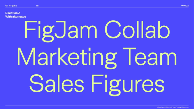
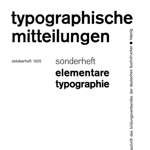
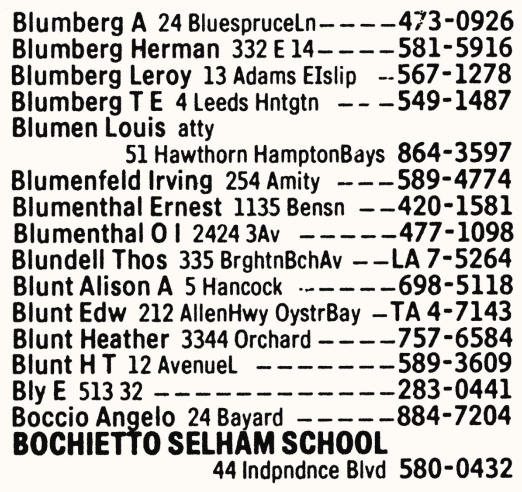
One example of that balance is visible in the capital R. An early version had the nonfunctional kink in the bottom leg typical of many sans serifs, such as Helvetica; later drafts ironed it out. “It doesn’t stand out as sharp or unfriendly, but there’s no unnecessary ornamentation,” says Blancpain. The lowercase from previous versions lost its tail to become “crisp, but not harsh.” The inner curve of the double-story a dips before returning to the bowl, a motif echoed in the cross stroke of the lowercase t—what Blancpain calls “a nice, graphical shape that has expressiveness.”
Letters in relationship
Typeface evaluation often zeroes in on individual letterforms, but the team focused on how letters behave as a system. “It’s less about character decisions and more about how things play out in the system—how terminals relate to the apertures, for example,” says Taryn. “If the g opens up, what does that mean for the s and the e?” Related groups—traditionally wide letters like m and w, narrow ones like f and t—share decisions, though Blancpain notes there’s always room to play.
Upper and lowercase also relate. Because the Brand team treats all caps as a stylistic choice, Grilli Type designed the uppercase letters wider than usual, producing a steadiness that holds up alongside the bolder shapes of the refreshed brand. “This relatively even rhythm of widths leads to words that create solid blocks,” says Blancpain, “whereas more varied letter widths create a lot of tension.”
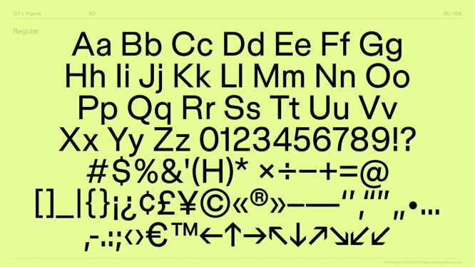
Figma Sans ships as a variable font system with five families: Text, Display, Condensed Text, Condensed Display, and Mono. Each includes light through black weights plus oblique. “You try to find the essence of the design and translate it across the board,” says Blancpain, not just in shapes but in the ethos of the whole system. In the mono version, the team avoided base serifs, stretching letters to fill the space. Andy Luce manipulated the condensed version so it reads well on Shortcut.
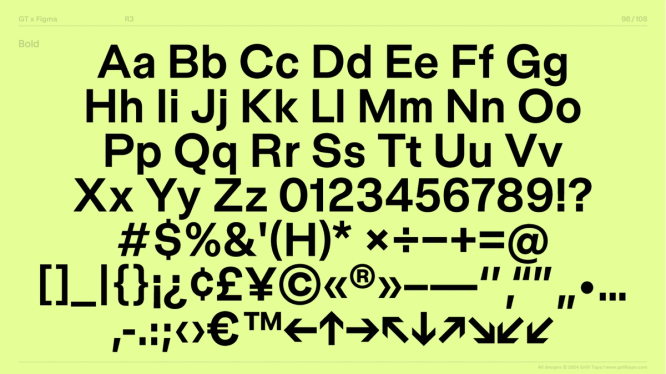
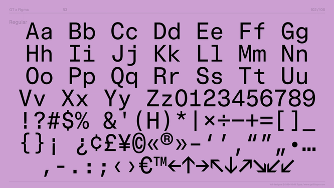
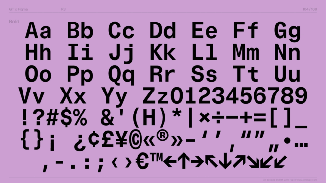
Because Figma Sans is variable, weight and width shift on an axis, and optical sizes adjust letterforms by scale: more open at small sizes, tighter at large. That control extends beyond expression. The team previously had to manually alter Whyte’s inktraps for impact across sizes. “With Figma Sans, the variable axes are equally focused on expression as they are on functionality and scale,” Taryn says. “Fonts are software, and this means we can fine-tune more of these details across brand surfaces and beyond.” It also means condensed type can serve as body text, and width can be adjusted subtly in translated web text to avoid awkward line breaks.
The wordmark
Adaptability, however, wasn’t meant to dilute identity. The team explored stylized wordmark variations but ultimately returned to the typeface itself, refined for the word Figma. “The most straightforward approach was to use the typeface and adjust it to make the word Figma look great,” says Blancpain. Trimming the width of the m for even spacing rippled outward, cinching related letters like w. “In that sense, everything is a little narrow, creating a vertical focus of the design that really adds to the feeling of the typeface.”
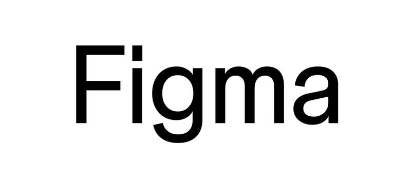
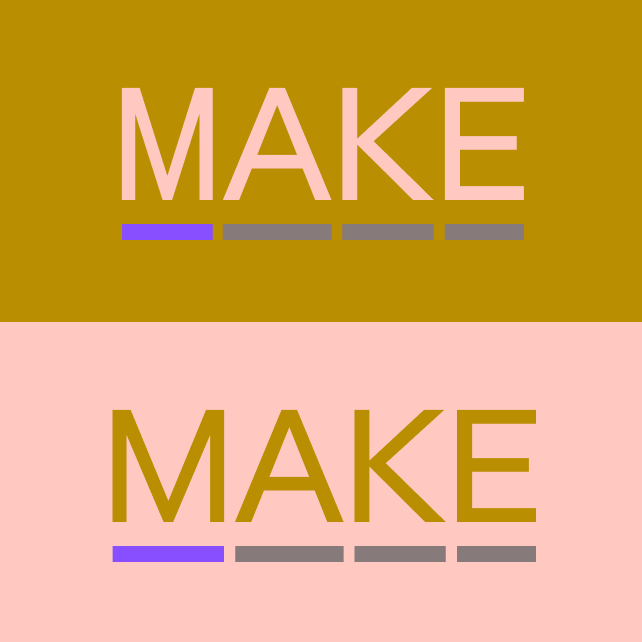
Grilli Type delivered the wordmark both as a fixed version and as a variable font, giving the Brand team the ability to render it across widths, weights, and optical sizes depending on the context. “We customized the weight and width to create a Shortcut wordmark that feels distinct, yet connected, to the greater brand system,” says Andy. Whether on a small digital ad or the exterior logo on San Francisco’s Moscone Center for Config 2024, the wordmark flexes to its surface.
Refining the character set
The Brand team and Grilli Type went through several rounds of drafts, testing the typeface across brand surfaces. Changes to individual letterforms had to stay consistent—for instance, elongating the tail on the lowercase t required matching changes on the capital Q. During variable typeface development, the focus shifted to letter spacing and "minute details in character design as we went into polish," according to Taryn.
Some choices required extended debate. The dot on the lowercase i was one of them. "A lot of tech companies try their hardest to appear friendly and neighborly, and a round dot is the most obvious expression of that," says Thierry. A larger circle risks feeling childish, and since Figma is meant to help teams get work done, the team decided not to follow common tech tropes. Instead they chose a rectangle that is somewhat larger than typical, which they felt conveys personality and confidence. "At its core and in relation to the visual world around it, Figma Sans is an interrelation of sharp and round shapes," says Thierry. "It sits there and knows what it's doing."
The concurrent development of Figma's broader brand refresh gave Grilli Type helpful context. "With Figma, there was a great sense of design we could tap into," says Thierry. "Paired alongside the very active visual language, the typeface had to balance not being overly expressive and not getting totally overshadowed."
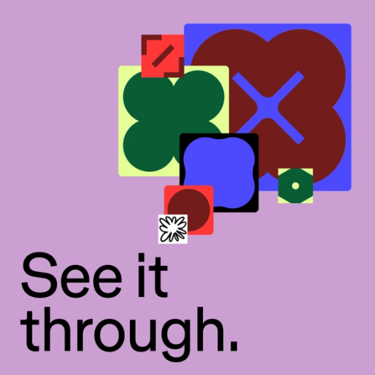
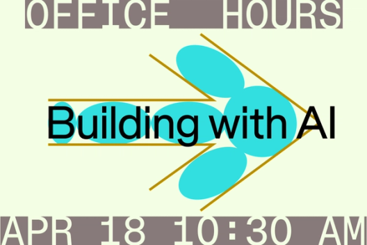
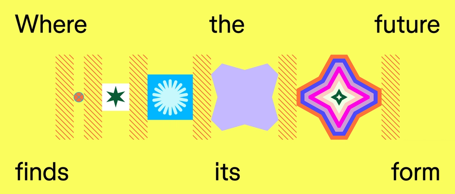
An abstract flower illustration in the new visuals helped crystallize the direction. "I realized that the typeface has to have a no-nonsense attribute that the new visual language has," says Thierry. "When you layer these attributes, there's poetry happening, but on their own, none of these elements tries to do anything special or ornamental. That was where it clicked for us."
When you layer these attributes, there’s poetry happening, but on their own, none of these elements tries to do anything special or ornamental.“When you layer these attributes, there’s poetry happening, but on their own, none of these elements tries to do anything special or ornamental.”
Diacritics are marks added to letters to indicate a difference in pronunciation, such as accents.
For the Brand team, seeing the typeface develop alongside their explorations of shape, line, pattern, and color provided reassurance. "It helped us understand and become more confident in our desire to move away from a more expressive typeface because we're using such bold visuals," says Taryn. Andy notes that the final typeface "was the perfect pairing with the refreshed brand, from the design details in the letterforms, to the punctuation marks and diacritics."
Once the full character set was approved, Grilli Type handled production—a stage Thierry likens to music mastering. This included final adjustments to letterforms and symbols, constructing accents, spacing between characters, and kerning between specific pairs. It also involved OpenType programming and QA. "In type design now, you can have any arbitrary fraction—say, 325/855—and it's automatically composed out of small versions of the letters," says Thierry. "That kind of stuff you just have to produce." The result was a typeface polished of any remaining rough edges so the shapes could work in harmony.
Where Figma Sans lands next
Alongside Figma's blog, Figma Sans will appear on web surfaces and out-of-home placements like billboards and transit ads. Beyond supporting the refreshed visual language with easy legibility, it speaks to Figma's aim to be a platform for all product creators, not just designers.


