
When Magazine Pages Refuse to Stay Neutral
Neville Brody’s work as art director of The Face in the 1980s didn’t just restyle a music magazine — it redefined what a magazine page could do. Brody treated typography as a medium for expressing ideas rather than a passive vehicle for text, and he approached the structure of the magazine itself as something to question. For web designers, the parallels are direct: Brody’s experiments with layout, spacing, and typography map neatly onto the challenges of designing multi-page experiences online.
Brody’s path to The Face started at the London College of Printing in 1977, where he found the curriculum frustrating and out of step with the cultural upheaval happening outside. Tutors condemned his experimental work as “uncommercial.” Brody skipped typography classes entirely, which meant he never absorbed the conventional rules that would have limited him. Instead, he studied the typography of Dadaism, Futurism, and Alexander Rodchenko. Leaving the LCP, he designed record sleeves for Rocking Russian and Stiff Records before landing at The Face, where he served as art director until 1986.
“The Face was a living laboratory where I could experiment and have it published. Our golden rule was to question everything. If a page element existed just as taste or style, it could be abandoned. Page numbers could be letters or shapes increasing in size. We could start the headline on the page before. We had disasters and near misses every issue. We had two weeks to art direct everything, then a week to lay it out. It was pre-computer so everything was traced by hand. […] It certainly wasn’t a nine-to-five job. You had to be obsessed to make it work.”
— Neville Brody
Wide Spaces, Slower Reading
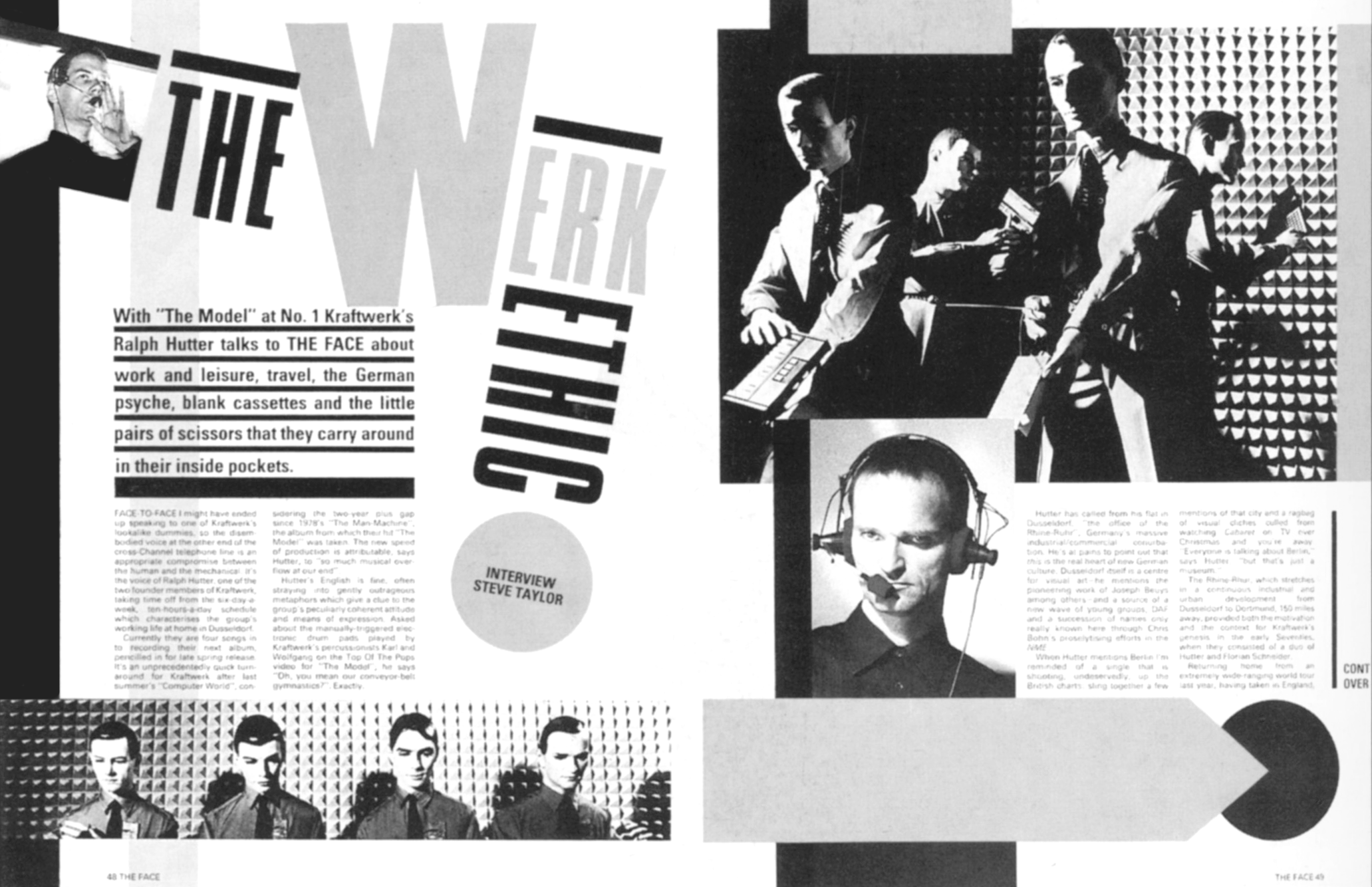
While Brody lacked traditional typography training, his priority remained readability. He worked closely with the editorial team to ensure the magazine remained legible. A signature element of his The Face pages was widely spaced letters, which served multiple purposes: the extra whitespace emphasized the horizontal, vertical, and sometimes diagonal direction of type, and it slowed down the reading experience, creating pauses for readers to consider content.
A Grid That Serves, Not Dictates
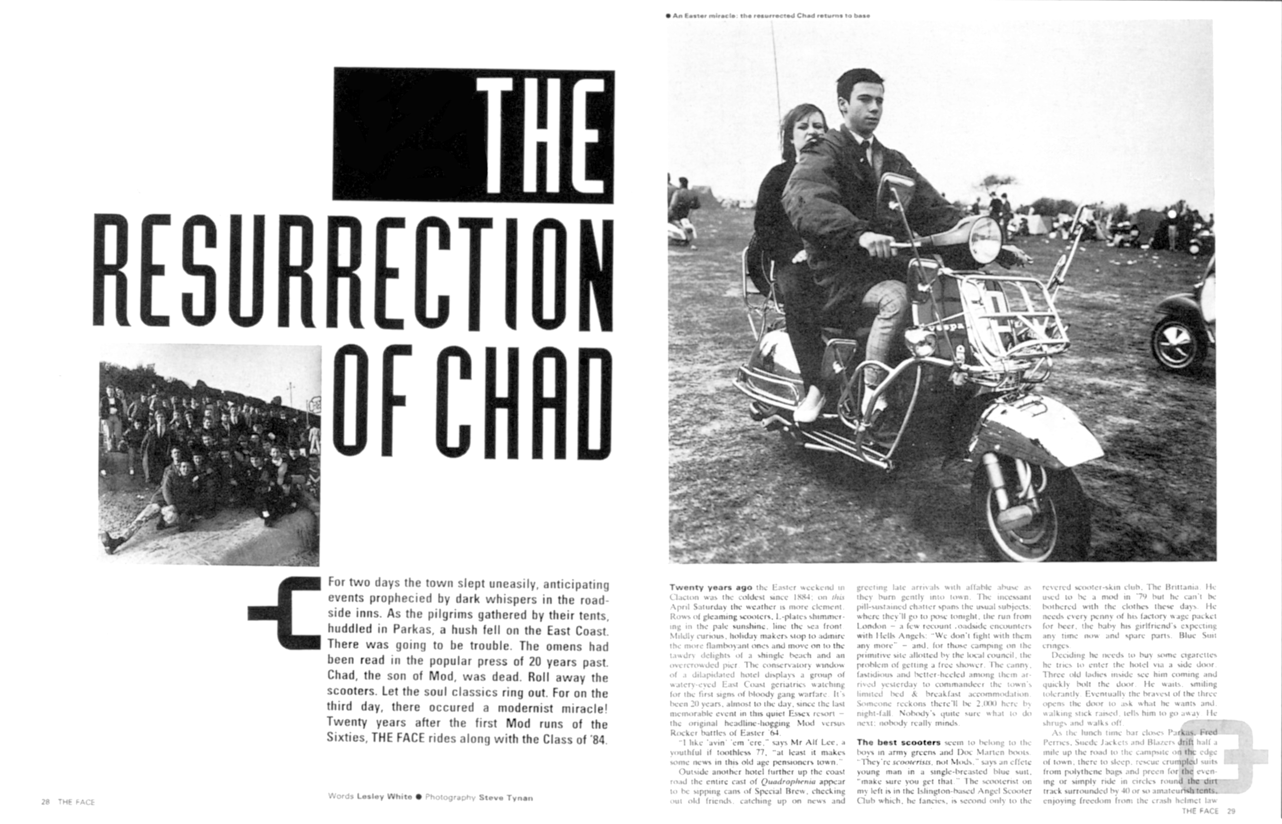
Brody’s layouts relied on a simple two- or three-column grid, but his execution showed how flexible even the most basic grid can be. The grid provided structure and continuity across the magazine, while still allowing space for expressive choices. Brody’s pages also guided readers through articles with features marking where to start and where to end. He became obsessed with finding alternatives to the traditional drop-cap, experimenting with graphic symbols, unusual type treatments, and whitespace. As he told Jon Wozencroft in 1987, “Once you have broken down the rules, literally anything is possible.”
Bleeding images and type off the edge of pages did more than create a distinctive look. It implied that what readers saw was part of a larger whole, and that content extended beyond the visible bounds.
Design That Makes You Look Twice
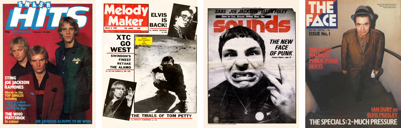
Web designers are taught to reduce friction — not to make people think or look more than once. Brody’s work runs against that instinct: his spread designs were self-contained and encouraged readers to linger rather than hurry to the next page. While this may appear to contradict user experience principles, it can actually make designs more memorable because audiences spend more time with them. This rule-breaking approach did not sacrifice usability. Brody’s pages retained clear structures and wayfinding features.
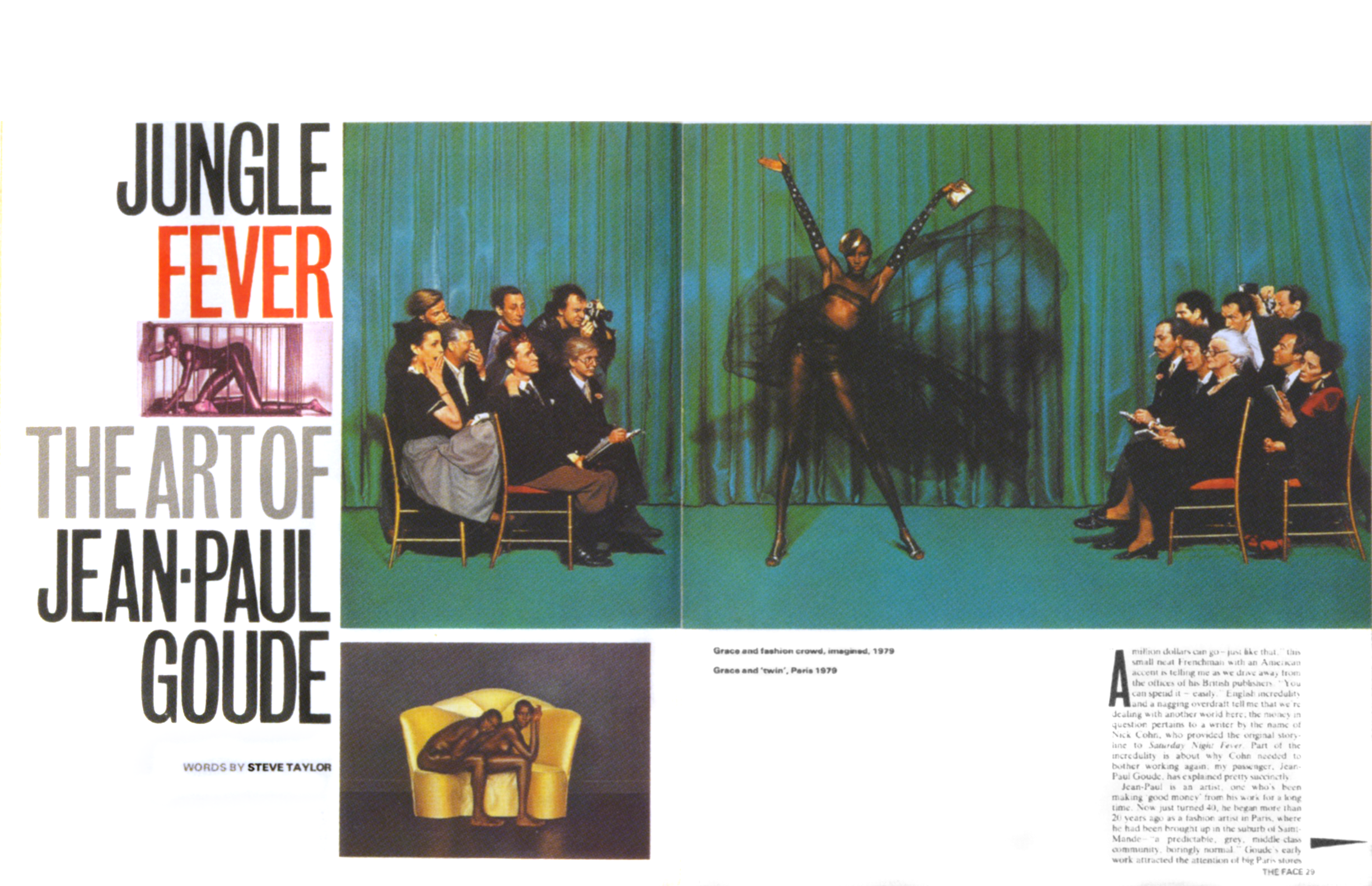
“For a lot of designers, The Face became the perfect graphic phrase-book, but its success, I hope, is also an indication that you can go against the grain and make it work commercially.”
— Neville Brody
Brody intended his work to prove that breaking with traditional design approaches could succeed in commercial contexts. He did not want designers to imitate his style or turn it into a new set of rules. The same applies to borrowing ideas from print for the web: the question should always be what we are trying to achieve, not just visual novelty.
After The Face
Brody left The Face in 1986 and went on to become one of Britain’s most prolific designers. In the 1990s, he co-founded the FUSE project with Jon Wozencroft, which ran for twenty issues, and co-founded the typeface library FontFont with Erik Spiekermann. In 2018, he stepped down as Dean of the School of Communication at the Royal College of Art.
Wozencroft published two volumes of The Graphic Language of Neville Brody in 1988 and 1994, still available secondhand. Paul Gorman’s The Story of The Face: The Magazine that Changed Culture remains in print, and a compendium collecting all twenty FUSE issues is also available for those building a design reference library.
Blending Backgrounds for Depth
The first Brody-inspired layout pairs a structured text column against a bold, full-page backdrop. Only two semantic elements are needed: a header holding the Ford logo and advertising copy, and a main containing an inline SVG profile of the Capri alongside the running text. Using inline SVG reduces server requests and lets the car's fill colour adapt to any background via CSS.
Base styling starts with background and foreground colours on the body, plus a minimum height so the background fills the viewport at every screen size. To keep the classic Ford logo from dominating small screens, its width is capped at one-third of the viewport using an attribute selector that matches “logo” in the src attribute.
The headline and tagline receive a double text-shadow: one shadow with positive X and Y offsets, another with negative values. Together they spread a glow all around the type. A full-page background image introduces the intended energetic feel. Although the source image is monochrome, a background-blend-mode value of multiply infuses the page with colour.
How background-blend-mode Works
Blend modes, proposed by the Adobe Web Platform team, give CSS the colour-mixing control familiar from tools like Photoshop. The CSS Compositing and Blending module defines three properties: background-blend-mode, mix-blend-mode, and isolation. The first blends an element's background colours and images together.
Fifteen blend modes are available: color, color-burn, color-dodge, darken, difference, exclusion, hard-light, hue, lighten, luminosity, multiply, overlay, saturation, soft-light, and screen. They can blend a colour with a single image, or be applied per-image when multiple backgrounds are stacked. A single value applies to all background images; listing values in the same order as the images blends each differently. Beyond saving trips to an image editor, these blend modes add texture and depth, breaking up the flat two-dimensional look common across the web.
For the remainder of the small-screen layout, a spark plug silhouette image fills the main element behind the text. Padding using a mix of rem and viewport-width units pins the content into a narrow column.
Hyphenation and Feature Queries
Justified text on the web often leaves unsightly gaps or “rivers” of whitespace. Hyphenation mitigates this by breaking words across lines. CSS offers three values for the hyphens property:
none: No breaks, which can leave gaps at line ends.manual: Breaks occur only where hard or soft hyphens () are present.auto: The browser decides break points based on its rules and the set language.
Browser support for automatic hyphenation isn't universal. To avoid applying it where it won't work, the hyphens property is wrapped in a feature query.
While @media queries test device characteristics like screen width or orientation, the @supports at-rule tests browser support for specific CSS features. A basic query checks a property-value pair before applying it. Browsers without support ignore the style inside. The :not operator styles elements when a feature isn't supported; and requires multiple features; or accepts any one of several. The tested feature needn't match the property being styled. For instance, text inside main is justified only if the browser also supports hyphenation.
On larger screens, the layout switches to a symmetric two-column grid with a 5vw gutter. Since the document order of header and main aligns with the desired visual order, no explicit placement is required. The logo size cap lifts, and a second background image—the white spark plug—sits offset using two different background-position values. Padding on the paragraphs adjusts to account for this wider image.
CSS Custom Properties for Theming
Custom properties bring variables natively to CSS, previously only possible through preprocessors like LESS or Sass. Defined with a double dash prefix, property names may include hyphens or underscores but not spaces, and are case-sensitive: --color-text-default and --Color_Text_Default are distinct. The var() function retrieves a property's stored value for use in any declaration. A shared custom property can control both the body background and the SVG's fill colour, making theme changes a single-point edit.
Strong Vertical Statements
The second design reuses much of the same HTML structure but presents a radically different appearance. A header contains the heading, logo, and a large brake disk image. The main holds a headline and a division with the article text.
Styling begins with foreground and background colours on the body. Two abstract background images are then added: one in the top-left, the other in the bottom-right, both sized with contain to preserve aspect ratio.
Typography carries this design. The main headline is enlarged, set uppercase, and coloured light grey with a blue span. The h2 shares the uppercase treatment, while the immediately following paragraph becomes a standfirst distinguished by two thick borders.
For an editorial feel, paragraph spacing is replaced by indentation typical of print. Margins are removed from paragraphs within main, and every paragraph after the first is indented by 1em, a text-based unit that scales with font size.
A drop cap adds personality and signals where to start reading. Previously a drop cap required combining font-size, line-height, and margin; the initial-letter property reduces this to one declaration, where the value defines how many lines the letter spans and adjusts the font size automatically. Support is not yet universal, so a feature query guards the style. Because Safari needs a vendor prefix, the query uses an or argument to check for both the prefixed and unprefixed versions. A known Safari bug renders the initial letter with system fonts instead of web fonts, so choosing a similar system font for that letter is wise.
The wide-screen layout applies a symmetric two-column grid to the body, scaling the abstract backgrounds down to 55%. Again, source order eliminates the need for explicit placement on the grid.
The centrepiece is a large vertical headline running down the middle of the page—common in magazine layouts but rare on the web outside of scripts like Chinese, Japanese, or Korean, which natively use vertical writing modes. The header becomes a two-column grid where the first column takes remaining space and the second is sized only for the headline's width. Simply switching the writing mode to vertical-rl makes the headline read top-to-bottom. Rotating it by 180 degrees and right-aligning flips the reading direction to bottom-to-top, starting at the top of the column.
Text Orientation and Blending
Using transform and text-align to change reading direction is a hack—an effective one, but new writing mode values are on the way to make it obsolete.
The running text inside main divides into two columns using column-count, producing balanced columns with a gutter and a vertical rule. Browsers automatically size the columns to the available width. Alternatively, the column-width property specifies the preferred column width using units like ch, em, or vw; the number of columns then depends on the space available.
A final touch blends the vertical headline with the background. The mix-blend-mode property—part of the same spec as background-blend-mode—blends elements with each other rather than colours within a single element. It shares the same fifteen mode values. Using multiply on the headline lets the body's abstract image show through the type, tying the composition together.
Clipping Figures and Striking Standfirsts
The Capri layout again relies on the same header and main structure, with each containing a figure element. Four images sit inside each figure, arranged in a 2x2 grid. A background colour and abstract image unite behind the pictures with background-blend-mode.
<header>
<figure>…</figure>
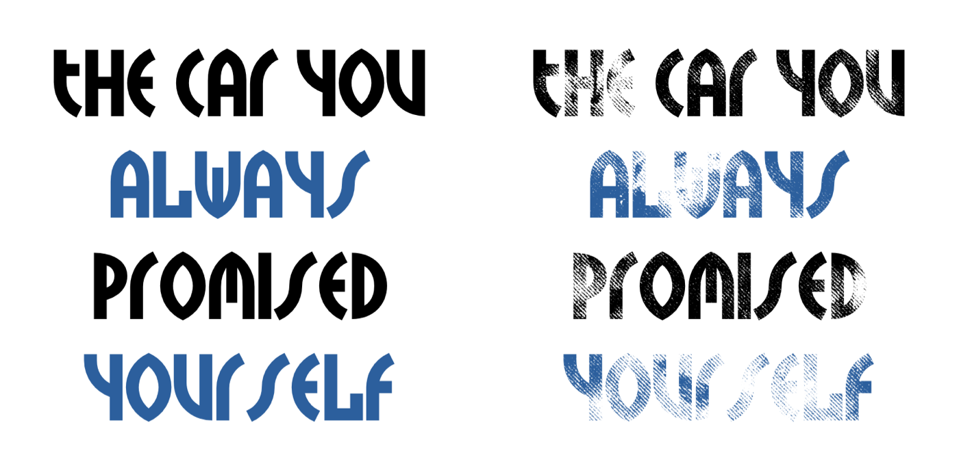
<h1>The car you <span>always</span> promised <span>yourself</span></h1>
</header>

<main>
<figure>…</figure>
<p>…</p>
<div>
<p>…</p>
</div>
</main>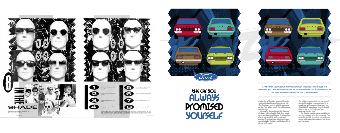
<figure>
<img src="capri-front-red.png" alt="">
<img src="capri-back-green" alt="">
<img src="capri-back-brown" alt="">
<img src="capri-front-lime" alt="">
</figure>
figure {
display: grid;
grid-template-columns: 1fr 1fr;
gap: 2rem;
background-color: #2c5f9d;
background-image: url(figure.png);
background-size: cover;
background-blend-mode: multiply; }Typography carries as much personality as readability. Brody’s original typefaces for The Face shaped his identity, and the headline here uses TokyoTwo, a facsimile of one of his designs, to echo that tone.
h1 {
font-family: 'TokyoTwoSolid';
font-size: 7vmax;
text-transform: uppercase; }
Key words get highlighted by wrapping them in span elements:
h1 span {
color: #2C5F9D; }
A standfirst opens the article, the few lines designed to stand out. These introductory paragraphs have many names — decks, kickers, riders, summaries — but their job stays constant: catch the eye, preview the content, and pull readers in. There is no universal style rule: size, weight, caps, or position all shift depending on device and layout needs. That flexibility matters when a layout must work across many screen sizes.
To turn the default paragraph into a proper standfirst, the design adds zig-zag lines via :before and :after pseudo-elements. Each contains a SVG image, which remains crisp at any display size:
main figure + p:before {
content: url(line-1.svg);
display: block;
margin-bottom: .75rem; }

main figure + p:after {
content: url(line-2.svg);
display: block;
margin-top: .75rem; }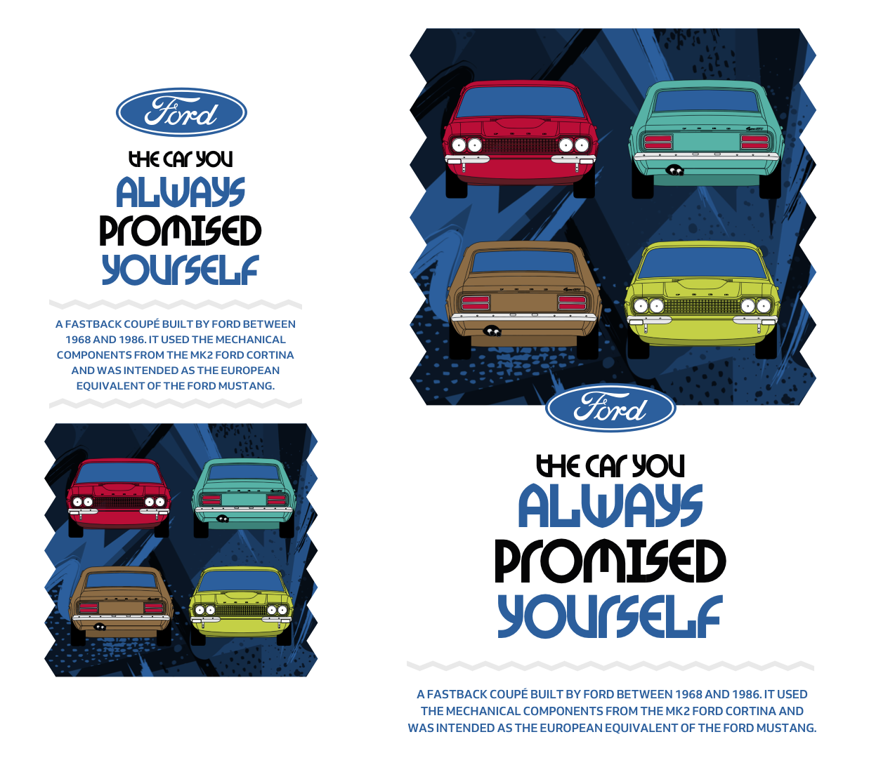
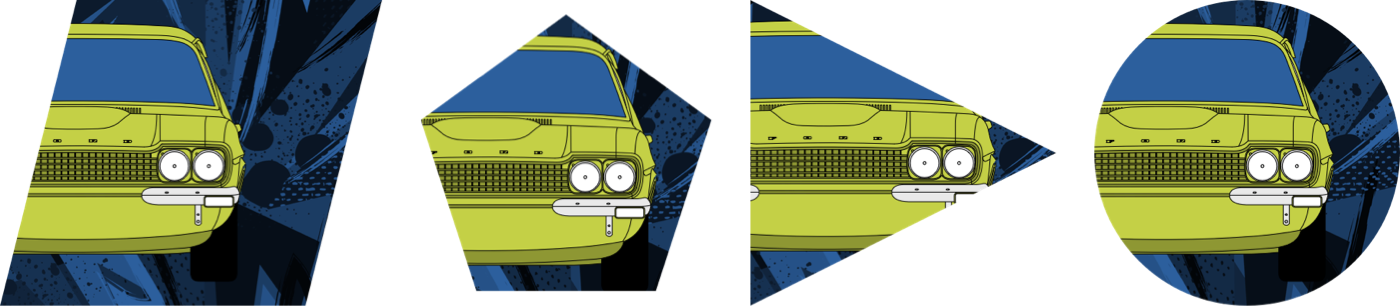
The zig-zag shapes at the sides of the colour-filled figures come from the CSS clip-path property, first covered alongside Alexey Brodovitch. A polygon path clips the figures so only part remains visible, no separate image needed:
figure {
-webkit-clip-path: polygon(0% 10%, 5% 20%, 0% 30%,…);
clip-path: polygon(0% 10%, 5% 20%, 0% 30%,…); }
Backgrounds on the body are positioned and sized, and larger screens fall into a two-column symmetrical grid:
body {
display: grid;
grid-template-columns: 1fr 1fr;
gap: 2rem; }

body {
background-image: url(body-small.svg);
background-position: 50% 0;
background-repeat: no-repeat;
background-size: cover; }

@media screen and (min-width : 64em) {

body {
background-image: url(body-large.svg);
background-position: 0 12rem;
background-size: contain; }
}
Rotating With Responsive Grids
The final Brody-inspired design uses a minimal set of structural elements:
<img src="logo.svg" alt="Ford">

<h1>Get a Capri… if you’re quick</h1>

<header>
<picture>
<source media="(min-width: 48em)">
<img src="header-small.png" alt="Ford Capri">
</picture>
</header>

<main>
<p>…</p>
<p>…</p>
</main>

<figure>…</figure>
<aside>…</aside>
<div></div>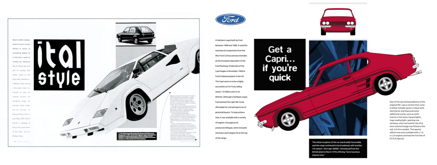
Grid properties apply from the start here, not just at larger breakpoints. The three-column grid gives the outer columns text-based widths and lets the centre column take all remaining space:
body {
display: grid;
grid-template-columns: 3rem 1fr 3rem;
background-color: #f0f0f1; }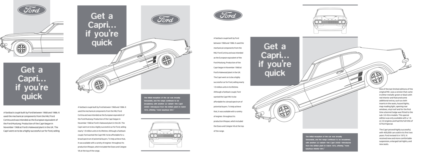
The Ford logo lands first in that centre column, on the first row:
[src*="logo"] {
grid-column: 2;
grid-row: 1;
justify-self: center; }
The header with its large Capri image spans every column and fills the page width in the second row:
header {
grid-column: 1 / -1;
grid-row: 2; }
A division holds an abstract backdrop behind the header, fitting in the second column and spanning the first two rows:
body > div {
grid-column: 2;
grid-row: 1 / 3;
z-index: 1;
background-color: #2c5f9d;
background-blend-mode: multiply;
background-image: url(div.png);
background-size: cover; }
A low z-index value pushes that division to the background, while the logo and header get a higher value to spring forward:
[src*="logo"],
header {
z-index: 2; }
That layer of depth works for small screens, but the space on larger displays unlocks the full composition. A two-column grid seems simple, yet the row pattern leans on a mixture of text-based, flexible, and intrinsic units:
@media screen and (min-width : 48em) {

body {
grid-template-columns: 1fr 1fr;
grid-template-rows: 16rem 8fr 16rem auto auto auto;
grid-column-gap: 5vw; }
}
The header goes into the third row and spans the grid’s full width. Remaining elements are placed by grid line numbers:
header {
grid-column: 1 / -1;
grid-row: 3; }

h1 {
z-index: 1;
grid-column: 1;
grid-row: 1 / 3; }

main {
grid-column: 1;
grid-row: 4 / 6; }

aside {
grid-column: 1;
grid-row: 6 / 7; }

body > div {
grid-column: 2;
grid-row: 1 / 4;
border-top: 10px solid #e9e9e9; }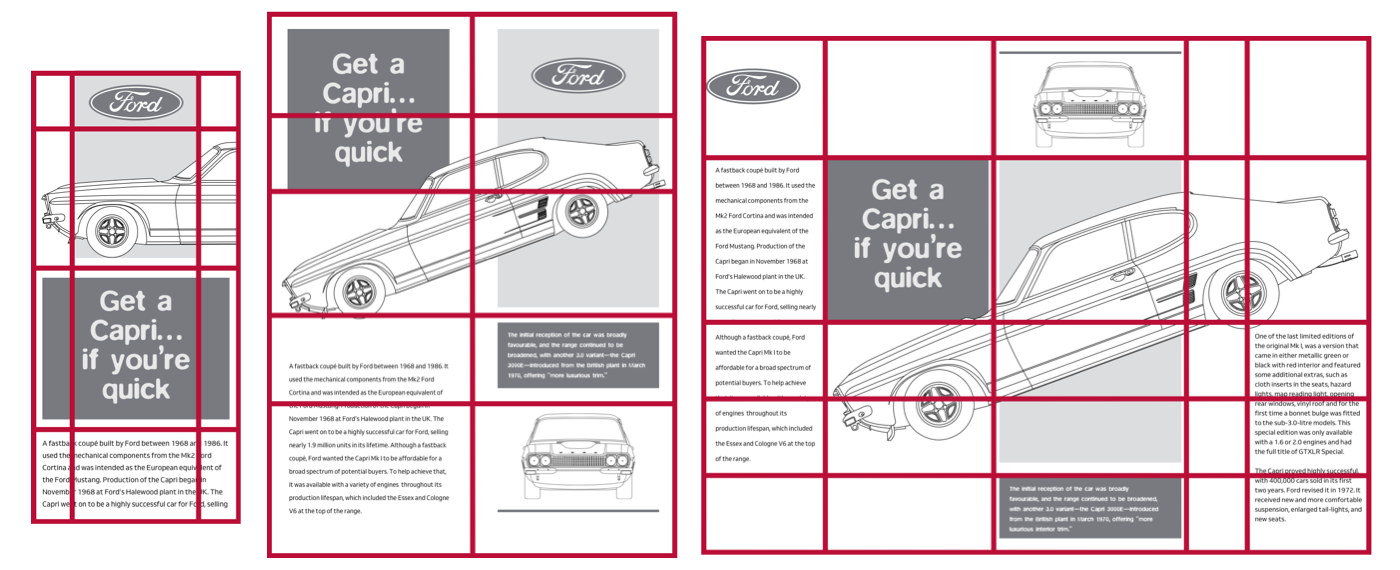
That figure element needs no styling itself, only its img and figcaption. Using display: contents; lets those children position themselves directly on the grid:
figure {
display: contents; }

figure img {
grid-column: 2;
grid-row: 5 / 7; }

figure figcaption {
grid-column: 2;
grid-row: 4 / 5; }
Now the header image can rotate and move upward, overlapping other pieces of the design:
header {
z-index: 2;
transform: rotate(-20deg) translateY(-6rem); }
Responsive design here is more than constraint — each breakpoint creates another chance for creativity. For large screens, the grid becomes five columns: four flexible, one text-based. The repeat value builds six rows of intrinsic height, and grid items align to the start instead of the default stretch:
@media screen and (min-width : 64em) {

body {
grid-template-columns: 1fr 1fr 1fr 6rem 1fr;
grid-template-rows: repeat(6, auto);
gap: 1rem;
align-items: start; }
}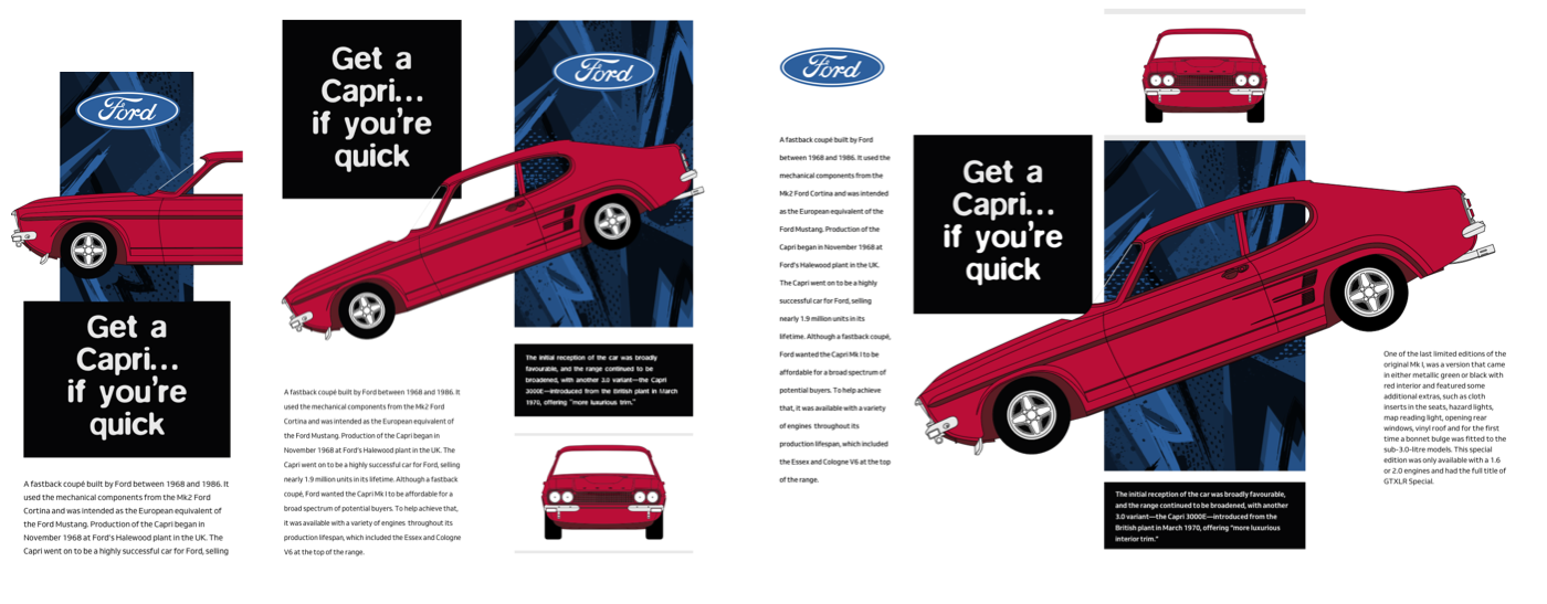
Line numbers reposition each element across the new grid, pulling content apart into columns:
[src*="logo"] {
grid-column: 1;
grid-row: 1; }

h1 {
grid-column: 2;
grid-row: 2; }

main {
grid-column: 1 / 2;
grid-row: 2 / 5; }

header {
grid-column: 2 / -1;
grid-row: 2; }

figure img {
grid-column: 3;
grid-row: 1; }

figure figcaption {
grid-column: 3;
grid-row: 4; }

aside {
grid-column: 5 / -1;
grid-row: 3 / 5; }

body > div {
grid-column: 3;
grid-row: 2 / 4;
align-self: stretch; }
Some elements share the same columns and rows, creating deliberate overlaps. That higher z-index keeps the Capri picture in the foreground where its rotation and offset are visible:
header {
transform: rotate(-20deg) translateY(3rem); }
A small surprise waits on hover: a transition with a series of transform values animates the classic Ford’s profile:
header {
transition: transform .25s ease; }

header:hover {
transform: rotate(-21deg) scale(1.025) translateY(3rem); }
Beyond Clipping: CSS Masks
The first Capri design used a spark plug silhouette as a background image, but recolouring it meant exporting a fresh asset. CSS masks solve this differently. Two mask types exist:
- luminance
White areas are transparent, black areas opaque, and gray scales sit semi-transparent in between. - alpha
The default, which uses alpha channels.
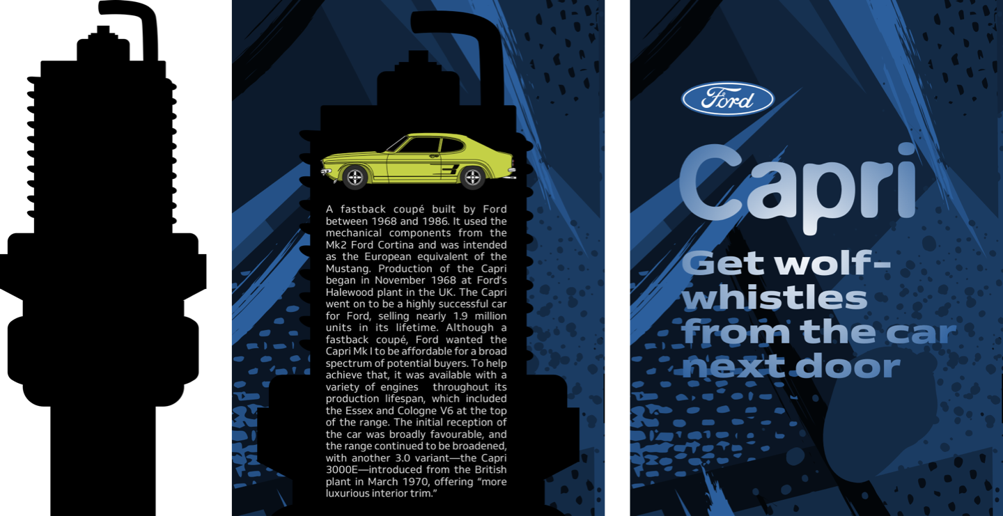
A single mask-image with an alpha channel saves re-exporting assets. Unlike clip-path, where content is either visible or not, masks allow multiple levels of opacity across an element. Fully black mask areas show content entirely, fully transparent ones hide it completely, and values between produce partial masking.
Because only the mask’s interior remains visible, the element’s background colour or image can change any time without altering the mask asset. The mask-image syntax follows background-image conventions: mask-position uses the same X and Y values as background-position, and mask-repeat accepts standard values like repeat, repeat-x, repeat-y, and no-repeat, plus the rarely used space and round. Sizing options for mask-size include one or two numbers, contain, and cover.
main {
mask-image: url(mask.png);
mask-position: 0 4rem;
mask-repeat: no-repeat;
mask-size: cover; }
Two more properties refine where a mask lands: mask-clip and mask-origin work like their background equivalents, clipping to border-box, content-box, padding-box, and other choices. On the experimental side, mask-border promises to combine border image flexibility with masking.
Masks add depth to headlines too. A bitmap or SVG gradient could work for the header, but CSS-generated gradients — which are themselves background images — qualify as mask images and keep the performance cost nearly nonexistent:
main {
mask-image: linear-gradient(
transparent,
rgb(0,0,0) 50%,
transparent 100%); }
A circular radial-gradient fades the edges of the header content:
main {
mask-image: radial-gradient(
circle at 50% 50%,
rgba(0,0,0,1),
rgba(0,0,0,.15) 80%); }
Adjusting alpha channel values and colour stops tunes the look until it fits the overall design.


