
How Selling Shaped a Designer’s Vision
Emmett McBain was a Black American graphic designer whose advertising work in the 1950s, ’60s, and ’70s changed how brands reached African American consumers. Along with co-founding what became the largest Black-owned agency in the U.S., McBain created nearly 75 record covers before turning 24. His approach to design — rooted in understanding the audience’s aspirations, not just pushing a product — offers lasting lessons for digital work.
Selling, often dismissed as pushy or coercive, is in fact a skill of deep empathy. Good salespeople understand a buyer’s problems before they explain how their product solves them. That principle guided McBain: to sell his clients’ goods, his work had to resonate with Black audiences through familiar imagery and language. His designs spoke to people where they were, and that authenticity made his campaigns successful.
Born in Chicago in 1935, McBain studied commercial art at the American Academy of Art. He began his career at Vince Cullers and Associates, the first African American-owned, full-service ad agency in the U.S., founded in 1958. Cullers believed reaching Black consumers required “thinking Black,” and he hired and educated African Americans in advertising — McBain among them.
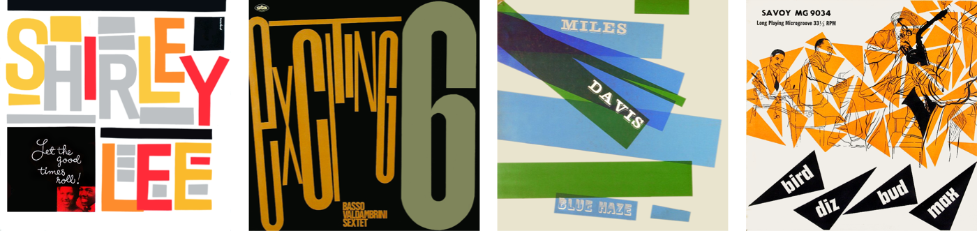
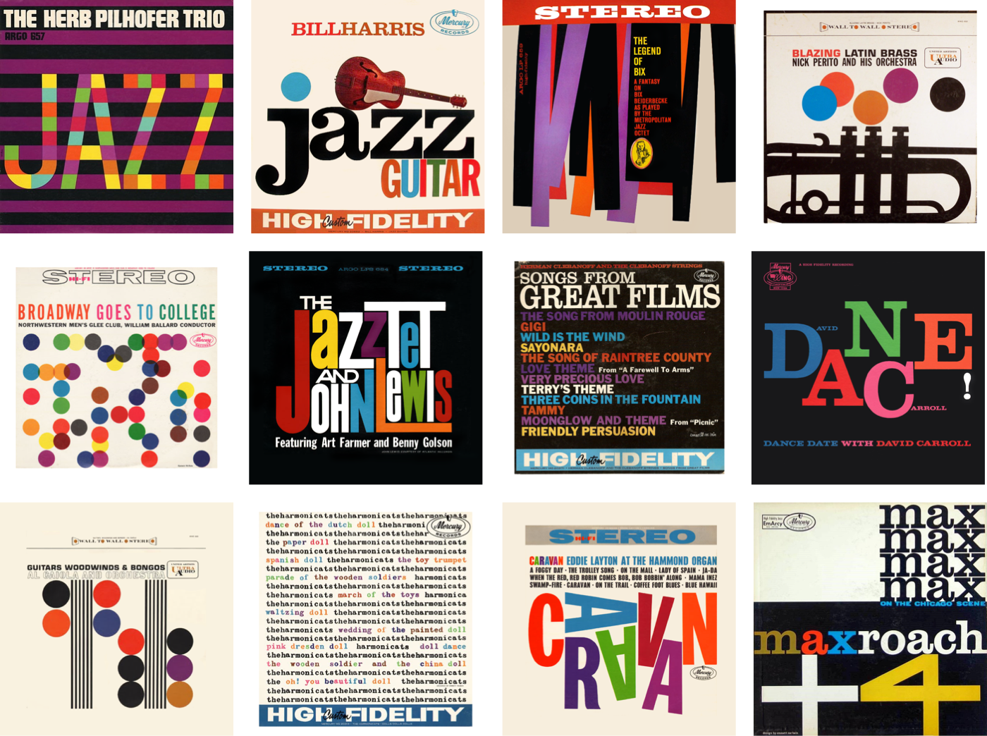
After two years there, McBain moved to Playboy Records as assistant art editor, then rose to promotion art director. In 1958, his Playboy Jazz All-Stars album art earned Billboard’s Album Cover of the Week. Leaving Playboy in 1959, he founded McBain Associates, which worked steadily with Mercury Records; by age 24, he had designed over 75 covers.
In 1968, McBain rejoined Vince Cullers Advertising as creative director, contributing some of his most significant work. Before the 1960s, advertisers largely ignored Black consumers, confining outreach to Black newspapers. White clients feared associating with African Americans and assumed they had little disposable income, even as Black consumers spent nearly $30 billion annually by the mid-1960s. Agencies then began recruiting African Americans, hoping their perspectives made campaigns more relatable — and McBain’s did.
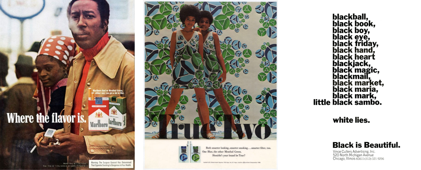
His work featured positive imagery of everyday Black people in familiar settings, for clients such as Newport menthols, Philip Morris’s Marlboro, and SkinFood Cosmetics. McBain understood, as his future partner Tom Burrell put it, that “Black people are not dark-skinned white people.” Selling meant acknowledging different needs, not imposing a monolithic view.
In 1971, McBain and Burrell founded Burrell-McBain Inc., an agency dedicated to the Black commercial market. They replaced Marlboro’s iconic white cowboy with Black smokers in everyday contexts, a campaign that won them Coca-Cola and McDonald’s and made the firm the largest Black-owned agency in America. McBain left in 1974 to pursue art, opening The Black Eye gallery and consultancy to help agencies connect with African American communities. He died in 2012, later recognized by AIGA, the Society of Typographic Arts, and the Art Directors Clubs of Chicago and Detroit.
Making the Web Speak to Everyone
McBain isn’t widely cited in design conferences or web articles, and no book covers his work. Yet his later advertising designs and his earlier record covers — full of color and deconstructed type — offer rich inspiration for web layouts. The design below applies his visual language to a page about the Citroën DS, using vertical stripes, bold hues, and careful typography.
The HTML for this design stays constant across screens: three structural elements — a header containing an SVG logo and headlines, a main, and an aside with a table of DS production numbers.
<header>
  <svg>…</svg>

  <div>
    <svg>…</svg>
    <svg>…</svg>
  </div>
</header>

<main>
  <p>…</p>
</main>

<aside>
  <table>…</table>
</aside>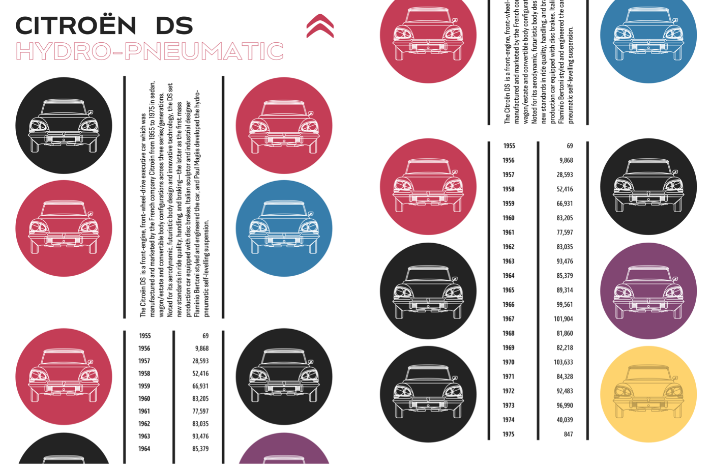
SVGs for the headlines ensure consistent scaling and stroked text. Accessibility matters here: add an ARIA role attribute, a level attribute to replace missing heading semantics, and a title element that assistive technology reads but browsers won’t render.
<svg role="heading" aria-level="1" aria-label="Citroën DS">
  <title>Citroën DS</title>
  <path>…</path>
</svg>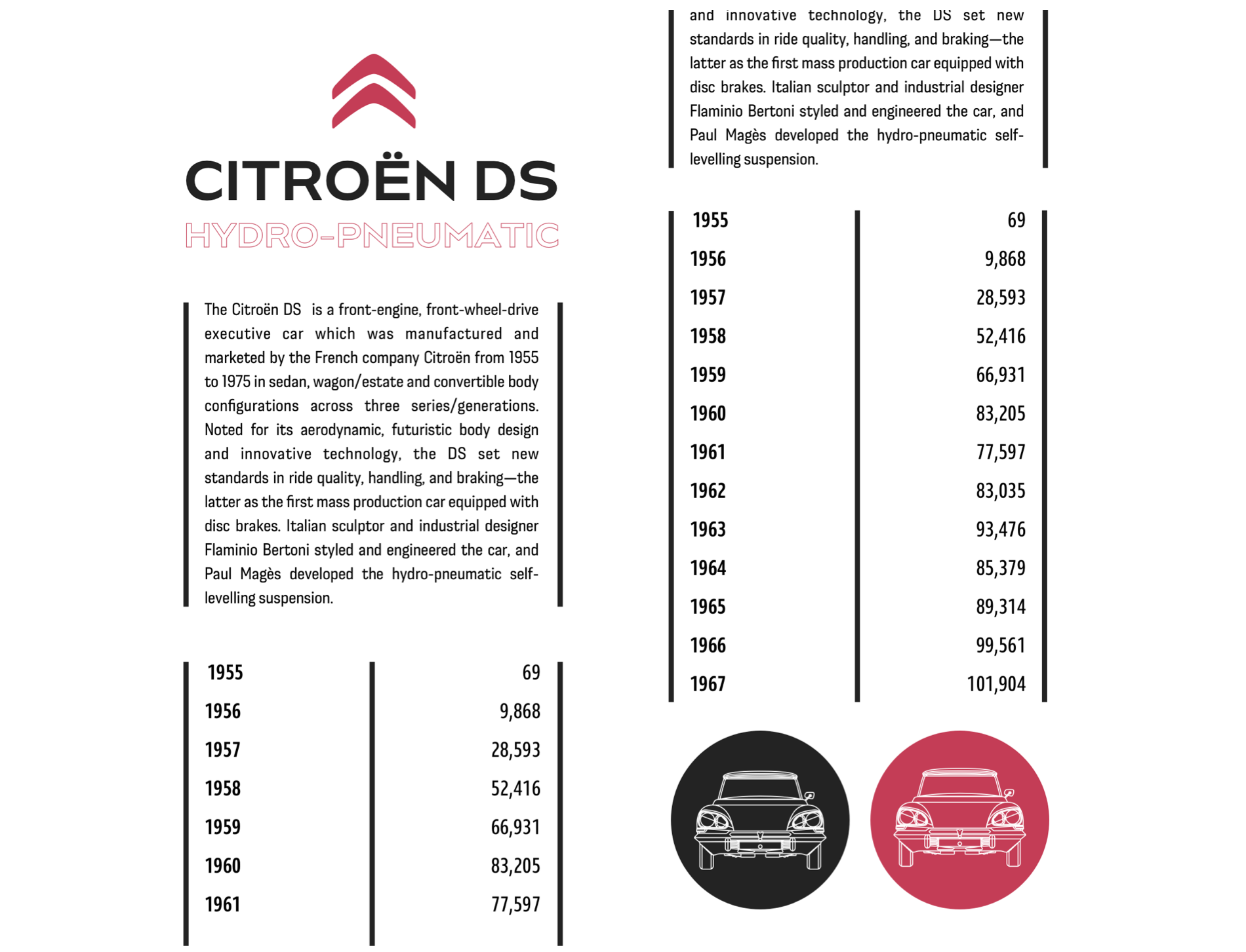
Start with foundation styles, then give SVG elements precise dimensions and center the logo with auto horizontal margins.
body {
background-color: #fff;
color: #262626; }
header > svg {
margin: 0 auto;
width: 80px; }
header div svg {
max-height: 80px; }McBain used vertical black stripes for layout structure. Without adding extra HTML, those stripes come from dark borders on either side of the main paragraph, and later on the table itself.
main p {
padding: .75rem 0;
border-right: 5px solid #262626;
border-left: 5px solid #262626; }
aside table {
width: 100%;
border-right: 5px solid #262626;
border-left: 5px solid #262626;
border-collapse: collapse; }Adding a third rule to the right of each table header, with each cell filling half the table width, creates a continuous center stripe from top to bottom.
aside th {
padding-right: .75rem;
padding-left: .75rem;
border-right: 5px solid #262626; }
aside th,
aside td {
width: 50%;
box-sizing: border-box; }Readers scan down the year column, then across to production figures. Right-aligning the numbers aids that comparison.
aside td {
text-align: right; }
Improve readability further with font-feature-settings for lining numerals — old-style 3, 4, 7, and 9 have descenders that drop below the baseline. Tabular numerals, each the same width, make hundreds and thousands align precisely.

aside td {
font-variant-numeric: lining-nums tabular-nums; }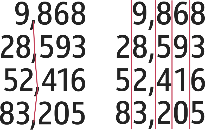
Introduce a circle motif at the bottom of the small-screen design using CSS-generated content with a data URI, encoding an image as a string to avoid extra markup.
aside:after {
content: url("data:image/svg+xml…"); }Responsive Refinements
Scaling up often requires only minor changes. On medium screens, align the logo and SVG headlines horizontally. Though the logo comes first in HTML, visually it sits right of the headlines — use flex-direction: row-reverse on the header. Let the headlines fill remaining space with flex-grow: 1, adding a viewport-based margin to keep elements apart.
@media (min-width: 48em) {

header {
display: flex;
flex-direction: row-reverse;
align-items: flex-start; }
}
header div {
flex-grow: 1;
margin-right: 2vw; }A symmetrical three-column grid applies to both main and aside. Place generated images into the first and third columns, with the previous small-screen circle replaced in the aside.
main,
aside {
display: grid;
grid-template-columns: repeat(3, 1fr);
gap: 1rem; }
main:before {
grid-column: 1;
content: url("data:image/svg+xml…"); }
main:after {
grid-column: 3;
content: url("data:image/svg+xml…"); }aside:before {
grid-column: 1;
content: url("data:image/svg+xml…"); }
aside:after {
grid-column: 3;
content: url("data:image/svg+xml…"); }The extra space also allows more vertical stripes. The main paragraph’s borders already exist; rotate it 180 degrees and set writing-mode: vertical-rl. Some browsers stretch grid items full height; others need an explicit height on the table to distribute row spacing evenly.
main p {
justify-self: center;
writing-mode: vertical-rl;
transform: rotate(180deg); }
aside table {
height: 100%; }On wide screens, place main and aside side by side with a two-column grid, with the header spanning the full width. Minimal CSS handles the transition from small to desktop.
@media (min-width: 64em) {

body {
display: grid;
grid-template-columns: 1fr 1fr;
gap: 1rem; }
}
header {
grid-column: 1 / -1; }
main {
grid-column: 1; }
aside {
grid-column: 2; }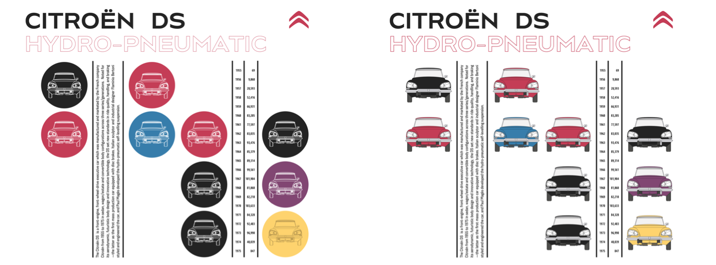
Irregular Layouts, Built Cleanly
The bright blocks and uneven shapes in McBain’s jazz-inspired design look unplanned, but their CSS foundation is precise. Only two structural elements are needed — header and main — and the layout starts with background and foreground colors plus generous padding that gives the eye room to wander through the spaces between blocks.
body {
padding: 2rem;
background-color: #fff;
color: #262626; }
On small screens, those colorful blocks would overwhelm the viewport, so the header adopts the same bright palette instead. The irregular silhouette stays visible at every screen size by clipping the header with a polygon path; anything outside the clip area becomes transparent.
header {
-webkit-clip-path: polygon(…);
clip-path: polygon(…); }
Typography details signal careful craft. A short horizontal rule beside the `` element at the start of the main content should stretch and shrink with the text length, but no presentational `
` belongs in the markup. A Flexbox row and a pseudo-element handle it: the text is styled first, then an :after pseudo-element gets a thin bottom border matching the text color.
main small {
display: flex;
align-items: flex-end; }

main small:after {
flex-grow: 1; }
The flex properties align both items to the bottom of the `` element, and a flex-grow value of 1 on the pseudo-element lets its width adapt to longer or shorter strings.
Surprises continue in the “Champion de France” headline. Almost ten years ago Dave Rupert’s Lettering.js wrapped individual letters and words in `` elements so they could be styled separately. This design gets the same effect without shipping any JavaScript — the multi-colored letters are marked up directly in the HTML, and each selected letter receives its own color.
h2 span:nth-of-type(1) {
color: #c43d56; }

h2 span:nth-of-type(2) {
color: #905dd8; }

h2 span:nth-of-type(3) {
color: #377dab; }
Responsive design here is a chance to use every extra pixel creatively. Medium and large screens introduce the large, irregularly shaped color blocks that make the composition feel unexpected. The body becomes an eight-column symmetrical grid, with the header placed into three columns. Once the color blocks are visible behind it, the header swaps to a dark grey background, and its content is centered both horizontally and vertically with Flexbox alignment. The header’s text colors change to match, and negative horizontal margins let the header overlap adjacent elements.
The main element needs no extra styling; it is positioned on the grid with line numbers. Not every element in a design has to come from the HTML — pseudo-elements created in CSS can take their place, keeping the markup free of presentation. A :before pseudo-element on the body is perfect for the colorful blocks, with a data URI background image that covers the entire pseudo-element regardless of size. CSS Grid treats pseudo-elements like any other grid item, so they slot into the layout using line numbers as well.
body:before {
grid-column: 1 / 4; }
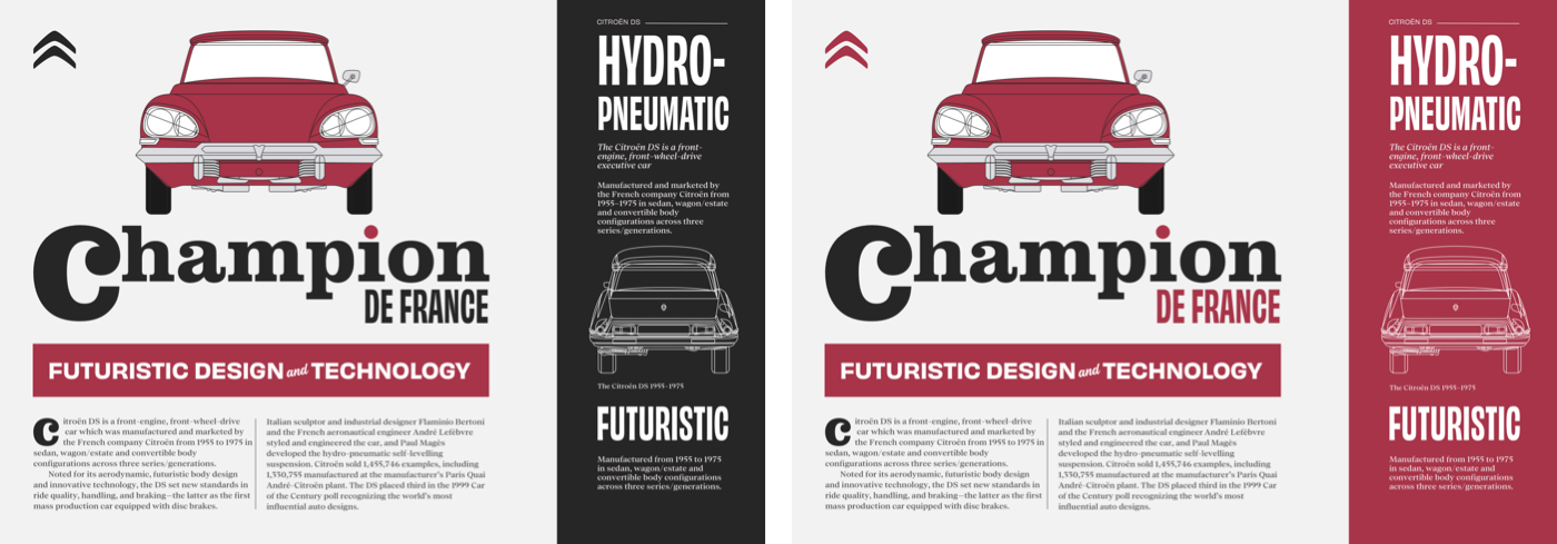
Media query breakpoints usually signal major layout changes, but sometimes a minor adjustment is all a design needs. Jeremy Keith calls these moments “tweakpoints.” This medium-size McBain-inspired design performs well at larger widths, but a few tweaks add detail on the very largest screens. Four extra columns extend the grid to twelve, and the generated color blocks, header, and main are repositioned with new line numbers. Because these elements now overlap, each one is given the same grid-row value so they do not create new rows. One more block of color sits between header and main content — again added as a pseudo-element with a data URI image, preserving the HTML’s semantics.
Type as Image, Built in SVG
Emmett McBain’s early record covers showed a flair for typography. He was playful with type, deconstructing and rebuilding it into unusual shapes. That degree of control was always difficult on the web until SVG made nearly anything possible. This next design leans on SVG and just two structural HTML elements: a header holding the large type-based graphic, and a main element for the article content.
<header>
  <h1>…</h1>
  <p>…</p>
  <svg>…</svg>
</header>

<main>
  <h2>…<h2>
  <div>…</div>
  <svg>…</svg>
</main>
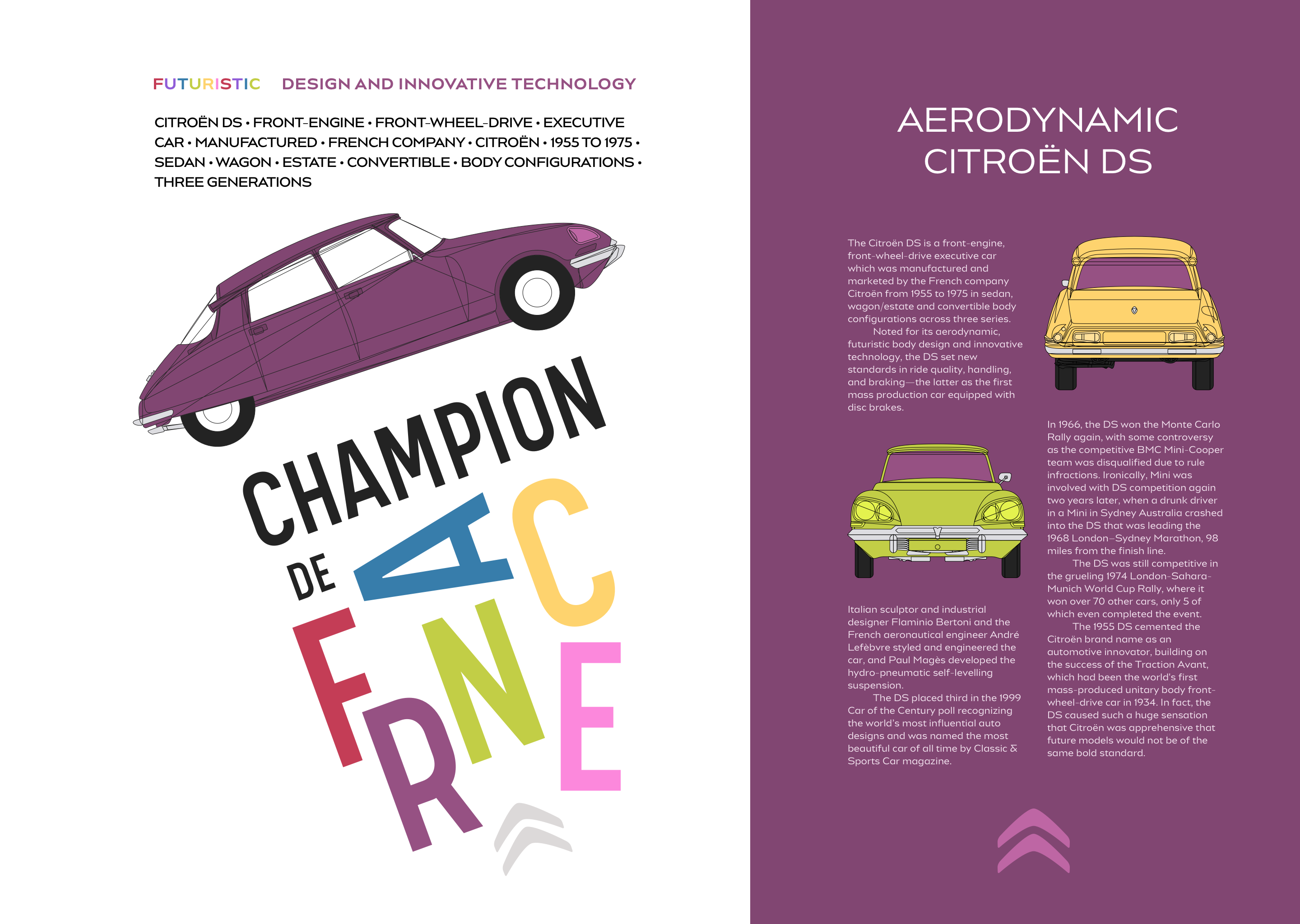
Foundation styles are minimal: background and foreground colors plus padding inside the two elements, followed by type styles for the headings and their accompanying paragraphs. The main content receives a rich purple background to match the Citroën’s color in the panel opposite.
main {
background-color: #814672;
color: #fff; }
The dominant graphic combines a profile of the Citroën DS with a stylized “Champion de France” type treatment. Arranging those letters with CSS positioning and transforms would be fiddly, which makes SVG the obvious choice. The SVG contains three path groups. One holds the outlines for “Champion de:”; the second holds paths for the brightly colored letter arrangement, with unique id attributes on each letter so they can be styled individually; the final group is the Citroën DS profile, whose paths carry class attributes so its colors can be swapped to suit different themes, even across media query breakpoints.
<g id="citroen">
  <path class="car-paint">…</path>
  <path class="car-tyres">…</path>
  <path class="car-wheels">…</path>
  <path class="car-shadow">…</path>
  <path class="car-lights">…</path>
  <path class="car-stroke">…</path>
</g>
On medium-size screens, the positions of the car profile and type-image are tweaked. The order of transforms matters here, as different combinations of rotate, scale, and translate produce subtly different results. The main content also gains multiple columns. For larger screens, header and main should no longer stack; the body becomes a twelve-column grid, with the header spanning seven columns and the main content just five. The result is an asymmetrical layout built on a perfectly symmetrical grid.
Scaling Text With SVG
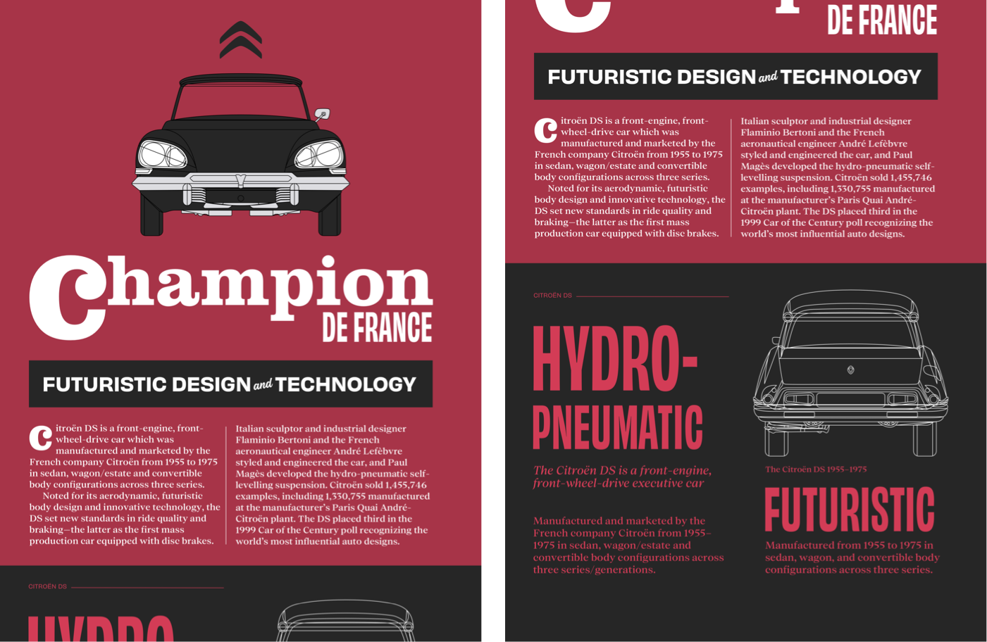
The boundary between SVG and HTML blurs the more it is used. SVG is XML-based and sits comfortably inside HTML. This final McBain-inspired design uses SVG-in-HTML not only for imagery but for text itself. The composition needs four structural HTML elements: a header with an image of the iconic Citroën DS, a banner division containing a large headline set as SVG text, the main element for article copy, and an aside for supplementary content.
<svg>…</svg>

<header>
  <svg>…</svg>
</header>

<div id="banner">
  <svg>…</svg>
</div>

<main>
  <div id="heading">
    <svg role="heading" aria-level="1">…</svg>
  </div>

  <div class="content">
    <p class="dropcap">…</p>
    <p>…</p>
  </div>
</main>

<aside>
  <small>…</small>
  <svg role="heading" aria-level="2">…</svg>
  <p>…</p>
  <figure>…</figure>

  <svg role="heading" aria-level="2">…</svg>
  <p>…</p>
</aside>
Once thought inappropriate — like setting text in images — SVG text is in fact just as accessible and selectable as HTML text, and infinitely more style-able with clipping paths, gradient fills, filters, masks, and strokes.
The banner headline is made of two text elements: a large “Champion” and “de France.” Pairs of x and y coordinates on each tspan element place the words precisely, building a solid slab of type. Whether inlined or linked as an external image, SVG can be styled with CSS. This headline is linked, so its styles live inside the SVG file itself.
<svg>

<style type="text/css">
<![CDATA[

text {
color: #fff; }

.title {
font-family: Clarendon URW;
font-size: 150px; }

.title__dropcap {
font-family: Clarendon URW;
font-size: 300px;
text-transform: lowercase; }

.title__small {
font-family: Obviously;
font-size: 85px;
text-transform: uppercase; }

]]>
</style>

</svg>
Foundation colors and typography come first. The article paragraphs are indented rather than spaced apart — bottom margins are removed and a 2ch wide indent is added to every paragraph after the first. The reverse-theme aside — dark grey background, red text — uses colors that look more vibrant when lightness and saturation are increased on a dark surface.
Medium screens get their own tweaks. Two different multiple-column layout properties are used: the content division specifies two columns of variable widths, while a narrower area uses any number of columns that are all 16em wide. Almost all the styling is visible on even the smallest screens, so the largest layouts simply add grid properties — twelve columns on the body — and place each element precisely: the Citroën logo in the first column, the header image spanning four columns, the banner and main content both spanning eight, and the reversed aside occupying three columns on the right, stretching from the top to the bottom of the layout via row line numbers.