
The New York Times redesigns its app around a product ecosystem
The New York Times relaunched its app in October 2024 with a structure built around its subscription ecosystem, which includes News, Games, Cooking, Audio, Wirecutter, and The Athletic. The previous version required readers to tap and scroll through multiple subsections to find content. The new design places a Today section at the top with the latest news, while a top navigation bar leads to other verticals and products, each with its own home screen and visual identity.
“The idea is that all the other pieces rotate around the sun, and the sun is journalism,” says Jak Horner, Principal Product Designer at The Times.
Instead of building a “super app” with all offerings in one central feed, the design encourages users to scroll between distinct feeds. The Lifestyle section uses a grid of images with headline overlays—a visually driven “poster” component—while Opinion features stylized headlines that convey a different perspective.
The team used Figma to manage the scale and number of stakeholders involved, including section editors, engineers, and senior management. The storytelling group—designers who collaborate with the newsroom to create story formats combining image, text, video, and audio—also worked asynchronously in the shared files. Peter Rentz, Principal Product Designer, describes this as “figuring out the shape of journalism itself.”
“It’s more, ‘Hey, let’s hop into Figma.’ We don’t need to be on a video call or share our screen,” Peter says. This workflow replaced building decks with sharing prototypes directly in Figma.
The shared workspace also lets team members check on each other’s progress without formal meetings. “Every so often, I'll pop in to see what Jak is doing just to make sure I'm not doing the exact same thing,” Peter says. “It's this nice way of working together without stepping on each others’ toes. It creates efficient work.”
Brainstorms in FigJam informed Figma sketches for each section of the app. For coverage of the 2024 presidential election, which shifted hourly, editors needed to settle on a visual pattern. Questions included how much the election panel should change daily, what belonged in that section versus Today, and how to highlight visuals. Designers Chen Wu, Nate Clancy, and Frannie Ello developed an election panel with a new video feature for streaming coverage.
The team often works with existing components to meet editorial needs, but sometimes goes off-script. “There's this push and pull we have with design systems and how we're using components,” Peter says. “Even though we have components in the code, our news stakeholders are more concerned about the best way to cover something and the best experience.”
Thea Lorentzen, Product Design Director, frames the recurring challenge as designing for uncertainty. “A constant source of creativity is this interplay between the chaos and unpredictability of news and the stability of creating a longer term product,” she says.
The Economist retools its typography for a digital-first readership
In early 2024, The Economist introduced two new typefaces, Economist Serif and Economist Sans, along with an updated logo. While the publication redesigned in 2018, that effort targeted a print-focused audience. Since then, more than 65% of subscriptions are digital-only, up from 35% four years earlier, and 85% of new subscribers choose digital. The typeface needed to work across newsletters, apps, and social platforms including TikTok, LinkedIn, and Instagram.
“Your typography has to work much harder now,” says Adam Morris, Head of Product Design. “But the core thing is that people pay to read our journalism, and you’ve got to have a typeface that makes it a pleasure to read.”
Typographer Henrik Kubel of the foundry A2-TYPE collaborated with Stephen Petch, Creative Director, and Adam's team on the variable typefaces. The serif references Plantin; the sans serif references Venus. The team used Figma to test letterforms across charts, body text, and bold headlines. Some characters proved too ornate in specific contexts, leading to adjustments—for example, they developed three versions of the capital “Q,” with tail lengths ranging from short for drop caps to long for headlines and special applications.
“With the new typographic system and with Figma, we’re able to have a streamlined experience everywhere,” says Mark Mitchell, Principal Product Designer. The brand typefaces are centralized in a foundations library in Figma, with a type scale and grid flexible enough to work across website, app, and newsletters. “It’s just a better experience, and we have better control.”
The 2018 redesign relied on a chain of tools: Sketch for interfaces, InVision for prototyping, and Zeplin for handoff. This time, workflows consolidated in Figma with Dev Mode, eliminating the need to produce assets for multiple programs. “We’re all working in one place versus three or four tools,” Adam says. “This helped with context switching and costs, but it was mostly about speed and ease.”
Dev Mode has been used on the majority of projects for the past year, with the team seeing the most impact from the inspect tool and its link to Figma variables. The Economist uses variables for spacing, color, theming, and typography, all mirrored in code as design tokens across web and app.
“Variables are really useful for designers—providing a set of fixed values that helps maintain consistency across our visual language and reducing the number of decisions we need to make—but really shine when we’re working with engineers,” Mark says. Engineers copy and paste from Dev Mode directly, reducing back-and-forth during reviews.
The typography project predated variable support for typography in Figma, so the team relied solely on text styles. Since variable fonts became available, they have updated all text styles with font sizes tied to their type scale, plus leading and typeface variables. “We have hundreds of text styles, so being able to centrally manage those values with variables now is a huge time saver,” Mark says.
Rebuilding a local news brand around a shared design workflow
The Minnesota Star Tribune, one of the top 10 daily papers in the U.S. by circulation, set out to modernize its digital presence and court younger readers. The problem was structural: desktop and mobile experiences were inconsistent, both information-dense and text-heavy, and the two ran on separate code bases. “Where we had been was pretty fragmented,” says Josh Penrod, Head of Design at the Star Tribune. “We did not have a single responsive site, which eroded brand trust.”
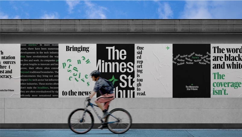
Partnering with digital agency Code and Theory, the paper launched a new responsive website in August, alongside a comprehensive rebrand that included a new logo and typography. The goal was a unified experience across devices. “We went into the project with the idea of removing friction and having a device-agnostic approach to content, stories, and narratives,” says Francisco Seiz, Senior Design Director at Code and Theory. “It’s crucial to have an experience that’s completely seamless and frictionless because as soon as it isn’t, it’s alienating to readers.”
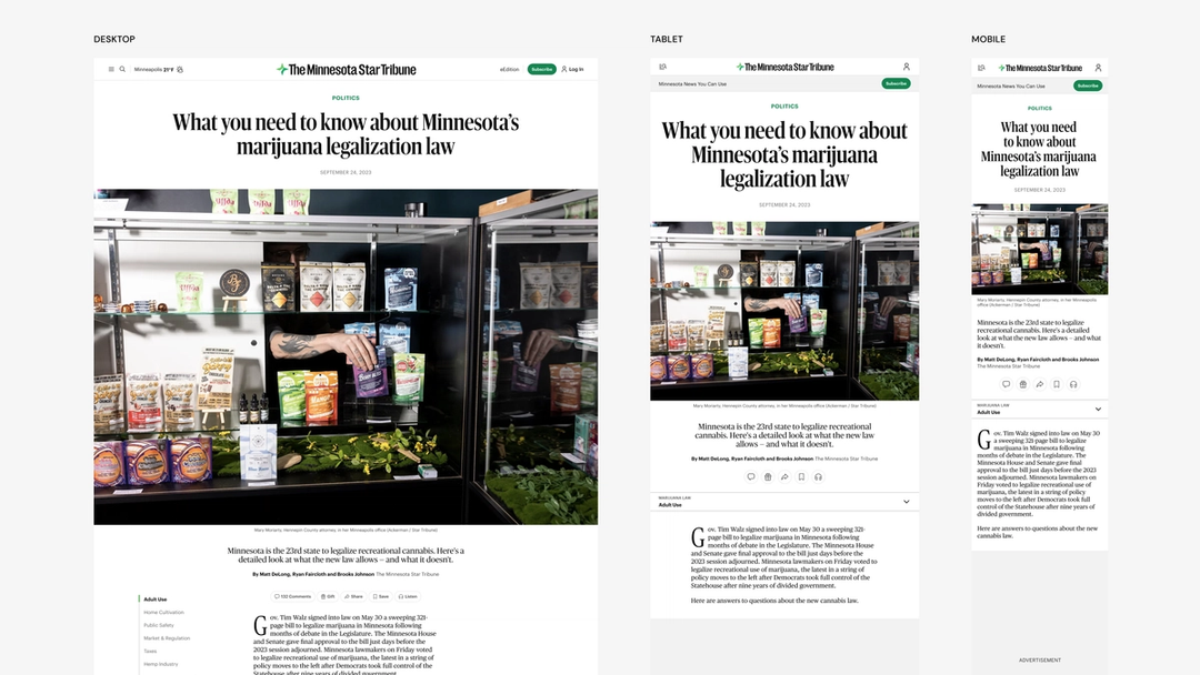
The redesign drove a move to Figma, replacing Sketch and the Adobe Creative Suite. Prior attempts at building and maintaining a design system had failed, but the new tool changed that dynamic. Seeing a design system in Figma “actually feels like magic,” says Penrod. During live design reviews with many stakeholders, the team could demonstrate changes on the spot—showing, for example, how to select from six instances of a component. “When you’re in a live design review with a lot of stakeholders, it’s hard to overstate how powerful that is for speed and getting buy-in.” The transparency extended the whole process: “Everyone was able to influence, inspire, and give input without ever leaving the design file,” adds Seiz.
Everyone was able to influence, inspire, and give input without ever leaving the design file.“Everyone was able to influence, inspire, and give input without ever leaving the design file.”
The teams worked almost entirely in Figma, from strategy workshops through prototyping and iteration. Old diagrams and wireframes remained useful reference points during design sprints. “The beauty of this process meant that our artifacts weren’t just final designs,” says Penrod. “We could show our work and point directly to strategic decisions and key data points.” That working method has since become a template for future projects.
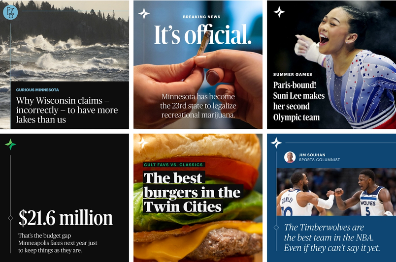
A soft relaunch in mid-July kept the existing typography to gather user feedback and test speed and functionality; three weeks later, the new typefaces went live. The site now feels more intentional and consistent across desktop and mobile—simple in design, and careful not to let UX interfere with the journalism. “I have no idea how we could have done it without the efficiency of something like Figma,” says Penrod. “This is the tool we’ve been looking for—for years.”
I have no idea how we could have done it without the efficiency of something like Figma.“I have no idea how we could have done it without the efficiency of something like Figma.”
The relaunch itself took just seven months, but internal replatforming continues. The hope is that more teams across the organization will adopt Figma. UX designers are already using FigJam to draft a team charter and are experimenting with an annotation plug-in to communicate more clearly with vendors unfamiliar with Dev Mode. Penrod even picked up a Figma Creator Micro keyboard, a custom shortcut keyboard—an indication, he says, of his enthusiasm for the tool.
For newsrooms facing pressure to retain readers, grow audiences, and stay viable, collaboration tools are becoming a baseline necessity, especially as the digital landscape shifts quickly. Figma has proven useful to publishers navigating that change.


