
The Problem With Icons In Design Systems
Design systems are supposed to bring order to chaos, yet iconography often remains one of the messiest corners of an otherwise tidy system. In the atomic design model, an individual icon is an atom: the smallest but most essential building block, on par with a color palette or typography. If a design is the interface's voice and a design system is its language, icons constitute its vocabulary. Getting that vocabulary right — and keeping it consistent — requires planning before you ever open a drawing tool.
Treating an icon as an autonomous element is a common trap. In reality, an atom only earns its place when you understand how it will behave as part of larger structures: molecules, organisms, and templates. Before drafting a single icon, you should be able to answer a set of questions about its future role:
- Is the icon scalable?
- Does it need color variations?
- How will it be classified — by meaning, group, style, or location?
- Can its meaning or style change without breaking the system?
- How will new icons be introduced to the roster?
- How do multiple designers working in parallel keep output consistent?
- How will teammates locate an icon when they need it?
Practical maintenance challenges follow close behind. You need to track updates, write usable creation guidelines, rationalize any existing inconsistencies, and keep the whole team informed of changes. None of this is trivial, but each problem has a workflow solution.
Rules Before Icons
An icon is not decoration; it's a symbol of action and an interactive wayfinding element. Treat it as a tool, and tools demand construction rules. Establish those rules before building your library, and you'll find it far easier to produce both standalone icons and icons that live within larger components consistently.
Grid
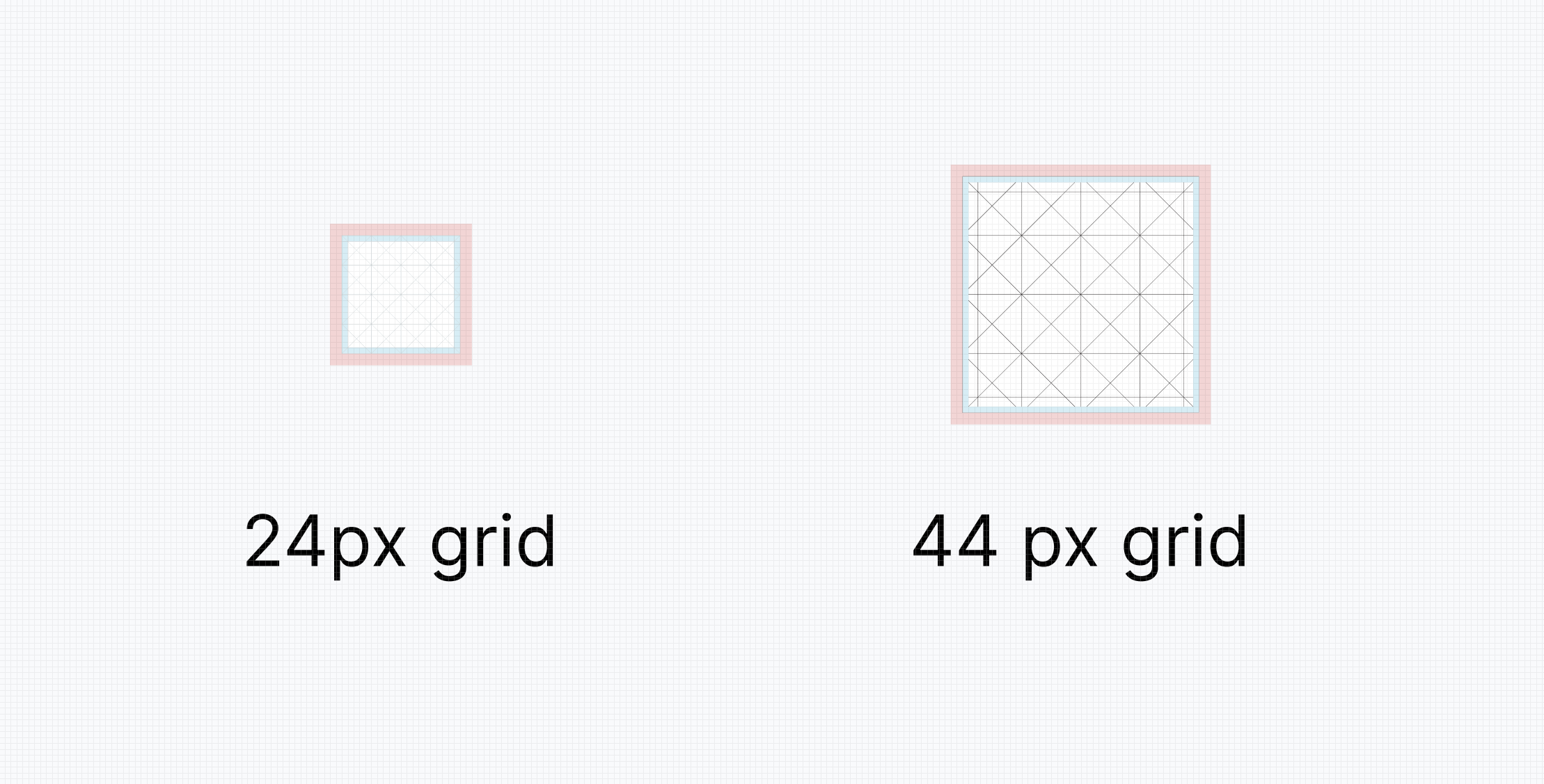
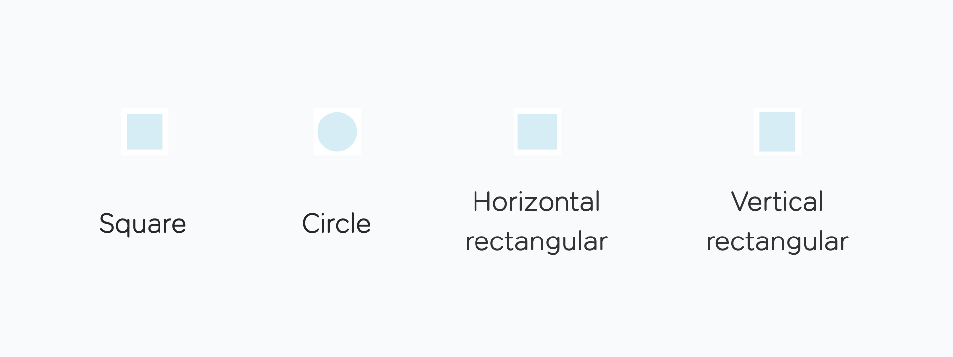
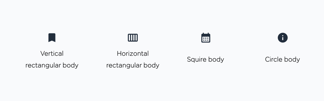
Start with the grid. The classic 24px grid works for standard icons, while 44px suits larger applications. Each grid is divided into a 2px padding area (red in most icon grid diagrams) and a 20px live area (blue). The live area's shape — circular, square, vertical-rectangular, or horizontal-rectangular — depends on the body of the icon you're drawing. Decide how much space the icon body will occupy and define the shape before drawing anything.
Size
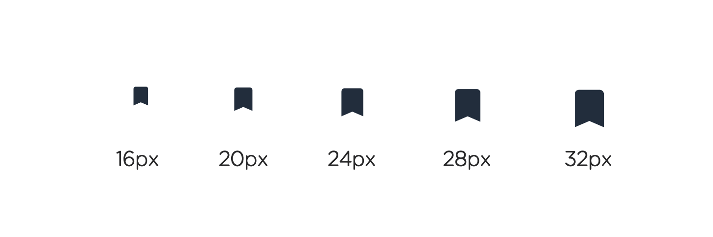
Every system needs a primary icon size, shared by the overwhelming majority of icons in the set. Google's Material Design suggests 24px, and that works well as a golden standard for both desktop and mobile interfaces. When exceptions are necessary, scale in 4-pixel steps: down from 24 to 20, 16, or 12; up to 28, 32, and beyond. Anything smaller hurts legibility, and anything larger tends to dominate the layout.
Weight And Fill
Outline weight matters, especially for icons with fine details. If you're building a library from scratch, test several stroke weights before committing. It's technically possible to assign different weights to different icon sets, but guideline documentation gets messy fast. A single unified value — 2 points, for instance — wins for clarity and maintainability.
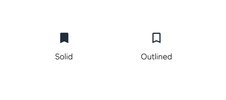
Solid icon variants can meaningfully improve accessibility and in-context readability. Having both solid and outline versions of an icon is useful, but don't force every icon into two variants. Pick which icons genuinely benefit from a solid option and decide which parts of the drawing should be filled.
Principles, Anatomy, And Fit
An icon meant for an interface should be simple, bold, and constructed according to unified rules. A practical test: drop your new icon into a live interface surrounded by existing elements. If it fits visually, it earns a place in the library.
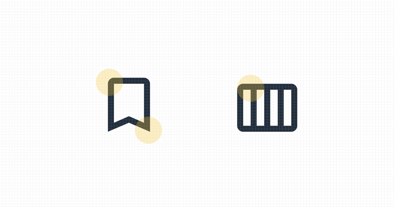
Visual consistency across the set ultimately rests in the details: the corner treatment, the counterstroke, the stroke terminal. These should all obey the same conventions across every icon. Material Design publishes a thorough reference on icon anatomy that covers these aspects in detail.
Getting a Handle on Icon Libraries
Joining an established project often means inheriting a large collection of icons. It is not uncommon to find over a hundred assets that have grown organically with the product. The problem is rarely the quantity; it is the lack of coherence. A library built this way tends to be a mix of styles, sizes, and purposes, which creates visual noise. A common and crippling issue is the absence of source files, which makes it impossible to tweak an icon to bring it in line with the rest of the design.
The first priority is establishing the fundamental rules of icon creation, which we have already discussed. This acts as a preventive measure, guiding the team to avoid generating further inconsistencies.
Tip 3: Put all your icons on one layout. This way, you’ll get a full visual understanding of your icons and determine repetitive design patterns.
Sustaining an icon set requires a structured approach. Here is a practical guide for maintaining order within a design system.
Categorize for Clarity
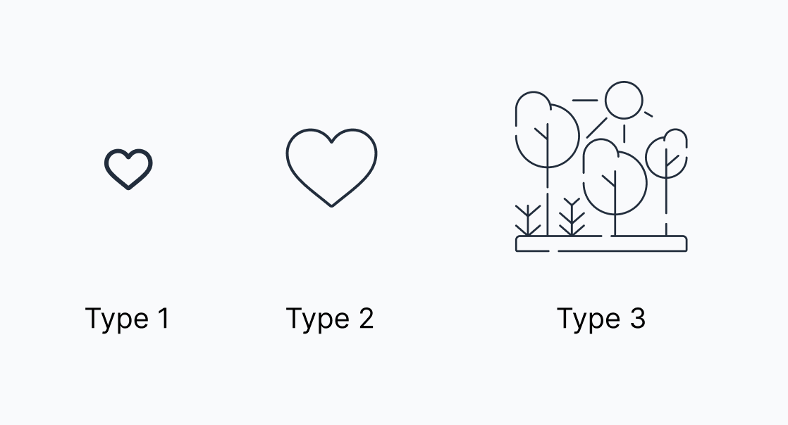
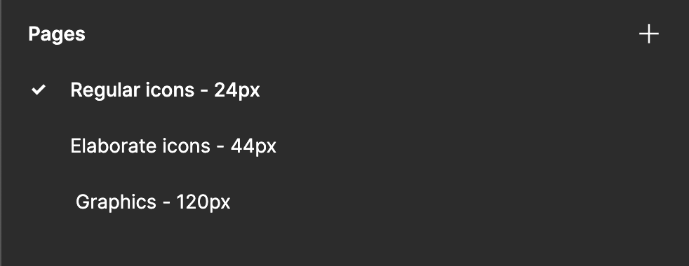
When you have a large, mismatched set of icons, your first step should be to divide them into subcategories. There is no hard rule for what these groups should be; they depend entirely on your system and the size of your library. A practical example is splitting icons by size and style. In one instance, this led to three useful groups: regular icons, detailed icons, and illustrations. This division makes it easier to apply consistent creation rules to each group and supports cleaner storage within the system.
Define Rules for Each Type
The next step is more challenging but equally necessary. If your library has multiple icon types, you must define specific creation guidelines for each one. This is the foundation your visual consistency efforts will rest upon. To manage disparate icons, you can apply the basic icon metrics discussed earlier. It helps to create a dedicated page or frame in your design tool for each type, and naming the file after the baseline size keeps everything clear.
Group by Semantics
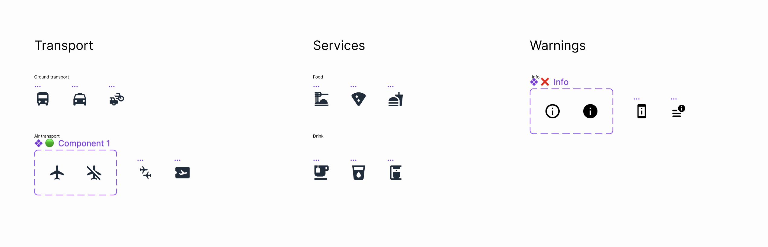
For naming and organization, a semantic approach is an effective strategy. This means grouping icons not by their appearance, but by their meaning or where they are used in the interface. You might have top-level sections like Transport, Services, and Warnings. From there, they can be split into further subsections, such as Ground Transport and Air Transport under the Transport group. Keeping icons in logically distinct sections makes them far easier to find, audit, and maintain.