Design systems are built for consistency, but scale works against them. As libraries grow, the rules meant to protect a brand start to constrain expression, and teams respond by building around the system. Variants multiply, libraries swell, instances get detached. Slots, introduced at Schema 2025 and now in open beta, target this failure mode: designers can customize components such as menu options, buttons, or icons—without detaching—so content flexes while the structure holds.
The model borrows from code, where components accept dynamically injected content rather than being duplicated.

Bringing that pattern into design means components behave more like they do in production, which simplifies implementation and handoff and makes systems easier for automation and AI to interpret.
- Design system managers: fewer variants, less maintenance, and closer alignment to production.
- Designers: creative freedom inside the design system rather than outside it.
- Developers: predictable structures that map directly to code.
Tip 1: Begin where teams already detach
Early testers got the largest immediate gains by starting where people were already working around the system—typically foundational components such as dialogs, menus, modals, cards, and panels. Two patterns recurred.
First, repeating elements. Menus and lists often ship with hidden layers to cover every possible item count: a list with three visible rows might hide seven more, and a request for an eleventh item triggers a detach. With slots, authors include only what's needed and designers add items as content grows without bloating the base component or severing the connection.

Second, components with many configurations. Modals and cards are classic variant magnets—titles, descriptions, media, and buttons each turn into another prop or variant. Slots keep the structure fixed while content is swapped or inserted, sharply reducing variant divergence. Rather than spreading slots across an entire system, prioritize components that appear frequently across screens, are duplicated across the system, have accumulated excessive variants, or must support different content types.
Tip 2: Choose default content deliberately
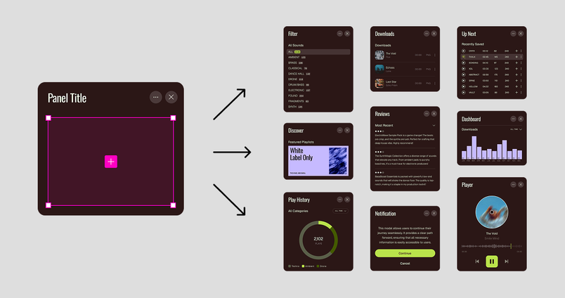
When authoring a slot, decide whether it carries default content. Pre-filled slots give designers context and often need no edits at all—an icon that always sits in a card's top-right corner shouldn't have to be inserted every time. In early testing this was the most common setup, particularly where content is predictable but occasionally changes. An empty slot, by contrast, explicitly signals that something must be added, echoing teams' existing patterns of simulating this behavior with instance swap. No single answer is right: some systems default to filled slots, others to empty ones, and many use both depending on the component.
Creating a slot itself is simple. Slots can only live inside a main component, not directly on the canvas, so start from the parent component. Insert a frame—slots are built from frames morphed into a special layer, and a plain rectangle can't be converted—then right-click to convert it, or use Shift + Command + S.
Tip 3: Signal what each slot expects
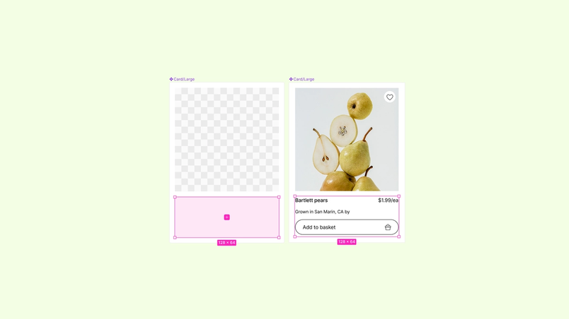
Ambiguous slots slow teams down and produce inconsistent usage. Preferred instances act as guardrails rather than constraints: authored from the props panel much like instance swap, they appear by default when a designer clicks the + inside a slot, presenting a curated set of options. For most systems this should be the default approach, because it speeds workflows (a short list instead of a full library search), strengthens consistency as approved components land in predictable ways, and eases handoff by removing questions like "Is this custom?"
Tip 4: Apply slots to layouts, not just elements
Early testers found the most leverage when they scaled slots up to page sections and layout components defining headers, sidebars, content regions, and footers. The overall layout holds while each region remains flexible and swappable. A product page's hero region might hold a video, several static images, or a combination depending on the launch—one layout with slots handles those differences without separate components per variation or structural detaching. The same principle applies from a single element to a full page framework: consistent structure, flexible content. If you find yourself duplicating layouts to cover variation, that layout probably calls for slots.
Tip 5: Mirror production structure
Testers repeatedly cited structural alignment as the biggest advantage. In code, container components—dialogs, menus, cards—are built to accept content inside defined regions, and slots bring that pattern into design. Instead of approximating flexibility with variants and detaches, designers work with components the way engineers build them. Engineers can see what content belongs in each region; designers can build layouts that reflect production behavior; the gap between mock and implementation narrows. Explicit structure also makes systems easier for automation and AI agents to reason about, since it no longer has to be inferred.
Slots are supported in Code Connect, appearing directly in code snippets so engineers can see how a slot-based component maps to production. Define slot regions intentionally and mirror how components are structured in code—the closer those models match, the fewer translation layers a team manages.