
Building a design system without the busywork
Starting a design system from scratch usually means staring down a blank Figma file and a long list of foundational work: color ramps, typography scales, spacing systems. A new batch of Figma features and community plugins targets exactly that grind, covering everything from initial setup to developer handoff.

Here is a quick reference list of the plugins covered:
- CSS color-mix() — Create color palettes and gradients
- Colorbox — Generate full color ramps
- The Genome Color Tool — Build WCAG-compliant color scales
- Peppercorn — Set up your entire type system
- Print Variables — Create sticker sheets for variable collections
- Auto Documentation — Make sticker sheets for all variables
- Variables and Styles List — Get variable sheets in a canvas widget
- Propstar — Map out component prop variations
- Specs — Generate component specs
- Similayer — Filter for specific layers and properties
- Style Finder — Find styles across pages
- CTRL Var — Rename variables
- Export Import Variables — Manage variables in or out of Figma
- Handoff — Copy CSS variables instantly
- Variables Converter — Translate variables into code
- Shaper — Manage token architecture and generate CSS code
What's new in Figma's design system features
Nine new design system features launched today, paired with new community plugins that build on them. The headline change addresses a long-standing pain point: reorganizing modes and collections.
Previously, reordering modes or collections meant deleting them and recreating them, which often left designs out of sync. Now you can drag and drop to rearrange them. Modes and their IDs stay intact during reorganization, so dependencies don't break or reset. You can also adjust the default mode without complications.
That matters for teams that want to keep frequently used collections at the top, group related modes together, or restructure when rebranding or updating product lines.
Quality-of-life updates
The new features also include several workflow improvements:
- A new shortcut for go-to-main component, so you can jump straight to the source.
- Duplicate and copy styles for faster iteration.
- Variable paints can be hidden and unhidden to keep the workspace uncluttered.
- Improved component description UI for easier reading at a glance.
- Drag the variable modal from the entire header for better control.
- Variable changes auto-save, so updates don't require extra clicks.
- Tooltips on component names give quick context on hover.
- The edit button is now properly aligned for a cleaner experience.
- Style window text overflow improvement ensures long names don't get cut off.
Foundations: Color and typography
The first set of plugins targets the foundational stage of a design system, when you're establishing color and type.
Building color palettes
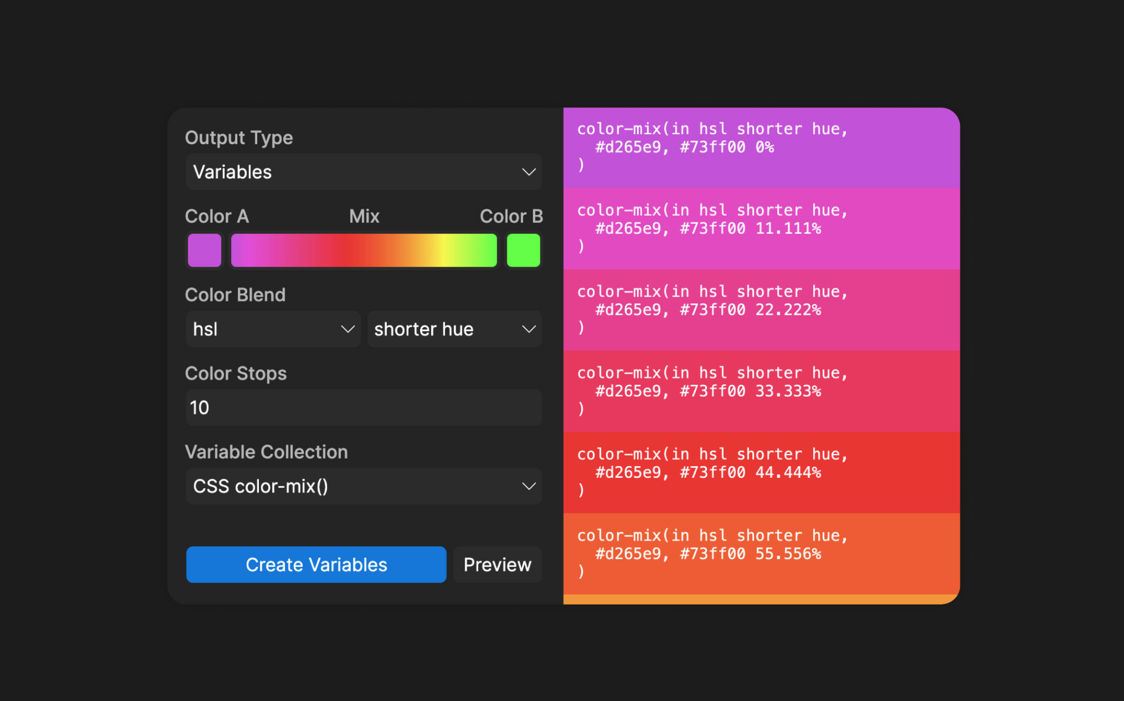
CSS color-mix(), created by Figma Developer Advocate Jake Albaugh, works like a digital color lab. It generates full palettes with variables included, using modern formats like HSL, HWB, LCH, or OKLCH. It also creates smooth gradients that transition between colors.
When starting a palette, resist the urge to create ten shades of every color. Start with three to five shades per color — one for backgrounds, one for foregrounds, and one for borders. You can always add more later.
For quick color ramp generation, Colorbox by Kevyn Arnott uses intuitive filters for saturation, brightness, and hue. It exports to JSON or directly to Figma. Once you've created a palette, the new variable organization features make it easy to arrange colors exactly as you want them.
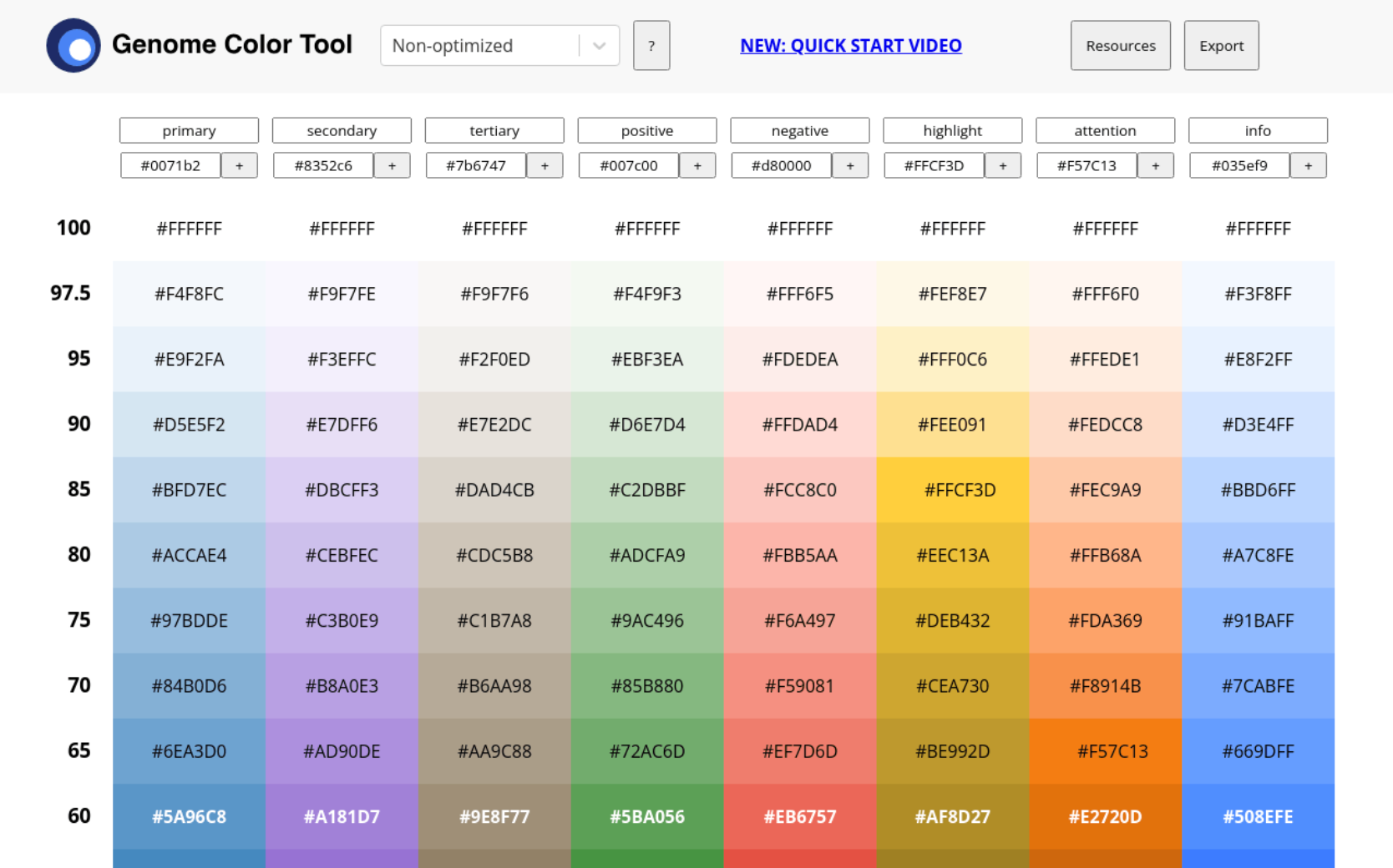
For accessibility-minded palettes, The Genome Color Tool by Kevin Muldoon is preloaded with ramps for primary, secondary, tertiary, positive, negative, highlight, attention, info, system, and neutral colors. It also includes familiar design system palettes — Univers, IBM Carbon, Salesforce Lightning, Adobe Spectrum, Ant, and Material — all exportable as JSON.
Streamlining typography
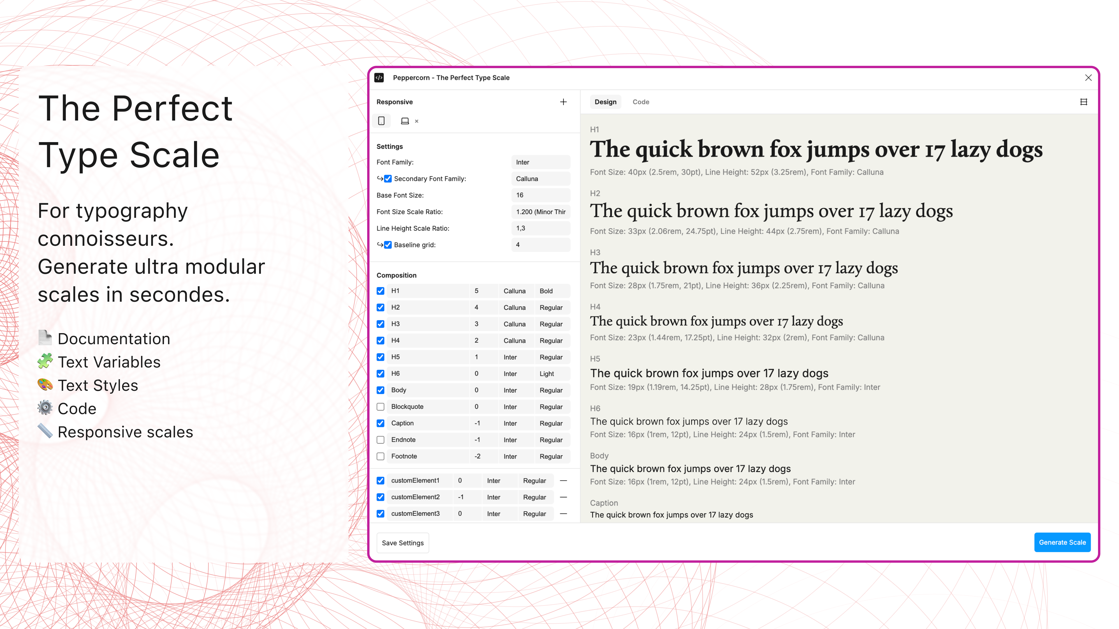
Peppercorn handles type system creation. It sets up your entire text hierarchy using your preferred font family, base size, and scale ratio. A live preview shows what you're getting before export to JSON or CSS. Combined with Figma's improved variable management, this makes typography systems significantly easier to maintain.
Documentation: Turning your system into a shared reference
A design system only earns its keep when the people who need it can actually use it. That means documenting variables, components, and styles in ways that make sense to both designers and developers. A few plugins can do the heavy lifting.
Sticker sheets and variable catalogs
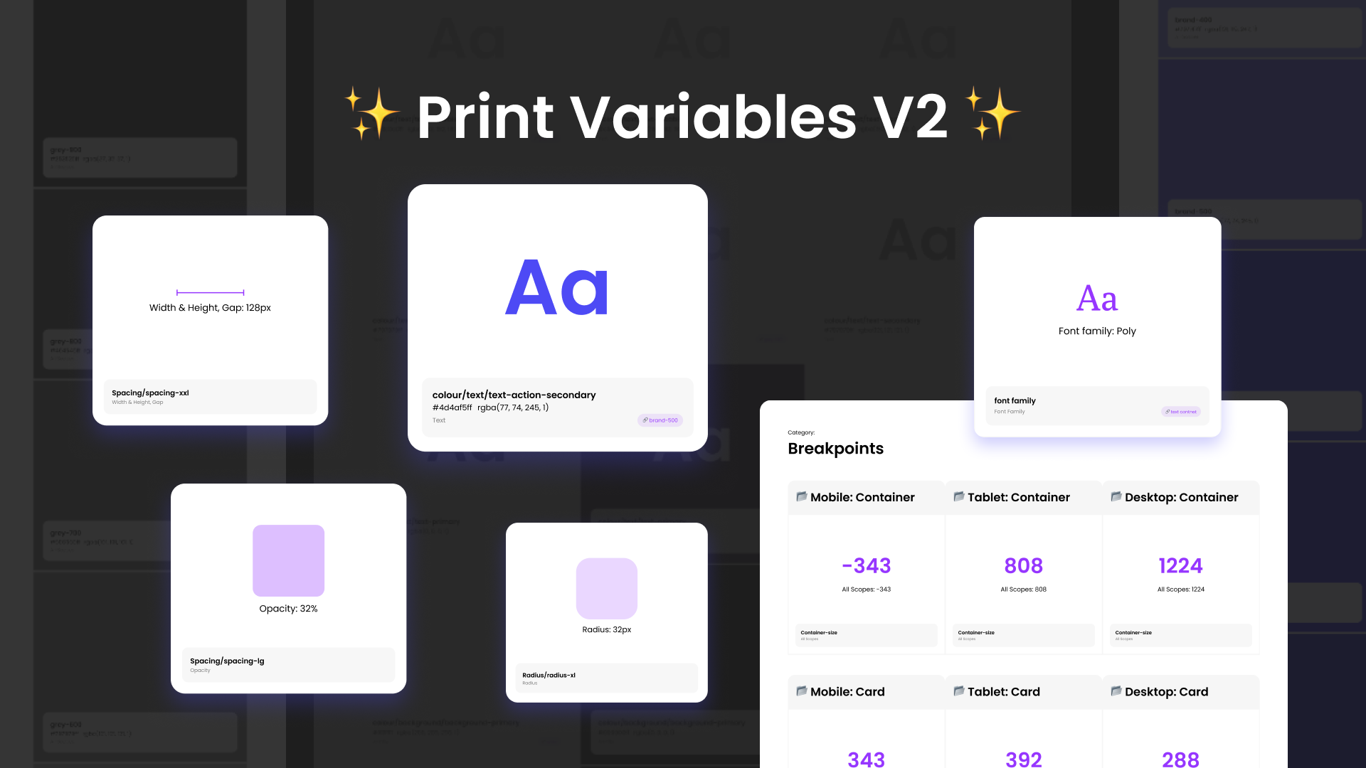
Print Variables by MINKMINKs generates focused sticker sheets for specific variable collections. It pulls in variable descriptions, so each value comes with context about its intended use. Combined with Figma's newer variable organization capabilities, this makes for documentation that stays tied to how your collections are actually structured.
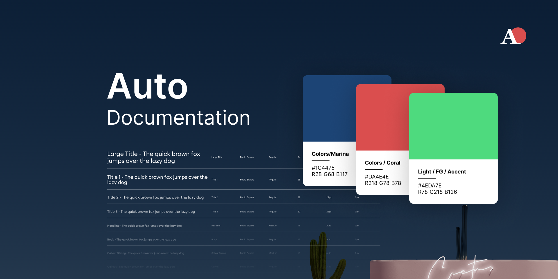
When you need the full picture, Auto Documentation by Eddy Salzmann generates complete pages listing every variable, grouped by collection and mode. The upcoming ability to reorder collections and modes means the generated pages will mirror your real organization without extra cleanup.
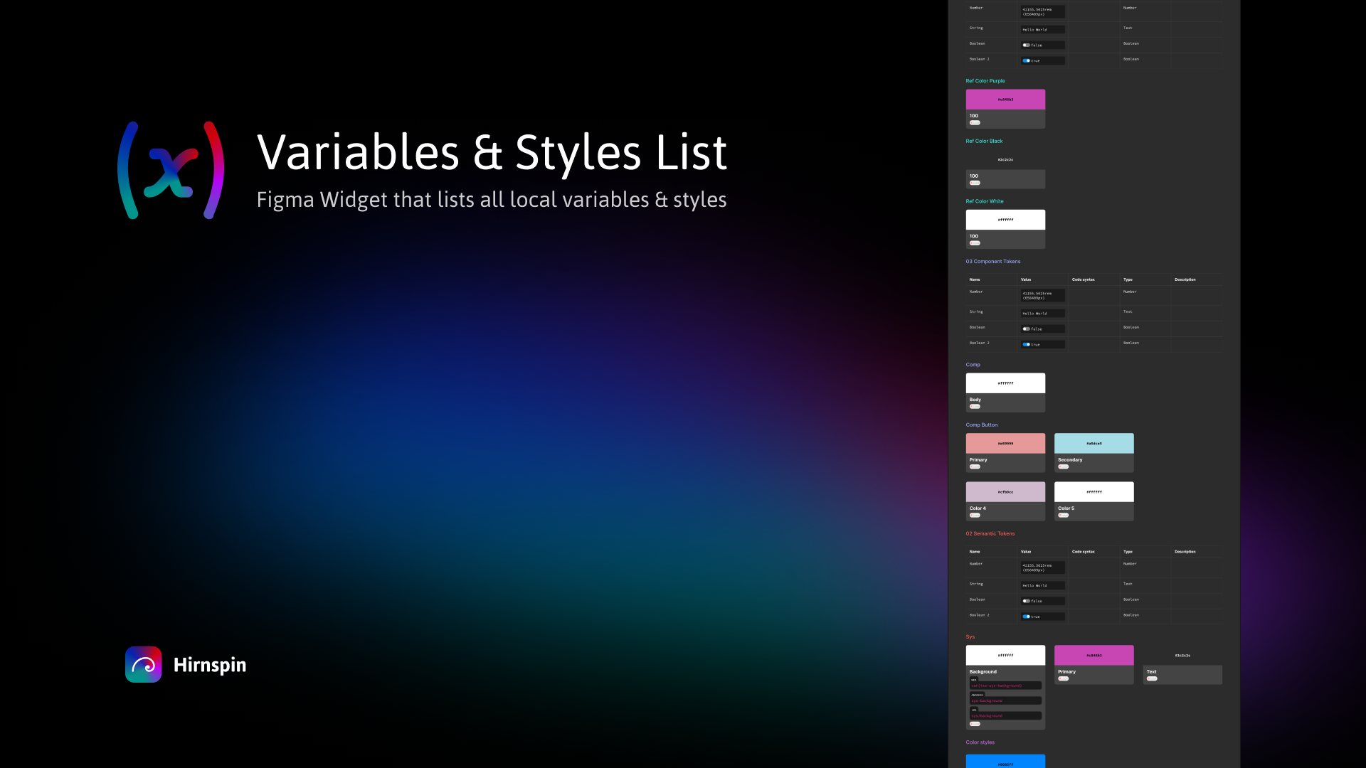
For something more interactive, Variables and Styles List works as a widget rather than a plugin. It prints all your variables into a canvas object that refreshes with a button press, so you do not have to regenerate an entire frame every time something changes.
Documenting component variants
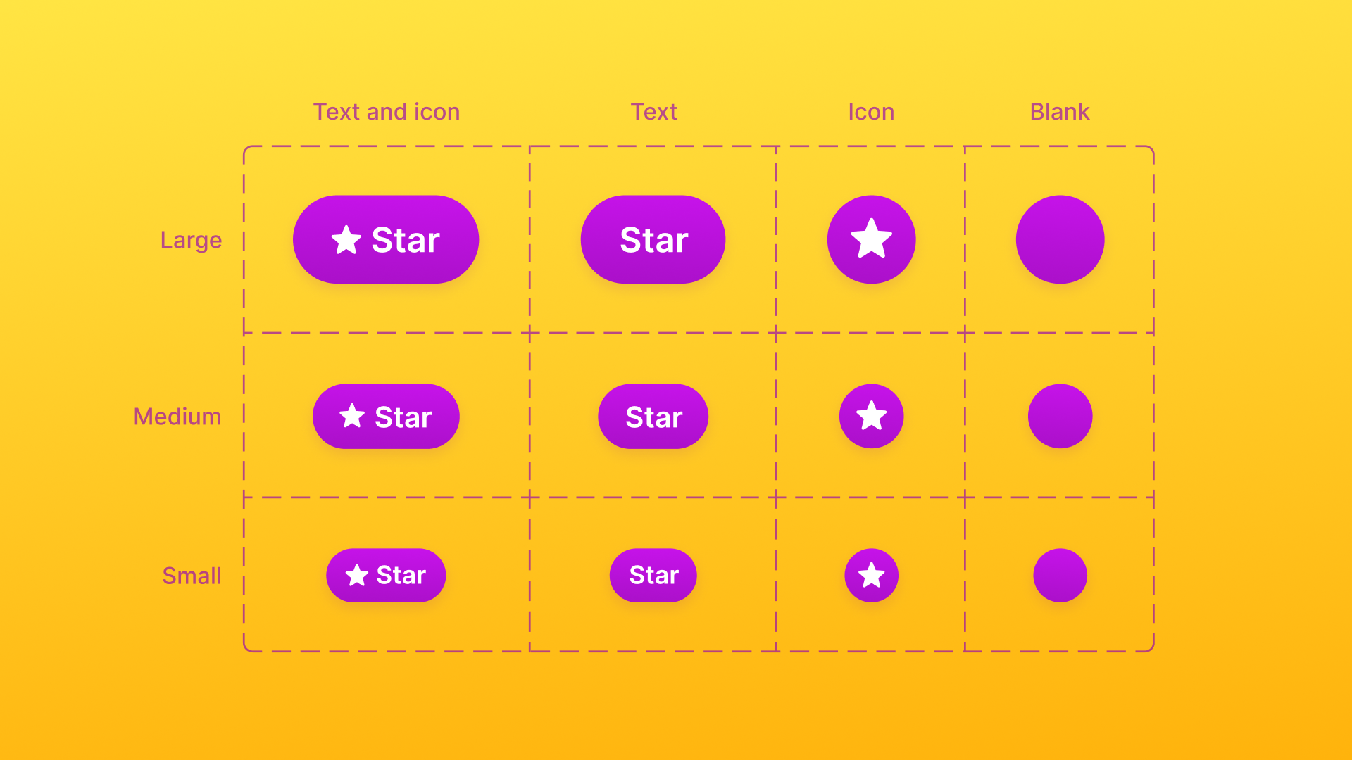
Propstar by Gusso lays out every combination of your variants and properties in a single table on the canvas. That removes the need to click through endless permutations to spot gaps or broken states, and it pairs well with the consolidated property panel for keeping components properly specced.
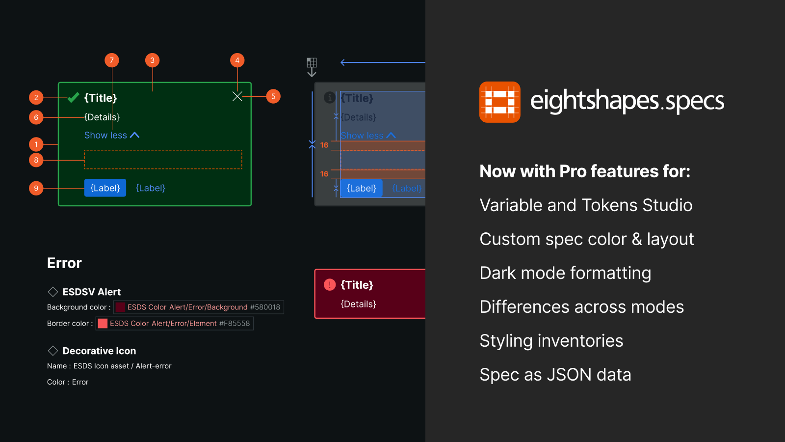
If you need a full spec sheet for a component, Specs from Directed Edges Plugins is a one-stop option. It breaks down variables, styles, nested components, and prop values into structured documentation.
Auditing what you have
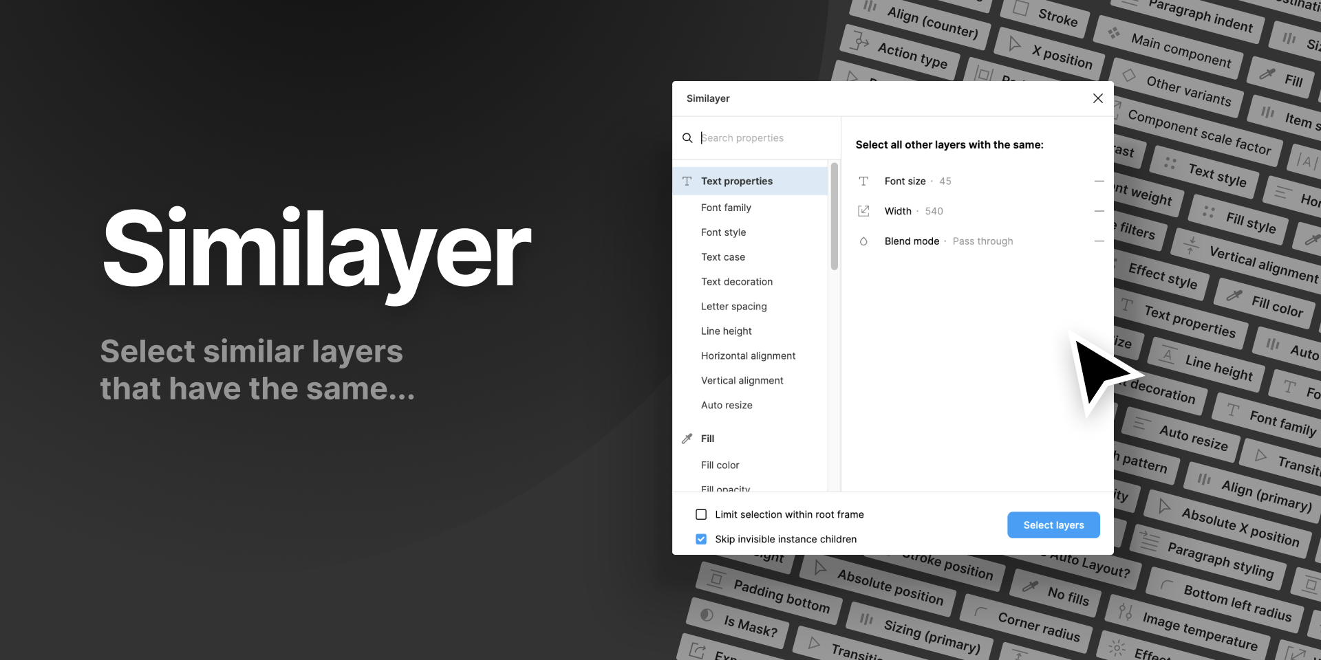
Similayer scans documents layer by layer and property by property, making it very useful for auditing and migrating between design systems. It was used on the Figma UI3 community file during its migration from staging to production, which speaks to its reliability at scale.
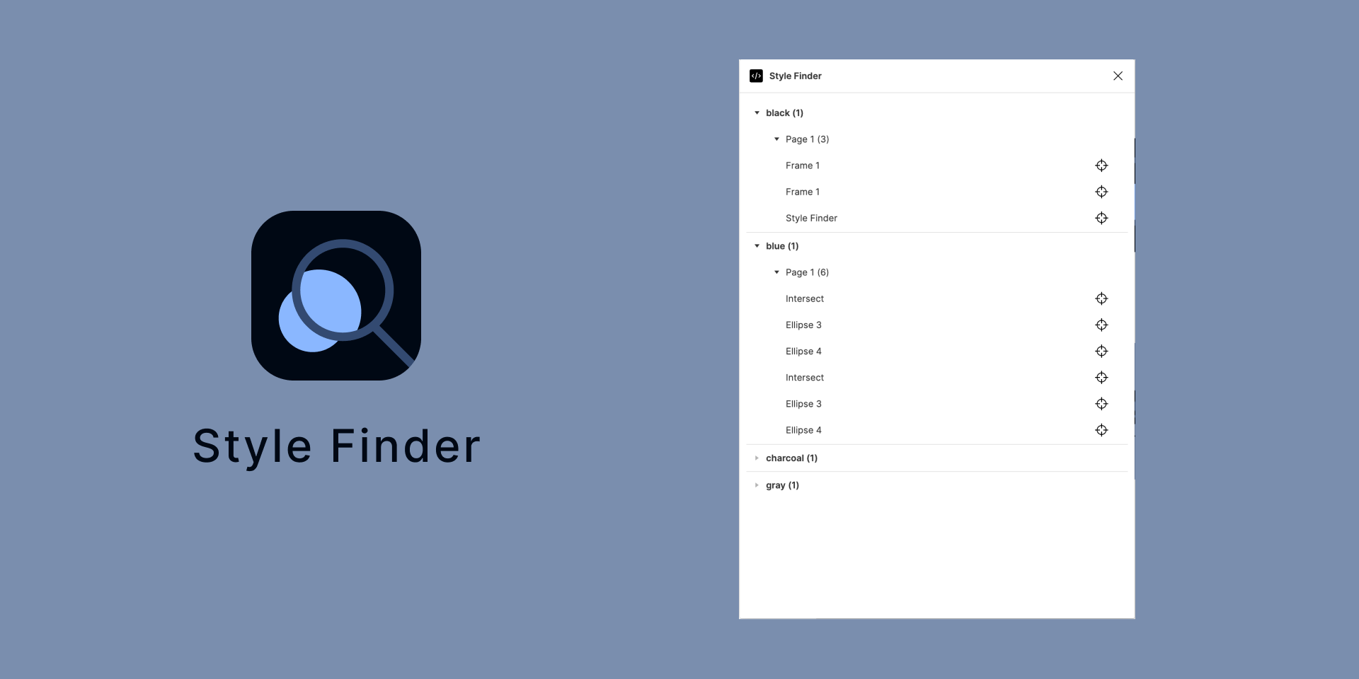
For maintenance work, Style Finder by Tafumi scans the whole document and lists every instance of a given style or variable. That makes finding outdated references far less painful when you are updating a system.
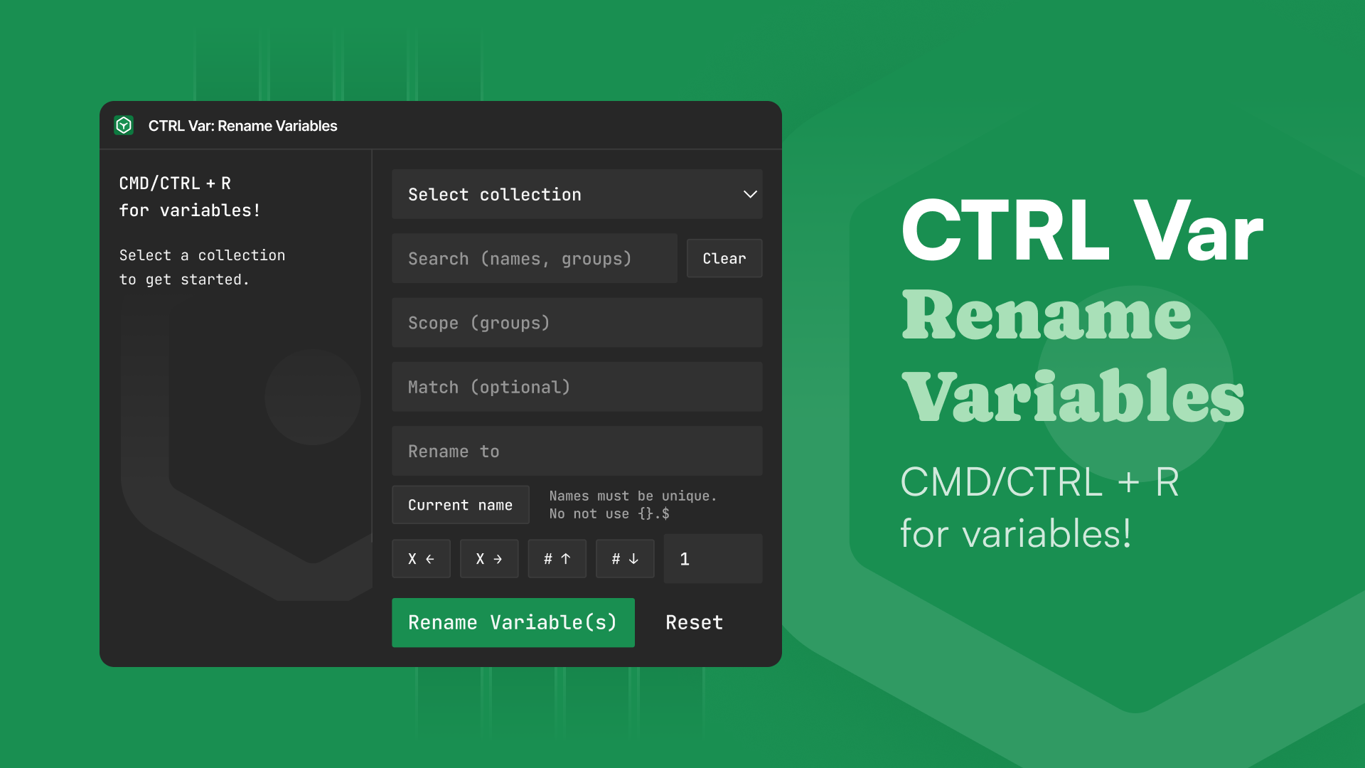
Variable naming conventions change, and when they do, renaming by hand is a slog. CTRL Var: Rename Variables by Murph handles batch renames across all collections using group or variable pattern matching.
Implementation: Getting tokens into code
The last mile is translating the design system into something developers can consume. A handful of tools keep Figma and codebases in sync.
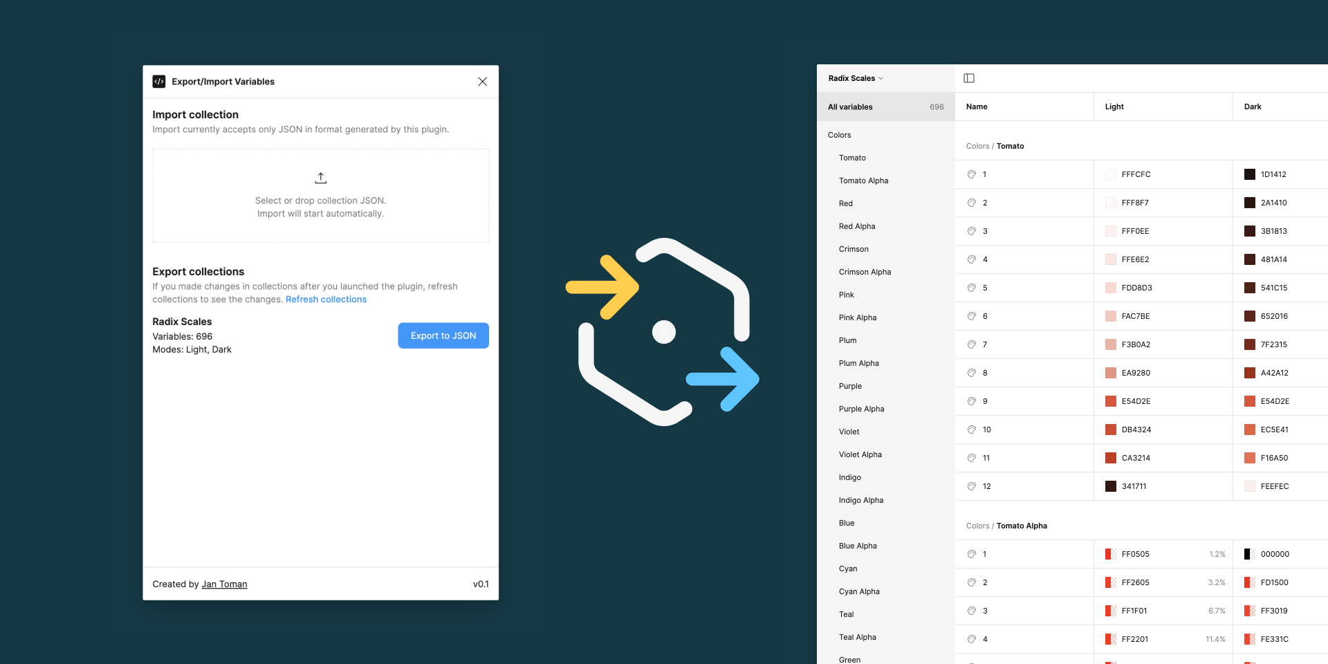
Export Import Variables by Jan Toman works both ways: it imports existing tokens from your engineering team and exports Figma variables to JSON. If you do not have a JSON pipeline set up yet, the export side gives you a starting point. With the variable organization improvements, exported tokens keep the structure developers expect.
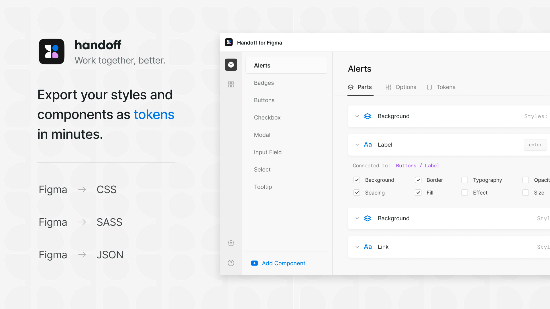
For CSS-focused teams, Handoff by Convertiv provides a clean interface for copying token values as CSS variables. The plugin is well designed, packing a lot of information into a usable panel.
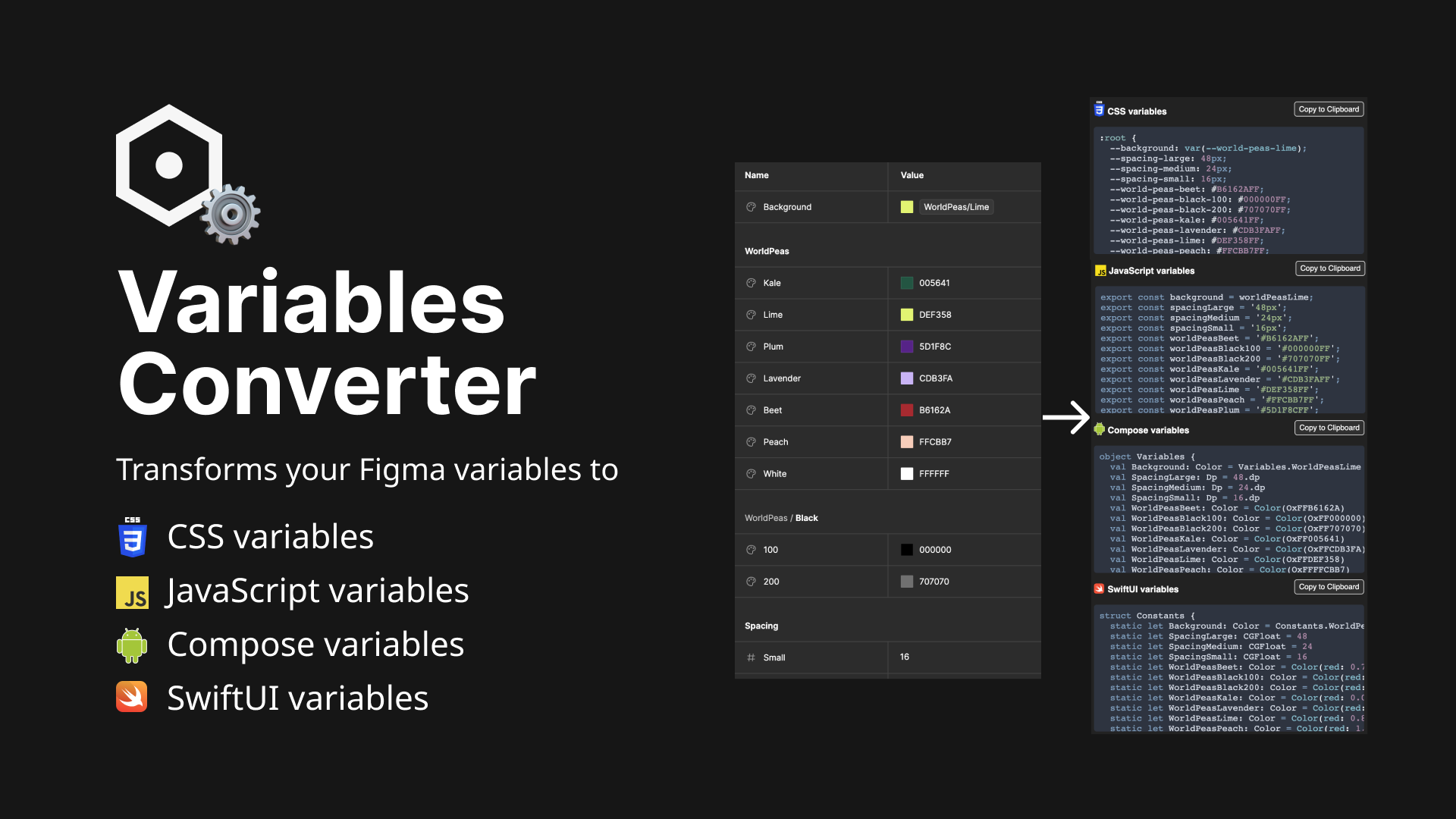
If you need code in more than one dialect, Variables Converter by Laurent Thiebault translates Figma variables into CSS, JavaScript, Compose, and SwiftUI. Pick a collection and mode, and it generates clean code ready to drop into a project. With better variable organization, the output stays aligned with your naming structure.
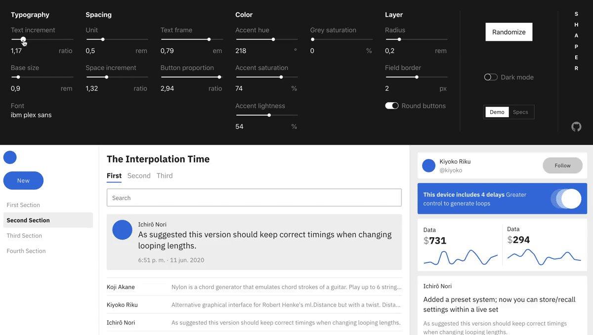
Outside Figma, Shaper is a web-based customizer for generating CSS. You set font family, padding, spacing scales, and primary colors against a live preview, then grab the resulting CSS — including dark mode values — when you are done.
A practical workflow for design system maintenance
Bringing these tools together, a typical design system project follows a repeatable sequence. Start by building foundations with CSS color-mix() and Peppercorn, then organize everything using Figma's reordering features. Document the system thoroughly with Auto Documentation and Specs. Run a consistency audit with Style Finder, and finish with a clean handoff to development using Export Import Variables.
The efficiency gains come from eliminating repetitive manual work. Tasks that once required switching between tools or checking each component individually can now be handled inline within Figma, cutting down the time spent on design system upkeep.
Plugin stack at a glance
- CSS color-mix() and Peppercorn for establishing design foundations
- Auto Documentation and Specs for thorough documentation
- Style Finder for consistency auditing
- Export Import Variables for developer handoff
Each tool addresses a specific stage of the workflow, but together they cover the full lifecycle of a design system: creation, organization, documentation, auditing, and delivery.
The result is a streamlined process that frees up time for higher-level design work. When the tooling handles the busywork, teams can focus on the actual design decisions and refinements that matter most.


