
Start With A Clear Value Proposition
A landing page is a standalone webpage built to support a specific marketing campaign or target a particular search term. Users arrive there after clicking a link in search results, an email, or an ad. The page’s job is to encourage a specific call to action—a purchase, a newsletter subscription, or getting in touch—without relying on manipulation or dark patterns. Getting that right depends on four things: a clear focus, persuasive copy, considered design, and relentless testing. Miss any one of them, and the page underperforms.
The stakes are high. Companies with more than 30 landing pages generate seven times more leads than those with fewer than 10, according to HubSpot. But before you start building, you need to define your focus, beginning with your value proposition.
You have less than eight seconds to grab a visitor’s attention. So the first step is to articulate, in a single sentence, what the page offers and why it matters. That sentence needs two parts: the problem you solve or the benefit you provide, and how you deliver it.
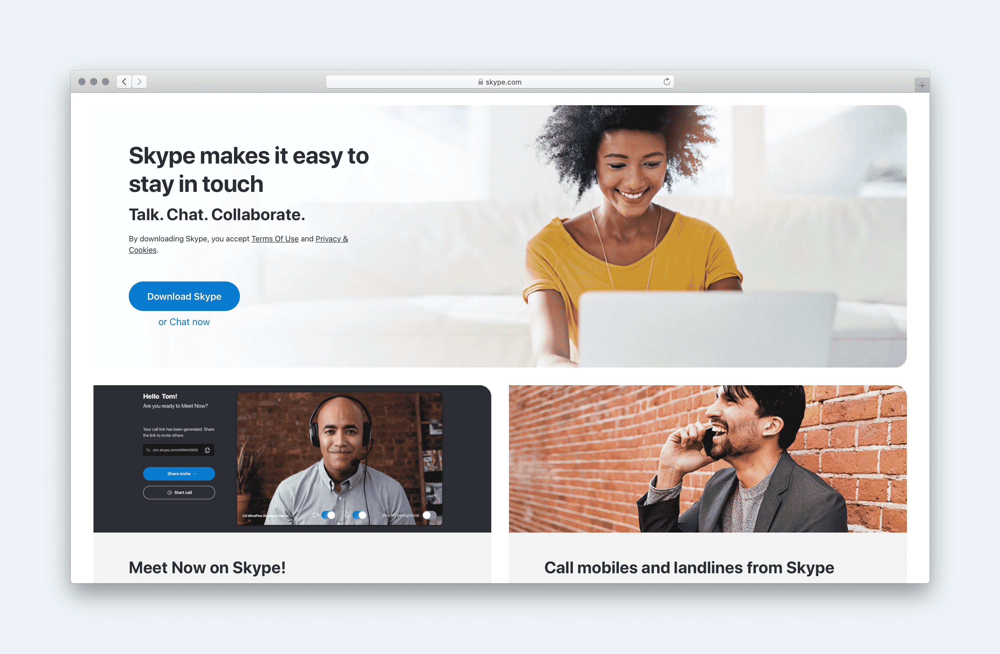
Skype’s value proposition is a good model: “Skype makes it easy to stay in touch. Talk. Chat. Collaborate.” The first clause states the benefit, the second explains the mechanism.
Beware of empty claims. Phrases like “best-in-class” or “friendly and approachable” could come from any company. A useful check: if the opposite of your statement would be absurd, you are stating the obvious. “We offer high-quality products at an affordable price” fails the test—nobody would advertise “terrible quality at an astronomic markup.” By contrast, “We offer handcrafted products for a discerning buyer” works, because “factory-produced products for the mass market” is a perfectly valid alternative.
Your value proposition is not limited to that one sentence. Build a list of every benefit you provide to customers, then note the features that enable those benefits.
Define Your Calls To Action
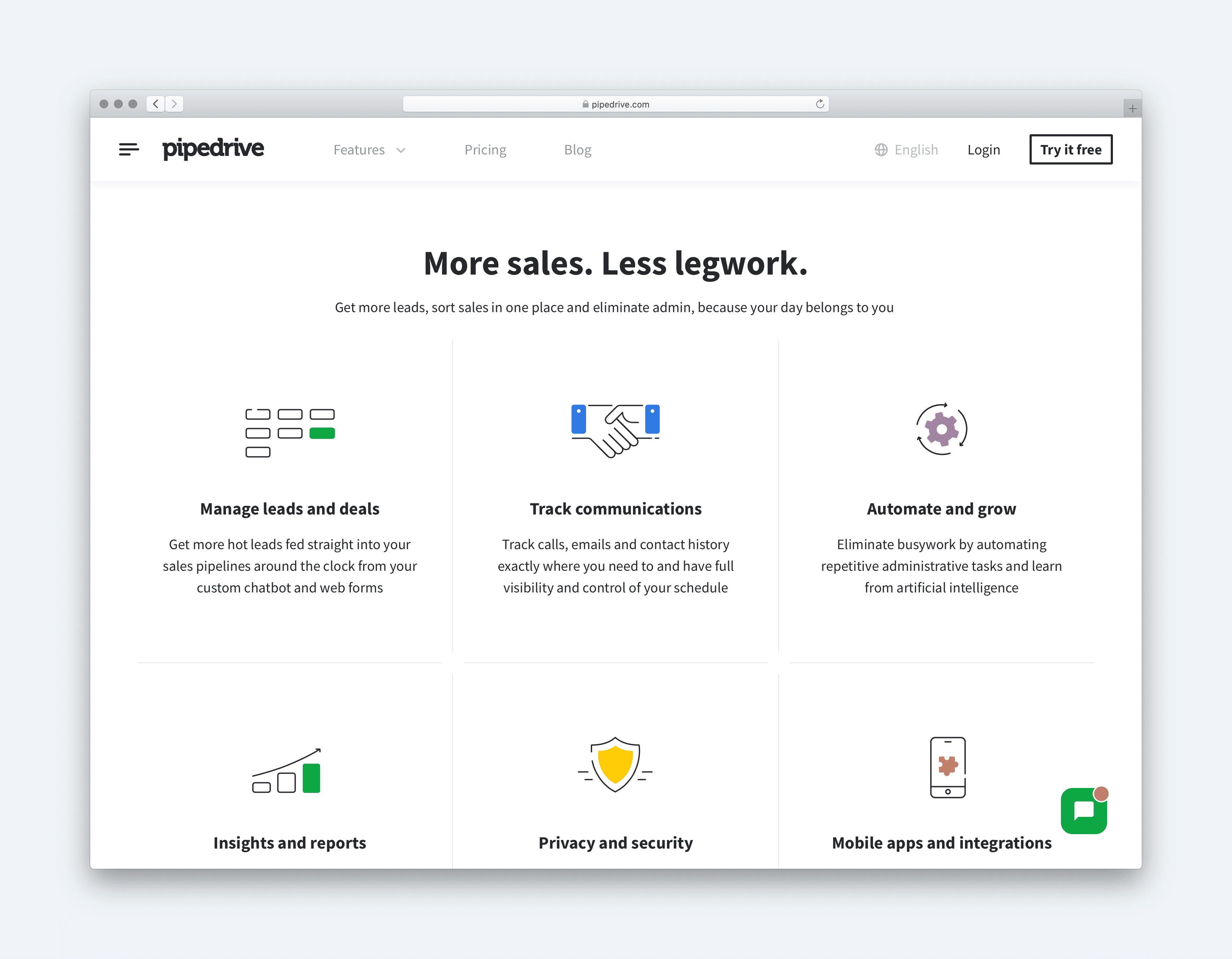
Every landing page needs clear calls to action, which means deciding what you actually want users to do. Resist the temptation to pile on multiple asks—requesting social media follows, for example, only distracts from the primary action and dilutes focus.
Still, a secondary call to action is often wise. Some visitors will be convinced by your page; others will not be ready to commit. Rather than losing those people entirely, offer a lower-commitment step. If your primary CTA is to make a purchase or get in touch, a secondary CTA might be a newsletter signup.
Keep that secondary action low-key so it does not distract. Place it further down the page or as an exit-intent overlay. Exercise caution with popups—some audiences react very negatively to them, so use them sparingly.
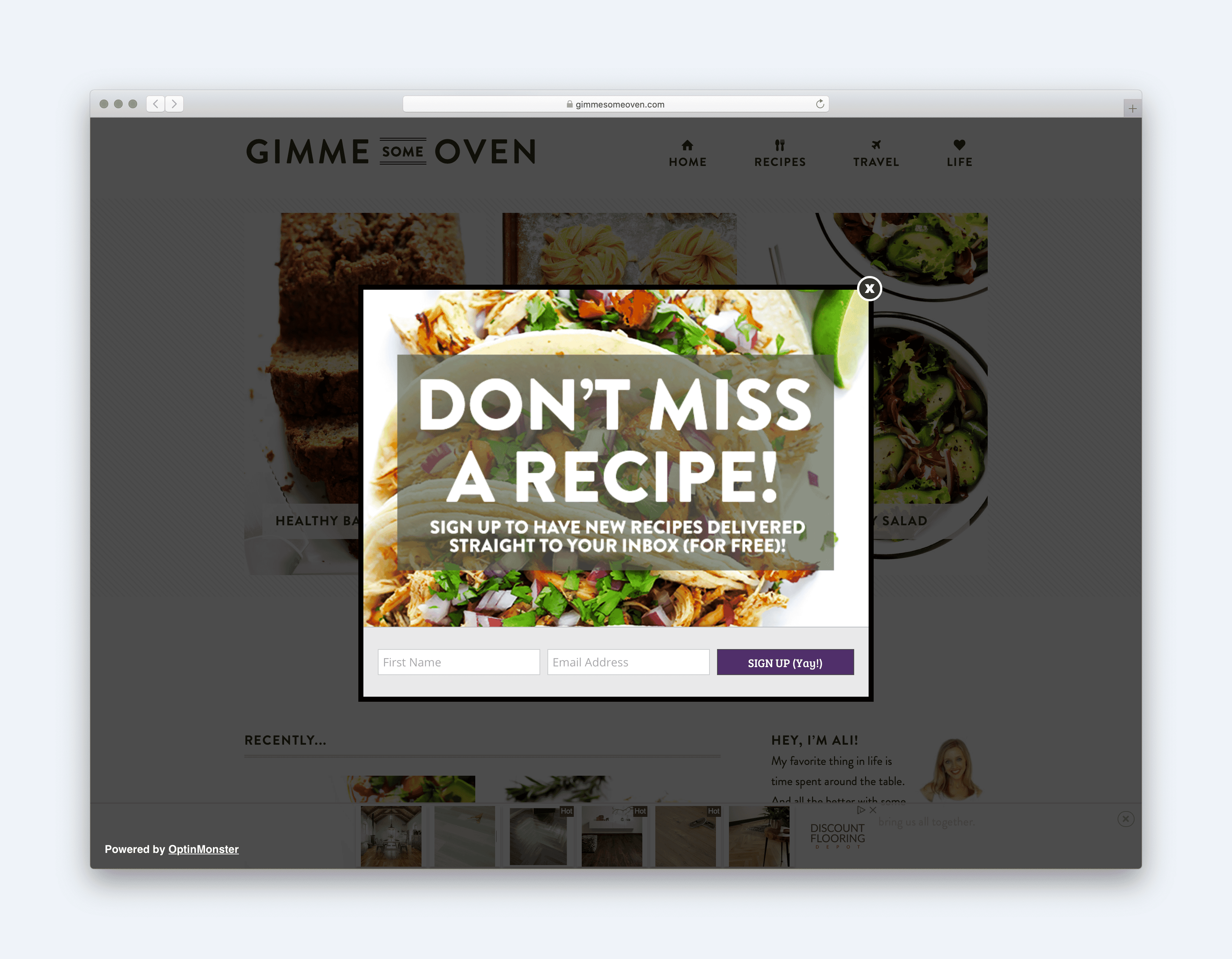
Consider incentives too. A free ebook for subscribing, or a discount for purchasing through the landing page, can be just enough to push someone to act now instead of later. But a gift will not matter if other elements on the page put people off. That is where objection handling comes in.
Handle User Objections
What stops someone from acting? It could be delivery charges, privacy worries, or a perception that you are expensive relative to competitors. If you cannot list likely objections easily, do some user research. It need not be time-consuming or expensive—a one-question survey on the landing page is enough.
When someone goes to leave without acting, ask: “If you decided not to act today, it would be useful to know why.” Present a list of possible reasons, and allow them to add their own.
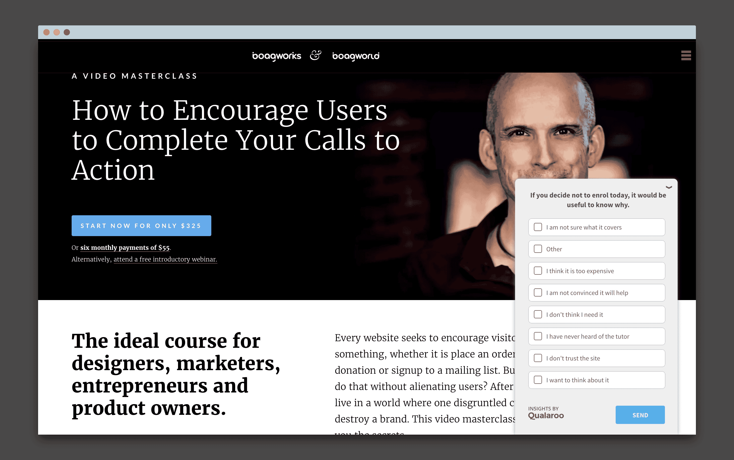
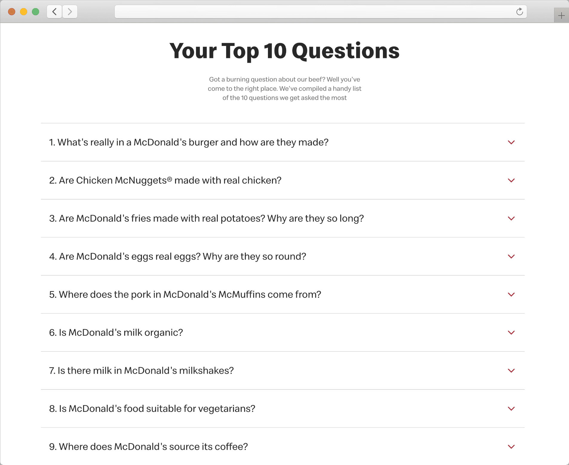
Once you know the reasons, you can address them. Ideally, you eliminate the obstacle entirely—free delivery or a money-back guarantee, for instance. If you cannot, reassure visitors in the copy. Addressing an objection is always better than ignoring it. McDonald’s, for example, directly counters concerns about chicken quality on its site rather than pretending the concern does not exist.
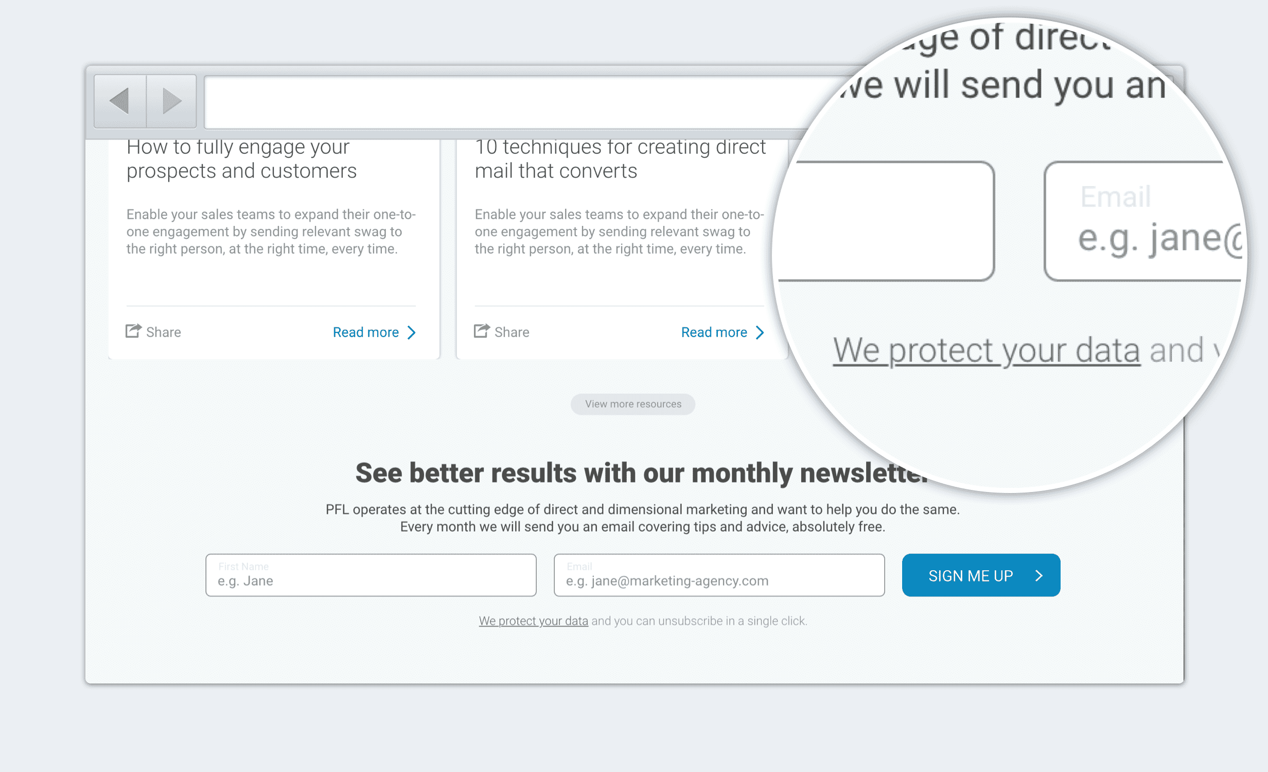
Timing and placement matter. Privacy and security are a case in point: people rarely worry about these when reading a privacy policy. They worry when they are about to submit an email address. That is why data protection reassurances belong right at the point of form completion. Users will not search your site for answers; they will simply assume the worst.
Shape Your First Impression
Logical appeal is only half the battle. Much of our decision-making is subconscious. Research published in the journal Behaviour and Information Technology found that people form an initial impression of a site in 50 milliseconds. Thanks to the halo effect, that impression sticks.
In practical terms, branding and aesthetics shape how users judge your offering—even though there is no causal connection between the two. That makes aesthetics critically important. More importantly, you need a clear idea of the impression you want to convey, and confidence that the design actually conveys it.
Decide What To Convey
Start with a shortlist of words describing the impressions you want users to have upon seeing the page. Some words apply universally—most landing pages want to convey “trustworthiness”—but many will depend on your audience and the offering.
Test The Aesthetics
Once the designer produces a design intended to reflect those words, test it. If there are multiple approaches, a simple preference test works: ask users which design they find more “approachable.” With a single design, run a semantic differential survey. Ask users to rate the website on a scale between your keyword and its opposite—for example, is the design more “approachable” or “unapproachable”?
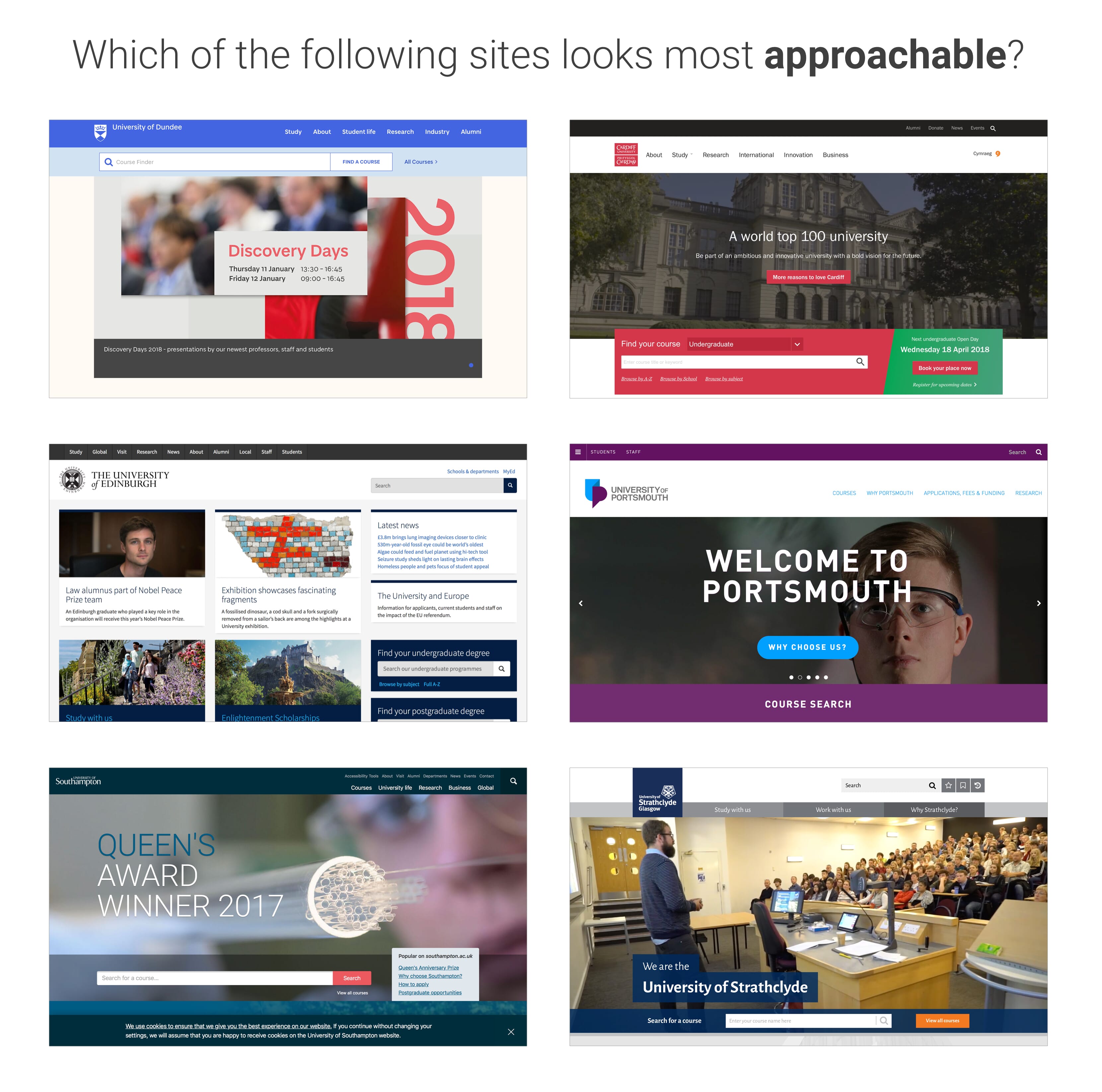
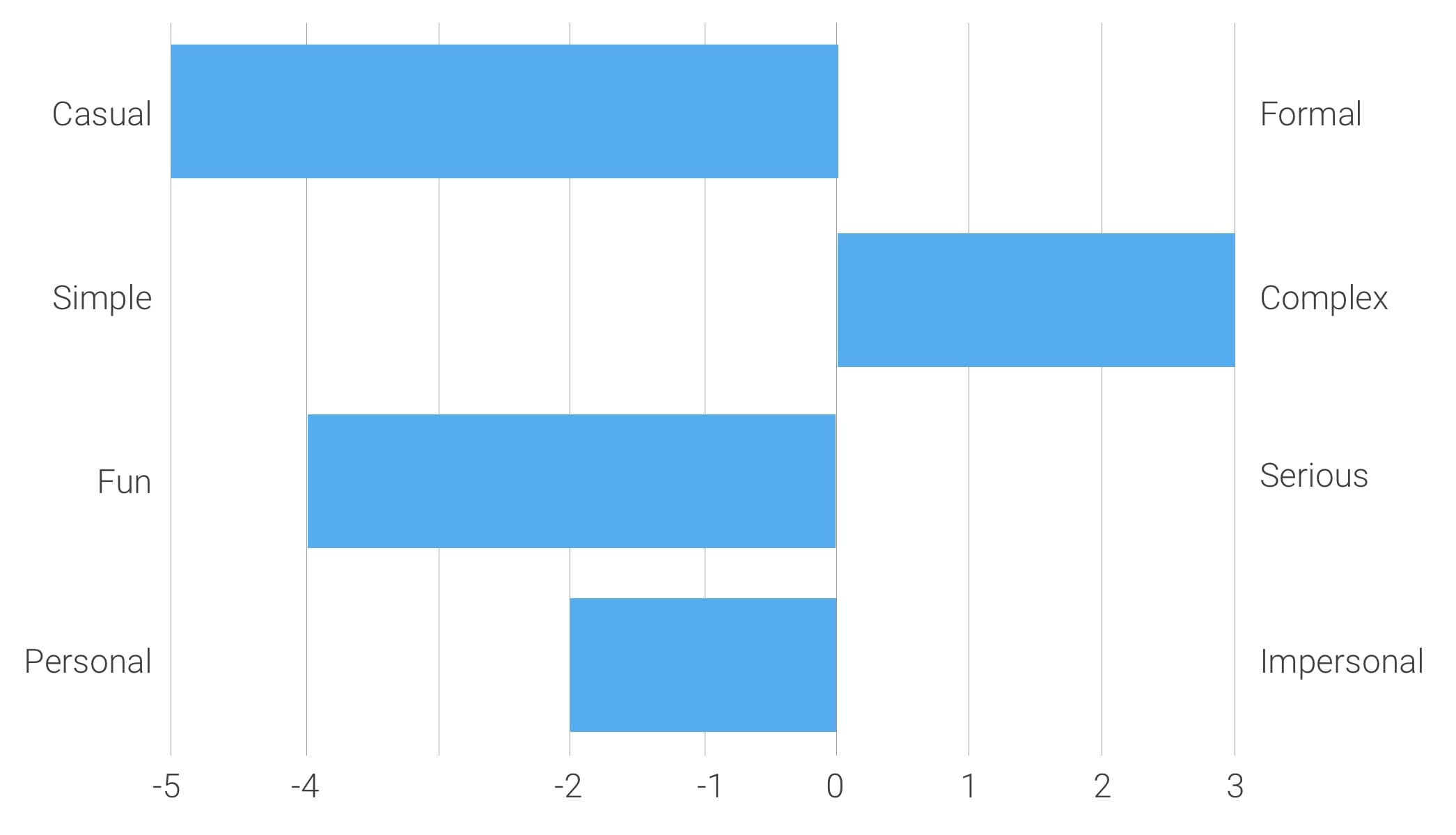
Aesthetics are not the only design consideration. Visual hierarchy matters too—but first impressions set the tone for everything that follows.
Sequence Content To Mirror User Questions
A landing page succeeds when its visual hierarchy matches the sequence of questions visitors subconsciously ask. While individuals vary, usability research points to a predictable order:
- What is this page offering? (Value proposition)
- How will that help me? (Benefits)
- How does the offering work? (Features)
- Why should I trust this page? (Social proof)
- What should I do next? (Call to action)
Your content flow should reflect that sequence, guiding the eye from the headline through supporting details and finally to the conversion element.
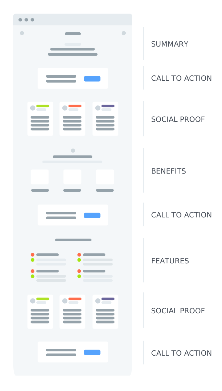
Ordering content correctly is only half the battle. The other challenge is making sure the essential elements actually stand out. You can draw attention through positioning, color, size, imagery, animation, or negative space — but the most effective tactic is often subtraction: eliminating distractions.
Simplify With Three Questions
A systematic review of every element on the page, from the logo to the privacy policy link, helps you strip away noise without losing value. For each element, ask:
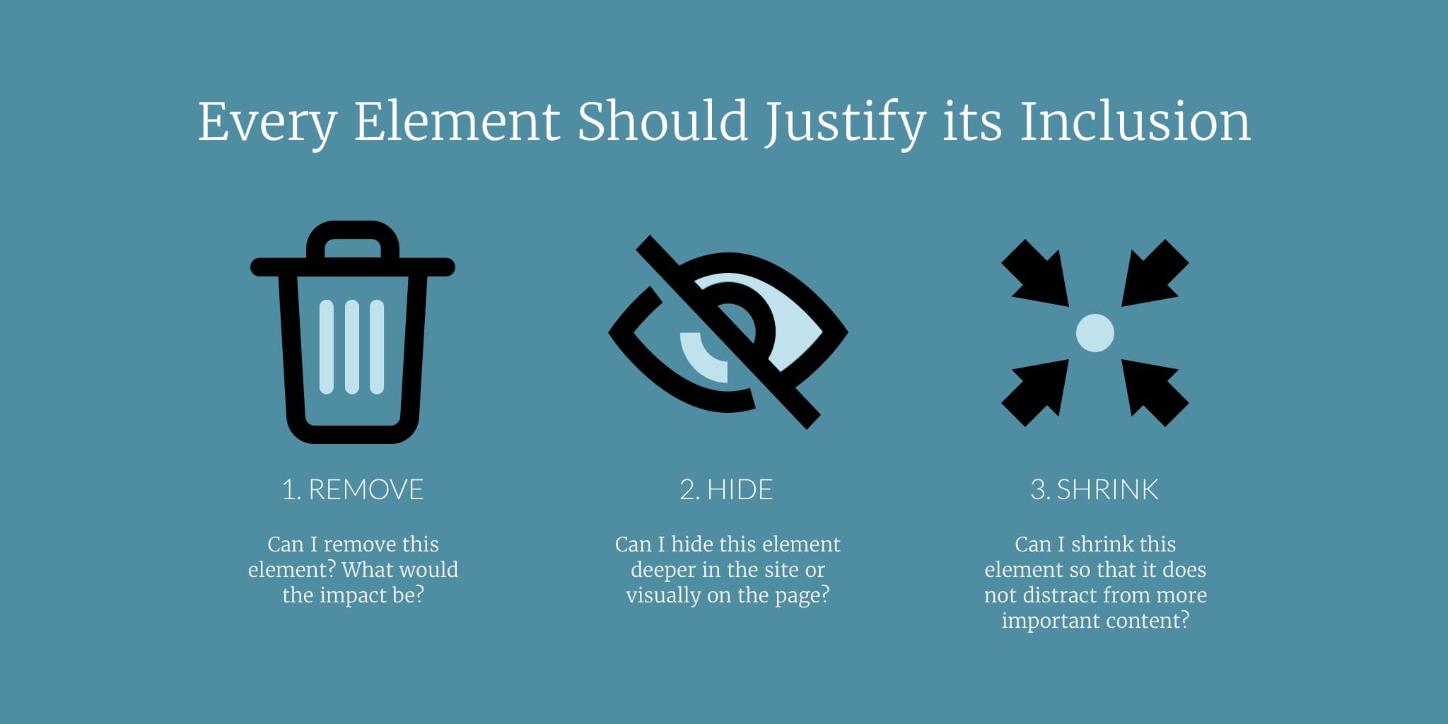
Could I remove this element? If removing it hurts less than the cognitive load it adds, delete it.
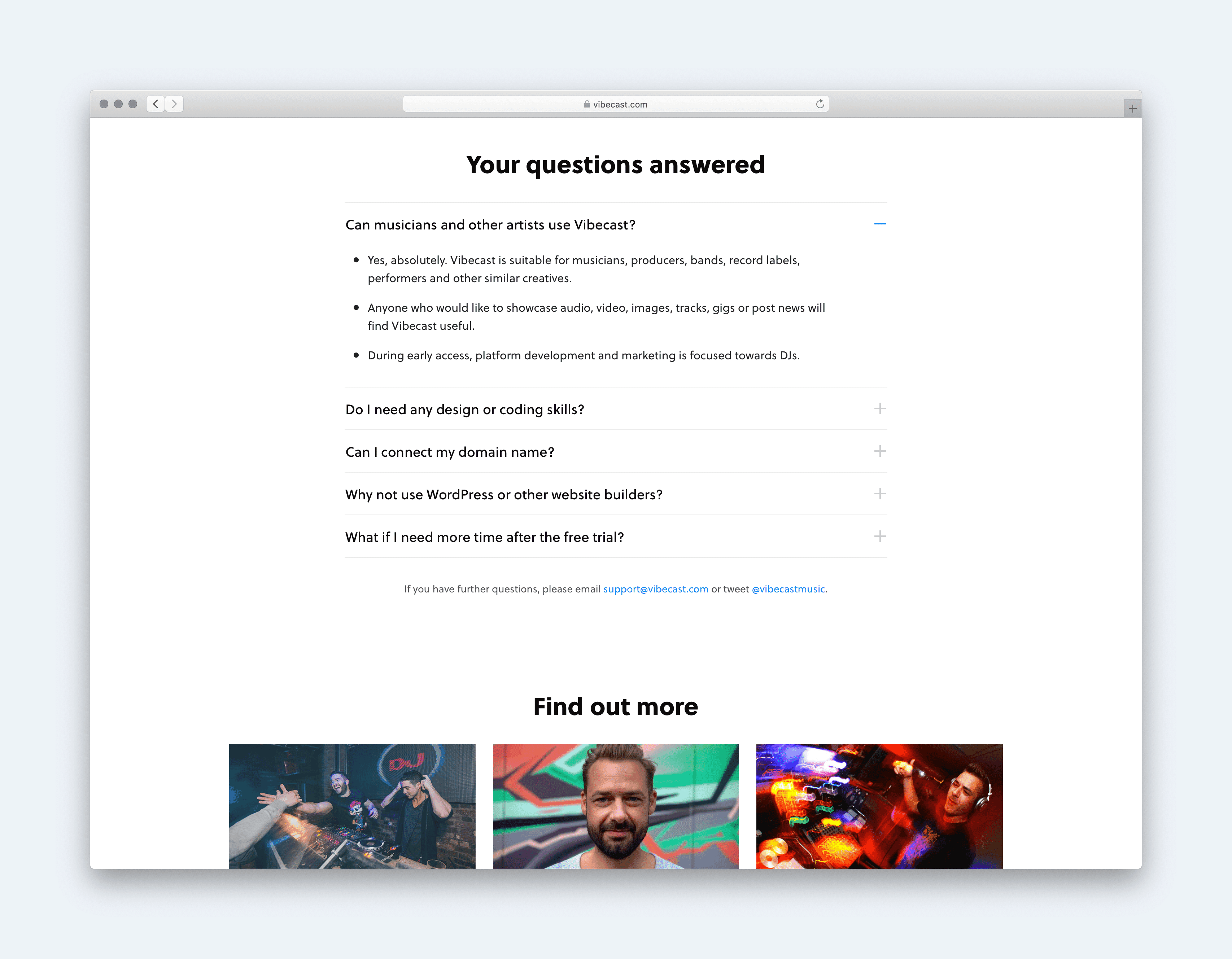
Could I hide this element? Secondary content that only some users need can live on a sub‑page, behind a tab, or inside an accordion.
Could I shrink this element? If every visitor must see it but it plays a supporting role — a return policy, for example — visually deemphasize it so it doesn’t compete with the primary message.
This three-step filter, combined with standard hierarchy techniques, produces a page where calls to action get the attention they deserve. But don’t trust your judgment alone; test it.
Run A Five‑Second Test
A quick, low‑cost way to verify your hierarchy is a five-second test. Show users the design for exactly five seconds, then ask them to recall what they saw.
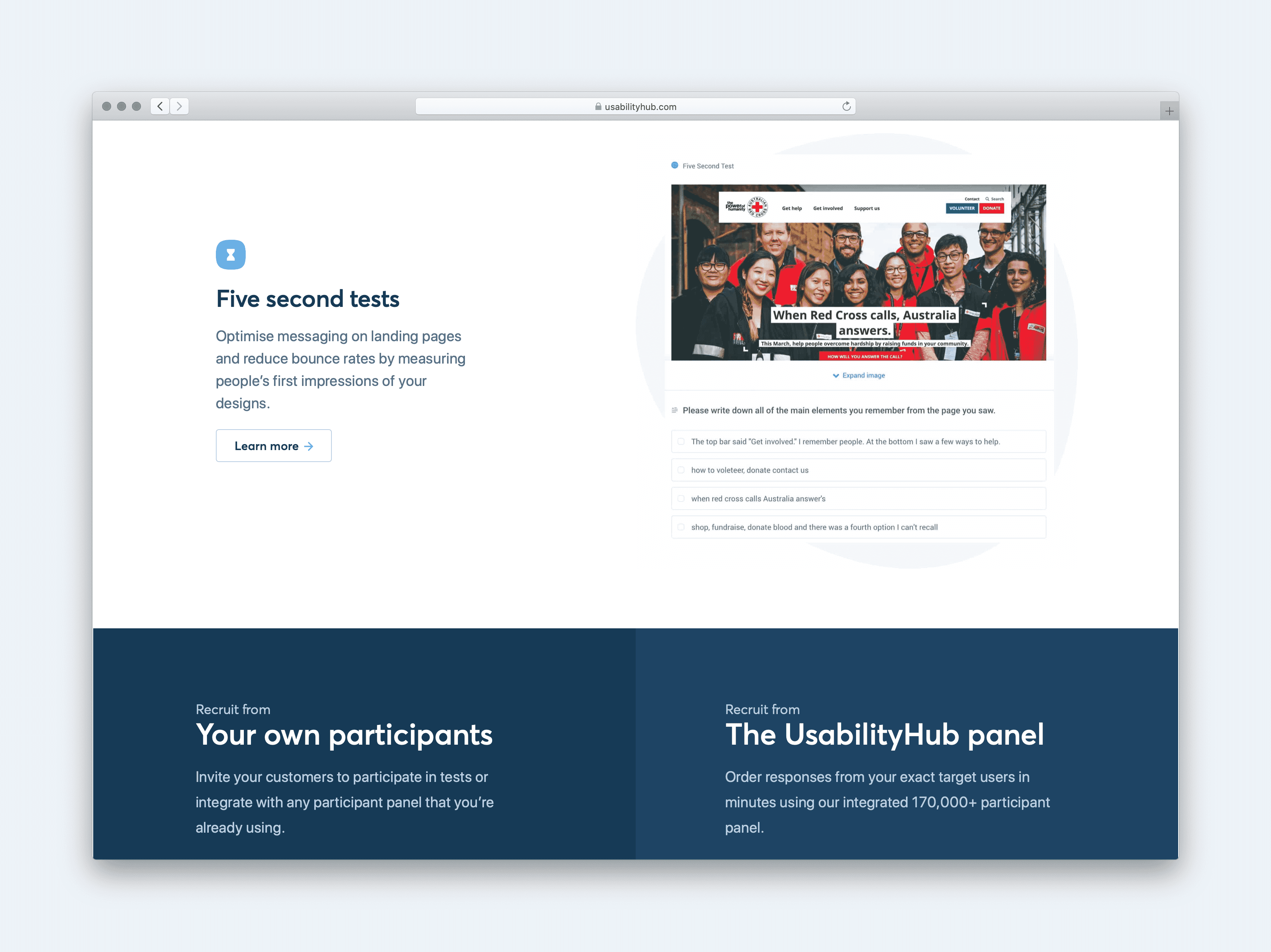
What users remember — and the order they recall it — reveals whether your page directs attention where you intended. This kind of feedback is valuable even after launch.
Iterate After Launch
No team nails the optimal landing page on the first try. Once your page is live, monitor real behavior with session recording tools such as Hotjar or Fullstory. Those recordings will surface friction points and inspire refinements.
Test incremental copy, imagery, and color changes with A/B testing, and prototype larger structural changes for usability testing. The long-term success of a landing page comes from a continuous cycle of monitoring, iterating, and testing — there is no finished state, only a better version.


