A Builder That Treats Layout Like a Design Tool
Web builders have existed for years, but only recently have they become viable for professional design work. The core promise — closing the gap between what you create in a design tool and what ends up in the browser — is what drives many of these platforms. Editor X is one such product, aimed squarely at designers and agencies that want more control than traditional template-based builders offer.
Editor X provides a canvas-based environment where you can construct websites using flexible components rather than being locked into pre-built layouts. To understand what the platform can actually do, it helps to build something with it from scratch.
Working On The Canvas
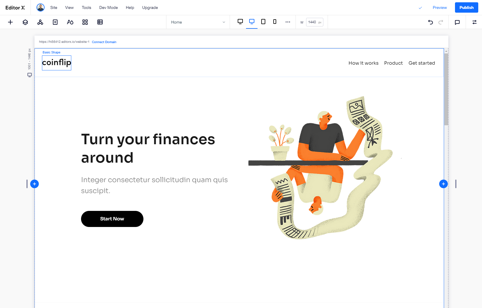
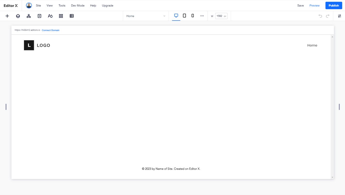
The first launch walks you through creating a new site, either from a blank canvas or from one of the platform's templates. The editor follows familiar patterns: you select elements, move them around, and adjust their properties. The workspace includes a resizable canvas in the center, toggles for panels on the top left, and an Inspector panel that opens on the right whenever you select an element.
Collaboration is built into the workflow. You can invite teammates to the project with individual roles and permissions, and leave comments on the page or on specific components for real-time discussion. This gets the whole team involved earlier in the design conversation, reducing the need to shuttle screenshots between tools.
Defining Page Structure
Sections act as large containers that form the skeleton of your page. When you create a new page, header and footer sections are added automatically. Clicking any existing section reveals a "+" icon at its edge for adding new ones. Each new section asks you to choose a layout: blank for simple sections, or a grid or layouter for more complex arrangements — concepts that map directly to CSS grids and flexbox.
The platform also offers pre-designed sections that are responsive by default and will adapt to your site's theme automatically, so you can use those as starting points where they fit.
Adding Elements And Styling
Adding elements is straightforward: open the Add panel and drag components onto the canvas. The panel includes a wide range of elements covering typical website needs. Each item can be moved and aligned, and its behavior across screen sizes can be controlled with the "Docking" feature, which determines element position inside containers when the viewport is resized.
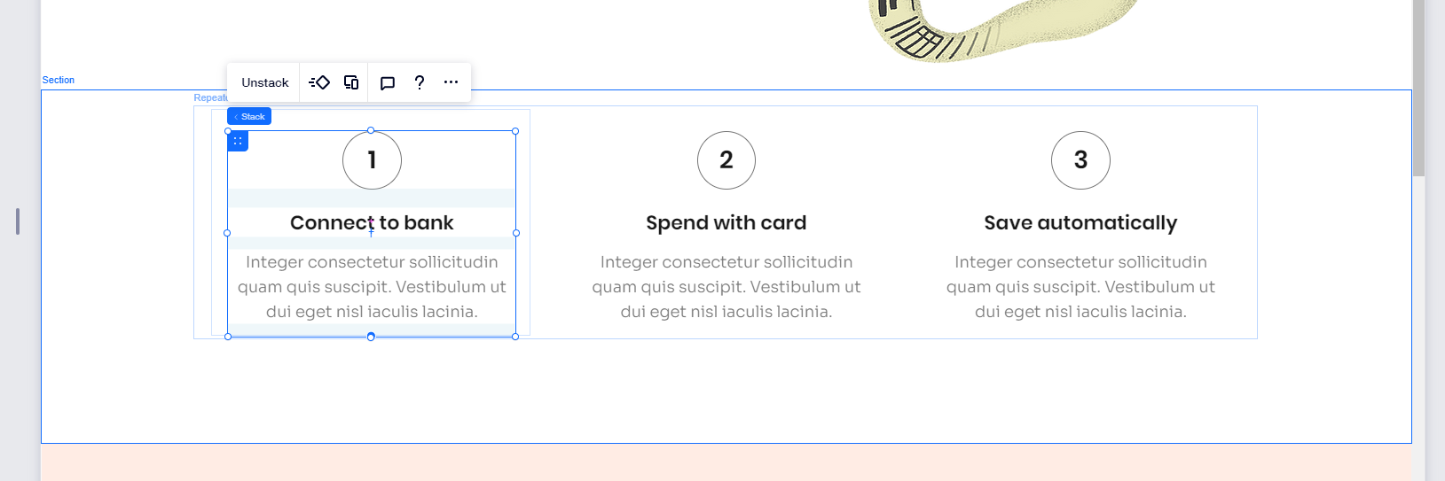
For a hero section, adding a title, paragraph, and button and then grouping them into a stack prevents overlaps on smaller screens. Stacking controls the relationship between vertically arranged elements — select the group and click "Stack" to apply it. Images can be swapped from the media library, which also includes stock photos and pre-designed illustrations.

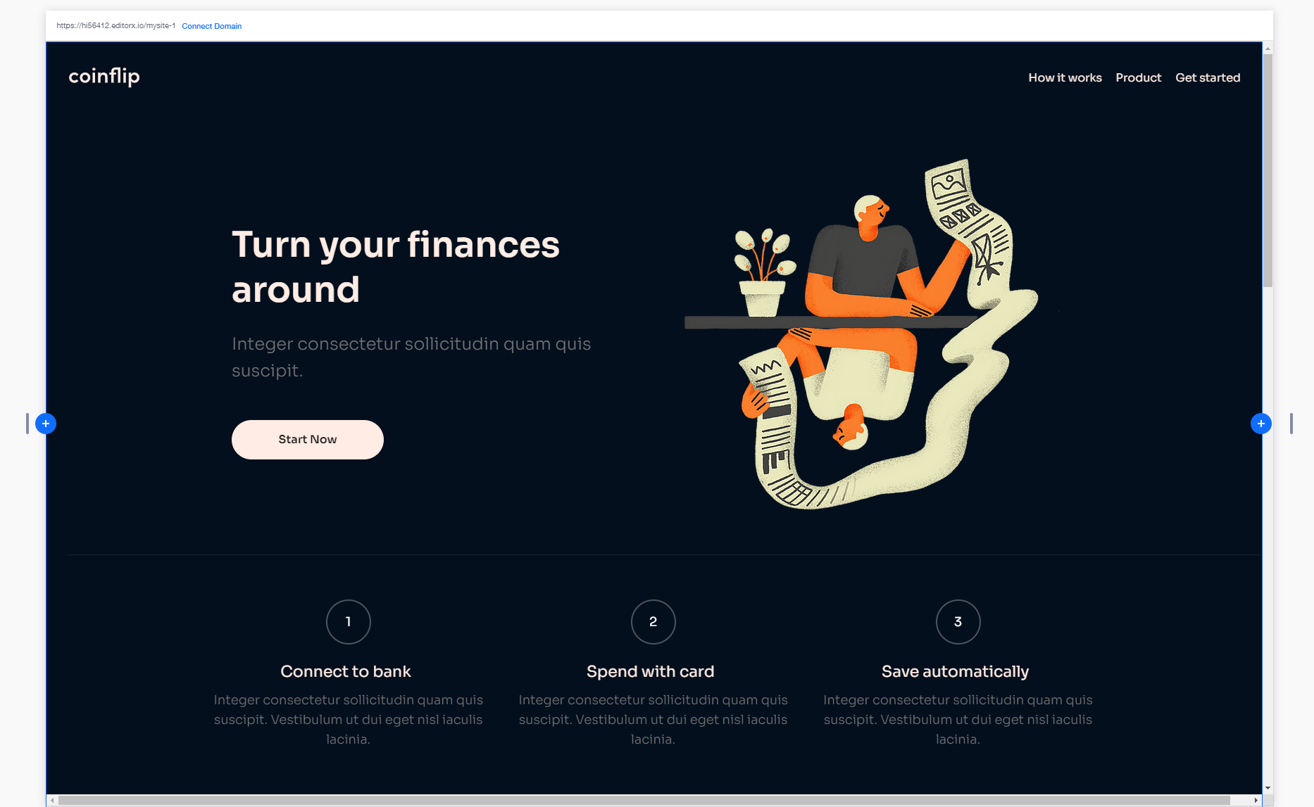
For content that repeats — like a three-step "How it works" section — a repeater element works well. The style and layout of the first item apply automatically to the rest while content stays independent. Individual items can contain nested structures, such as a bordered container with text inside.
Managing Themes Globally
Styling page by page works at small scale, but for a full site you can use the Theme manager to define typography and color globally. Changes made here apply across your site rather than just the current page. From the theme manager, you can set a background color, adjust headline fonts, and match typography colors to a palette.
Themes can be saved to a design library that carries across all sites built in the tool. That supports consistent implementation of design systems and provides reusability for agencies maintaining multiple products for clients — all managed from one central place.
For sections that showcase a product or feature, adding a headline, sub-headline, and image, grouping them into a stack, and docking them centrally works well. Overlapping visual elements can be created by arranging separate image elements behind the main content. Color updates remain straightforward: adjust background and text colors directly in the inspector.
Forms And Navigation
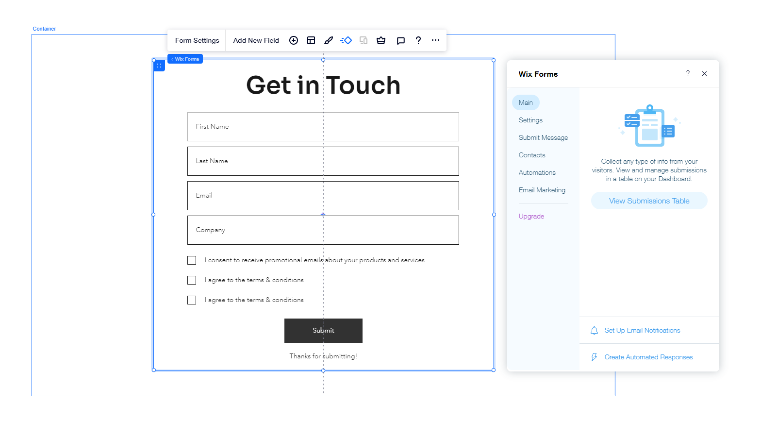
Forms are accessed through the Add panel under "Contact & Forms," where templates provide a starting point. The contact form can be customized through form settings: fields can be renamed or added, and consent checkboxes can be appended by selecting "Add new field" and choosing a terms checkbox — a useful option for GDPR compliance.
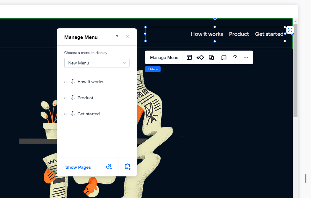
For navigation between sections on the same page, anchors are the mechanism. Select any element, open the Anchor section in the Inspector, and toggle it on with a name. Repeating this for each section you want in the menu, then linking those through "Manage menu" and "Add link" creates smooth navigation without requiring multiple pages.
Animating Elements
Animations can be applied to any element or section. Selecting an element and clicking the Animation icon brings up presets that work out of the box, with options to fine-tune duration and delay variables.
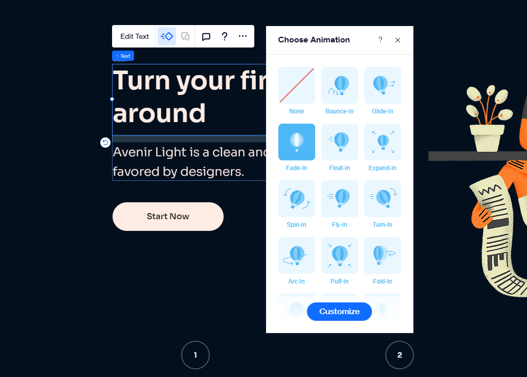
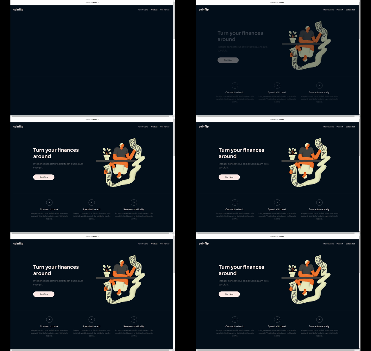
Subtle effects like a fade-in for headlines and images provide an easy way to make pages feel more interactive that doesn't require heavy config.
Designing For Breakpoints
Designing desktop and mobile separately often means duplicating decisions. Rather than mock-ups created for desktop first or mobile first, designing both at the same time makes more sense: the priorities for each content block can shift between screen sizes, so emphasizing the right elements requires the right relative positioning on every viewport. The platform supports this by designing directly for individual breakpoints using fluid and relative size units.
Breakpoints are added only when needed while previewing the site as the viewport grows. Each can be customized from the three-dotted menu next to the existing breakpoints. If elements built with relative sizes will already resize properly, the rest get design overrides per breakpoint as you review each range of screen widths. Changes apply to the current breakpoint range and cascade down to smaller sizes, so adjustments remain consistent across the board.
Going Live and Auditing the Result
Once the design is complete, clicking “Publish” assigns the site a domain and makes it publicly accessible. The free tier is sufficient for experimentation, though it displays a banner that is removed on paid plans—the tier most businesses would likely choose.
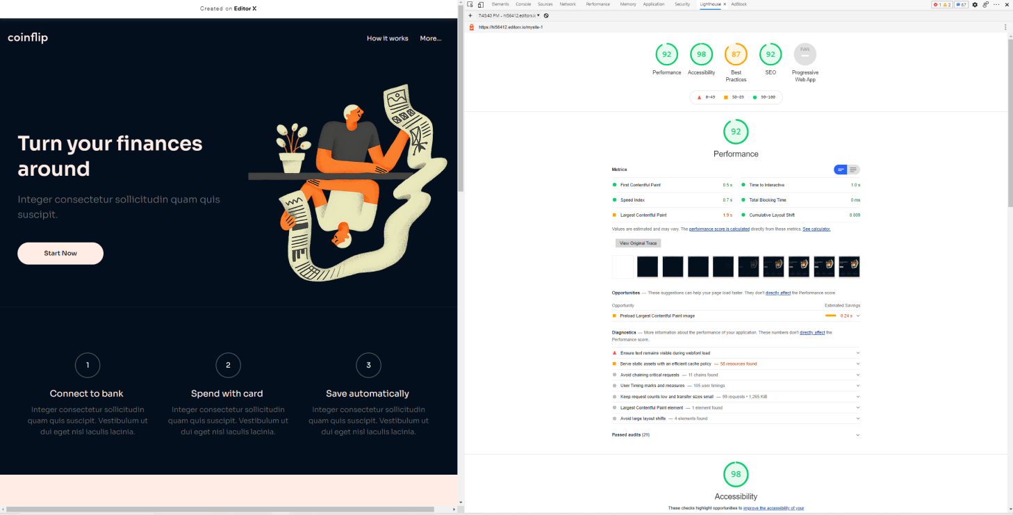
The page itself performs without any noticeable slowdowns in normal use, but a proper stress test requires deeper analysis. Running Google’s Lighthouse audit provides a clear breakdown of speed, accessibility, and SEO metrics.
It’s worth noting that the platform isn’t limited to its pre-built components. For more complex functionality, Editor X integrates with Velo, a development environment that supports custom JavaScript, connecting to external APIs, using npm packages, and automating client-to-server interactions with web modules.
For this project, the site was assembled largely by combining elements without rewriting or fixing code. The results hold up well against typical website builder output, with high scores in performance and accessibility, especially on desktop. Mobile optimization may require additional fine-tuning depending on your target audience.
Final Assessment
Web builders frequently disappoint due to accessibility and performance shortcomings, bloated markup, and inefficient CSS or JavaScript. Editor X appears to have made substantial progress in providing a streamlined environment for producing quality sites. It includes collaboration features, responsive testing tools, and components that would otherwise take considerable time to prototype or set up manually.
The platform is a viable option for agencies or organizations that need to reuse components across projects or maintain client sites efficiently. Plans come with support for online payments, eCommerce, domains, storage, bookings, event management, and video monetization. Whether you're building quick prototypes or managing extensive client work, the available feature set is likely to cover your requirements.
You can sign up for a free Editor X account and test all functionality without any commitment or hidden conditions.