A new era for an instant icon
Edwin Land, who founded Polaroid in 1937, famously advised against undertaking any project unless it was "manifestly important and nearly impossible." That philosophy gave the world instant photography with the Land Model 95 in 1948, and turned the white-framed print into a cultural touchstone used by artists from Andy Warhol to Ansel Adams.
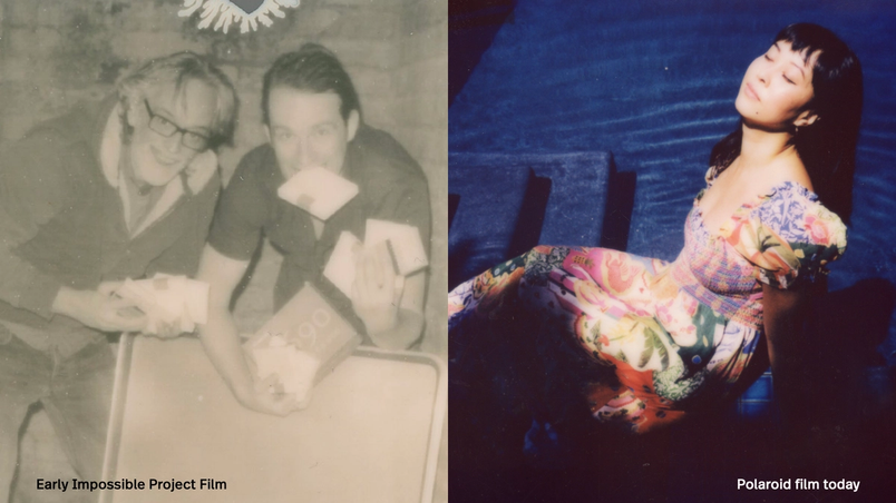
The digital photography boom nearly ended that legacy. When Polaroid shuttered its last film factory in the Netherlands in 2008, a group of enthusiasts stepped in, purchased the facility, reinvented the chemistry, and eventually took over the brand itself. Now, Polaroid is courting a new generation with modern instant cameras, photo printers, and mobile apps—and rebuilding its digital workflows in the process.
One system, every touchpoint
The Polaroid app, the Hi-Print app, and the company's website all need to feel like part of the same product family. Before the team adopted Figma, that consistency was hard to achieve. Designers worked in isolated files, duplicated effort, and iterated slowly. The friction was so severe that the team only designed for iOS, even though the apps also shipped on Android.
UX Design Lead Tim Parker has used Figma to establish a centralized design system and pull collaborators into the process from the start. "Figma's cloud-based approach has democratized our design process, increasing transparency and fostering cross-departmental discussion and ideation," he says. "With members of the team being remote, it's a real game-changer. It's easy to forget that this just wasn't possible in an efficient way before."
Design tokens and variables let the team test ideas quickly and adapt designs across contexts. That speed has translated into meaningful product changes: the camera connection flow now surfaces only the device a user actually owns, the app theme matches the camera's colorway, light and dark modes are supported, and fonts switch appropriately between iOS and Android. Figma's UI kits provided starting points, while plugins like Autoflow help map user journeys before the final design is locked in.
Prototyping that goes deeper
Better prototypes have moved user testing earlier in the cycle. "Figma has enabled us to create more prototypes—faster and with higher quality," says Tim. "Earlier methods lacked the ability for users to change settings, navigate freely, and genuinely test concepts in a natural way. User testing ensures we build truly user-centered products based on actual behavior, not assumptions."
The shift has also made it possible to simulate hardware. Using the ProtoPie plugin, the design team can now mock up the camera's viewfinder—which controls distance, shutter speed, aperture, and exposure—in high fidelity. Previously, that required custom code or renders from other tools and never felt authentic. "It unlocked an entirely new level of exploration," Tim says.
Design and development, together
A single source of truth in Figma, paired with Dev Mode for inspection, has streamlined handoff and improved quality. Tim notes the app once contained more than 50 different fonts. "Dev Mode has dramatically bridged the gap between design and development, accelerating QA and development cycles through efficient design system implementation," he says. Developers can now export assets directly in the format they need rather than waiting for designers to provide everything.
Bringing developers in earlier also changes the tenor of the collaboration. They see annotations, use variables to test different screen sizes, and understand how properties and modes behave together—context that previously required several screenshots to convey.
Creative teams in the same file
It isn't just product design and engineering that have converged in Figma. Brand designers, art directors, copywriters, and freelancers on the Creative Studio team now work within shared files. For a campaign like a new camera launch, each person can work in their own page while staying aware of the others' progress.
"For example, the art director and copywriter can work on out-of-home placements in their own page, and I can work on the creative toolkit for both internal and external partners," explains Senior Designer Ryan Esquivel. Immediate feedback is a built-in side effect. "There's the ease of being able to drop comments in, or fix something really fast," he says. "It's just made everything more efficient. I could not imagine it not being a part of what we do now."
Esquivel also values that brand guidelines live in Figma rather than as a static PDF, making them a flexible, living document that can be corrected and updated as work evolves. Chief Product Officer Stine Bauer Dahlberg sees the benefit in how ideas now flow across roles. "Everybody's building on each other to create a thing," she says, "and everybody feels really invested in that thing succeeding."
Looking forward, with a nod to the past
Polaroid leans on both intuition and usage data to decide which features to build next. The popularity of the app's built-in scanner, which digitizes instant photos, helped inspire Instant Answers, an AI-powered assistant that offers photography tips and common questions. The feature is trained on a key piece of Polaroid folklore: shaking a print does nothing for today's film, which sits behind a protective window. "We did train the algorithm on this one," says Stine.
With handwritten fonts and warm, conversational replies, Instant Answers echoes the brand's original mission of making photography more tactile, intentional, and personal—now translated for a digital audience.


