

Why Small UX Fixes Move The Conversion Needle
Sunuva, a kids' swimwear brand stocked by retailers like Harrods and Bloomingdale's, had solid engagement metrics. Traffic composition, bounce rate, and conversion for new versus returning users all sat within normal ranges for the segment. Still, customers were abandoning carts and failing to complete purchases. A UX audit of the site, using Hotjar recordings, click maps, and known customer snag points, uncovered a set of interface problems that were quietly suppressing key metrics. The fixes were not redesigns; they were targeted adjustments to navigation, error handling, and checkout messaging.
The audit focused on five growth areas: mobile conversion rate, product detail page views, desktop add-to-basket rate, cart abandonment, and checkout completion. Six root issues emerged from the analysis, each addressed with a specific recommendation and implemented with the client's in-house development team.
Catalog Navigation Made The Product List Harder To Use
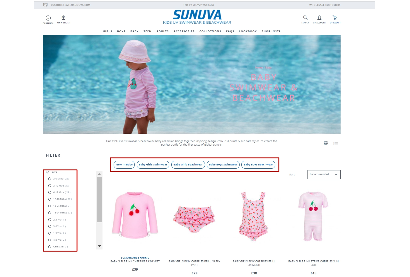
With mixed products in the catalog list, users had to rely heavily on filters for size and gender. Heat maps showed that those who did use filters engaged better, but the analytics told a blunt story: only 37% of users viewing a product list found an item interesting enough to click through to its detail page.
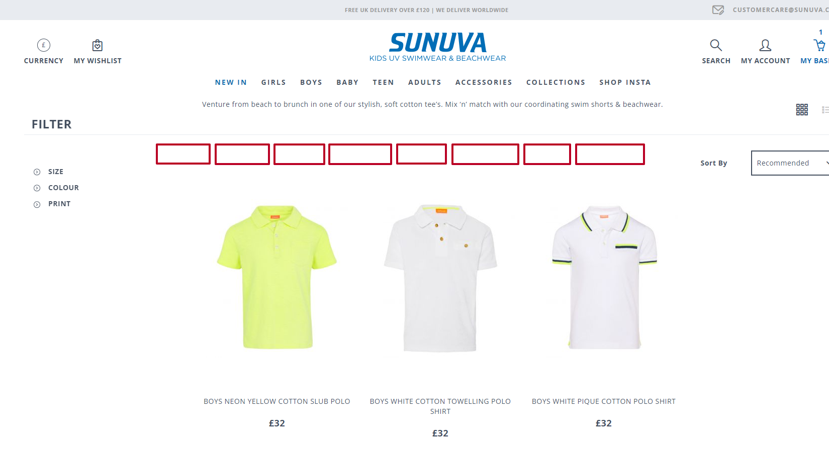
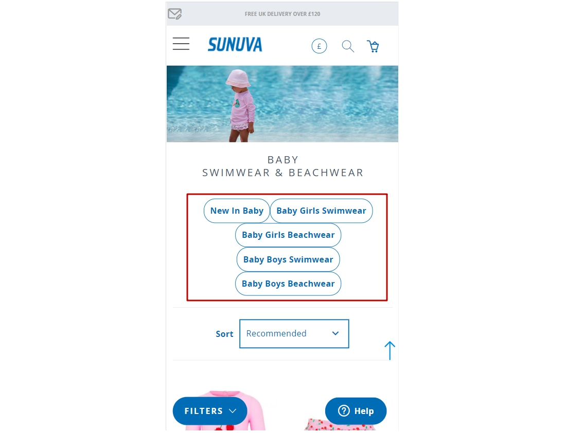
The recommendation was to add quick filter tags below the list — grouping by Boys, Girls, Baby, and product type such as Shorts or Suits — and to keep gender and size filters expanded by default. On mobile, the filter button needed to stay pinned while scrolling, shortening the path from list to product.
Silent Errors On Add-To-Basket
On product pages, clicking "Add to basket" without first selecting a size produced no error message. Users had to realize their mistake, scroll back up, and repeat the action. The fix was simple: trigger the size list to open automatically when the button is clicked without a size selected, drawing the user's attention directly to the required field. That removes a step from a frustrating loop without adding any new UI.
Free Shipping Notifications Were Killing Checkout
The checkout page displayed a notice telling users how much more they needed to spend to qualify for free shipping. On the surface, that is a standard upsell tactic. In practice, it was pushing up to 38% of users away from the checkout page entirely — they left to go add more items and never came back.
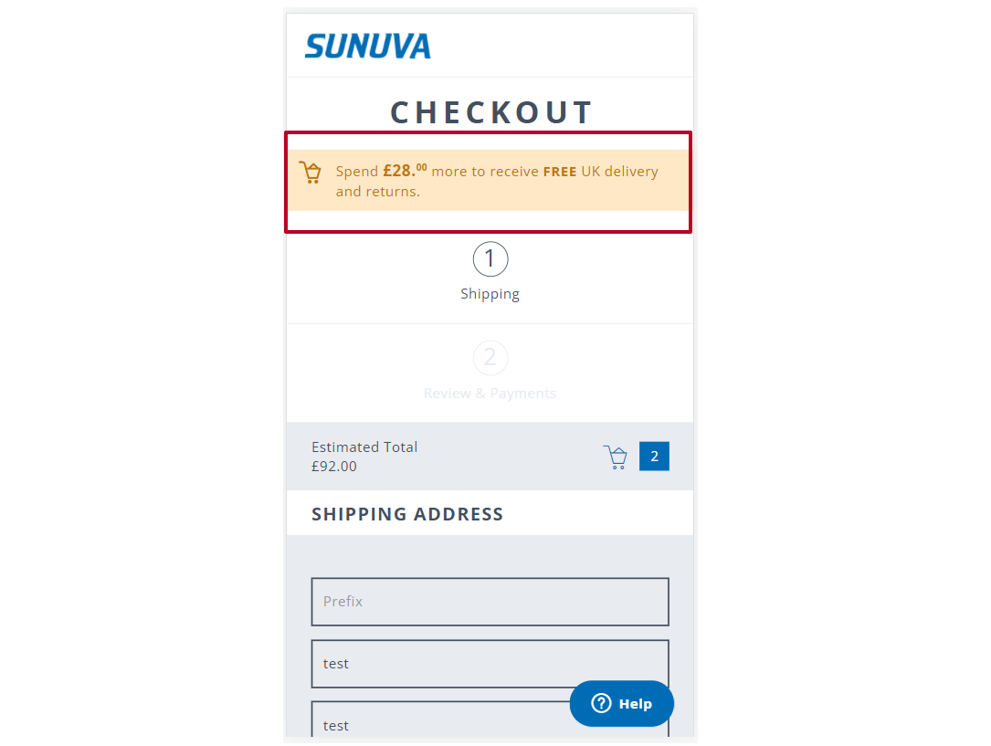
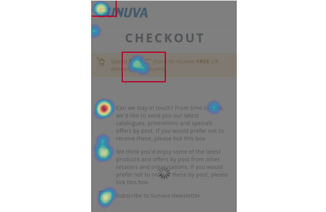
The auditor's advice was to drop the shortfall message from the checkout page. If the store wants to promote free shipping thresholds, that information belongs on the basket page in the form of a progress bar or an explanatory note. The checkout should be a clear path to payment, not a reminder of what the cart is missing.

Header Elements Lacked Visual Hierarchy
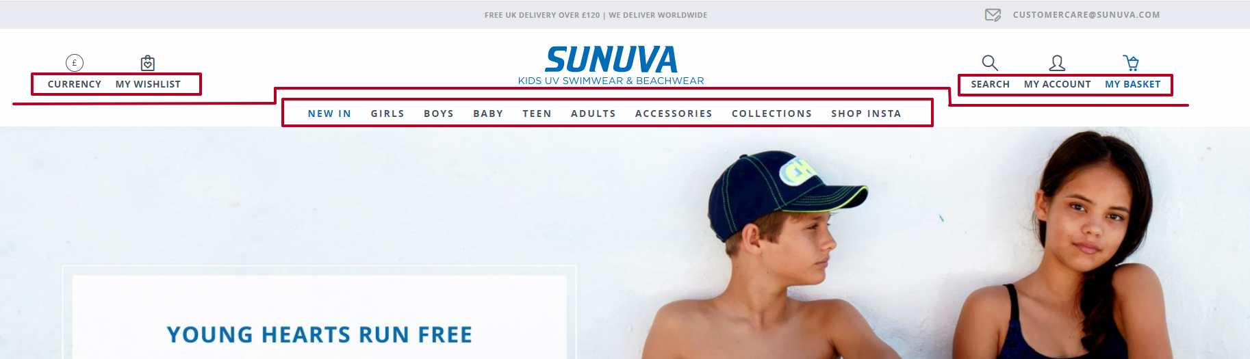
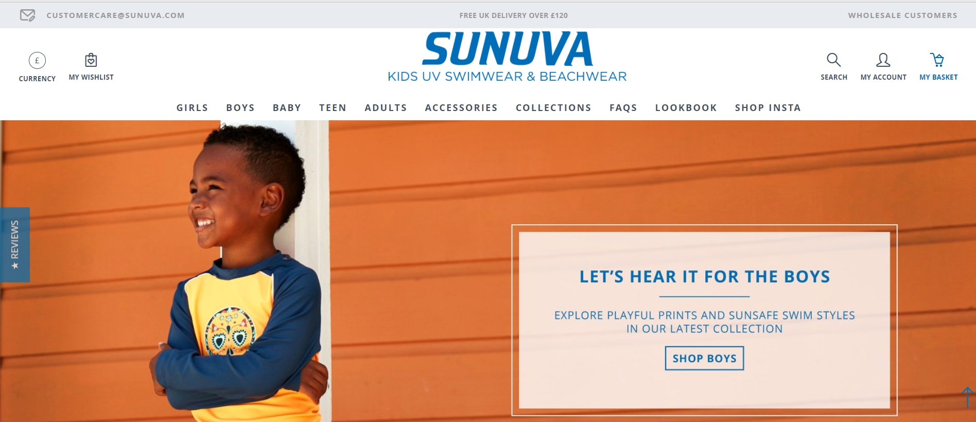
In the desktop header, currency, wishlist, search, account, and basket icons carried the same visual weight, with no clear priority. Users could not quickly distinguish between utility actions and catalog categories. The fix had two parts: visually separate those utility elements and align them with the logo, then give the catalog categories stronger visual emphasis so users can locate navigation options at a glance.
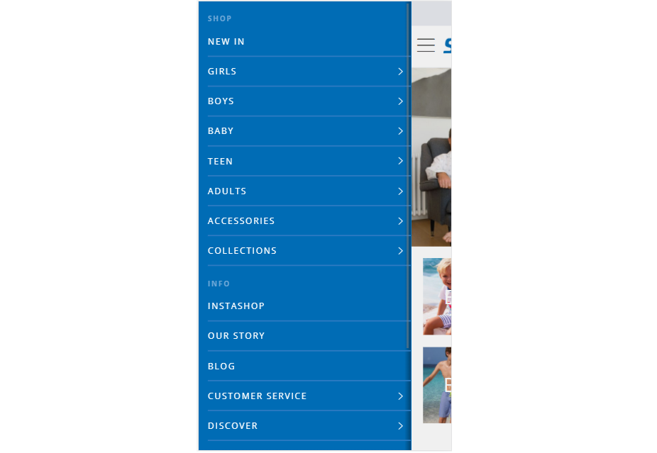
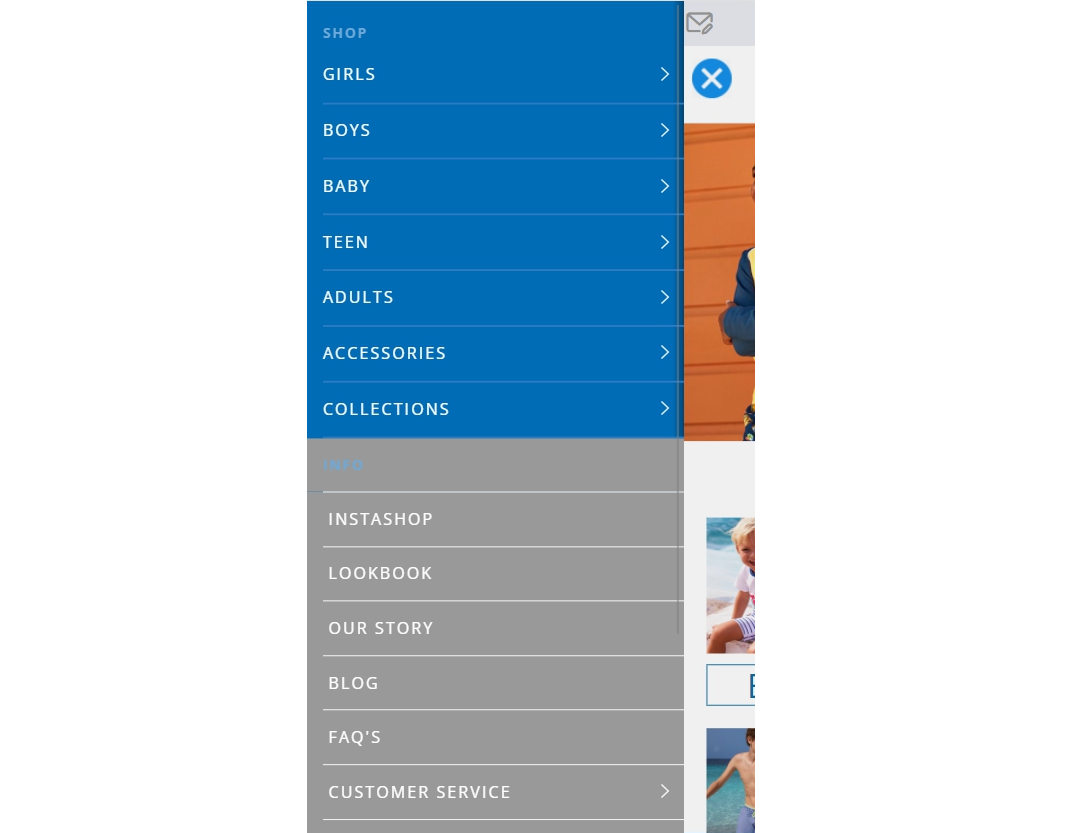
The mobile menu had a related issue. In the burger menu, catalog categories and informational links looked the same, so users spent extra time hunting for product sections. Differentiating the visual treatment — giving more weight to catalog links and less to info links — helps guide users toward the items they came to find.
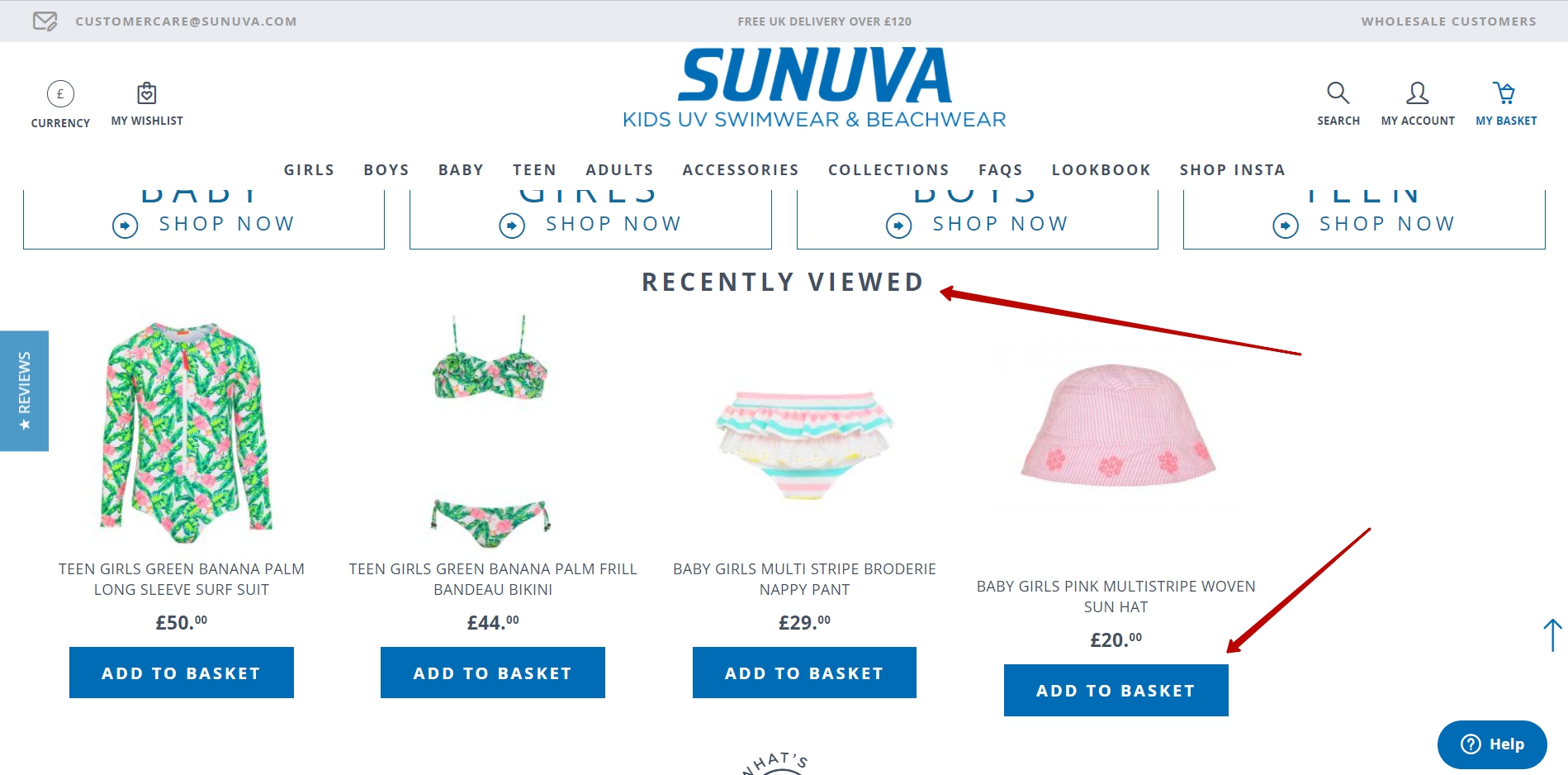
No Recently Viewed Items On Product Lists
The site had no recently viewed products block, and its product listing cards had no quick "Add to basket" affordance. Analytics showed that returning users were 2.5 times more likely to browse again than to purchase during a new session. Those returning browsers had already seen products and were closer to buying; without a record of what they had looked at, they had to retrace their browsing or give up.
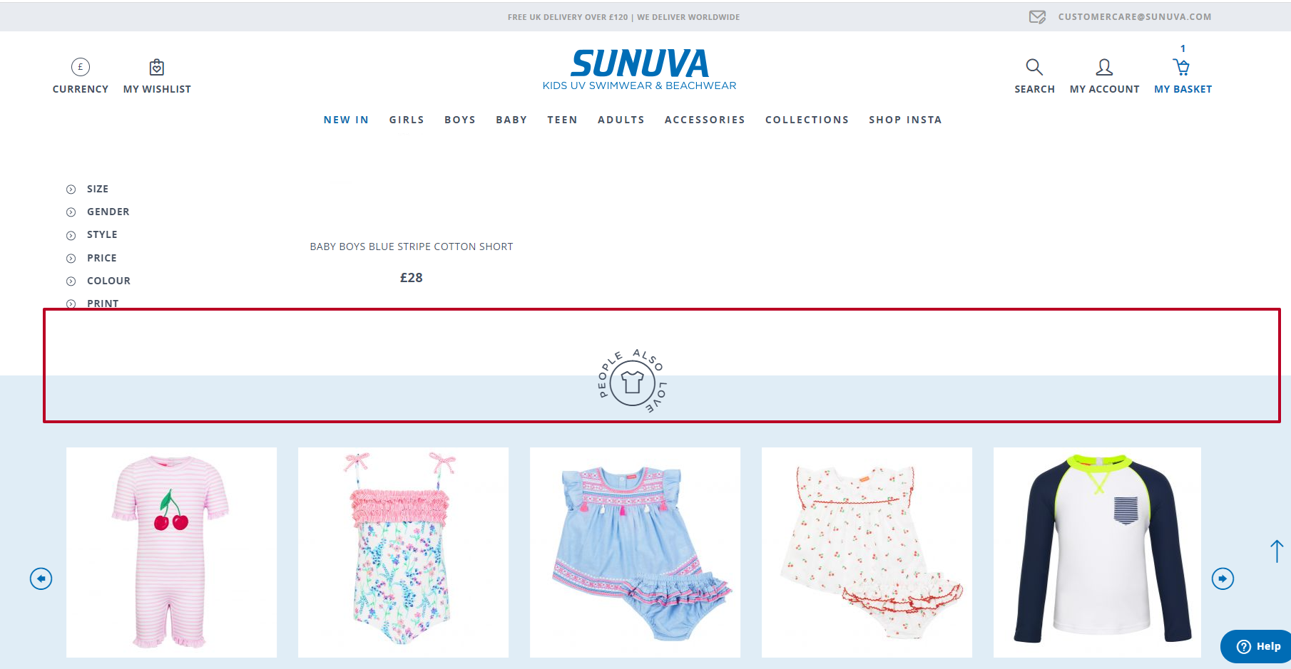
Adding a recently viewed list gives those users a fast route back to familiar products. Quick "Add to basket" buttons on product cards — visible on hover for desktop, always available on mobile — shorten the final step to conversion.
Category Blocks Looked Like Banners, Not Links
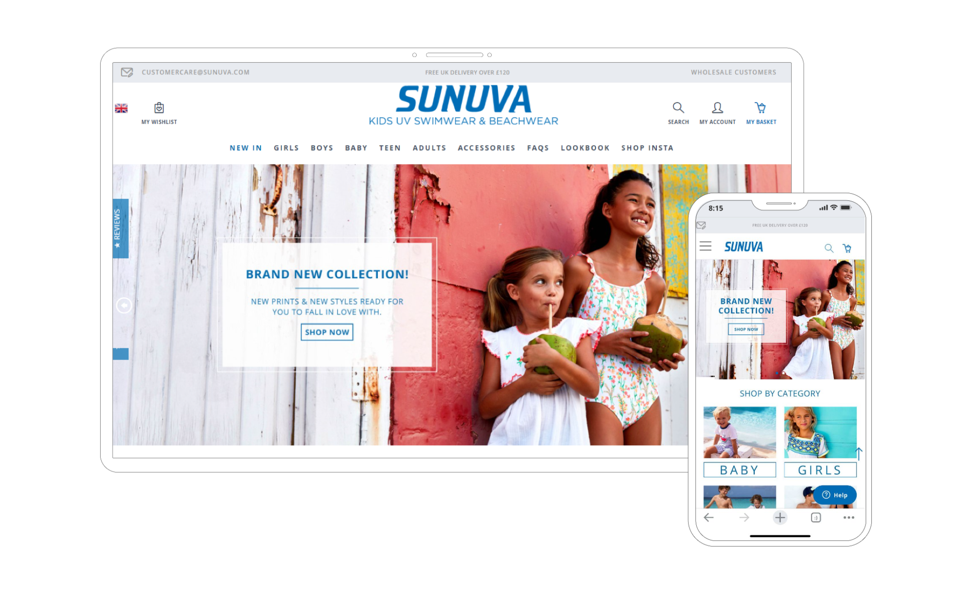
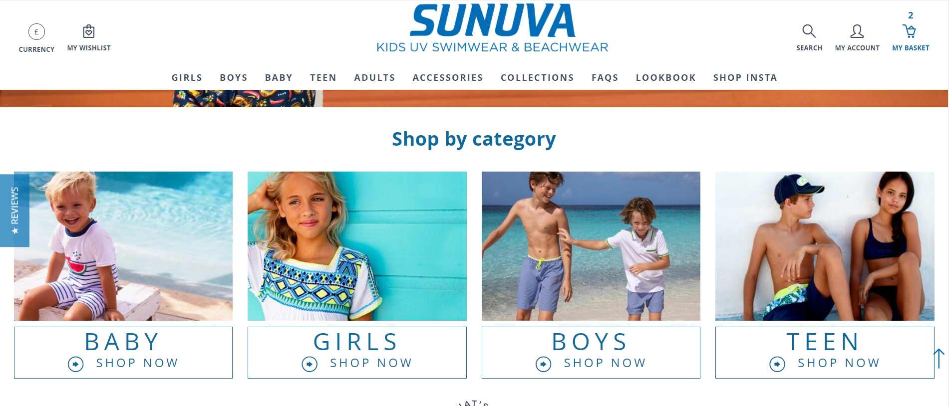
Homepage category blocks were not getting clicked because their labels were hard to read and visually overlapped the banner image. The effect made the blocks look decorative. Users did not recognize them as clickable navigation to category listings.
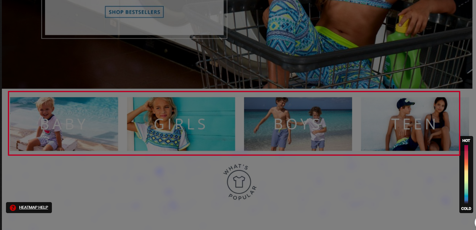
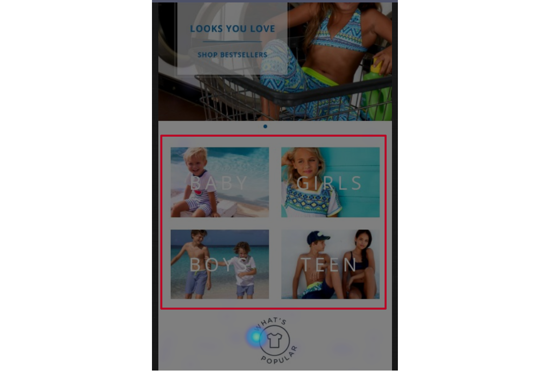
The correction was to separate the title treatment from the banner and make the blocks look like distinct, tappable elements, signaling that they lead somewhere.
Results
After nearly all recommendations were implemented, the client's internal reporting showed a measured increase in conversion rate and site traffic. The client's e-commerce manager credited the audit team's use of analytics and session data in arriving at the proposed solutions.
"Turum-burum's work drove an increase in the client's conversion rate and site traffic. Proactive and detail-oriented, they took the time to understand all of the available data to provide optimal solutions and explanations for the client's problems. They were supportive and transparent throughout."
— Jennifer Tully, E-Commerce Manager, Sunuva
Running Your Own UX Audit
The same process can be applied to any e-commerce site. A practical audit follows these steps:
| Steps | |
|---|---|
| 1. Follow the user’s footsteps. | Make a purchase like you are the customer |
| 2. Analyze micro and macro conversions. | Using GTM and GA |
| 3. Conduct audience research. | What is your target audience portrait? |
| 4. Conduct a technical audit. | Is everything working on your website? |
| 5. Check heatmaps and scroll maps. | Hotjar and Plerdy could be helpful. |
| 6. Watch session recordings. | |
| 7. Analyze feedback. | (Hotjar, Survio) |
Once issues are identified, form hypotheses about how to improve specific metrics and rank them by expected impact on conversion. Test those hypotheses through A/B testing or by tracking the relevant analytics. The cycle is continuous: user behavior, business goals, and market conditions shift, so auditing should be a recurring discipline rather than a one-time project.
Re-engaging visitors who already know the site costs much less than acquiring brand-new traffic. Small, well-reasoned changes to the interface can make the difference between a visitor who abandons the checkout and one who completes it.


