
Drop caps are the decorative letter that opens a block of text, usually spanning several lines. They appear in illuminated manuscripts and traditional book design, where they draw the eye to the story's starting point. In the Middle Ages the artists who made them were called "illuminators," and their versals did more than mark where reading began — historiated letters told the story itself, which mattered at a time when most people could not read.
On the web, the same flourish can improve readability and carry a brand's visual identity. The techniques below were developed around a fictional country music artist, Patty Meltt, and her album launch site — an exercise in making every element expressive, drop caps included.
The CSS foundation
Drop caps are built with the ::first-letter pseudo-element plus initial-letter. The first targets the opening letter independently of the paragraph; the first number passed to initial-letter sets how many lines the letter spans, and the second sets its baseline alignment — which line of text the bottom of the cap rests on.
p::first-letter {
  -webkit-initial-letter: 3 3;
  initial-letter: 3 3;
}
Browser support still varies, so shipping both the unprefixed and -webkit- prefixed properties is common. Wrapping initial-letter in an @supports rule lets you test for support and supply a fallback:
@supports (initial-letter:2) or (-webkit-initial-letter:2) {
  p::first-letter {
    -webkit-initial-letter: 3 3;
    initial-letter: 3 3;
  }
}
The property calculates the font size needed to match the requested line span automatically. That alone makes a strong first impression; the effect deepens when combined with less obvious properties.
Tip: Interactive examples from this article are available in the author's lab.
Shadows and strokes
A single text-shadow lifts a cap off the page, and shadows can be coloured rather than black. Two hard-edged shadows instead of one turn the letter into a classic graphic element.
p::first-letter {
  /* ... */
  text-shadow:
    -6px -6px 0 #7d6975,
    6px 6px 0 #e6d5b3;
}
text-stroke — shorthand for text-stroke-width and text-stroke-color — outlines the centre of the text shape. It is now a Baseline feature and widely available. Making the cap's fill transparent, or colouring it to match the page background, leaves the outline on its own.

Backgrounds, borders and shapes
A solid background-color is the simplest decorative starting point. A conical, linear or radial gradient adds a lighting effect, an image URL brings in bitmap or vector artwork, and clipping a bitmap, gradient or vector image to the text with the colour set to transparent confines the image to the letterforms themselves.
p::first-letter {
  /* ... */
  background-clip: text;
  color: transparent;
}
Borders repay more than they promise. A solid border surrounds the cap box; border-radius rounds all corners or selected ones for a more distinctive profile. The border-image property is the overlooked tool here: slicing, repeating and outsetting images produces intricate borders and decorative caps in minimal code, and the border space accepts a bitmap, a vector image or a CSS gradient.

clip-path defines which parts of an element are visible, cropping the box into circles, polygons or complex SVG path shapes. Clipping a cap into a right-facing arrow reinforces direction and hierarchy, pointing readers to where the story begins.
p::first-letter {
  /* ... */
  padding-inline: 1rem 2rem;
  background-color: #e6d5b3;
  clip-path: polygon(...);
}
Combining clip-path with a gradient background and a text shadow yields a glossy sticker-style cap.
Transforms and text wrap
transform acts on the drop cap independently of the paragraph, so it can be rotated, scaled, skewed or translated for a more dynamic feel. With some trial and error on the values, shape-outside can flow the remaining paragraph text around the transformed cap.

Applying it to a brand
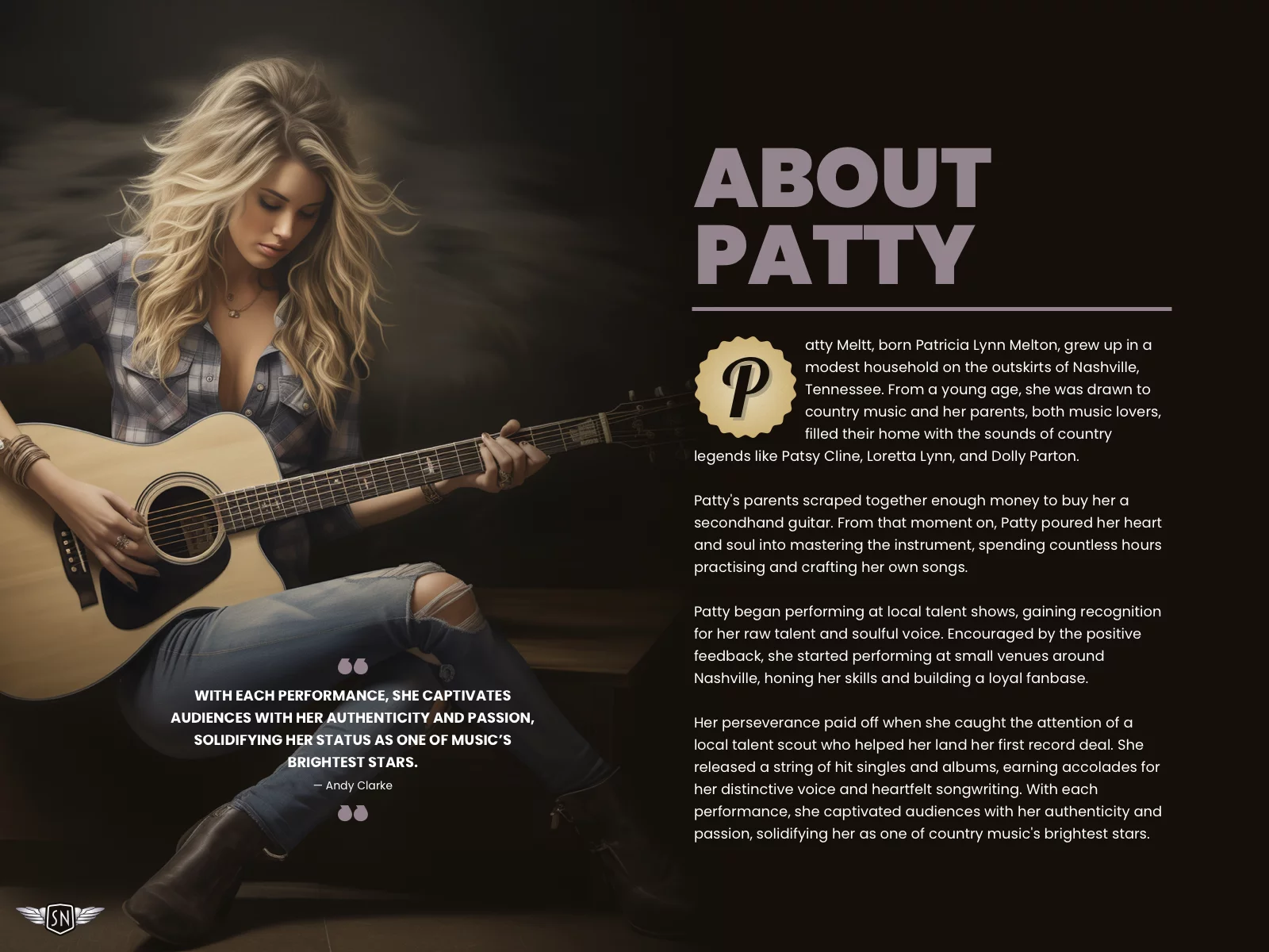
For Patty Meltt's biography page — presentable, but without focus on where reading should start — the sticker-style cap from a set of design options best matched her brand. The implementation:
- A cursive typeface that matches her branding and contrasts with the rest of the typography.
- A cap colour matched to the page background, plus a semi-transparent text shadow.
- A
clip-pathclipping the cap box to a sticker-shaped visible area. - Two background images — a noise-filled SVG and a radial gradient — combined with a
background-blend-mode.
Styling a drop cap is not decoration for its own sake. It sets a tone, pulls readers in, and uses a single letter to express a brand's voice. Gradients, textures, borders and complex shapes take the cap well past the default, and because the first letter is often the first element a reader sees, it carries disproportionate visual weight. That makes it an opportunity worth spending.