
Breaking text out of the rectangle
Every image, whatever its subject, arrives inside a box. By default, text sits above or below that box; float the image left or right and the text wraps the rectangle, ignoring whatever is inside it. shape-outside is the property that removes that constraint, letting a layout follow the contours of an image instead of its edges.
The property accepts an image's alpha channel — its transparent areas — as the source of the shape, so a guitar or a portrait can bend the text around itself. Straight-edged images beside solid blocks of text read as static; text that follows a curve introduces movement, brings image and copy into a shared composition, and slows readers slightly as they navigate the page.
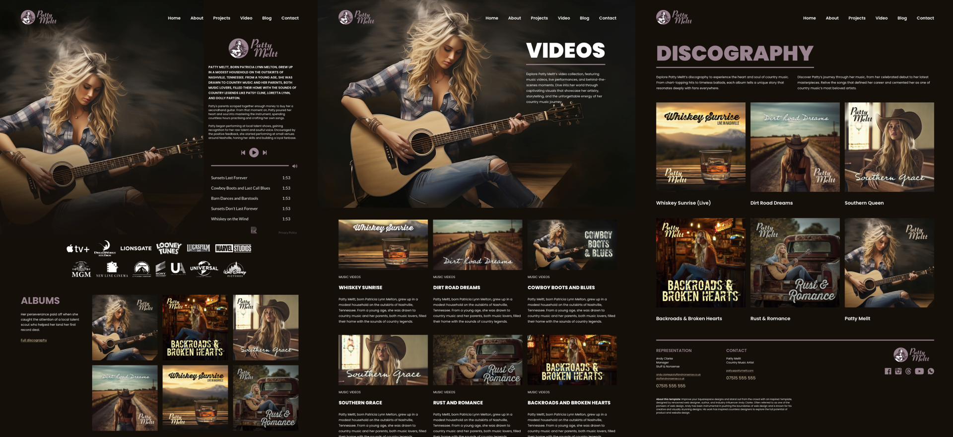
Most guides to shape-outside begin with circles and polygons. That covers the how, but not the why, which is where the property becomes interesting to designers. The examples below come from a fictional brief: Patty Meltt, a country artist launching an album and a tour, needed a site that was distinctive and memorable, with a biography and a music section.
The mechanics, briefly
Text only flows around an element that is floated left or right and has a defined width. The URL passed to shape-outside points at an image with an alpha channel, such as a PNG or WebP. shape-image-threshold sets the alpha level at which the shape is generated, and shape-margin adds margin around the resulting shape.
img {
  float: left;
  width: 300px;
  shape-outside: url('patty.webp');
  shape-image-threshold: .5;
  shape-margin: 1rem;
}
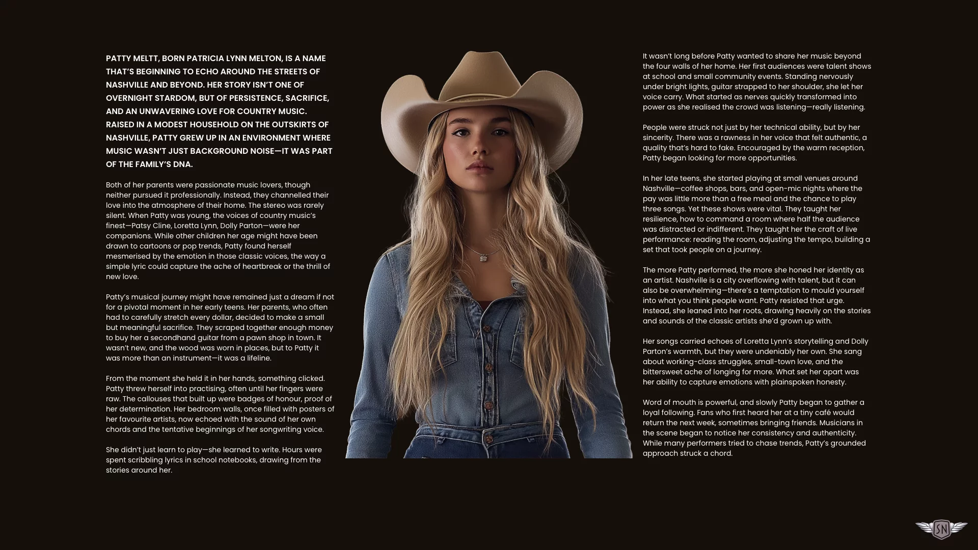
A tall portrait in a two-column grid
Patty's life story splits into two parts — her biography and her music — so a tall vertical portrait serves the first and two smaller album covers the second. A simple grid creates the two columns.
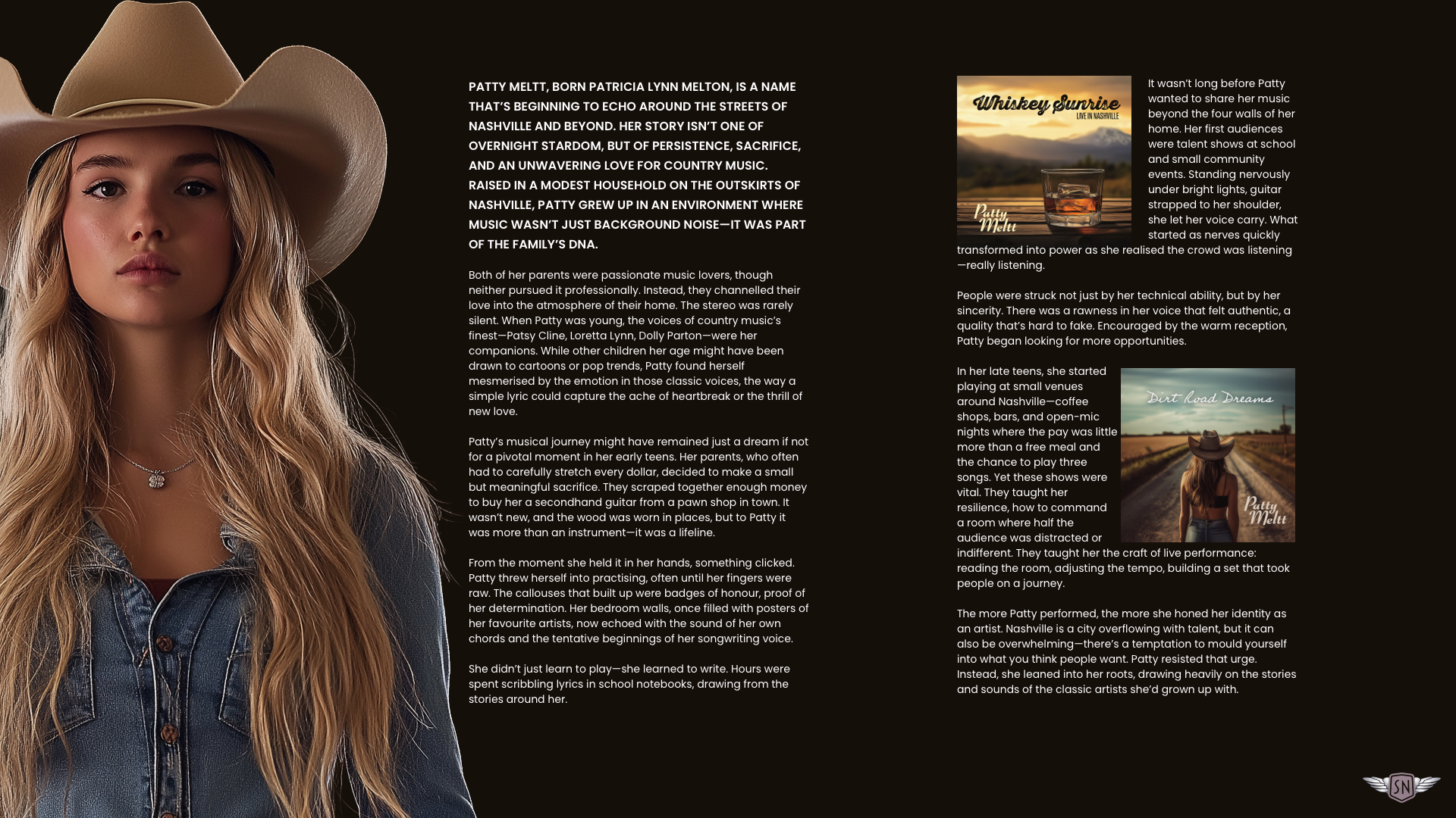
shape-outside applied to them<section id="patty">
<div>
<img src="patty.webp" alt="">
[...]
</div>
<div>
<img src="album-1.webp" alt="">
[...]
<img src="album-2.webp" alt="">
[...]
</div>
</section>To keep the design flexible, the column widths and margins are set in percentages rather than static pixels, so they scale with whatever the container's size turns out to be.
#patty {
  display: grid;
  grid-template-columns: 2fr 1fr;
  gap: 5rem;
}
#patty > *:nth-child(1) img {
float: left;
width: 50%;
shape-outside: url("patty.webp");
shape-margin: 2%;
}
#patty > *:nth-child(2) img:nth-of-type(1) {
float: left;
width: 45%;
shape-outside: url("album-1.webp");
shape-margin: 2%;
}
#patty > *:nth-child(2) img:nth-of-type(2) {
float: right;
width: 45%;
shape-outside: url("album-2.webp");
shape-margin: 2%;
}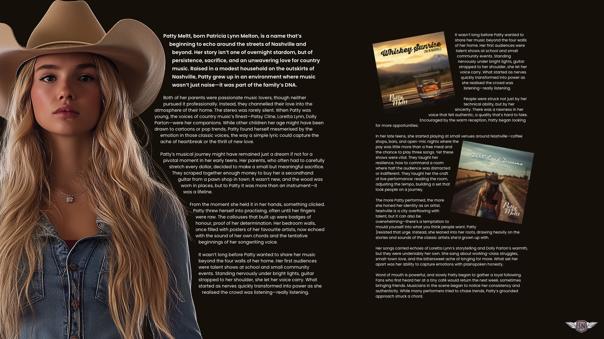
shape-outside applied to them. See this example in my lab.The text wraps Patty's image purely through its silhouette — no clipping paths, no polygons.
One caveat: when an image is rotated with a CSS transform, browsers do not reflow text around the rotated alpha channel. In practice, the rotation usually has to be built into the image file itself.
Faking a centred image
Because floats have no center value, centring an image inside the text — a more striking treatment for the biography — requires an illusion. Patty's bio content is divided into two symmetrical columns, and the portrait is cut into two halves, each 50% of the original width.
#dolly {
  display: grid;
  grid-template-columns: 1fr 1fr;
}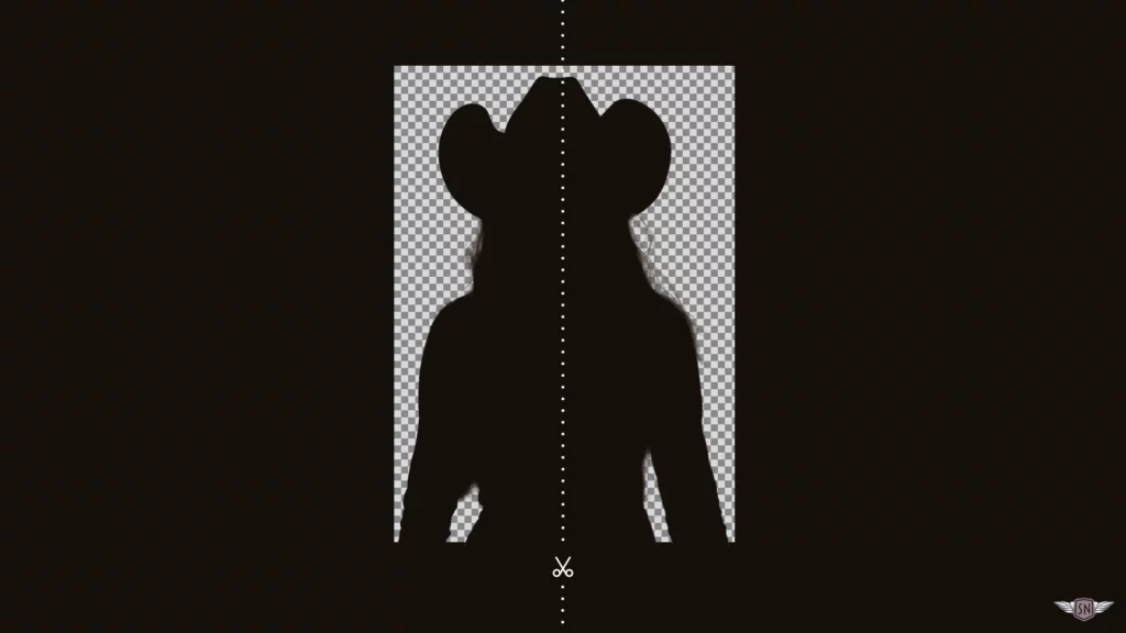
Each half sits in its own column, and each is floated toward the middle: the left column's half to the right, the right column's half to the left.
<section id="dolly">
  <div>
    <img src="patty-left.webp" alt="">
    [...]
  </div>

  <div>
    <img src="patty-right.webp" alt="">
    [...]
  </div>
</section>
#dolly > *:nth-child(1) img {
float: right;
width: 40%;
shape-outside: url("patty-left.webp");
shape-margin: 2%;
}#dolly > *:nth-child(2) img {
float: left;
width: 40%;
shape-outside: url("patty-right.webp");
shape-margin: 2%;
}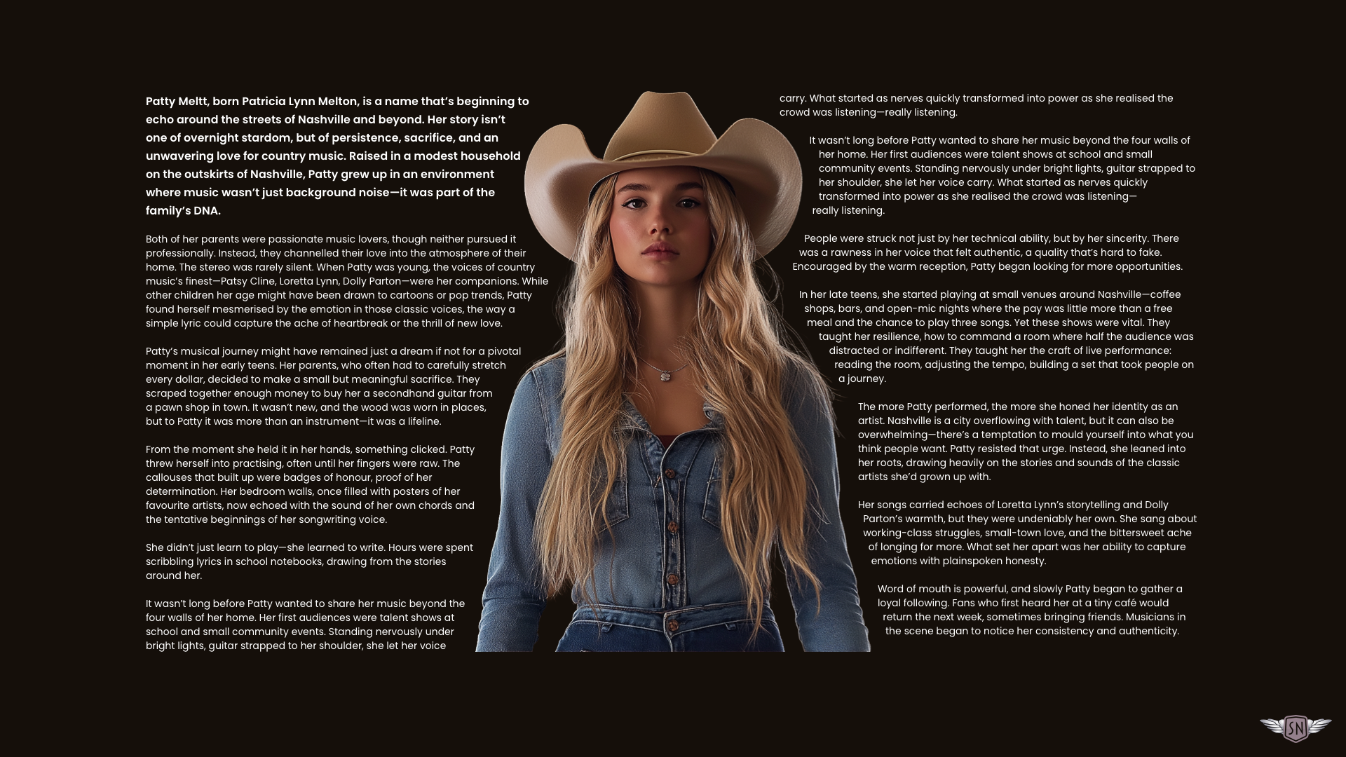
The two halves meet in the centre, and the text appears to flow around both sides of a single image.
Text around a photograph with no hard cut-out
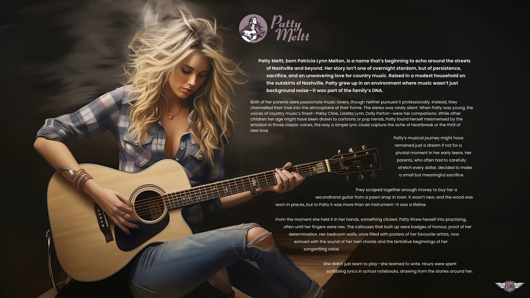
A tightly cut-out portrait with a clean alpha channel isn't always the right look; some designs should feel looser. For a section where the content had to flow around Patty and her guitar, the picture goes in as an inline image rather than a background-image, floated with a width of 100%.
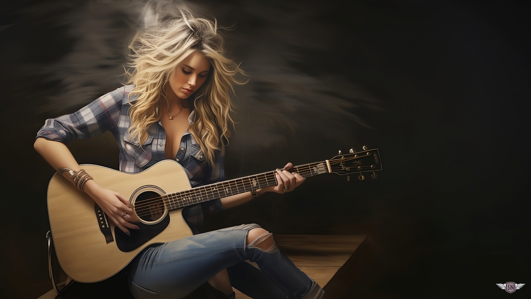
<section id="kenny">
  <img src="patty.webp" alt="">
  [...]
</section>
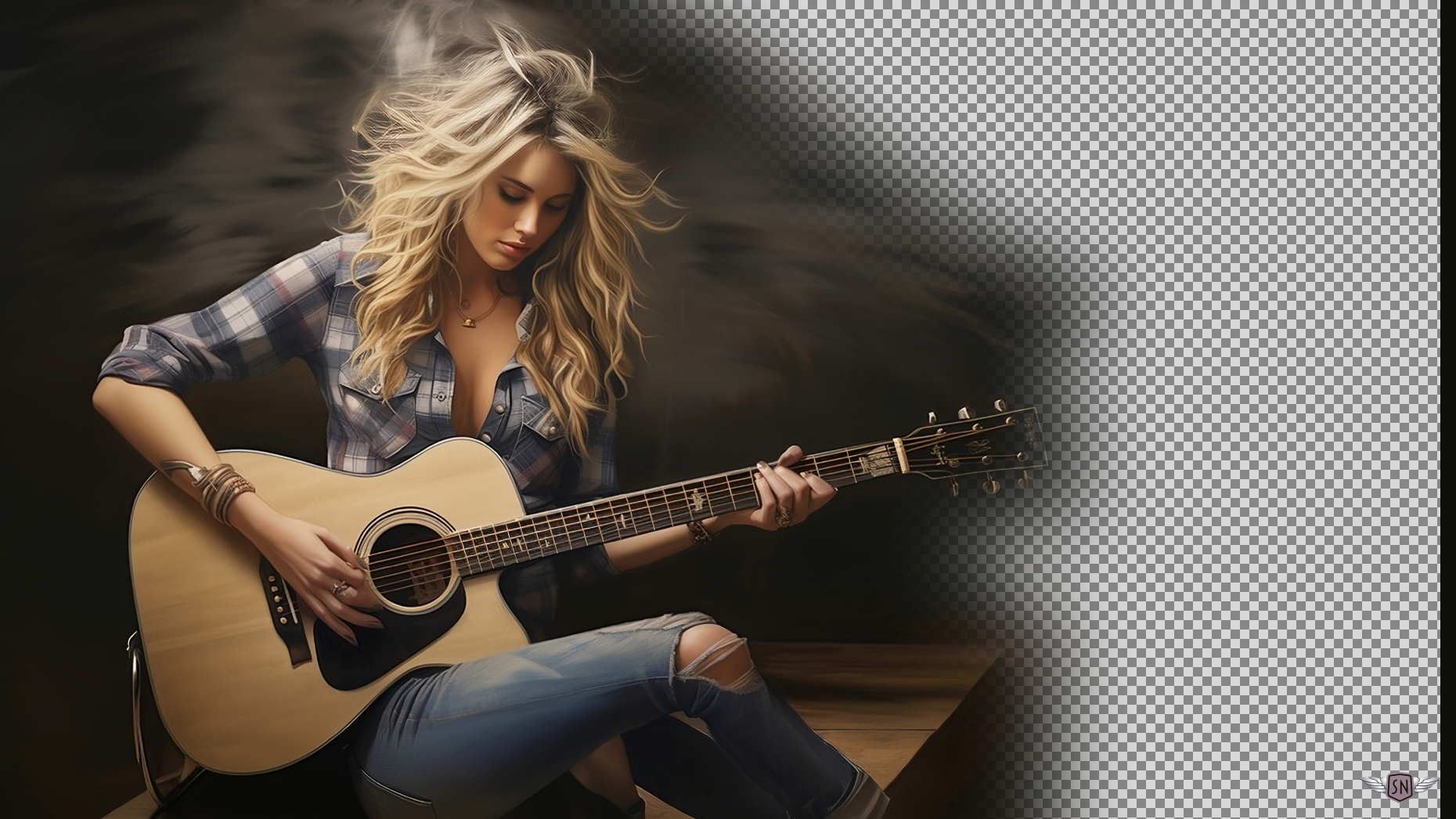
One approach is to edit the image — strip away non-essential areas to produce a soft-edged alpha channel — then let shape-image-threshold decide which parts of that alpha become the wrapping contour. Because it is destructive and removes much of the texture behind Patty, that method was rejected here.
#kenny > img {
  float: left;
  width: 100%;
  max-width: 100%;
}
#kenny > img {
shape-outside: url("patty.webp");
shape-image-threshold: 2;
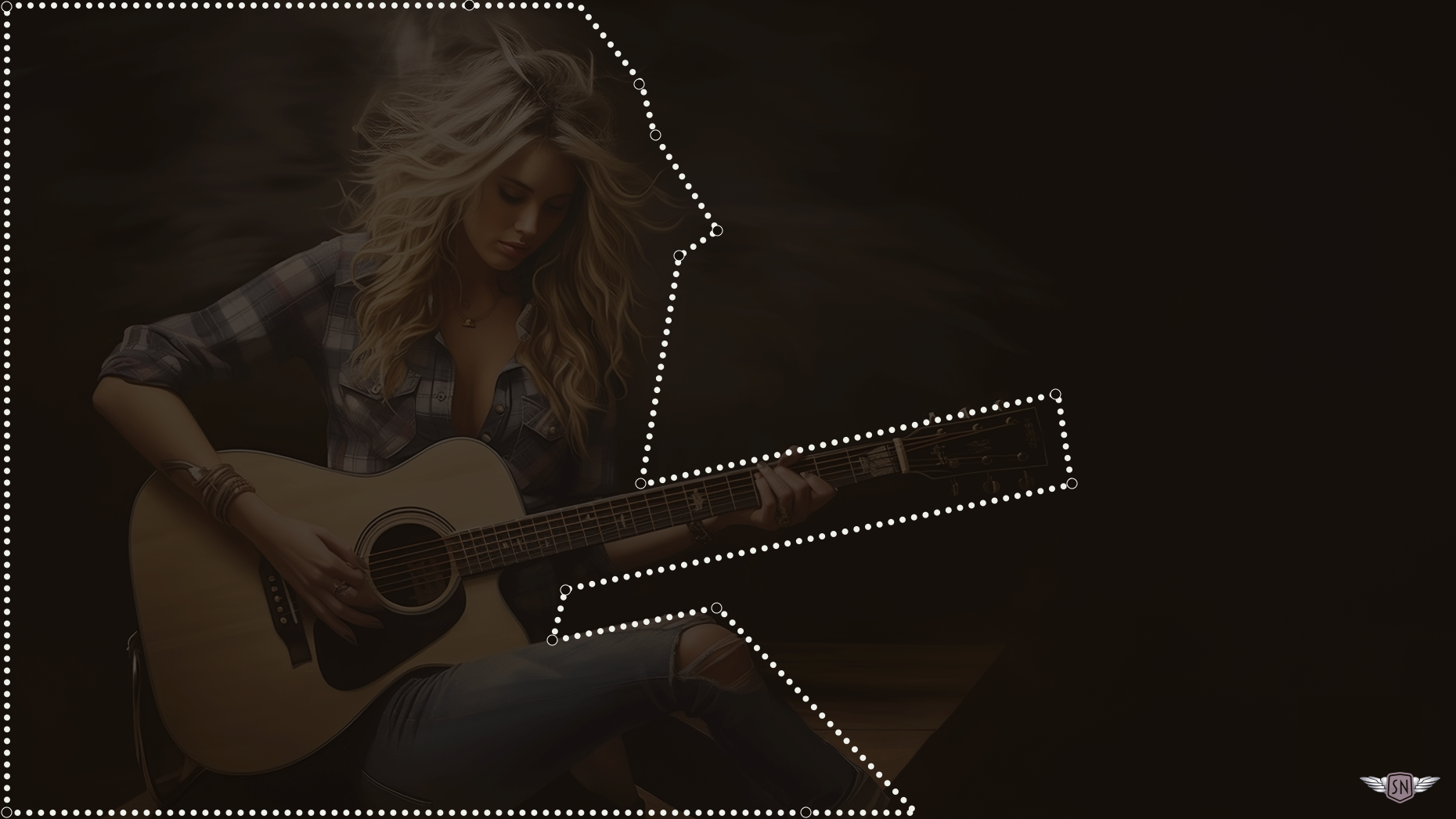
}Instead, a polygon clip-path supplies the shape-outside value. The text flows around the polygon while the original image keeps all its detail.
#kenny > img {
  float: left;
  width: 100%;
  max-width: 100%;
  shape-outside: polygon(…);
  shape-margin: 20px;
}
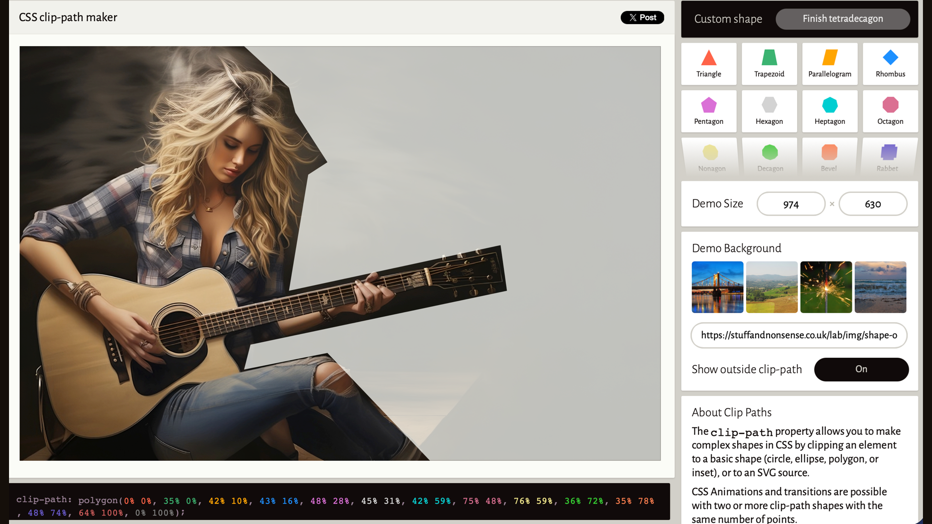
Polygon points are rarely worth writing by hand; Bennett Feely's CSS clip-path maker does the work. Load the image, draw the shape, then copy the generated clip-path values into shape-outside.
clip-path.Flowing text between two shapes
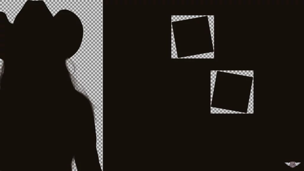
For a design that pushes against convention the way Patty pushes against country music's, two photomontages sit above the content, their elements overlapping and spilling out of their containers to create depth. Each montage has an irregularly shaped alpha channel.
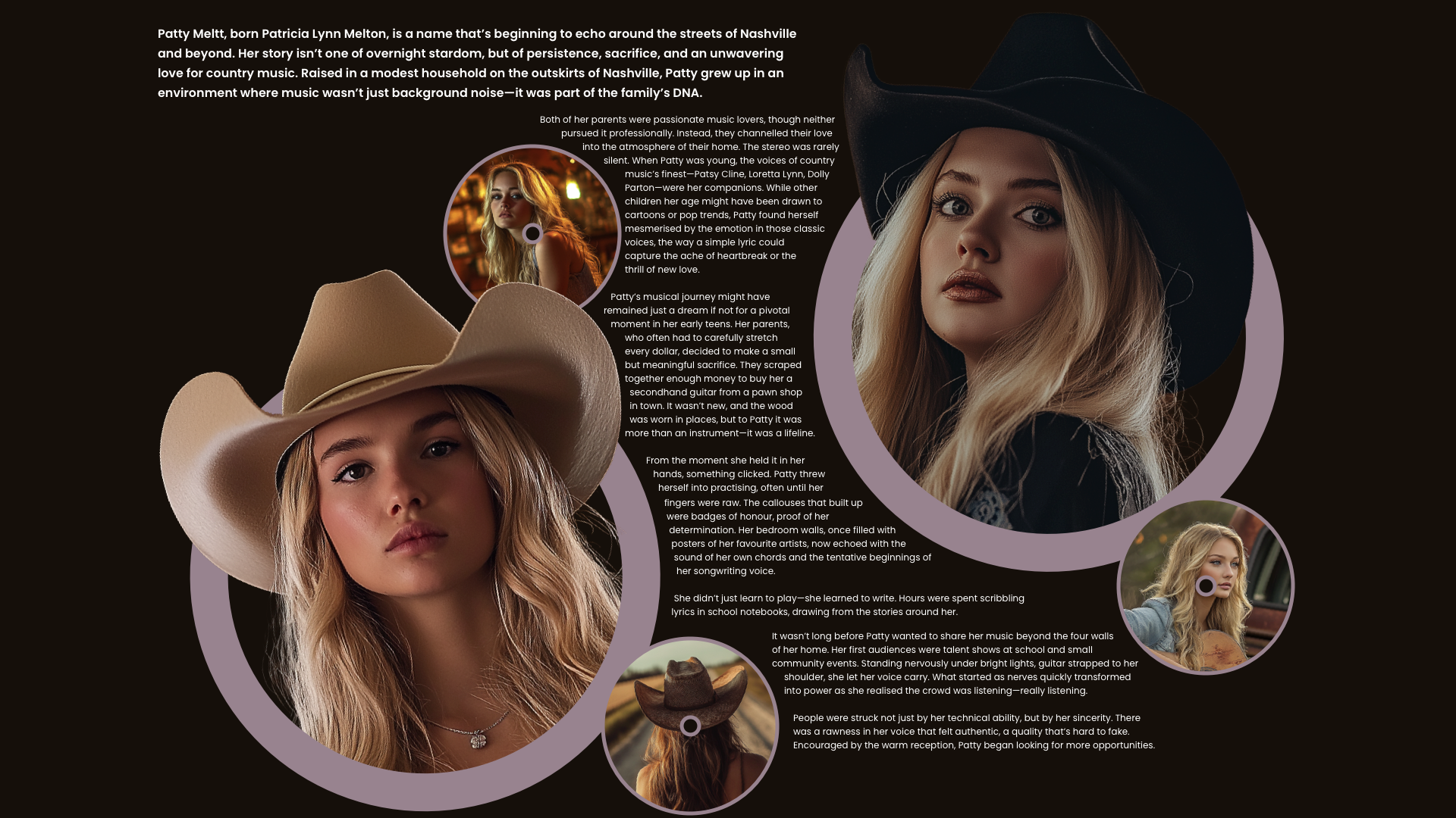
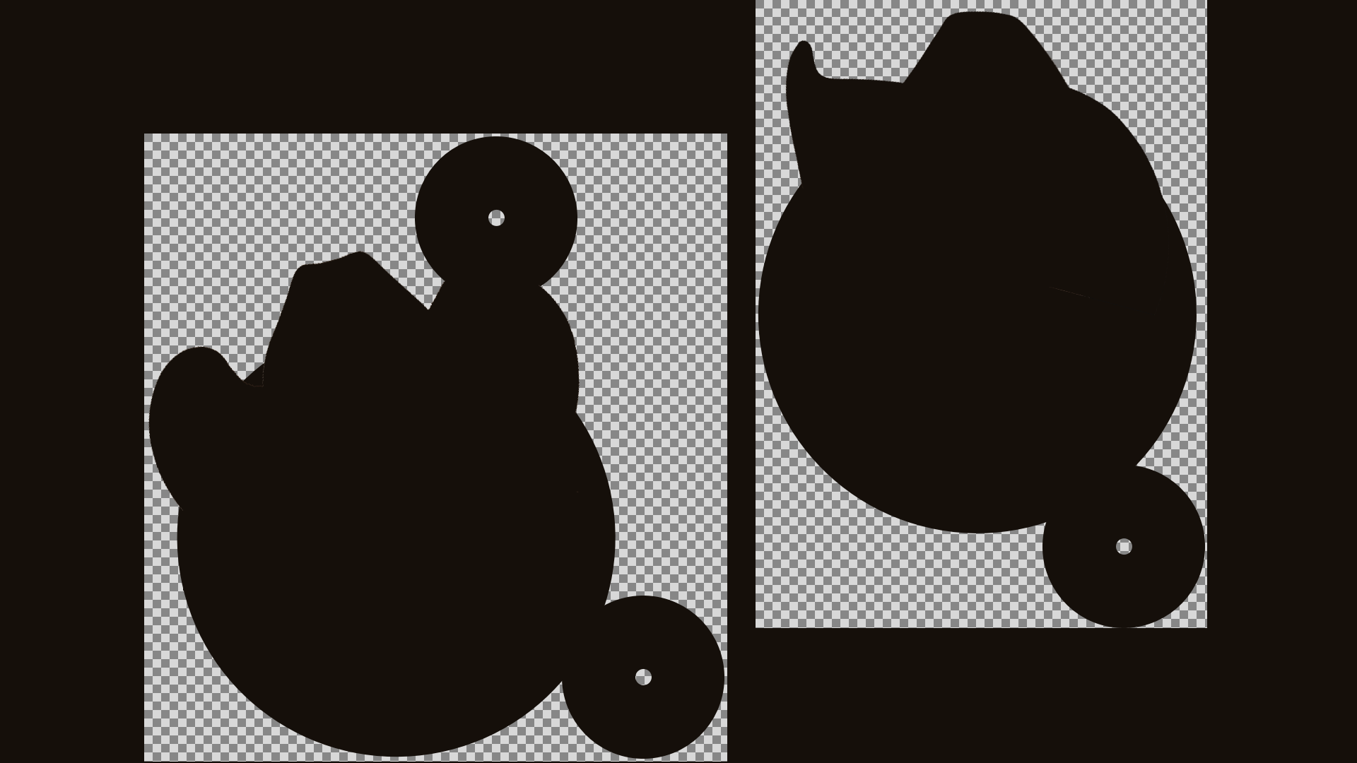
The same image URLs used for the montages become the values of shape-outside, and the content flows between the two shapes down the page.
<section id="johnny">
  <img src="patty-1.webp" alt="">
  <img src="patty-2.webp" alt="">
  […]
</section>
What the property changes
Images in long-form content are too often boxed in and isolated, as if added as an afterthought. CSS Shapes, and shape-outside in particular, let images and text participate in one composition. That matters beyond usability: it shapes how the page feels. Text wrapping the curve of a guitar or the edge of a portrait makes a reader linger and turns an otherwise flat layout into something with rhythm and character.
Where a rectangle seems like the obvious container, it may be worth checking whether the image's own outline can carry the layout instead.